23 Gallery Wall Layout Templates That Transform Blank Walls
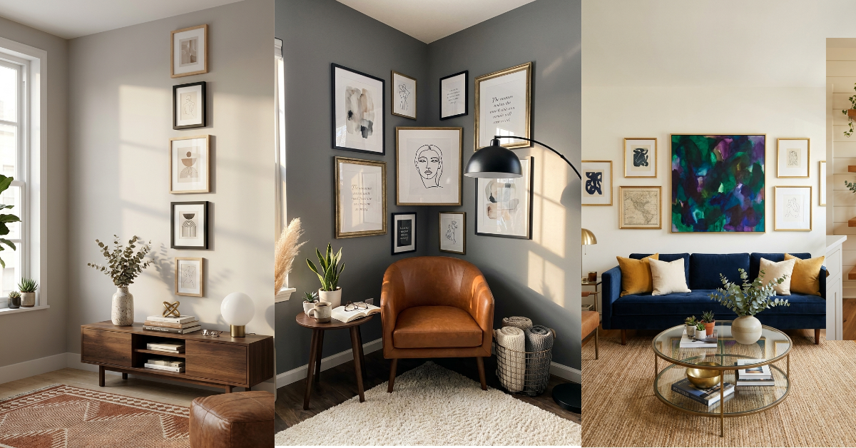
You’ve been staring at that blank wall for months now. You’ve got frames leaning against the wall, some favorite prints rolled up in a closet, and a Pinterest board bursting with gorgeous gallery wall inspiration. But every time you grab the hammer, you freeze. Where do you even start? How do you make it look balanced without a million nail holes?
Here’s the thing: gallery walls aren’t about perfection. They’re about creating a collection that feels like you. But having a template? That’s the secret sauce that takes the guesswork out of spacing and arrangement. I’m sharing 23 tried-and-true layout templates that actually work in real homes. Some are structured and symmetrical. Others are playful and organic. All of them will help you finally get those frames off the floor and onto the wall. Let’s get into it.
1. The Classic Grid
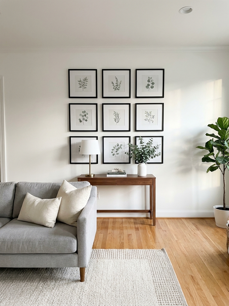
This is your fail-safe layout when you want polish without fuss. Picture nine identical frames arranged in three perfect rows. Same size, same mat, same spacing between each piece. It’s the gallery wall equivalent of a little black dress.
What makes the grid so good? It creates instant visual calm. Your eye doesn’t have to work to find a pattern because the pattern is obvious and satisfying. This works beautifully in modern spaces, offices, or anywhere you want your art to feel intentional rather than collected over time. Black and white photography looks stunning in this format. So do botanical prints or abstract pieces in a limited color palette.
The spacing matters more than you think. Keep about 2-3 inches between frames for that clean, gallery-quality look. Too close and it feels crowded. Too far apart and the arrangement loses its impact as a unified installation.
2. The Salon Style
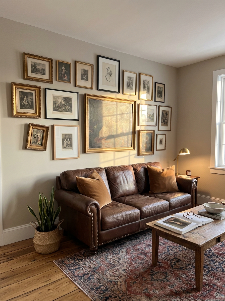
This is where things get fun and a little wild. Salon style means covering your wall nearly edge-to-edge with frames of all different sizes, orientations, and even styles. It’s organized chaos at its best. Think vintage art museum meets collected-over-a-lifetime vibe.
The secret to pulling this off? Start with your largest piece and build around it. That anchor frame gives your eye somewhere to land before it wanders through the rest of the collection. Mix horizontal and vertical orientations. Combine ornate gold frames with simple wood ones. Throw in a small mirror or two if you’re feeling adventurous. The beauty is in the abundance.
But don’t mistake busy for random. Even salon walls follow a loose structure. Try to keep relatively consistent spacing between all frames—usually about 1-2 inches. And make sure your outer edges create a somewhat cohesive boundary, even if the interior feels freeform. This keeps it from looking like frames exploded onto your wall.
3. The Horizontal Line
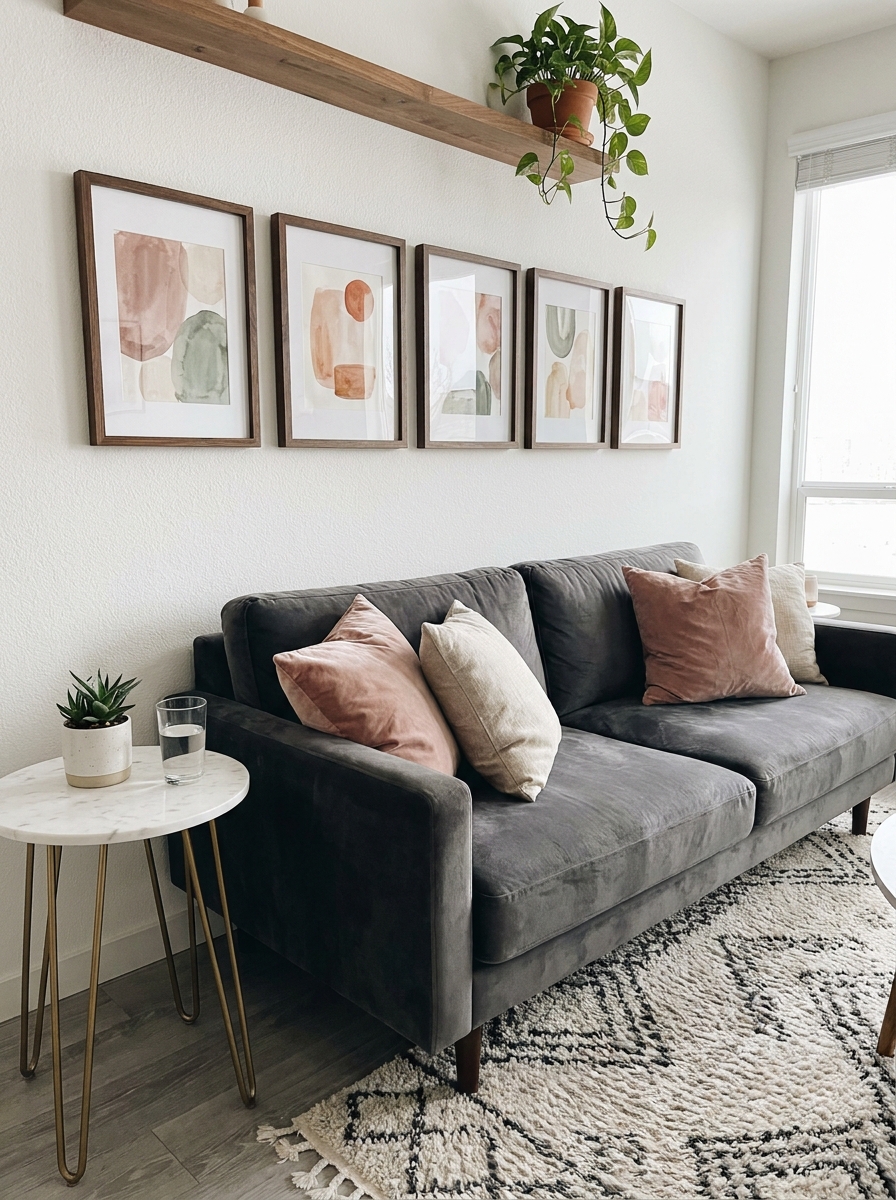
Long and lean. That’s the vibe here. Three to five frames arranged in a single horizontal row, all hung at the same height. It’s perfect above a sofa, along a hallway, or floating above a console table.
This layout elongates your space visually. It draws your eye across the wall rather than up and down, which makes rooms feel wider. I love this for narrow spaces that need a little horizontal breathing room. The frames can be identical or varied in size, but keeping them aligned along the bottom or center creates that clean, intentional look.
You’ve got options with what goes inside the frames too. A series of coordinating prints tells a visual story. Family photos in matching frames feel cohesive and personal. Or mix it up with different art styles united by a common color thread. The linear arrangement holds it all together even when the content varies.
4. The Symmetrical Pair
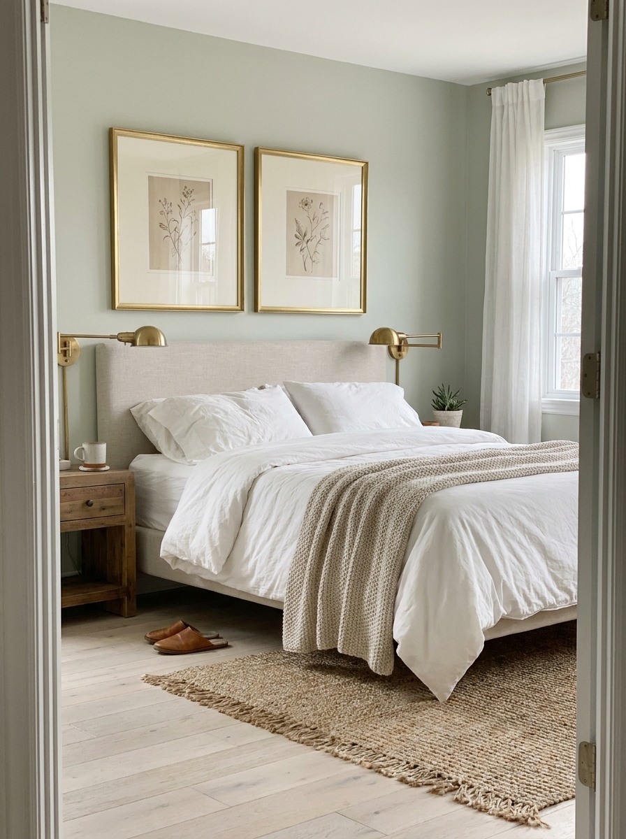
Sometimes two is all you need. Two identical frames flanking a central element—a window, a mirror, a piece of furniture—creates instant architectural balance. It’s classic. It’s elegant. And it works in literally every decorating style from farmhouse to contemporary.
The key word here is identical. Same frame size, same mat width, same hanging height. The symmetry is what makes this layout so satisfying to look at. Your brain loves matching patterns, and this delivers that dopamine hit without any fuss. This works beautifully in bedrooms flanking a headboard, in dining rooms on either side of a buffet, or in entryways balancing a console table.
What you put in those frames matters less than you think. Matching botanical prints are lovely. Coordinating abstract art works too. Even two pieces that share nothing but a color palette can look intentional when the framing and placement are identical. The structure does the heavy lifting here so your art can just be beautiful.
5. The Vertical Stack
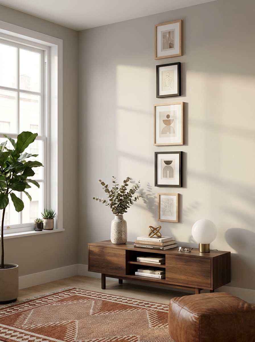
This layout is my secret weapon for narrow walls and tight spaces! You’re basically stacking your frames vertically in a single column, creating this gorgeous upward flow that makes your ceilings look miles higher.
I love this one between windows, beside doorways, or in that awkward skinny wall space nobody knows what to do with. The key is keeping your frames roughly the same width so they align nicely on both sides. You can mix up the heights though—that’s where it gets interesting!
Start with your largest or most eye-catching piece at eye level, then build up and down from there. I usually go with 3-5 frames total, but you can absolutely do more if your wall height allows it. The beauty of this layout is how it draws your eye up and makes the whole room feel taller. It’s like giving your space a visual stretch!
6. The Scattered Organic
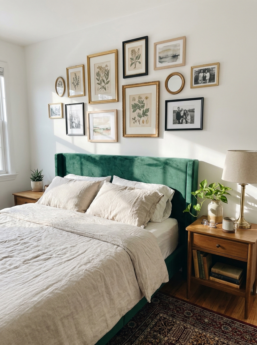
Okay, this is the “I collected these over time and they just happened to look amazing together” layout—except you’re totally planning it! It’s that effortlessly cool, asymmetrical arrangement where frames of all different sizes scatter across your wall in what looks random but is actually really thoughtful.
This layout feels so personal and collected, like you’ve been curating art for years. The trick is starting with your largest piece off-center, then filling in around it with smaller frames at varying distances. Some frames get close and cozy, others have breathing room. There’s no rigid structure here—just visual balance.
I always step back every few frames to see how it’s feeling. Does one side look too heavy? Add something small to the other side. Does it feel crowded? Spread things out a bit. This layout works beautifully in eclectic or bohemian spaces where you want that relaxed, artistic vibe. It’s gallery wall jazz—improvised but harmonious!
7. The Corner Cluster
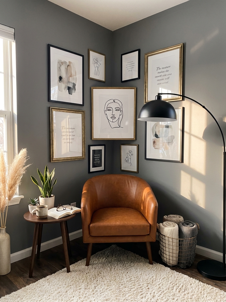
This layout is pure genius for those tricky corner spaces that always feel forgotten! Instead of centering everything on one wall, you’re wrapping your gallery around the corner, using both walls to create this really cool wraparound effect.
Start with a medium-sized piece right at the corner—this becomes your anchor. Then build outward on both walls, keeping the arrangement balanced on each side. I love mixing horizontal and vertical frames here because it emphasizes that corner turn and makes the whole thing feel intentional rather than like you ran out of wall space.
This works amazingly well in reading nooks, home offices, or at the end of hallways where corners naturally draw your eye. It’s unexpected, which makes it memorable. Plus, it solves that age-old problem of what to do with corner walls that feel too small for furniture but too big to leave blank!
8. The Statement Center
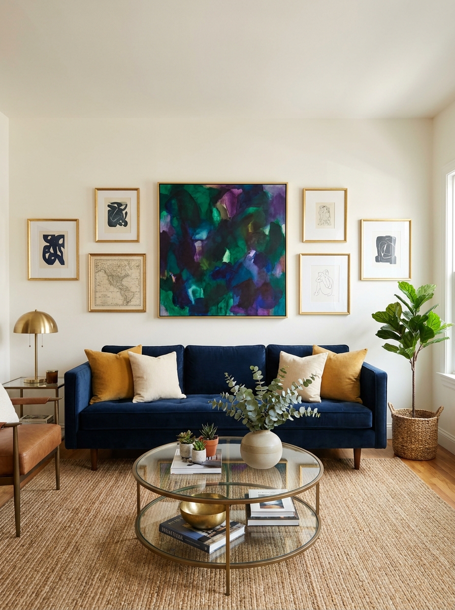
This is for when you have one showstopper piece that deserves to be the star, but you want to give it some supporting actors. You’re centering one large, dramatic piece and then surrounding it with smaller frames that complement without competing.
Think of it like a solar system—your big piece is the sun, and everything else orbits around it at respectful distances. The surrounding frames should be noticeably smaller (at least a third smaller) so there’s no confusion about what’s the main attraction. I usually go with 4-6 smaller pieces circling the center.
This layout is perfect when you’ve invested in a really special piece of art or a meaningful large photograph that you want to highlight. The surrounding frames add context and fill the wall without stealing thunder. It feels curated and intentional, like a museum display but way more personal and homey!
9. The Arch Formation
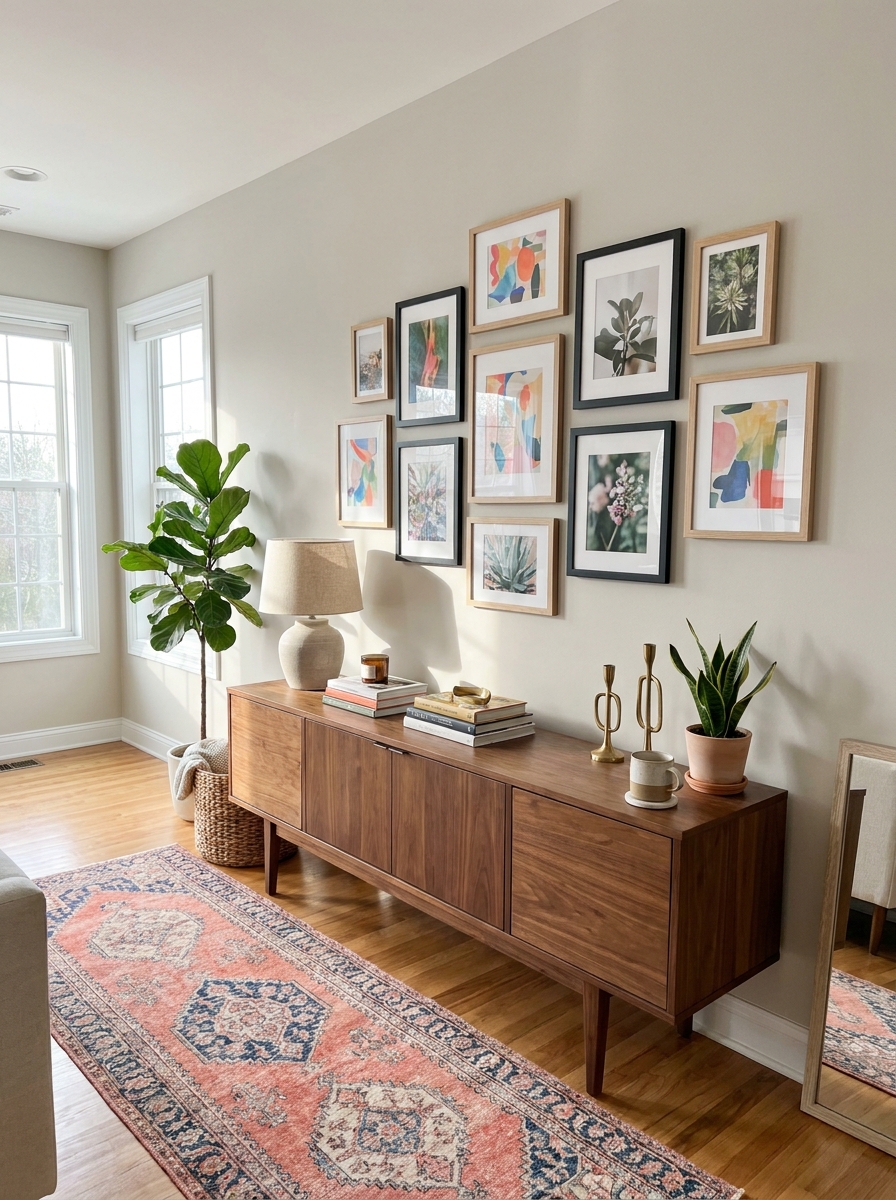
This one’s pure magic. You arrange your frames to create a gentle arch shape along the top edge. Start with your largest piece at the center top, then build downward and outward with smaller frames that follow a curved line.
I love this layout because it feels intentional but not stiff. It works beautifully above a console table or headboard where you want something special without going full-on symmetrical. The curved top edge draws your eye upward and makes the ceiling feel higher.
The trick is planning that arch line before you start hammering. I like to use painter’s tape on the wall to mark my curve first. Then arrange your frames along that invisible line, mixing sizes but keeping that rounded top consistent. Leave the bottom edges loose and organic for contrast. It’s structured enough to feel designed but relaxed enough to feel collected over time.
10. The Offset Square
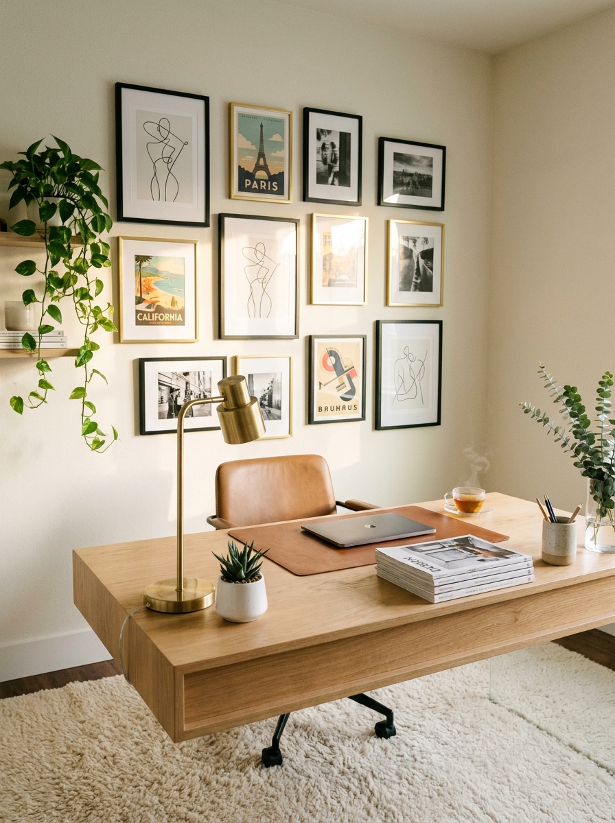
Here’s where things get interesting. You create a square-ish overall shape, but nothing actually lines up perfectly. Each frame is slightly offset from the one next to it, creating this gorgeous staggered effect that feels modern and collected at once.
This layout is perfect if you have frames in wildly different sizes and you want them all to feel equally important. No single piece dominates because the whole composition becomes the statement. Your eye bounces around in the best possible way.
I always start with my four corner pieces first, then fill in the middle. Keep roughly equal spacing between all frames—usually 2 to 3 inches works beautifully. The outer edges should form a loose square or rectangle, but inside? Total organized chaos. Mix your orientations freely. Portrait next to landscape next to square. It shouldn’t match, and that’s exactly the point. The slight imperfection makes it feel authentic.
11. The Ascending Staircase
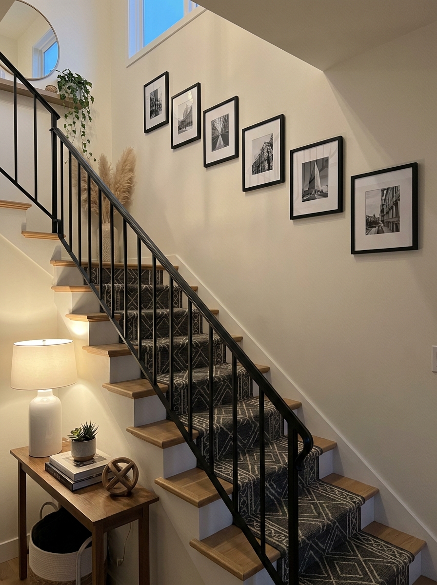
This layout literally follows your stairs upward, and it’s one of my absolute favorites for making awkward staircase walls feel intentional. You arrange frames to mirror the diagonal line of your staircase, creating a rising visual rhythm that guides you up.
The beauty here is in the repetition. I like using frames that are similar in size and style—maybe all matching black frames or all natural wood. This creates a gallery-like consistency that makes the diagonal arrangement feel purposeful rather than random.
Start at the bottom of your stairs and work your way up. Keep the spacing between frames consistent both horizontally and vertically. Each frame should sit at roughly the same distance from the stair railing. This creates that clean ascending line that feels so satisfying. You can use identical frame sizes for ultra-modern simplicity, or vary them slightly while maintaining that diagonal flow. Either way, you’re turning a tricky architectural feature into a showstopper.
12. The Triple Column
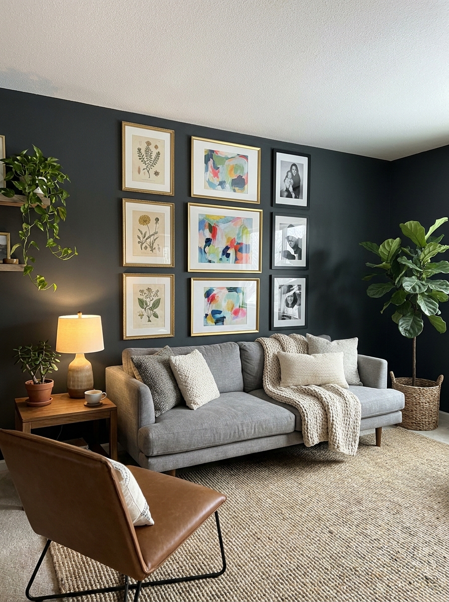
Think of this as the grid’s cooler cousin. You create three distinct vertical columns of frames, but each column can have its own personality. Maybe the left column has all black-and-white photos, the middle has colorful art, and the right has botanical prints.
This layout works brilliantly on wide walls where a single grid might feel too uniform. The three-column structure gives you organization and balance, but the varying content keeps it from feeling boring or corporate. Your eye travels across the wall discovering little collections within the bigger picture.
I love playing with column widths here. Your center column could be wider with larger frames, while the side columns stay narrow with smaller pieces. Or make all three equal for that satisfying symmetry. Keep vertical spacing consistent within each column, but the frames don’t have to align horizontally across columns. That little bit of variation makes the whole thing feel approachable and human rather than museum-precious.
13. The Floating Corner
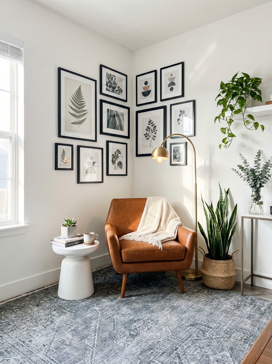
This one’s for those awkward corner spaces that always feel forgotten. Instead of centering your gallery on a wall, let it float into the corner where two walls meet. Start with a larger piece on one wall, then let smaller frames wrap around the corner onto the adjacent wall. It creates this gorgeous flow that pulls your eye around the room.
I love how this layout makes a corner feel intentional instead of leftover. It’s perfect for that weird space next to a doorway or between two windows. The key is keeping your frames close enough to feel connected but not so tight that they look cramped. Leave about 2-3 inches between frames and let the corner itself become part of the composition.
This works beautifully in entryways where you want to create visual interest from multiple angles. As people walk in and turn, they discover more of the collection. It’s like your walls are telling a story that unfolds as you move through the space.
14. The Mini Gallery Shelf
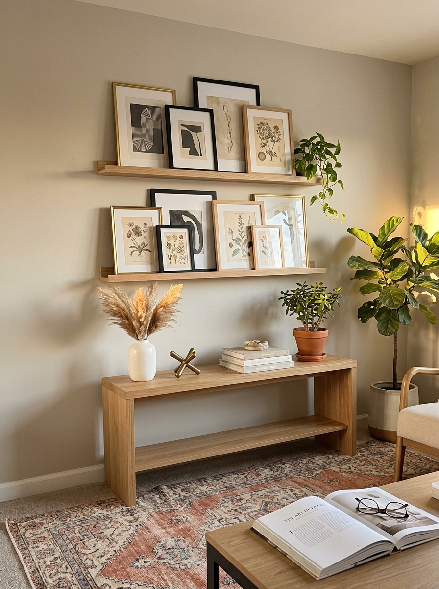
Okay, this one’s a game-changer if you’re commitment-phobic about putting holes in your wall. Install one or two floating shelves and layer your frames on top instead of hanging them. Mix standing frames with leaning artwork, throw in some small objects, and suddenly you’ve got a gallery that you can rearrange whenever the mood strikes.
What I love most is how forgiving this layout is. Nothing has to be perfectly straight because the casual lean is part of the charm. You can overlap smaller frames in front of larger ones, prop a postcard against a vase, or tuck a tiny print behind a bigger piece. It feels collected and personal, like you’ve been gathering treasures over years.
This works especially well above a console table, dresser, or along a hallway. The shelf creates a natural boundary for your collection, so you don’t have to stress about spacing or alignment. Just play around until it looks good to your eye.
15. The Mix-and-Match Shape
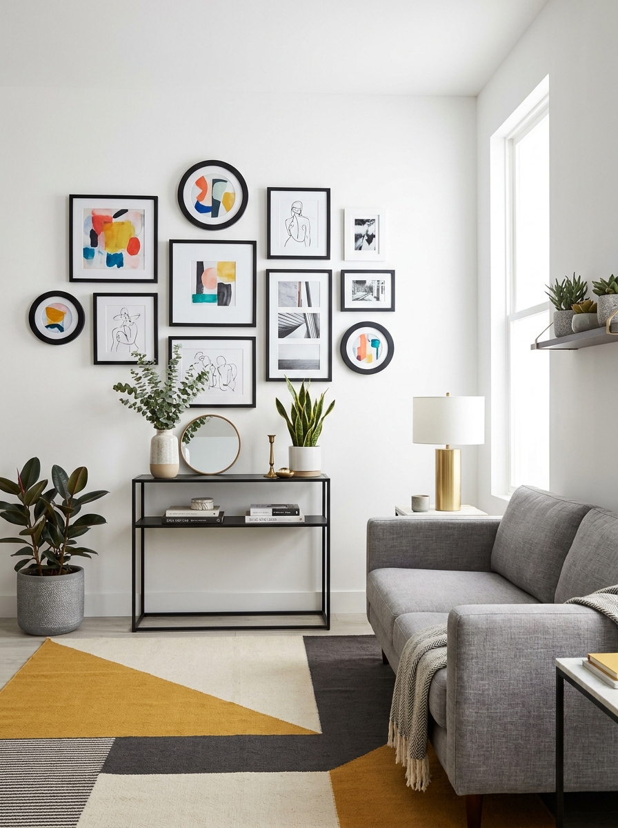
Who says all your frames have to be rectangles? This layout celebrates variety by mixing square frames, vertical rectangles, horizontal pieces, and even circular or oval frames into one cohesive arrangement. The different shapes create visual rhythm that keeps your eye moving across the wall in the most delightful way.
The secret to making this work is finding a common thread that ties everything together. Maybe it’s all black frames with different shapes, or all the same warm wood tone in various geometries. That consistency keeps the mix from feeling chaotic. I usually start with one round piece as my focal point, then build rectangles and squares around it.
This layout feels playful and unexpected without being overwhelming. It’s perfect if you’ve collected frames over time and they don’t all match. Instead of seeing that as a problem, this layout turns it into your design signature. Embrace the beautiful mess of it all.
16. The Oversized Statement Plus Minis
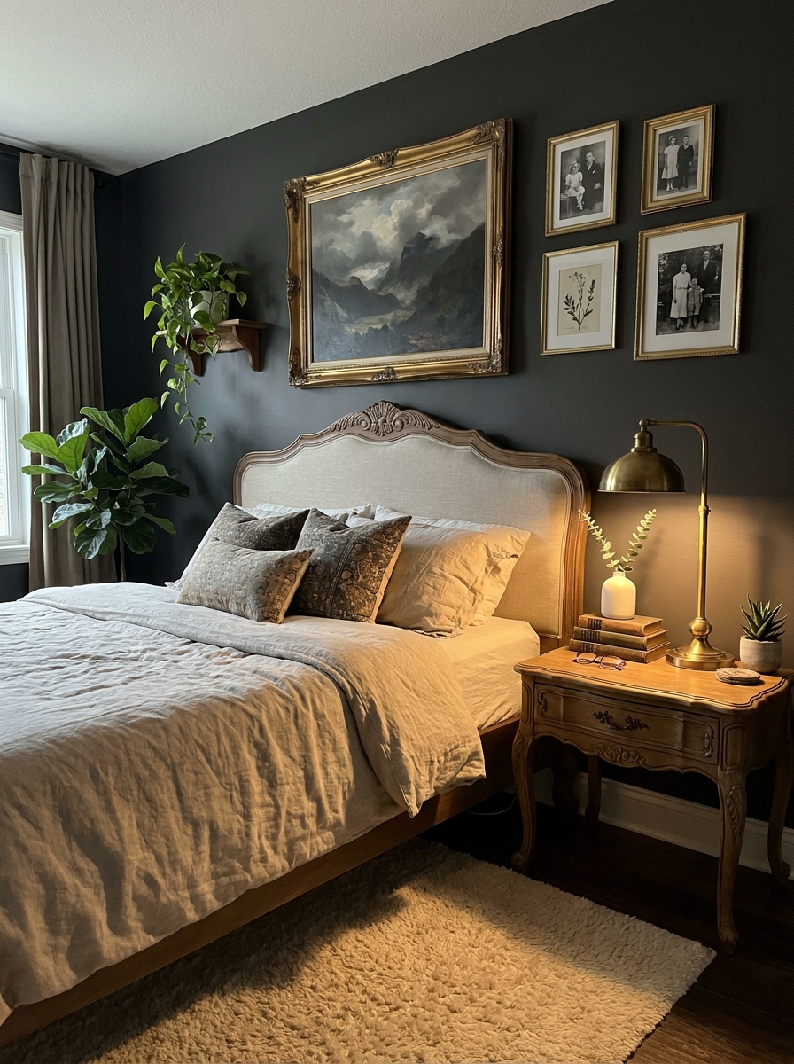
Sometimes you just need one big, bold piece to anchor everything. This layout pairs one oversized frame with a cluster of much smaller pieces grouped nearby. The size contrast creates instant drama and makes both the large piece and the mini collection feel more important than they would alone.
I position the large frame first, usually slightly off-center, then cluster 4-6 small frames on one side like satellites orbiting a planet. The small pieces can be tight together in a mini grid or slightly scattered organically. Either way, that size difference is what makes this layout so visually striking.
This is brilliant if you scored one amazing large print or painting and want to showcase it without going full minimalist. The mini frames add personality and tell more of your story without competing for attention. It’s the perfect balance of bold and layered.
17. The L-Shaped Wrap
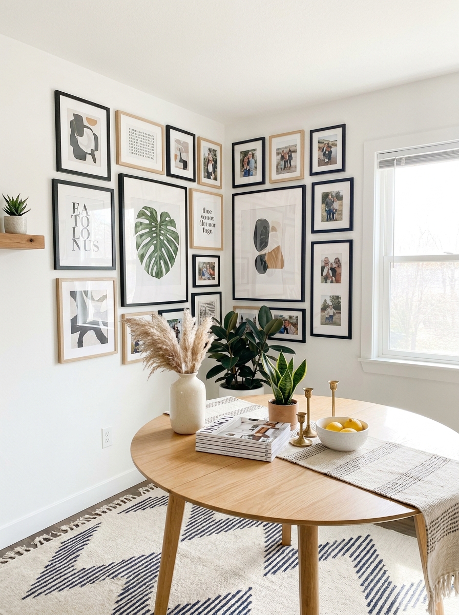
This layout literally hugs a corner, wrapping around two walls like a visual embrace. It’s perfect for those awkward corners that always feel a bit forgotten. The key is treating both walls as one connected canvas—the frames flow from one wall onto the next without breaking the rhythm.
Start with your largest piece right at the corner where the walls meet. This becomes your anchor point. Then build outward along both walls, keeping the spacing consistent so it feels intentional rather than like two separate galleries that happen to meet.
I love this layout in entryways or dining rooms where you want to create movement and draw the eye around the space. It makes a corner feel special instead of empty. The wraparound effect adds dimension and makes your room feel more layered and collected. Just make sure to step back and view it from different angles—you want it to look cohesive from multiple viewpoints, not just straight-on.
18. The Diagonal Flow
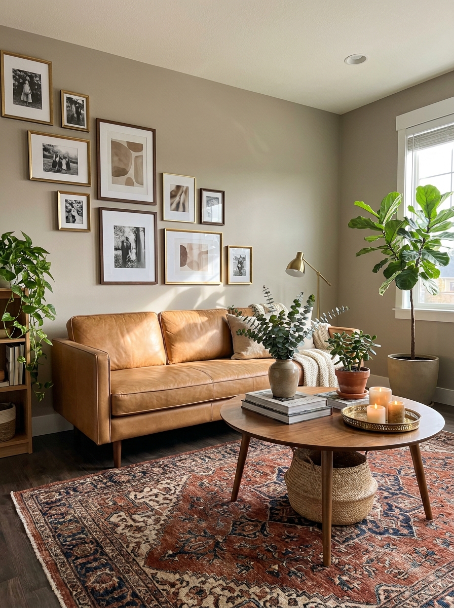
Think of a river flowing downhill—that’s the energy of this layout. Frames are arranged in a descending diagonal line that creates natural movement and draws your eye across the wall. It’s dynamic without being chaotic, and it works beautifully on staircase walls or above furniture that sits at an angle.
The trick is maintaining that invisible diagonal line while varying your frame sizes. Your frames don’t all need to touch that line—some can float slightly above or below—but the overall trajectory should be clear. Mix sizes to keep it interesting, but don’t let any single piece break the flow too dramatically.
I’m obsessed with this layout above a sofa that sits on an angle or along a hallway where you want to pull people forward. It has this effortless, collected-over-time vibe that feels less rigid than a grid. The diagonal creates energy and makes your wall feel taller and more expansive.
19. The Floating Frame Cluster
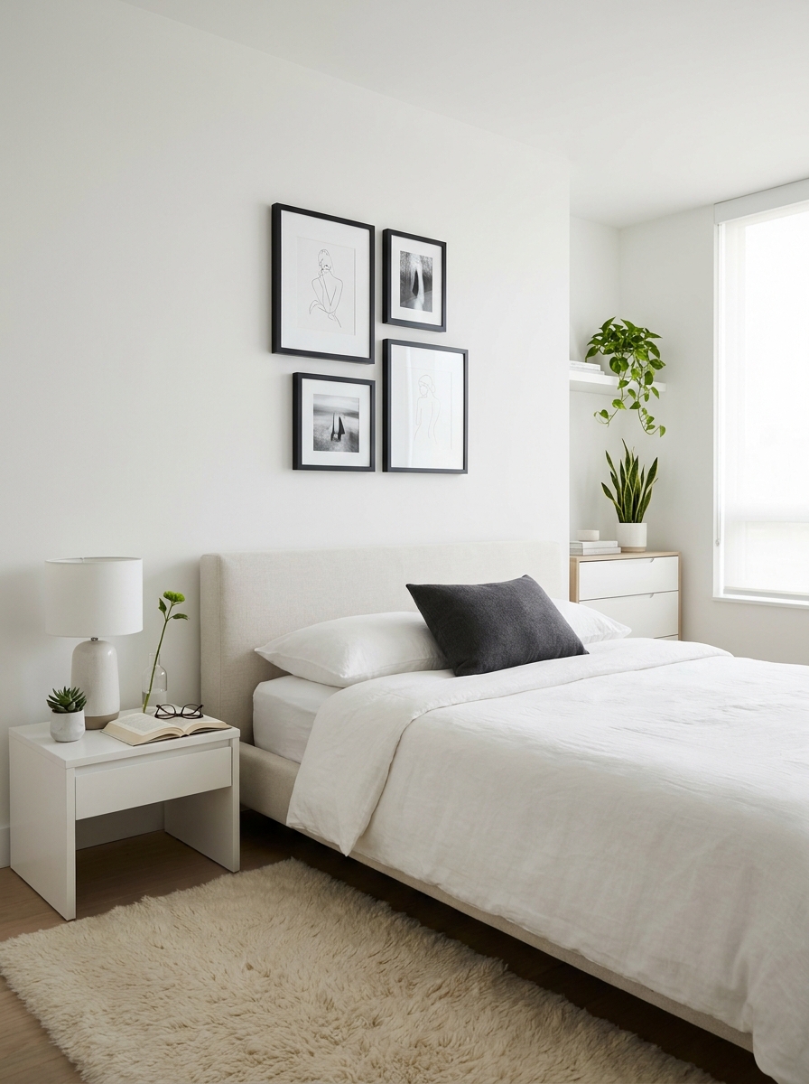
This is gallery wall minimalism at its finest. Instead of filling an entire wall, you create a tight, floating cluster of frames that hovers in the middle of your wall space. It’s surrounded by negative space on all sides, which actually makes it more impactful, not less. The breathing room gives your eyes a place to rest.
Keep your cluster compact—usually four to six frames arranged closely together. The frames should almost touch or have just an inch or two between them. This tight grouping makes them read as one cohesive unit rather than random pieces. The surrounding empty wall space becomes part of the design.
I love this approach in minimalist or Scandinavian-style rooms where less is definitely more. It works beautifully in small spaces too because it doesn’t overwhelm. The key is choosing your wall placement carefully—center it above furniture or position it deliberately off-center for a modern, unexpected look.
20. The Frame-the-Furniture Layout
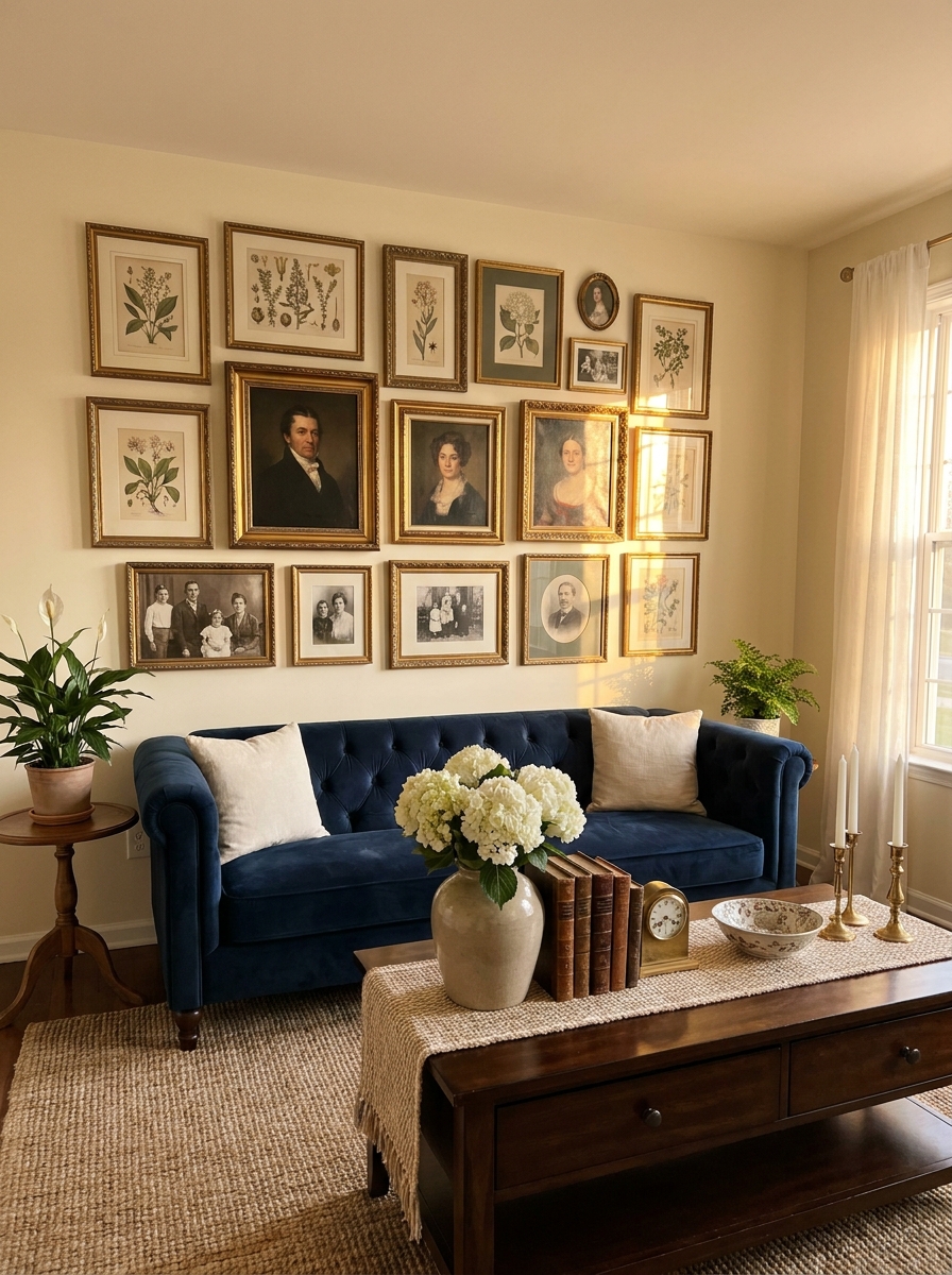
Here’s a smart trick: use your gallery wall to literally frame your furniture piece below. The frames create a visual border around your sofa, console, or bed, making everything feel more intentional and designed. It’s like your furniture and art are having a conversation, and your whole wall suddenly feels pulled together.
The frames extend just slightly wider than your furniture on both sides—maybe six inches past each edge. Keep the bottom row relatively level with the top of your furniture, then build up from there. This creates that framing effect that makes your furniture feel like it belongs exactly where it is.
I especially love this layout behind a console table or sofa because it creates such a cohesive moment. Your furniture becomes part of the art installation rather than just something sitting below it. It’s polished without feeling stuffy, and it makes decorating feel easier because you have clear boundaries to work within.
21. The Layered Ledge System
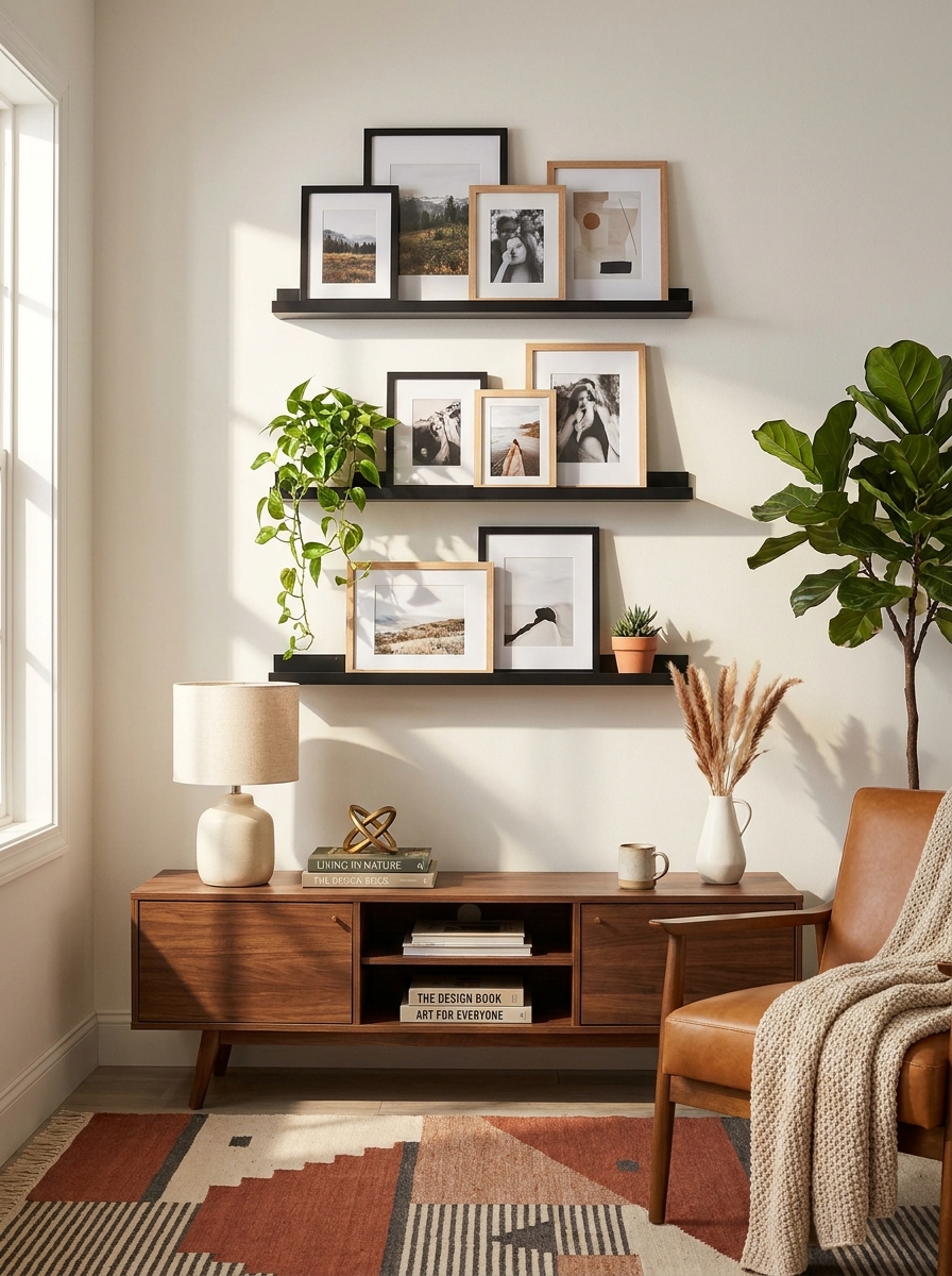
Okay, this one’s for everyone who hates measuring and wants flexibility forever. Instead of hanging everything on the wall, you’re using picture ledges stacked at different heights with frames leaning casually against the wall.
I’m obsessed with this layout because you can switch things up whenever the mood strikes. Feeling bored? Swap a print. Found something new? Just tuck it in front. The layered, overlapping look creates so much visual interest, and honestly, it feels way more collected and personal than a perfectly hung grid.
The trick is varying your frame sizes and letting some overlap others. Mix in a small plant, a candle, maybe a little sculpture between frames. It creates this effortless, gallery-browsing vibe that I can’t get enough of. Perfect for renters too, since you’re only installing the ledges themselves, not a million nail holes.
22. The Around-the-Corner Wrap
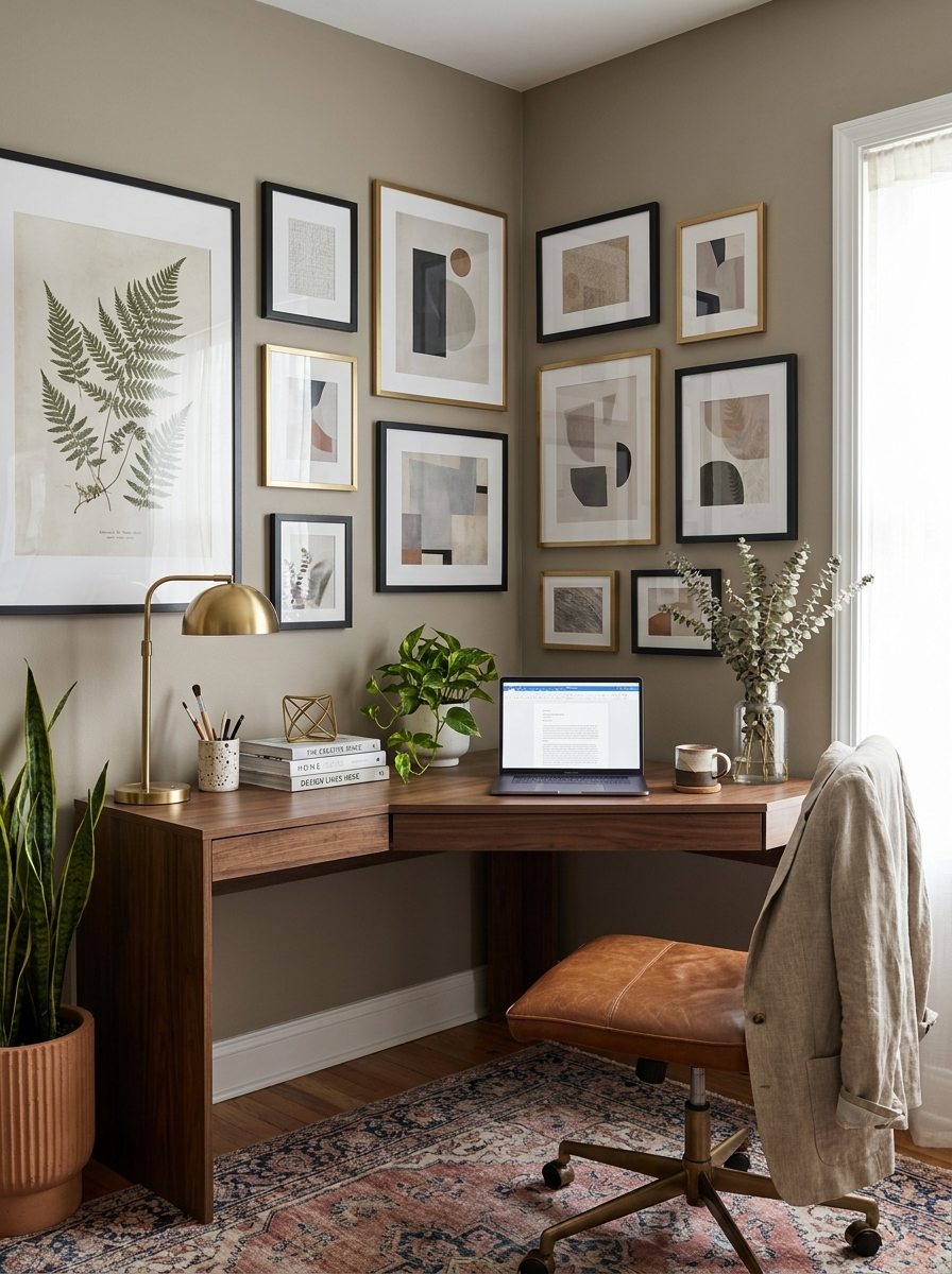
Why stop at one wall when you have a gorgeous corner just begging for attention? This layout wraps around a corner, turning two walls into one cohesive gallery moment. It’s unexpected, it’s bold, and it makes any room feel instantly more designed.
The key is treating the corner as the anchor point. I like putting a larger statement piece on one side of the corner, then flowing smaller frames around and onto the adjacent wall. It creates this natural visual path that draws your eye around the space. So good for awkward corner areas that usually just sit there doing nothing.
This works especially well in dining rooms, home offices, or at the top of a staircase where you have that corner wall situation. It makes the whole space feel more connected and intentional, like you really thought about how the room flows. Because you did!
23. The Oversized Solo Plus Tiny Satellites
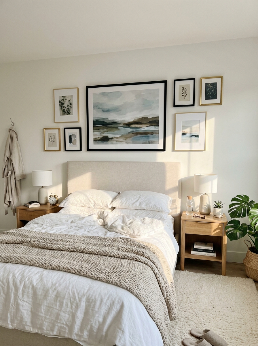
This is my secret weapon when you have one absolutely stunning large piece that deserves to be the star, but you still want that gallery wall vibe. You hang your oversized showstopper first, then cluster four to six tiny frames around it like little satellites orbiting a planet.
The contrast in scale is what makes this so visually exciting. That big piece commands attention, but those little frames add personality and keep it from feeling too serious or hotel-like. I love using small 4×6 or 5×7 frames for the satellites, sometimes even mixing in a few 3×3 squares.
This layout is perfect when you’ve invested in one really special piece of art or a large family photo you adore, but you want the collected, curated feeling of a gallery wall. Best of both worlds, and it’s surprisingly easy to hang because you’re really just centering that one big piece and scattering the small ones around it.
Quick Guide
Quick Planning Guide: Gallery Wall Prep
Before You Hammer:
– Trace each frame on kraft paper and tape the paper templates to your wall first
– Step back 6-8 feet to see how the arrangement looks from your typical viewing distance
– Take a photo on your phone—sometimes things look different through a camera lens
Spacing Sweet Spots:
– Tight & modern: 1-2 inches between frames
– Classic gallery: 2-3 inches between frames
– Relaxed & eclectic: 3-4 inches between frames
Hanging Height:
– Center of arrangement should be 57-60 inches from floor (eye level)
– Above furniture: 6-8 inches above the piece
– In hallways: slightly lower (54-57 inches) since you’re often walking past, not sitting
Your Wall Is Waiting
Here’s what I want you to remember: there’s no wrong way to create a gallery wall that makes you happy. These 23 templates aren’t rigid rules. They’re starting points. Creative scaffolding. A way to silence that voice in your head that says you’ll mess it up.
You might start with the classic grid and end up loving the salon style chaos. Or maybe you’ll combine two templates into something totally your own. That’s the whole point. Your walls should tell your story, showcase what you love, and make you smile every time you walk past.
So grab those frames. Print those photos or order those art prints you’ve been saving. Spend a Saturday afternoon with some painter’s tape and a level. Put on good music. Pour yourself something nice to drink. And just start. The first nail hole is always the scariest, but I promise your wall can handle it. And honestly? Once you finish your first gallery wall, you’ll be eyeing every other blank wall in your house. Consider yourself warned.
Frequently Asked Questions
How do I choose which gallery wall layout template is right for my space?
Consider your room style and the wall size you’re working with. The classic grid works beautifully in modern or minimalist spaces and on medium-sized walls. Salon style needs a larger wall and suits eclectic or traditional homes. If you’re working above furniture, the horizontal line or symmetrical pair layouts are your best bet. Start with the layout that matches your comfort level—structured templates if you like order, organic layouts if you’re more adventurous.
What’s the best way to hang a gallery wall without making a million holes?
Use the kraft paper template method. Trace each frame onto kraft or butcher paper, cut them out, and tape them to your wall in your desired arrangement. Step back and adjust until it looks right. Then poke a nail through the paper where each hanging point should be, remove the paper, and hammer your nails into the marked spots. This lets you experiment freely before committing to any holes.
Should all my frames match in a gallery wall layout?
Not necessarily. Matching frames create a cohesive, polished look that’s perfect for grids and structured layouts. Mixed frames work beautifully in salon-style or eclectic arrangements, but keep one element consistent—like all black frames in different styles, or all wood tones in various finishes. This gives you variety while maintaining visual harmony.
How much spacing should I leave between frames in my gallery wall?
The standard spacing is 2-3 inches between frames for a classic gallery look. Go tighter (1-2 inches) for a modern, compact feel, or wider (3-4 inches) for a more relaxed, breathing arrangement. Whatever spacing you choose, keep it consistent throughout your entire wall—this consistency is what makes any layout look intentional rather than random.
Can I create a gallery wall with different frame sizes and orientations?
Absolutely, and it often looks more interesting than uniform frames. Mix horizontal and vertical orientations, combine large statement pieces with smaller accent frames, and vary your frame depths for added dimension. The key is creating visual balance—distribute your larger pieces throughout the arrangement rather than clustering them all in one area, and step back frequently to check that no single side feels too heavy.