35 Dining Room Wall Decor Ideas to Transform Your Space
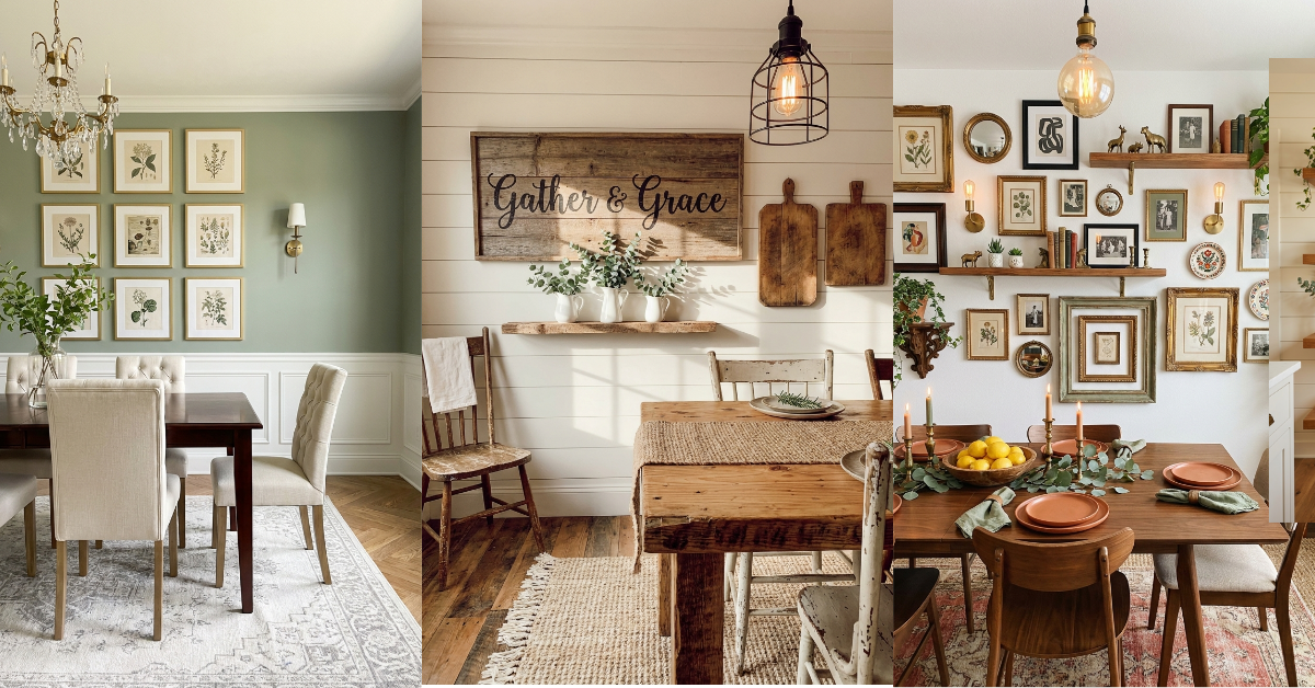
You know that feeling when you walk into your dining room and something just feels… unfinished? The table looks great, the chairs are perfect, but those blank walls are practically screaming for attention. I’ve been there too many times to count. Your dining room walls are prime real estate for making a statement, but figuring out what to actually put up there can feel overwhelming. Should you go big with one dramatic piece? Create a gallery wall? Add shelves? The good news is there are so many gorgeous ways to dress up those walls, and most of them are way easier than you think. Whether you’re working with a formal dining room or a cozy breakfast nook, the right wall decor pulls everything together and makes the space feel intentional. Let’s get into it.
1. Oversized Abstract Canvas Art
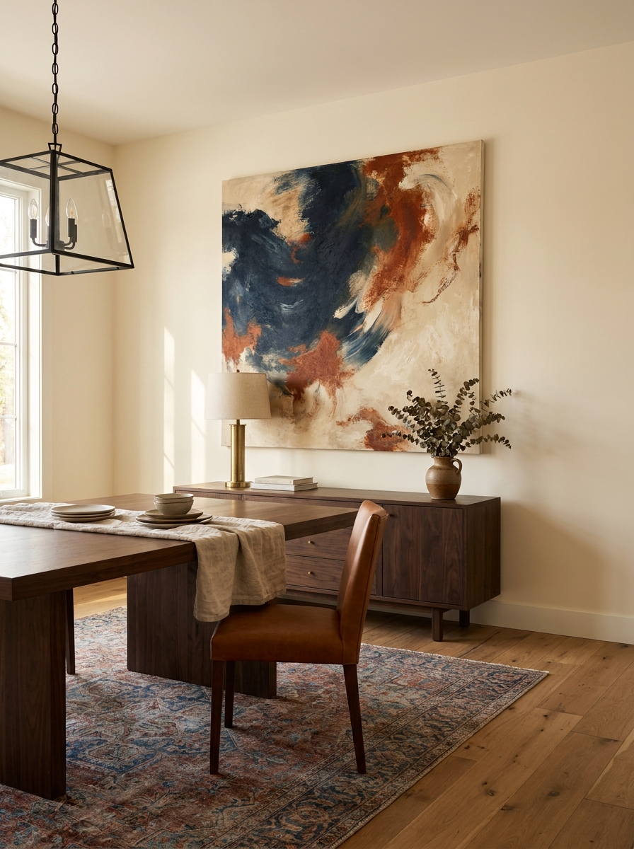
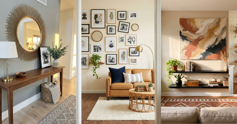
Sometimes you just need one big, bold piece to anchor the whole room. An oversized abstract canvas immediately draws the eye and gives your dining space that gallery-worthy vibe without the fuss of arranging multiple pieces. The beauty of abstract art is that it works with almost any style—modern, traditional, eclectic—you name it.
I love choosing a canvas that pulls in colors from other parts of the room. Maybe it echoes the blue in your rug or the warm terracotta in your throw pillows. That little connection makes everything feel cohesive without being matchy-matchy. And honestly? You don’t need to spend a fortune. There are amazing affordable options online, or you could even DIY one if you’re feeling adventurous.
Hang it centered on your main dining wall, about 6-8 inches above your buffet or sideboard if you have one. The scale matters here—don’t go too small or it’ll look like it’s floating awkwardly. You want it to command attention and set the mood the moment someone walks in.
2. Symmetrical Gallery Wall with Matching Frames
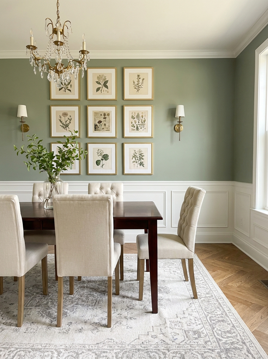
If you love order and balance, a symmetrical gallery wall is your friend. There’s something so satisfying about perfectly aligned frames that creates an instant sense of calm and sophistication. This approach works beautifully in more formal dining rooms where you want that polished, collected look.
Start with matching frames—all black, all gold, all natural wood—whatever speaks to you. Then play with the art inside. You can mix family photos, botanical prints, abstract pieces, or even pages from vintage books. The uniform frames tie everything together so the content can be more eclectic without feeling chaotic.
I usually do a grid pattern with equal spacing between each frame. Measure carefully and use a template (newspaper or craft paper works great) to map it out on the floor first. Once you’re happy with the arrangement, transfer those measurements to the wall. It takes a little patience upfront, but the payoff is worth every minute. Your dining room will feel like it belongs in a design magazine.
3. Large Round Mirror as a Focal Point
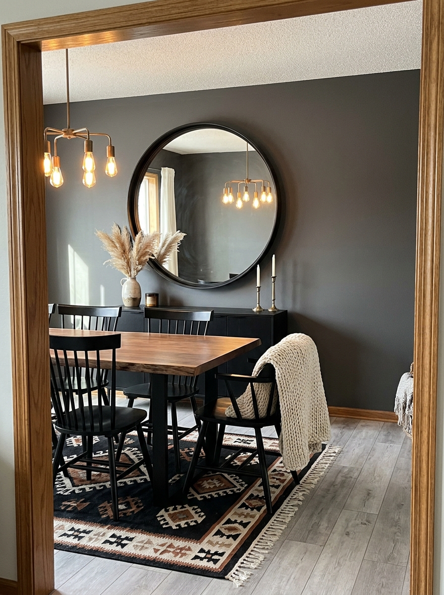
Mirrors are magic in dining rooms. They bounce light around, make the space feel bigger, and add that touch of glamour that elevates everything. A large round mirror brings softness to a room that’s often filled with rectangular shapes—the table, the chairs, the windows.
I’m obsessed with how a statement mirror can change the whole vibe. Go for something with an interesting frame—maybe rattan for bohemian vibes, ornate gold for traditional elegance, or sleek black metal for modern edge. Hang it on the wall opposite a window if possible, and watch how it doubles the natural light in the room. It’s like adding another window without the construction.
The size matters here too. You want it large enough to make an impact but not so huge it overwhelms the space. Generally, aim for about two-thirds the width of your buffet or sideboard if you’re hanging it above furniture. If it’s going on a blank wall, go bigger. There’s something so satisfying about catching your reflection during dinner and seeing the whole beautiful room behind you.
4. Rustic Wooden Signs with Farmhouse Charm
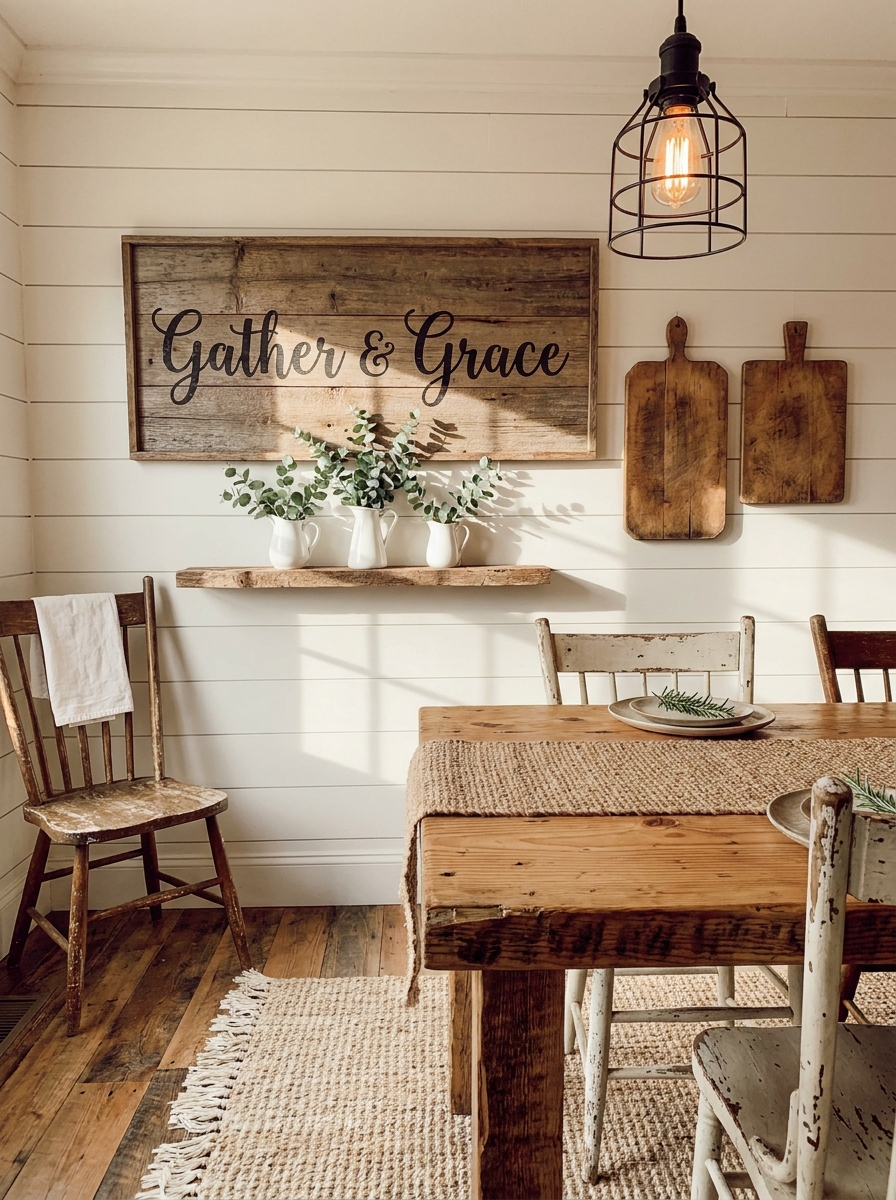
If farmhouse style makes your heart happy, rustic wooden signs are calling your name. There’s something wonderfully cozy about weathered wood with hand-painted or carved lettering hanging in a dining space. It instantly makes the room feel warm and welcoming—like you’re gathering around a table that’s seen generations of family meals.
You can go with classic sayings like “Gather” or “Bless the Food Before Us,” or get more personal with custom family names or meaningful quotes. I love mixing a large wooden sign with smaller complementary pieces—maybe some vintage cutting boards or a small shelf with mason jars. The key is embracing the imperfections. These signs should look a little worn, a little loved.
Hang your main sign centered above a buffet or sideboard, or lean it on the furniture for a more casual vibe. The beauty of this style is that it’s forgiving. Things don’t need to be perfectly straight or pristinely hung. That slightly undone quality is part of the charm. It tells everyone who walks in that this is a space for real living, not just looking pretty.
5. Botanical Print Collection in Vintage Gold Frames
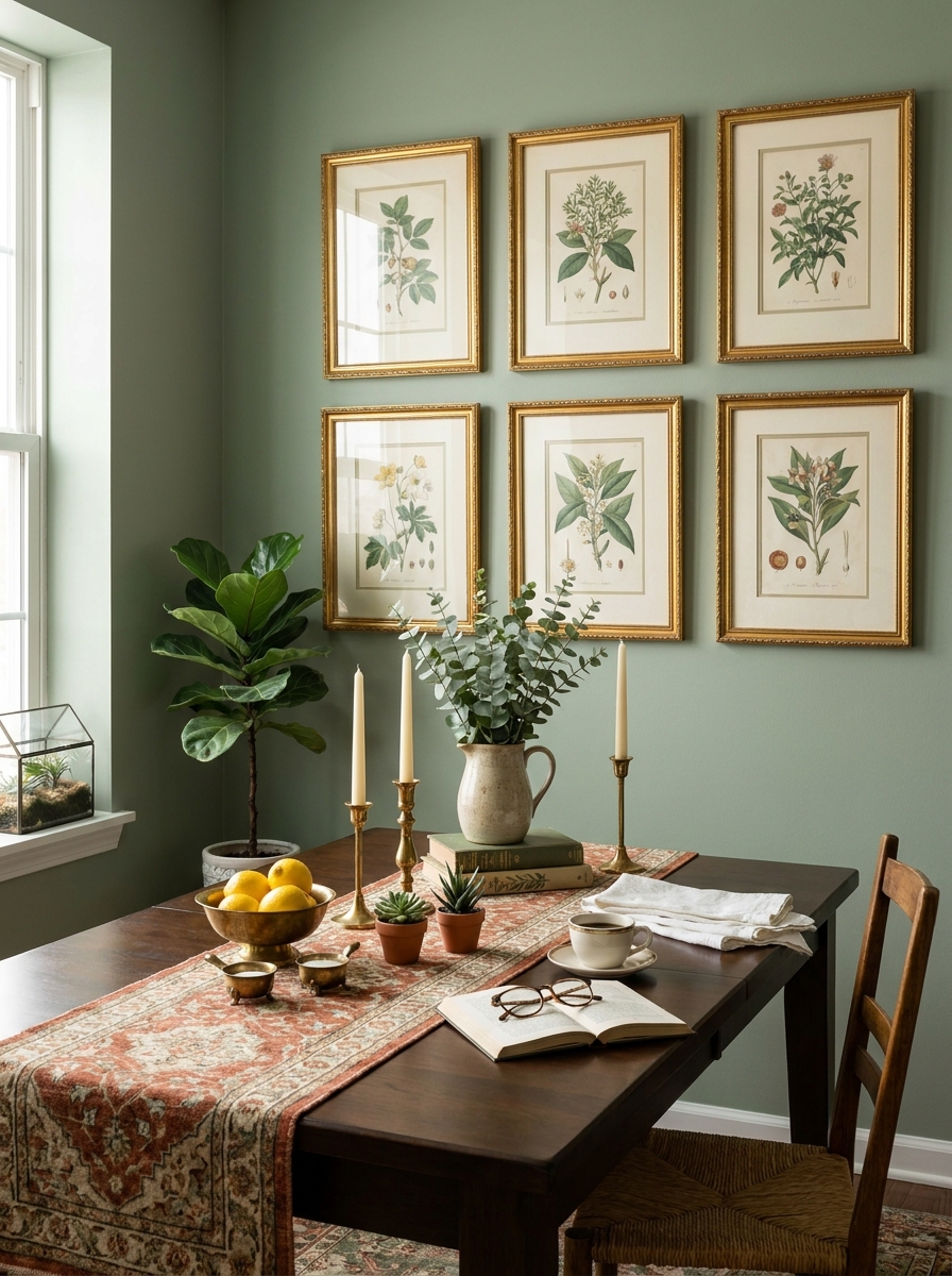
There’s something so elegant about a collection of botanical prints hung together. I’m talking those beautiful vintage-style illustrations of ferns, leaves, and flowers—all framed in matching gold frames that catch the light.
The magic here is in the repetition. When you use the same frame style for different botanical prints, it creates this cohesive museum-quality look that feels collected and intentional. I love mixing different plant species—maybe a palm frond next to a monstera leaf next to some delicate wildflowers. The variety keeps it interesting while the matching frames tie it all together.
What I really love about this approach is how timeless it feels. Botanical prints work in literally any dining room style, from traditional to modern. They bring in that touch of nature without being too literal or cutesy. And gold frames? They add just enough warmth and sophistication without feeling stuffy. Hang them in a grid pattern or a more organic arrangement—both work beautifully.
6. Floating Shelves with Layered Art and Objects
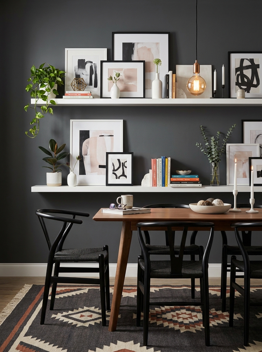
Okay, this is one of my absolute favorite looks because it gives you so much flexibility to switch things up. Instead of just hanging art directly on the wall, you install a couple of floating shelves and then layer framed pieces with decorative objects. It’s like creating a mini gallery you can restyle whenever the mood strikes.
The beauty of this approach is the dimension it creates. You can lean larger frames against the wall on the shelf, then tuck smaller frames in front, add a little sculptural vase, maybe some vintage books. Everything overlaps just slightly, creating this effortlessly curated look that feels personal and lived-in rather than too perfect.
I especially love this for people who can’t commit to nail holes everywhere or renters who want impact without damage. The shelves themselves need to be installed, but after that, you’re free to play. Mix textures—a chunky ceramic piece next to a sleek framed print next to a brass candlestick. It’s collected, eclectic, and totally Instagram-worthy.
7. Statement Woven Wall Hanging Above the Sideboard
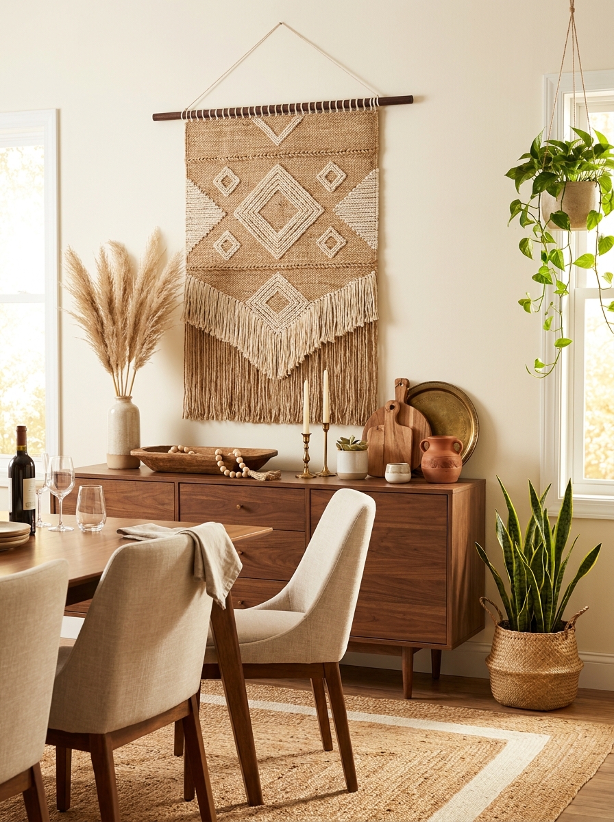
If you want to add texture and warmth without traditional frames, a large woven wall hanging is absolute magic. I’m talking about those gorgeous macramé pieces, jute weavings, or even a beautiful vintage textile hung like tapestry. The texture alone transforms a plain wall instantly.
What I love most is how these pieces soften a dining room. All that woven fiber adds acoustic warmth too—it actually absorbs sound, making your dining space feel cozier during dinner conversations. And unlike hard-edged art, woven pieces have this organic, handmade quality that brings in major boho-chic or coastal vibes.
The key is scale. You want something substantial enough to hold its own on the wall, especially if it’s going above a buffet or sideboard. A tiny macramé doesn’t cut it—go bold! Pair it with simple, clean-lined furniture so the textile becomes the star. I like to add a couple of plants nearby to echo that natural, earthy vibe. It’s effortlessly cool without trying too hard.
8. Dramatic Black and White Photography Gallery
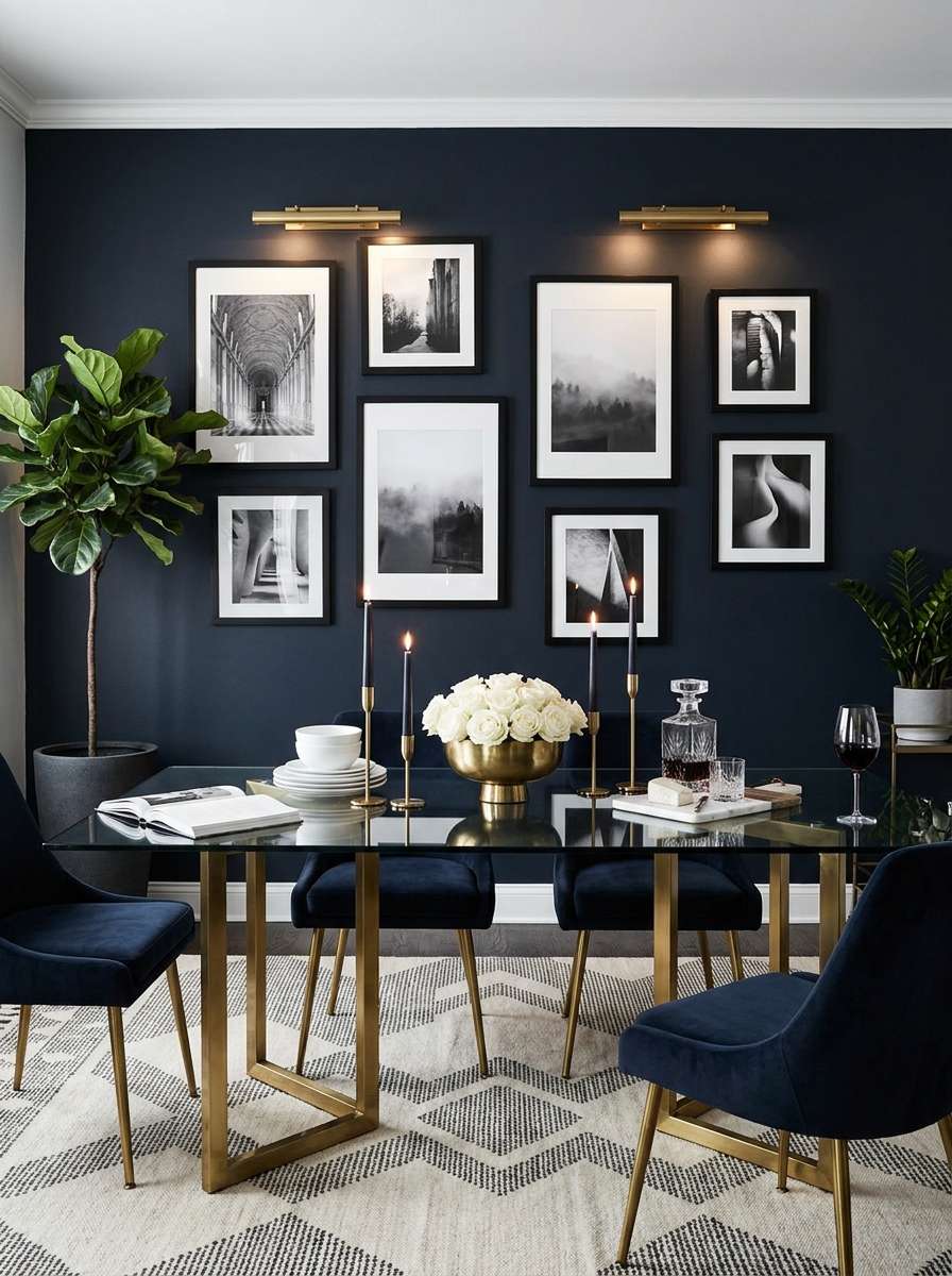
Sometimes you just need that crisp, sophisticated vibe, and nothing delivers quite like a gallery wall of black and white photography. I’m obsessed with this look—it’s timeless, it’s dramatic, and it works with absolutely everything. Architecture shots, landscapes, portraits, abstract compositions—as long as they’re all black and white, they’ll look cohesive together.
The contrast is what makes this so striking. Those deep blacks and bright whites create serious visual impact, especially against a neutral wall color. I love using all black frames for a modern gallery feel, or mixing black and white frames if you want something a bit more eclectic. Either way, stick with the monochrome photography to keep it feeling pulled together.
This approach is perfect if your dining room already has lots of color or pattern happening elsewhere. The black and white art won’t compete—it’ll actually ground everything and give your eye a place to rest. Plus, it photographs like a dream for Instagram. Just saying.
9. Vintage Plate Wall Arranged in Organic Clusters
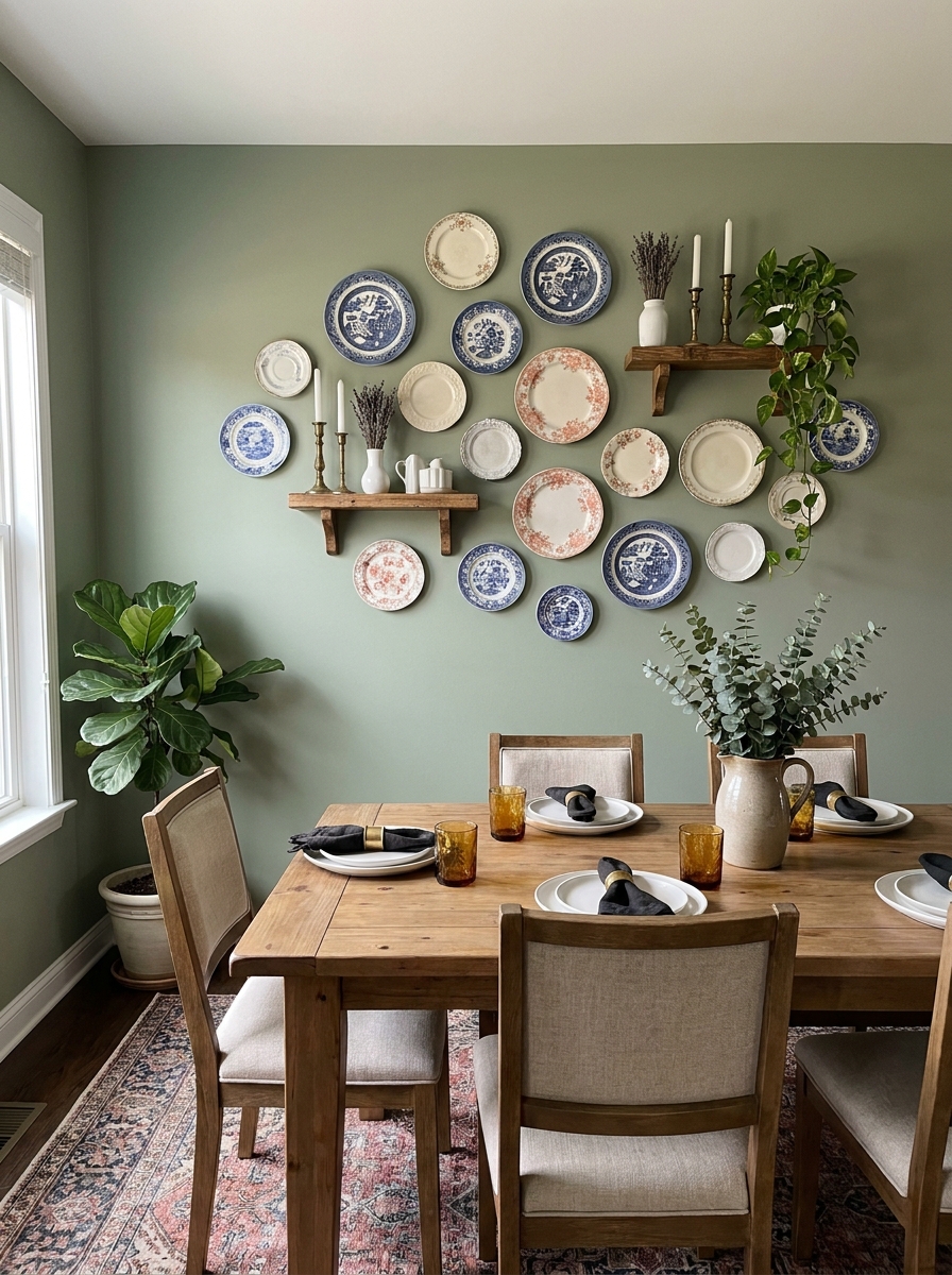
There’s something so charming about a plate wall that feels collected over time. I’m talking mismatched vintage plates in different sizes, arranged in loose clusters rather than rigid grids. Mix blue and white chinoiserie with cream transferware and maybe a pop of coral or sage green.
The magic is in the imperfect arrangement. Start with your largest plates as anchors, then fill in around them with smaller ones. Leave breathing room between clusters so it doesn’t feel too cluttered. I love mixing in a small wooden shelf or two among the plates to break things up.
This works beautifully in traditional dining rooms but also adds unexpected character to modern spaces. The texture and dimension from all those plates catching light differently creates such visual interest. And honestly? It’s way easier than you’d think to hang them with plate hangers from the hardware store.
10. Floor-to-Ceiling Vertical Shiplap Accent Wall
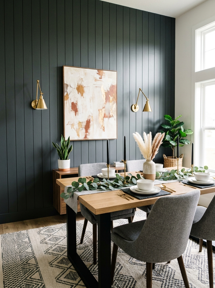
Okay, shiplap isn’t just for Fixer Upper anymore. When you run it vertically instead of horizontally and paint it a gorgeous moody color, it becomes something totally different. I’m obsessed with charcoal gray or deep navy shiplap walls in dining rooms right now.
The vertical lines draw your eye up and make your ceiling feel taller, which is perfect for smaller dining spaces. Keep it simple with one large piece of art or a statement mirror mounted on the shiplap. The texture of the wood adds dimension without needing tons of accessories.
This is one of those projects that looks expensive but is actually pretty DIYable if you’re handy. The shiplap itself becomes the decor, so you don’t need to fill the entire wall with stuff. Sometimes less really is more, especially when the wall itself has this much texture and personality going on.
11. Eclectic Maximalist Wall with Layered Frames and Objects
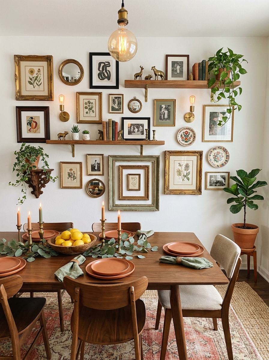
If more-is-more is your vibe, let me introduce you to the joy of a truly maxed-out gallery wall. I’m talking frames overlapping frames, small mirrors tucked between art, decorative brackets holding tiny shelves, maybe even a vintage sconce thrown in the mix.
The secret to pulling this off without looking chaotic? Stick to a cohesive color story even if your style is all over the place. Maybe everything has touches of gold, or you’re working with a palette of warm terracotta, cream, and sage. The frames can be different, the art can be wildly varied, but that color thread ties it together.
Start from the center and work your way out, layering as you go. Don’t be afraid to lean smaller frames against larger ones on floating shelves. This collected, salon-style approach feels so personal and tells a story about who you are.
12. Modern Metal Grid Wall Organizer with Rotating Art
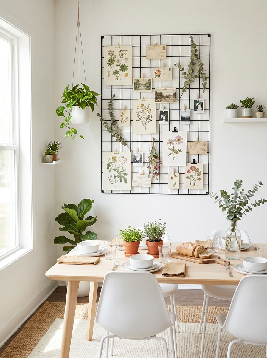
Here’s a genius idea for people who get bored easily: a large metal grid system mounted on your dining room wall. You can clip art prints, postcards, photos, dried flowers, whatever you’re into at the moment, and swap them out whenever the mood strikes.
I love the industrial-modern look of black metal grids, but they come in gold and white too. The beauty is in the flexibility. Feeling spring vibes? Clip up botanical prints and dried flowers. Want something moodier for fall? Swap in dark moody photos and autumn leaves.
This works especially well in breakfast nooks or casual dining areas where you want something more playful and less permanent than a traditional gallery wall. Plus, it’s renter-friendly since you’re only making a few mounting holes instead of twenty.
13. Textured Rattan and Wicker Wall Art Trio
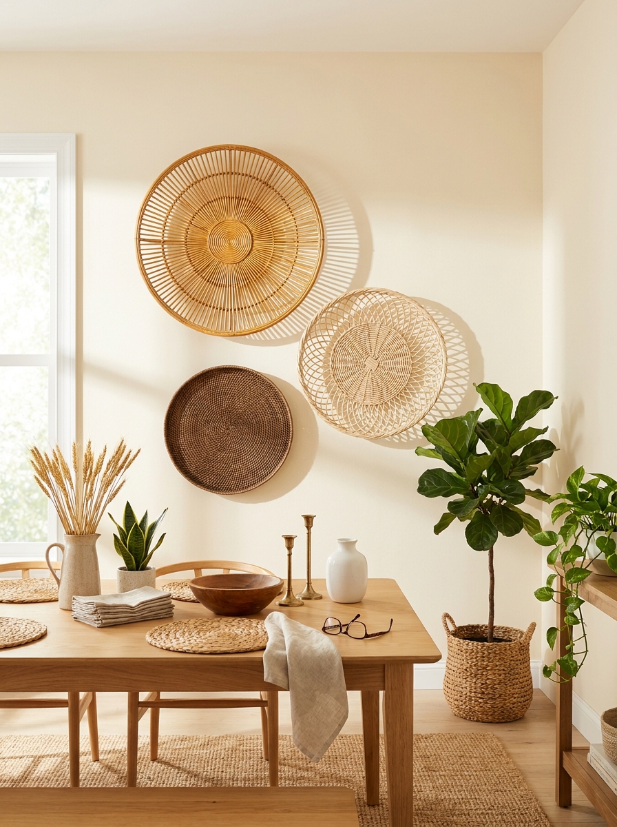
Natural textures are having a major moment, and nothing says relaxed elegance quite like wicker wall art. I’m talking about those gorgeous oversized circular rattan pieces that look like they came straight from a chic boutique hotel. Hang three different sizes in a triangular arrangement for instant impact.
The beauty of these pieces is how they soften hard walls without being fussy. They work in practically any style dining room—from coastal to bohemian to modern farmhouse. The woven texture catches light beautifully throughout the day, creating subtle shadows and depth that flat art just can’t match.
I love mixing different weave patterns and shades of natural fiber. Maybe one piece is tightly woven, another has an open basket-weave, and the third features a sunburst design. They’re lightweight, affordable, and honestly so forgiving. Unlike perfectly curated gallery walls, these feel effortless and organic. Plus, they bring that warm, earthy vibe that makes everyone want to linger at the table just a little longer.
14. Vintage Window Frames Repurposed as Wall Art
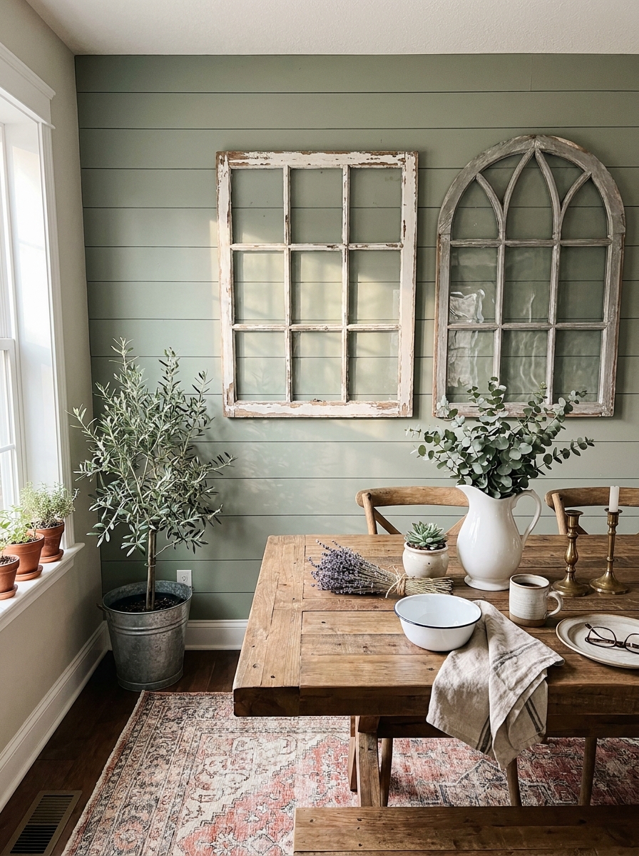
Okay, this one makes my heart so happy. Old window frames with their chippy paint and weathered wood add instant character that you just can’t buy new. I hunt for these at flea markets, estate sales, and architectural salvage shops—and when you find the right one, it’s magic.
You can leave the glass in and tuck photos, pressed botanicals, or vintage prints behind each pane. Or remove the glass entirely and let the frame stand alone as sculptural art. I’ve seen people back them with antique mirrors, chicken wire for a farmhouse vibe, or even just leave them empty to frame whatever paint color is on your wall.
The best part? Each window tells a story. That six-pane window came from a 1920s farmhouse. Those arched ones? An old chapel. They bring soul and history into your dining room that feels authentic and collected. Layer two or three different styles together for an eclectic look, or let one substantial piece command the whole wall. Either way, you’re creating a conversation starter that guests will actually remember.
15. Colorful Ceramic Plate Wall in Jewel Tones
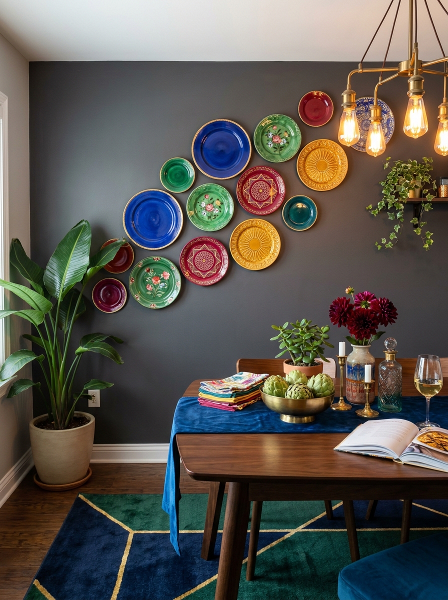
Forget the matchy-matchy white plate walls your grandmother had. I’m talking about a vibrant, joyful collection of ceramic plates in rich jewel tones that make your dining room feel like a celebration every single day. Think deep emerald greens, sapphire blues, ruby reds, and golden yellows all playing together beautifully.
Start collecting plates with interesting patterns—maybe some with hand-painted florals, others with geometric designs, a few solid colors to ground the collection. The key is varying the sizes from tiny dessert plates to large chargers. Arrange them in an organic cluster rather than a rigid grid, letting them overlap slightly and flow across the wall.
This look works surprisingly well in both traditional and eclectic spaces. The colors bring energy and personality without needing to commit to bold wall paint. I love how each plate can come from a different source—a vintage shop find here, a travel souvenir there, maybe one from your actual grandmother. It’s like creating a living scrapbook on your wall that gets better every time you add to it.
16. Architectural Molding Feature Wall with Picture Rail
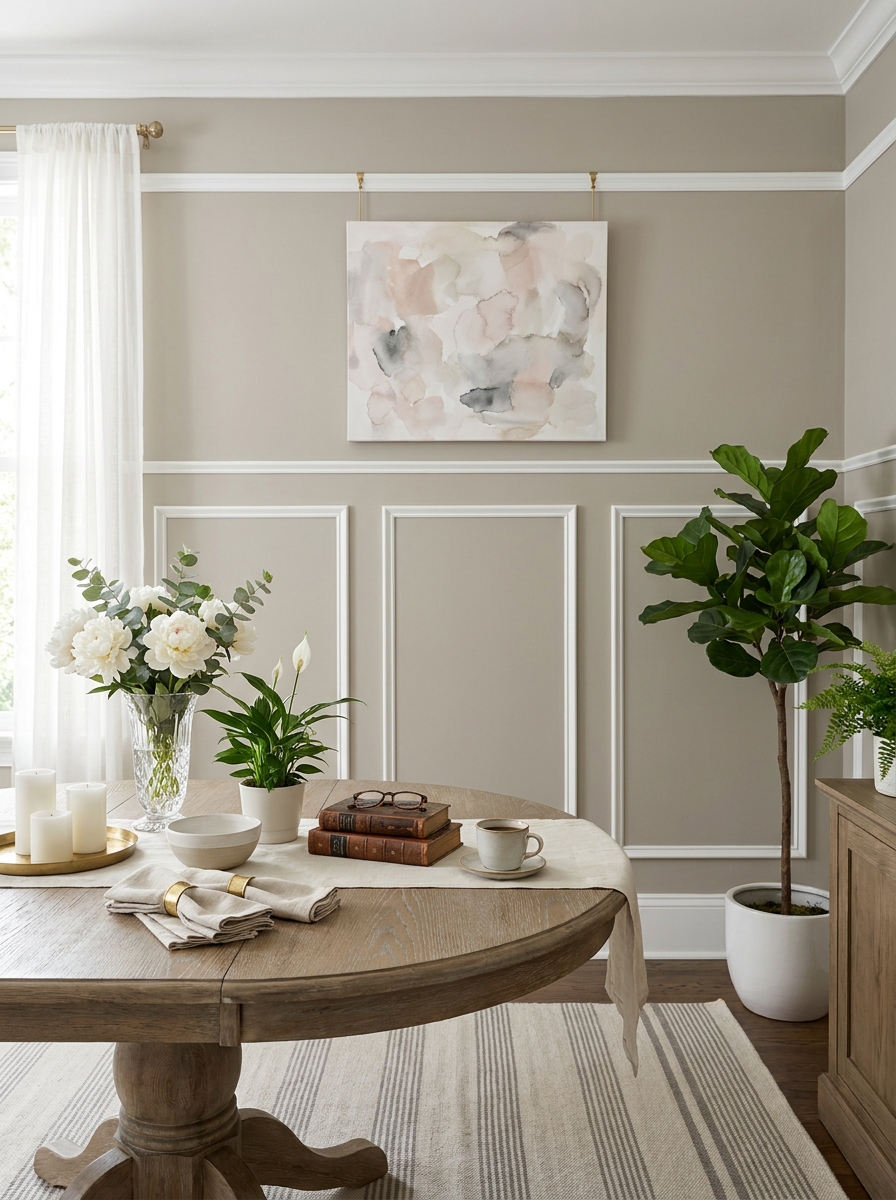
Sometimes the wall itself becomes the art, and that’s exactly what happens with gorgeous architectural molding. I’m obsessed with this look—classic picture rail molding running horizontally with vertical trim creating elegant panels below. It’s like giving your dining room instant old-world sophistication.
You can DIY this with simple trim pieces from the hardware store, painted in a contrasting color to your walls. Soft white molding on a warm gray wall? Perfection. Or go tone-on-tone for subtle texture that catches light beautifully. The picture rail at the top isn’t just pretty—it’s actually functional for hanging art without putting holes everywhere.
What I love most is how this creates a stunning backdrop for furniture and décor without needing additional wall art. The panels themselves provide all the visual interest you need. Maybe hang one special piece of art from the picture rail, or keep it completely minimal and let the architecture shine. It’s timeless, elegant, and makes even a basic builder-grade dining room feel custom and expensive.
17. Sculptural Metal Wall Art with Organic Shapes
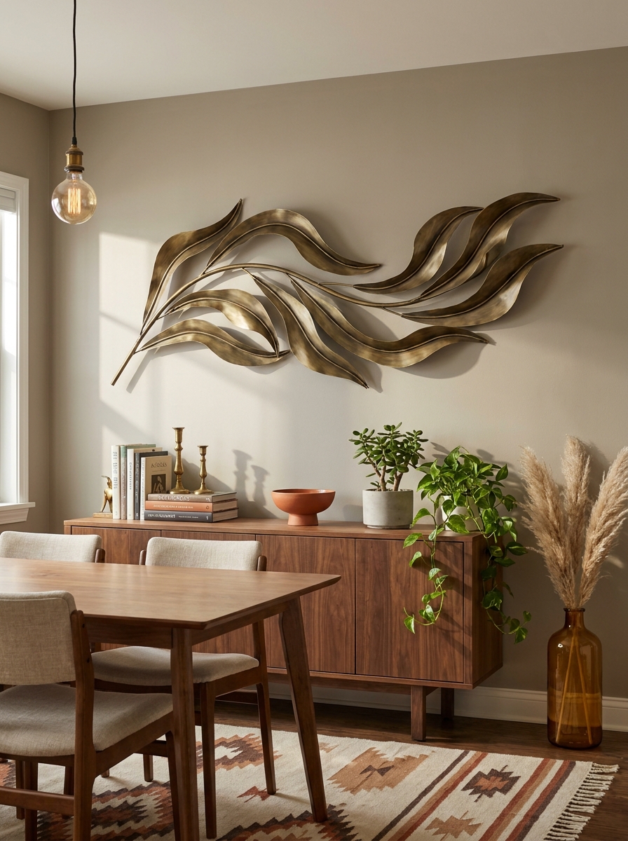
Metal wall art has come such a long way from those generic sunburst mirrors! I’m talking about organic, flowing pieces that feel like modern sculpture. Think abstract leaves in brushed brass, geometric shapes that cast gorgeous shadows, or layered metal pieces that create depth and dimension.
What I love about metal art is how it plays with light throughout the day. When sunlight hits those curves and angles? Magic. And unlike canvas art, there’s no glare to worry about. The three-dimensional quality adds so much visual interest without feeling heavy or cluttered.
I especially love mixing metals—a bronze piece paired with matte black frames, or copper tones against warm wood. It brings that collected, designer look without trying too hard. And here’s the thing: one really good metal sculpture can hold its own on a large wall. You don’t need to fill every inch of space. Sometimes that breathing room makes the statement even stronger.
18. Chinoiserie Wallpaper Feature Wall with Coordinating Art
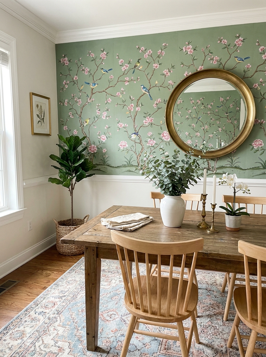
Okay, can we talk about how wallpaper is having a major moment again? And chinoiserie patterns—those beautiful hand-painted birds, flowers, and trees—instantly transform a dining room into something special. I’m obsessed with using one wallpapered wall as your entire art moment.
The trick is treating the wallpaper itself as the statement and then layering carefully. I love adding one or two pieces of simple art in complementary colors, or a gorgeous mirror that reflects the pattern. You don’t want to compete with all that beautiful detail. Think of it like jewelry—if you’re wearing statement earrings, you skip the chunky necklace.
Chinoiserie works in so many styles too! Pair it with modern furniture for that fresh traditional vibe, or go full moody elegance with dark walls and brass accents. Even in a small dining nook, one wallpapered wall creates such an elevated, restaurant-worthy backdrop. Your guests will absolutely notice.
19. Linear Wood Slat Wall Treatment with Integrated Lighting
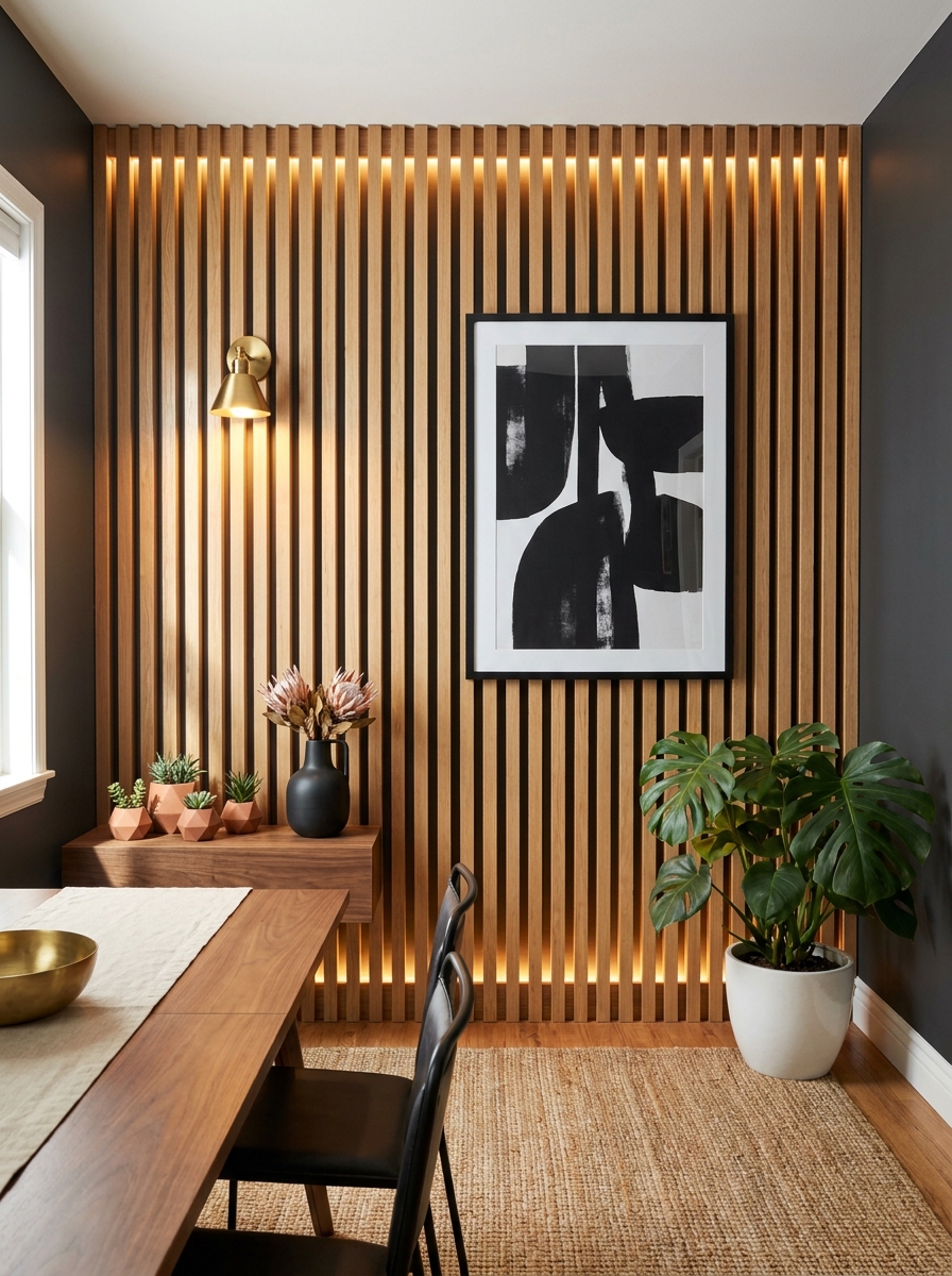
Wood slat walls are everywhere right now, and I totally get why. They add incredible texture and warmth while keeping things modern and clean. I’m especially loving the look when you integrate lighting—either behind the slats for a soft glow or picture lights mounted directly on them.
The vertical lines do amazing things for your space too. They draw the eye up and make your ceilings feel taller. And unlike a gallery wall that you might want to rearrange, slat walls feel permanent and architectural. They’re like built-in elegance.
You can go full wall or just create a panel section behind your dining table. Natural wood keeps things Scandi and warm, but I’ve also seen painted slats in charcoal or forest green that look so sophisticated. Add one piece of simple art or a sculptural sconce, and you’re done. The slats themselves are the statement, and everything else just enhances that beautiful texture.
20. Antique Mirror Collection in Mismatched Ornate Frames
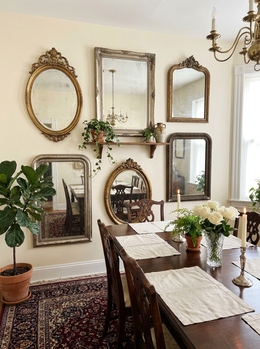
There’s something so romantic about a wall of vintage mirrors. Not matching, not perfectly aligned—just a beautiful collected mix of ornate frames in different shapes and finishes. It’s like your wall went treasure hunting at the best flea markets.
What makes this work is the variety. Oval mirrors next to rectangular ones, gold frames mixed with silver and bronze, some mirrors aged and foxed (those cloudy spots), others crystal clear. The imperfection is the whole point. It feels European and timeless, like these mirrors have stories.
And functionally? Genius. All those reflective surfaces bounce light around your dining room like crazy. Your space feels bigger and brighter, plus you get these gorgeous glimpses of your chandelier, your table setting, your flowers from different angles. It’s dinner party magic. Even in daylight, the effect is stunning—like stepping into a French apartment that’s been in the family for generations.
21. Peel and Stick Removable Wallpaper Accent Wall
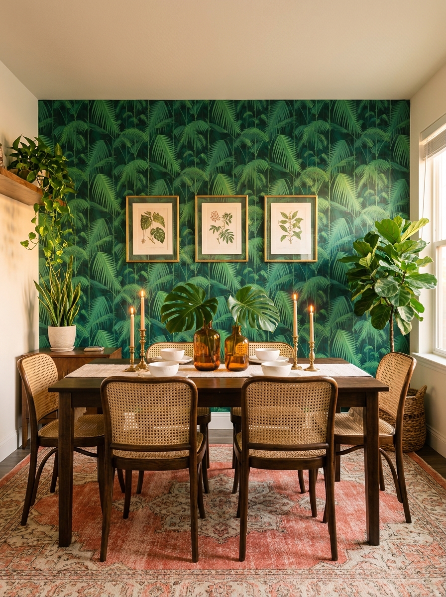
Okay, can we talk about how removable wallpaper has changed the game? I’m obsessed with the idea of transforming your dining room wall in an afternoon without committing forever.
Pick a bold pattern for your accent wall—maybe a gorgeous hand-painted floral, a chic geometric print, or even a moody dark botanical. The beauty here is that you can go BOLD because you’re not stuck with it for decades. I love seeing peel-and-stick wallpaper behind a dining table with simple art layered on top. It creates instant depth and personality.
The application is actually pretty forgiving if you take your time. Start from the top corner and smooth as you go. I always tell people to overlap patterns carefully at the seams—that’s where the magic happens. Choose a design that makes you giddy every time you walk into the room. This is your chance to try that maximalist palm leaf print or that vintage Parisian map you’ve been eyeing forever.
22. Horizontal Wood Beam Shelf Display with Collected Objects
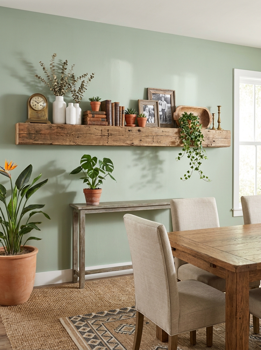
There’s something so charming about a single chunky wood beam mounted horizontally on your dining room wall. It’s like a mantel, but better because you can style it however you want.
I’m talking about a substantial piece—maybe reclaimed barn wood or a thick live-edge slab that becomes both storage and art. The styling is where you get to have fun. Layer in framed family photos, small sculptures, vintage books stood on their ends, ceramic vases with dried florals. Mix heights and textures like you’re creating a little vignette that tells your story.
What I love most is how this changes with the seasons. Swap in pumpkins for fall, fresh greenery for spring, candles for cozy winter dinners. It’s functional art that keeps your dining room feeling current and personal. The wood adds warmth that plays beautifully against painted walls, and the horizontal line draws your eye across the space making the room feel wider.
23. Tonal Monochromatic Art Collection in Varying Sizes
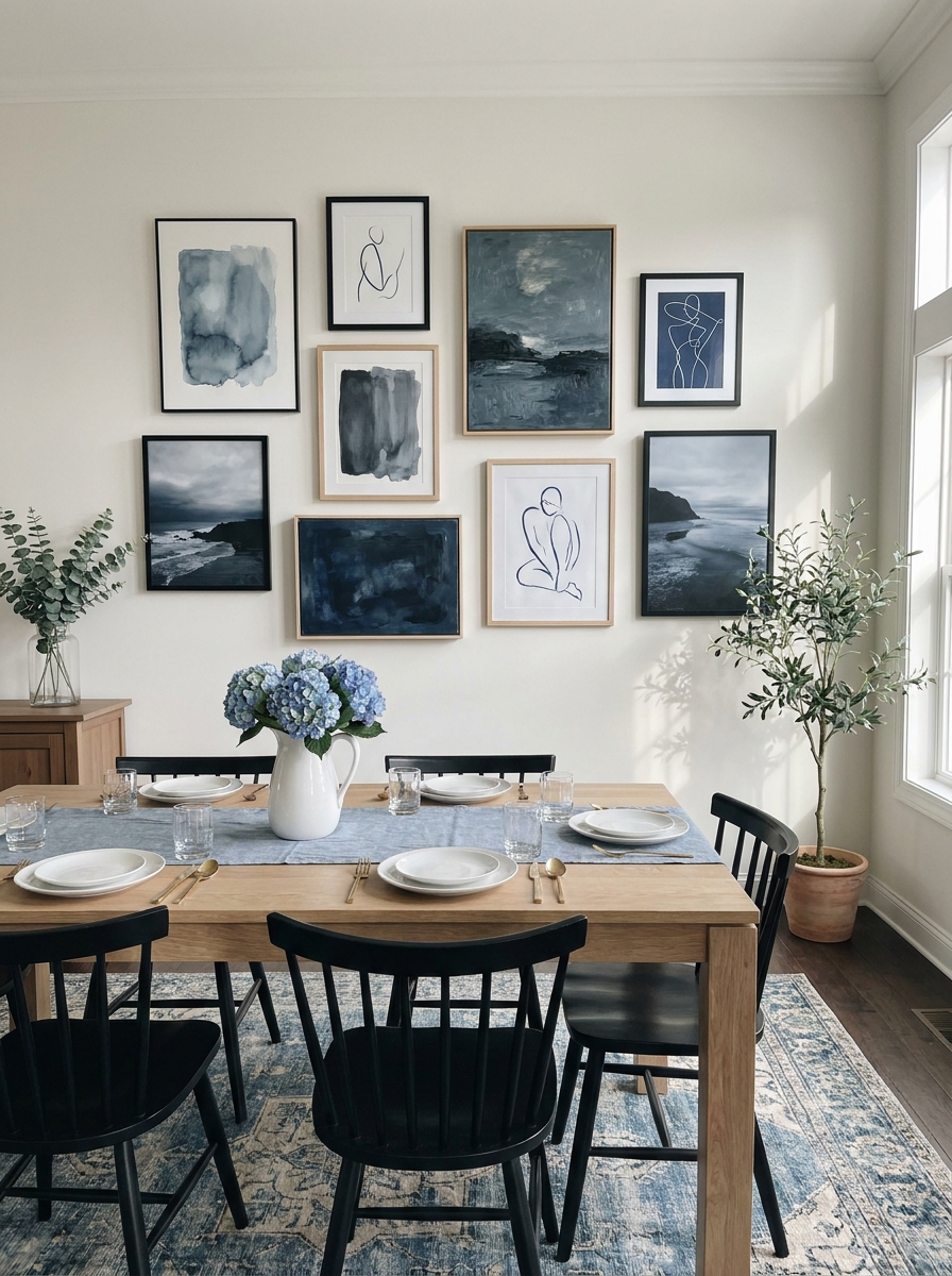
Here’s a sophisticated trick that looks expensive but doesn’t have to be: create a gallery wall using all artwork in the same color family. I’m talking various shades of blue, or all cream and beige abstracts, or even different tones of charcoal and black.
The magic happens because your eye moves smoothly across the wall without jarring color shifts. You can mix different art styles—abstract paintings next to line drawings next to photographs—and it still feels cohesive because of that tonal consistency. Vary your frame sizes from tiny 5x7s to a substantial 24×36 centerpiece.
This approach works especially well in dining rooms where you want impact without overwhelming dinner conversation. The subtle variation in shades creates depth and interest, but it’s calming rather than energizing. I’ve seen this done beautifully in all-white spaces where cream and ivory artworks create whisper-soft elegance, and in moody dining rooms where charcoal and slate tones add drama without chaos.
24. Antique Architectural Salvage as Oversized Statement Piece
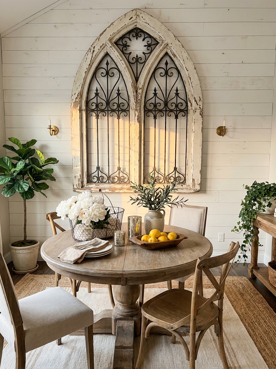
Want to make your dining room unforgettable? Mount a single massive architectural salvage piece on your wall. I’m talking about an ornate iron gate, a carved wooden door panel, an old church window, or decorative ceiling tin.
These pieces have history written into every chip and patina mark. They command attention in the best possible way—guests will absolutely ask about them. The scale is what makes this work. Going big with one dramatic piece often has more impact than a dozen smaller artworks. It anchors your entire dining space.
I love how these pieces bridge old and new. Your salvaged treasure can lean rustic in a farmhouse dining room or provide fascinating contrast in a sleek modern space. The texture and dimension add something you just can’t get from flat art. Look for pieces at salvage yards, estate sales, or architectural antique shops. Bonus points if there’s a story behind it—maybe from a historic building in your town or a trip abroad. That’s dining room wall decor with soul.
25. Illuminated Picture Ledge with Rotating Seasonal Art
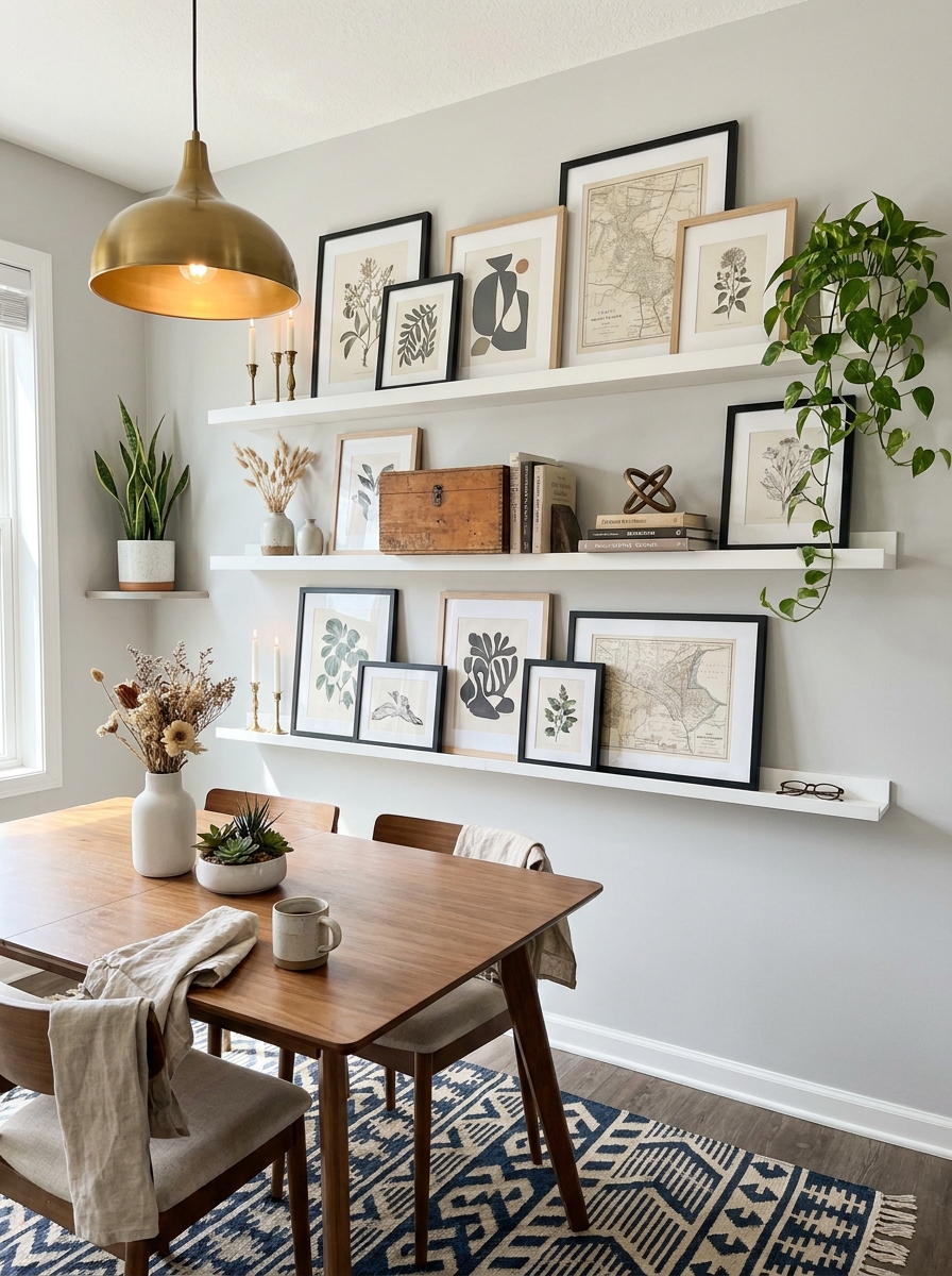
Picture ledges are the most forgiving way to display art because nothing’s permanent. You can swap pieces whenever the mood strikes without hammering another hole in your wall.
I love installing a single long ledge or stacking two shorter ones at different heights. The beauty is in the layering—lean larger frames in back, smaller prints in front, and tuck in little objects between them. Add a strip of LED lighting above the ledge and suddenly your casual art display looks like a museum installation.
This setup works brilliantly if you’re indecisive or love changing things seasonally. Summer botanicals can become fall landscapes can become winter abstracts. Keep a basket of backup art nearby and switch things out whenever you’re bored. The ledge stays put, but your dining room gets a whole new personality without any commitment.
26. Mural-Style Wallpaper with Complementary Framed Art Border
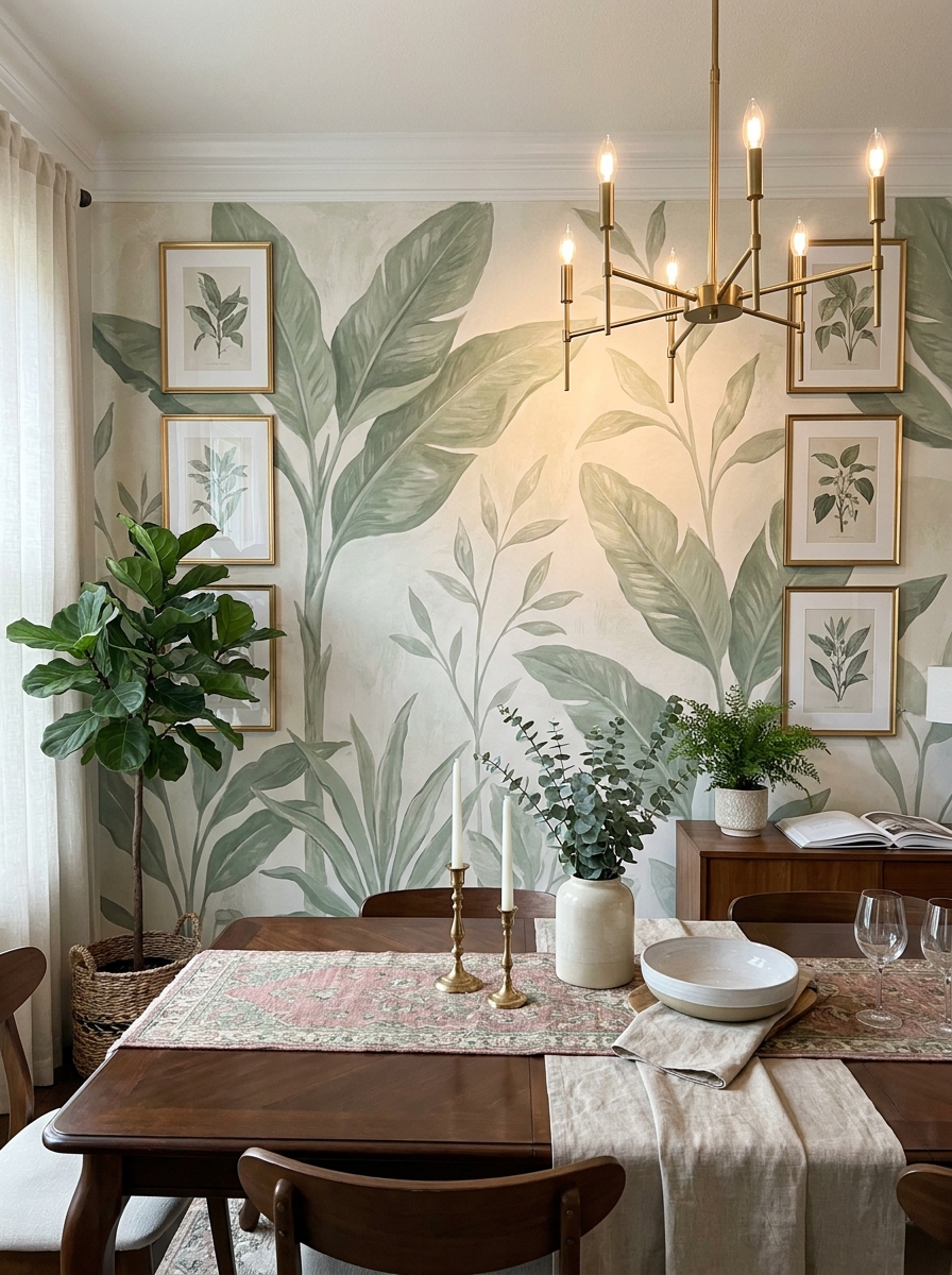
Statement wallpaper murals have come so far. We’re talking entire forest scenes, abstract watercolor washes, or dramatic mountain landscapes that turn your dining room wall into actual art.
The trick is treating the mural as the main event and surrounding it thoughtfully instead of competing with it. I like adding a border of smaller coordinating frames that pick up colors from the mural—maybe botanical prints that echo the leaves in a forest scene, or abstract pieces that pull accent colors from a geometric mural. Keep the frames simple and the matting generous so they enhance rather than crowd.
This approach works especially well on shorter walls or in dining nooks where you can’t fit a massive gallery. The mural gives you that wow factor while the complementary frames make it feel curated and intentional instead of like you just slapped up wallpaper and called it done.
27. Pegboard Gallery Wall with Adjustable Hook System
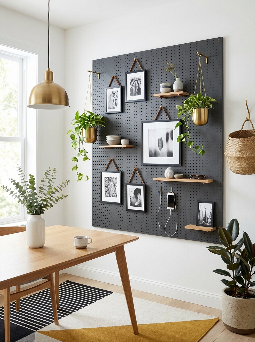
This is genius for commitment-phobes. Install a large pegboard panel (painted to match or contrast your wall), and suddenly you can rearrange your entire gallery without tools or new holes.
I’m obsessed with how flexible this system is. Hang frames from leather straps, add small shelves for objects, hook up little planters for trailing greenery, even attach battery-operated sconces. Everything adjusts with simple pegs and hooks that move wherever you want. Change your mind about that print placement? Just unhook it and move it three inches over.
The pegboard itself becomes a graphic element—especially striking when painted a bold color against a neutral wall. It creates a defined zone for your gallery that feels intentional and modern. This works beautifully in casual dining spaces where you want that collected, evolving vibe without the permanence of traditional hanging.
28. Dramatic Ceiling-to-Floor Drapery Panels as Textured Wall Art
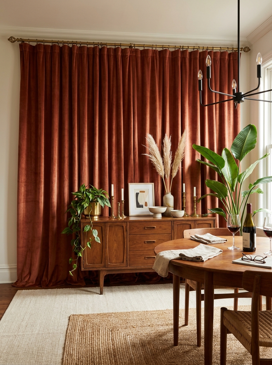
Who says wall decor has to hang on the wall? Floor-to-ceiling fabric panels bring incredible softness and drama that traditional art can’t match. They’re especially magical in dining rooms that feel too echoey or stark.
I love using luxe fabrics like velvet, heavy linen, or even tapestry-weight textiles hung on decorative rods that span the entire wall. The panels don’t need to be functional curtains—they’re purely decorative, adding color, pattern, and sound-absorbing texture. Choose a bold color to create an instant accent wall, or go tonal with interesting weave patterns that add subtle dimension.
This approach works brilliantly behind a sideboard or buffet where you might struggle with traditional art placement. The fabric backdrop makes everything in front of it pop while adding that expensive, layered look interior designers always achieve. Plus, fabric panels are way easier to install than wallpaper and completely reversible when you’re ready for something new.
29. Three-Dimensional Layered Shadow Box Display
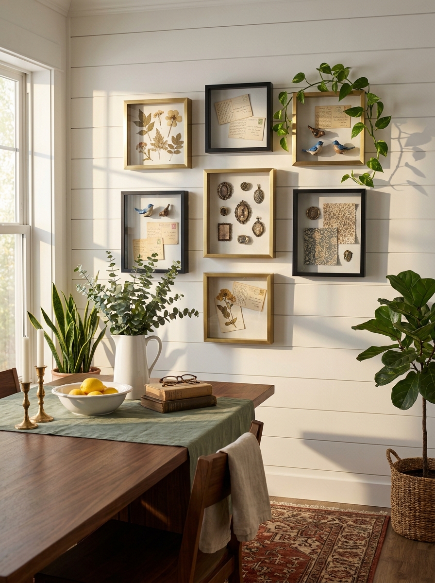
Shadow boxes bring actual dimension to your dining room wall in the most satisfying way. I’m talking about those deep frames that let you display three-dimensional objects—pressed flowers, vintage book pages, heirloom jewelry, tiny sculptures, whatever tells your story. When you arrange several shadow boxes together, you create this incredible layered effect that changes as you walk past.
The beauty here is how personal this gets. I’ve seen shadow boxes filled with seashells from family beach trips, vintage keys collected from flea markets, and even framed fabric swatches from grandma’s quilt. Each one becomes a tiny museum exhibit on your wall.
The depth creates actual shadows throughout the day as light shifts, making your wall decor genuinely dynamic. It’s like having art that performs differently in morning light versus candlelit dinners. Choose shadow boxes in coordinating frame finishes—all brass, all black wood, or mix metals intentionally—and vary the sizes for visual interest.
30. Asymmetrical Trio of Oversized Woven Baskets
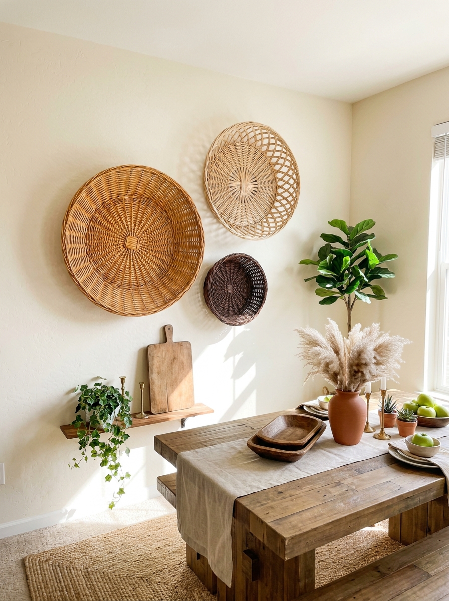
Sometimes the most unexpected things make the best wall art, and oversized woven baskets are proof. I’m obsessed with how these bring instant texture and warmth without any fussiness. Three large shallow baskets in varying sizes and weave patterns, hung asymmetrically, create this organic, collected-over-time vibe that feels effortlessly stylish.
The natural fiber adds softness that balances harder dining furniture materials like wood and metal. I love mixing different basket origins too—maybe a tightly woven African basket beside a looser-weave farmer’s basket beside a flat sweetgrass design. The variations in color from cream to honey to deep chocolate brown create subtle tonal interest.
This approach works brilliantly in both modern and traditional spaces. In a contemporary room, the baskets add organic warmth. In a farmhouse setting, they emphasize that rustic, handcrafted aesthetic. Plus, they’re lightweight and easy to hang, which makes rearranging a breeze when you get that redecorating itch.
31. Geometric Painted Accent Wall with Floating Art Ledge
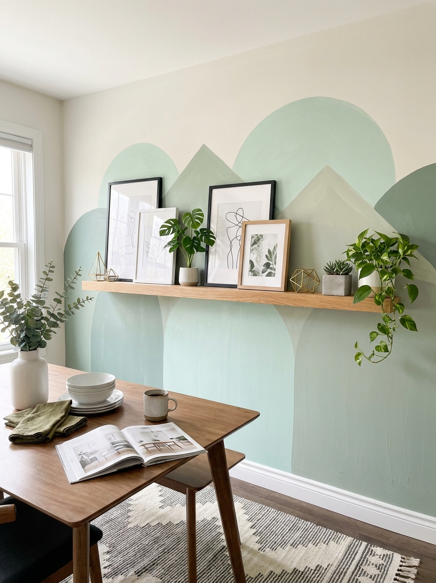
Why choose between painted wall art and framed art when you can have both? A geometric painted accent wall—think color-blocked triangles, half-circles, or mountain silhouettes—becomes the backdrop for a floating ledge displaying rotating artwork. It’s like giving your wall a permanent art installation that you can continuously refresh.
I painted overlapping semicircles in tonal shades behind my dining table, then added a simple wood ledge about five feet up. Now I can swap out framed prints, propped canvases, and small objects seasonally without putting new holes in the wall. The painted shapes peek around the frames, adding this playful layered effect.
The trick is keeping your painted design fairly subtle—soft colors, geometric but not too busy—so it supports rather than competes with your displayed art. Think of it as a custom wallpaper you created yourself. This approach works especially well in rentals where you want impact but might need to paint over it eventually.
32. Vintage Mirror and Frame Collage with Dimensional Layering
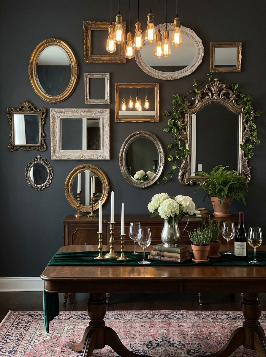
This is where thrift store magic happens. A collage of vintage mirrors mixed with empty ornate frames creates this dimensional, almost sculptural wall installation that’s endlessly fascinating. Some frames hold mirrors, some are empty showcasing the wall color behind, and the varying depths and finishes create incredible visual texture.
I started collecting ornate frames at estate sales—gilded baroque, carved wood, tarnished silver—and mixed them with vintage mirrors in different shapes. The mirrors reflect light and views around the room, making your dining space feel larger and brighter, while the empty frames add artistic negative space. It’s like wearing statement jewelry for your wall.
The key is embracing imperfection. Chippy paint, tarnished finishes, and mismatched styles actually make this look better. Arrange them salon-style with frames overlapping slightly, some hung portrait-style and others landscape. The collected-over-decades vibe makes your dining room feel storied and layered rather than decorated all at once.
33. Stained Glass Window Panels Mounted as Backlit Art
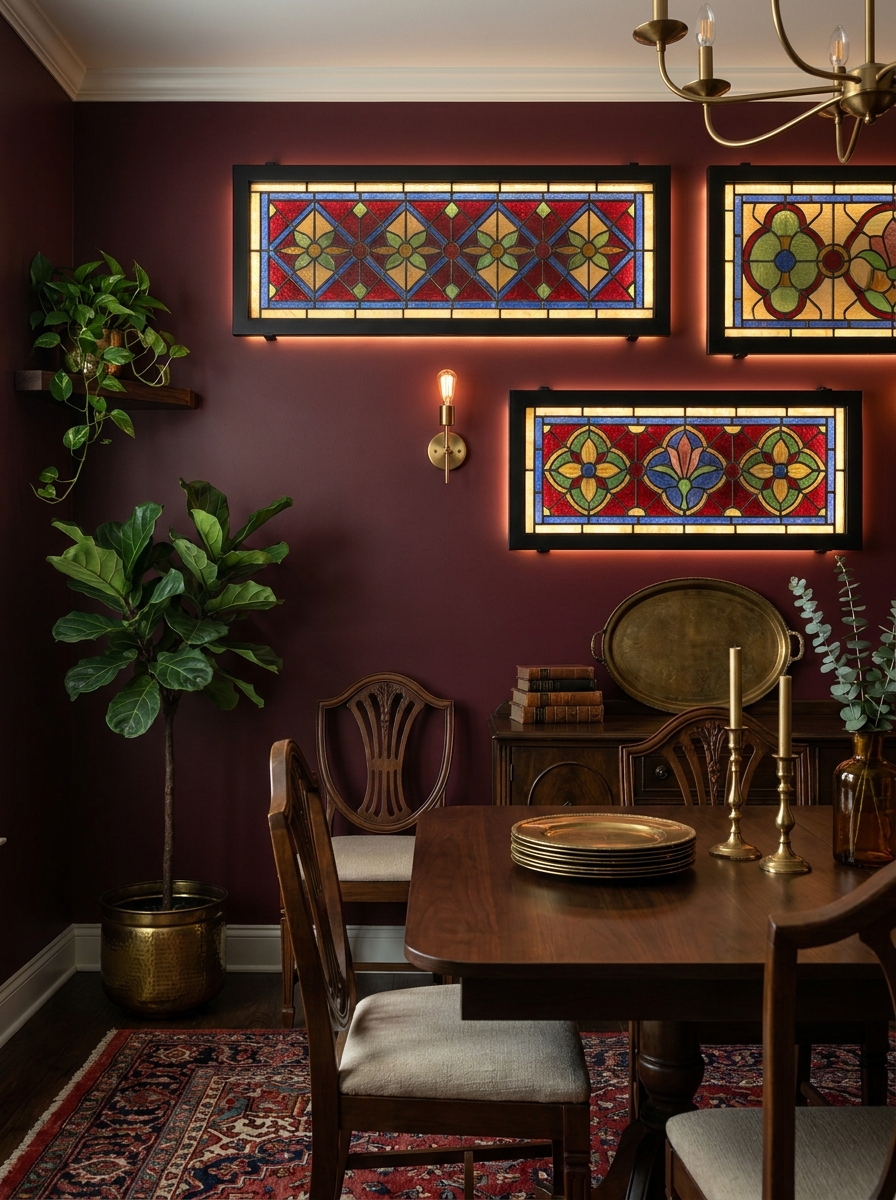
This one’s for the treasure hunters! Mounting vintage stained glass panels on your dining room wall creates instant drama and color that changes throughout the day. The light streaming through those jewel tones is absolutely magical.
I love installing LED strip lighting behind the panels to create that backlit effect even at night. You get all the romance of an old church window without actually knocking holes in your walls. Hunt for these beauties at architectural salvage shops, estate sales, or even online.
The trick is mounting them securely but leaving just enough space behind for your lighting setup. Frame them out with simple black metal or dark wood trim to make those colors really pop. Mix different sizes for an eclectic look, or go symmetrical with matching panels for something more formal. Either way, you’re bringing serious wow factor to dinner time.
34. Cork Board Wall with Pinned Inspiration and Rotating Displays
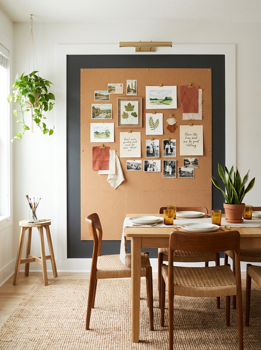
Who says cork boards are just for offices? A full wall (or even just a large framed section) of cork creates the ultimate flexible gallery system. Pin up postcards, kids’ artwork, seasonal prints, fabric swatches, or whatever makes you happy right now.
I’m obsessed with this idea for families who want their dining space to feel alive and changing. Your wall becomes a living mood board that reflects what you’re into at the moment. Vacation photos one month, fall leaves and botanical drawings the next.
The secret is treating it like intentional design, not a messy bulletin board. Use a consistent color palette for your pins or clips. Leave plenty of breathing room between pieces. Frame out your cork with wide painted trim or metal edging to make it look architectural rather than office-y. It’s casual and creative without being chaotic.
35. Minimalist Ledge Gallery with Leaning Oversized Prints
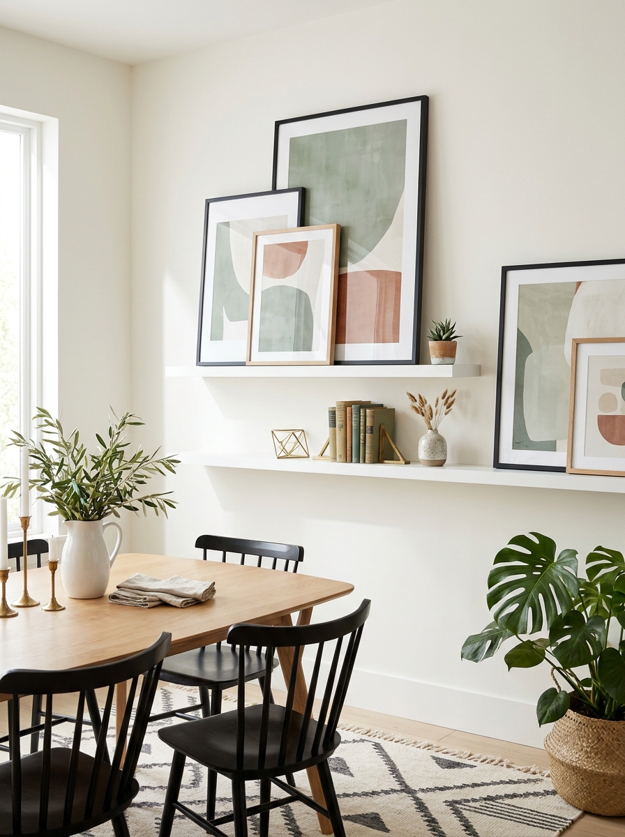
This is hands-down my favorite low-commitment gallery wall solution. Install one or two long floating ledges and just lean your art against the wall. No nail holes, no measuring, no commitment anxiety. You can swap things out whenever the mood strikes.
The key is going BIG with your prints. Oversized abstract art, large-scale photography, jumbo botanical prints—anything substantial enough to make a statement when leaning. Layer a smaller piece in front occasionally for dimension, but let those big beauties do the heavy lifting.
I love this approach because it feels effortlessly cool, like you just happened to prop some gorgeous art there and it looked perfect. The reality is you probably shifted things around seventeen times, but nobody needs to know that. Keep your frames simple and cohesive—all black, all natural wood, or all brass—and the casual leaning style reads as intentional rather than unfinished.
Quick Guide
Quick Guide: Choosing Your Wall Decor Style
Love clean lines and simplicity? → Go for one large statement piece or symmetrical gallery wall with minimal frames.
Drawn to cozy, collected spaces? → Mix textures with wooden signs, woven pieces, and layered frames in warm tones.
Want maximum visual interest? → Create an eclectic gallery wall with varied frame sizes, colors, and art styles.
Working with a small dining area? → Mirrors are your best friend—they expand the space and reflect light beautifully.
Budget-conscious decorating? → DIY abstract art, thrift vintage frames, or print affordable art from online sources.
Formal dining room? → Stick with symmetry, matching frames, and classic art pieces for timeless elegance.
Remember, your walls should reflect YOUR style, not what you think you’re supposed to do. Trust your gut and choose what makes you smile every time you sit down to eat.
Your Walls Are Waiting for You
Here’s the thing about dining room walls—they’re not just background. They’re an opportunity to show off what you love, what makes you happy, and what makes your home uniquely yours. Whether you go bold with oversized art, create a carefully curated gallery wall, or keep it simple with a stunning mirror, the right wall decor transforms your dining space from just a place to eat into a room you actually want to spend time in. And isn’t that the whole point?
Don’t stress about getting it perfect right away. Start with one piece you love and build from there. Move things around. Try that gallery wall layout on the floor before committing to the wall. Give yourself permission to experiment. Some of my favorite dining room walls have evolved over months or even years as homeowners found pieces that spoke to them. Your dining room walls have been waiting patiently for you to give them some love. So grab that hammer, pick your favorite idea from this list, and start creating a space that feels like home.
Frequently Asked Questions
How high should I hang art above my dining room table?
Hang your art so the center sits at eye level, typically 57-60 inches from the floor. If you’re hanging above a buffet or sideboard, leave 6-8 inches of space between the furniture and the bottom of the frame. The art should feel connected to the furniture below it, not floating randomly on the wall.
What’s the best way to arrange a gallery wall in a dining room?
Start by laying out your arrangement on the floor to experiment with spacing and placement. Use painter’s tape or paper templates on the wall to visualize before hammering nails. Keep 2-3 inches between frames for a cohesive look. The most foolproof approach is to start with your largest piece as an anchor and build around it.
Can I mix different frame colors in one gallery wall?
Absolutely! Mixing frame colors adds personality and keeps things interesting. The trick is to have a common thread—maybe all the frames are thin profiles, or you repeat one color throughout. I love mixing black, gold, and natural wood frames with lots of white matting to tie everything together.
How do I choose art colors that work with my dining room?
Pull colors from your existing decor—your rug, curtains, or upholstery. Your art doesn’t need to match exactly, but it should have at least one or two colors that echo what’s already in the room. This creates visual harmony without being too matchy. Don’t be afraid of contrast either—a pop of unexpected color can be stunning.
What’s the most budget-friendly dining room wall decor?
DIY abstract paintings are incredibly affordable and easier than you think—just grab a canvas and some acrylic paints. Thrifted vintage frames with printable art from Etsy or free sources give you a custom gallery wall for under fifty bucks. Large mirrors from discount stores look expensive when styled well. You can also frame fabric remnants, pages from old books, or even wallpaper samples for unique art on a tiny budget.