23 Serene Neutral Living Room Ideas to Calm Your Soul
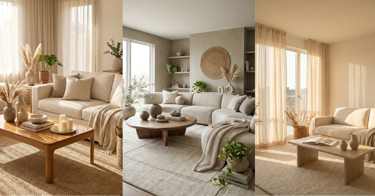
You know that feeling when you walk into a space and your shoulders just drop? That’s what a well-designed neutral living room does. It’s not boring or bland — it’s the opposite. When you strip away the visual noise and let cream, beige, and soft greys take center stage, something magical happens. Your space breathes. You breathe.
But here’s the thing. Creating a neutral living room that feels warm and inviting instead of cold and empty takes a little know-how. You need layers, textures, and the right mix of materials to make it work. I’ve spent years figuring out what actually creates that calm, collected vibe we all see on Pinterest.
So whether you’re starting from scratch or just want to tone down your current space, I’m sharing 23 ideas that’ll help you build a living room that feels like a deep exhale. Let’s get into it.
1. Layer Different Shades of White and Cream
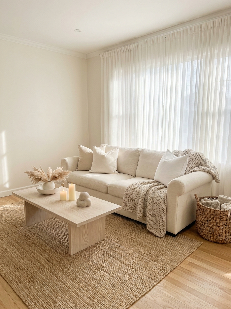
White on white isn’t flat when you do it right. The secret is mixing different undertones — warm ivories with cooler whites, creamy off-whites with pure bright whites. This creates depth without adding color.
Start with your walls in a soft warm white, then bring in a cream sofa. Add bright white pillows and maybe an ivory throw. See how each shade plays off the others? That’s the magic. Your eye moves around the room instead of getting stuck on one flat tone.
And don’t stress about matching everything perfectly. In fact, you don’t want perfect matches. A slightly warmer pillow next to a cooler linen cushion creates visual interest that feels natural and collected over time. Think of it like cooking — you’re building flavor through subtle variations, not dumping everything from one bottle.
2. Bring in Natural Wood Tones for Warmth
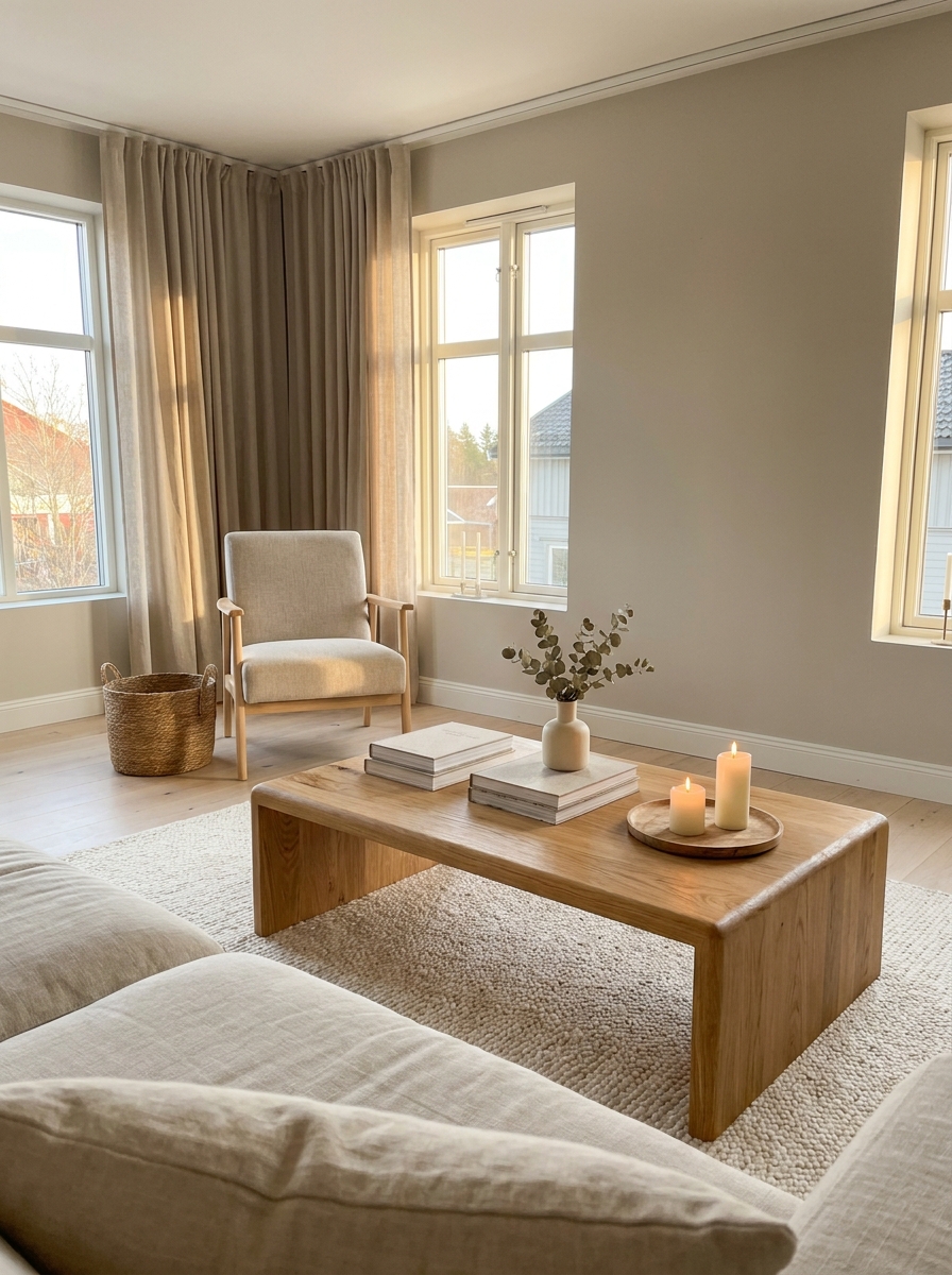
Wood is your best friend in a neutral space. It adds warmth without adding color, and the grain brings in organic pattern that feels calming instead of busy.
Go for lighter woods like oak, ash, or maple. These read as neutral but keep things from feeling too cool or clinical. A wooden coffee table, floating shelves, or even a simple wood-framed mirror can completely shift the temperature of your room. The natural variations in the grain give your eye something interesting to land on.
Don’t forget about wood furniture legs either. Swapping out metal legs for wooden ones on your sofa or chairs can make a surprising difference. And if you’ve got existing dark wood pieces? You can always lighten them with a whitewash or light stain. But honestly, a mix of wood tones works beautifully too — just keep them all on the lighter, warmer side of the spectrum.
3. Add Texture Through Woven and Knit Fabrics
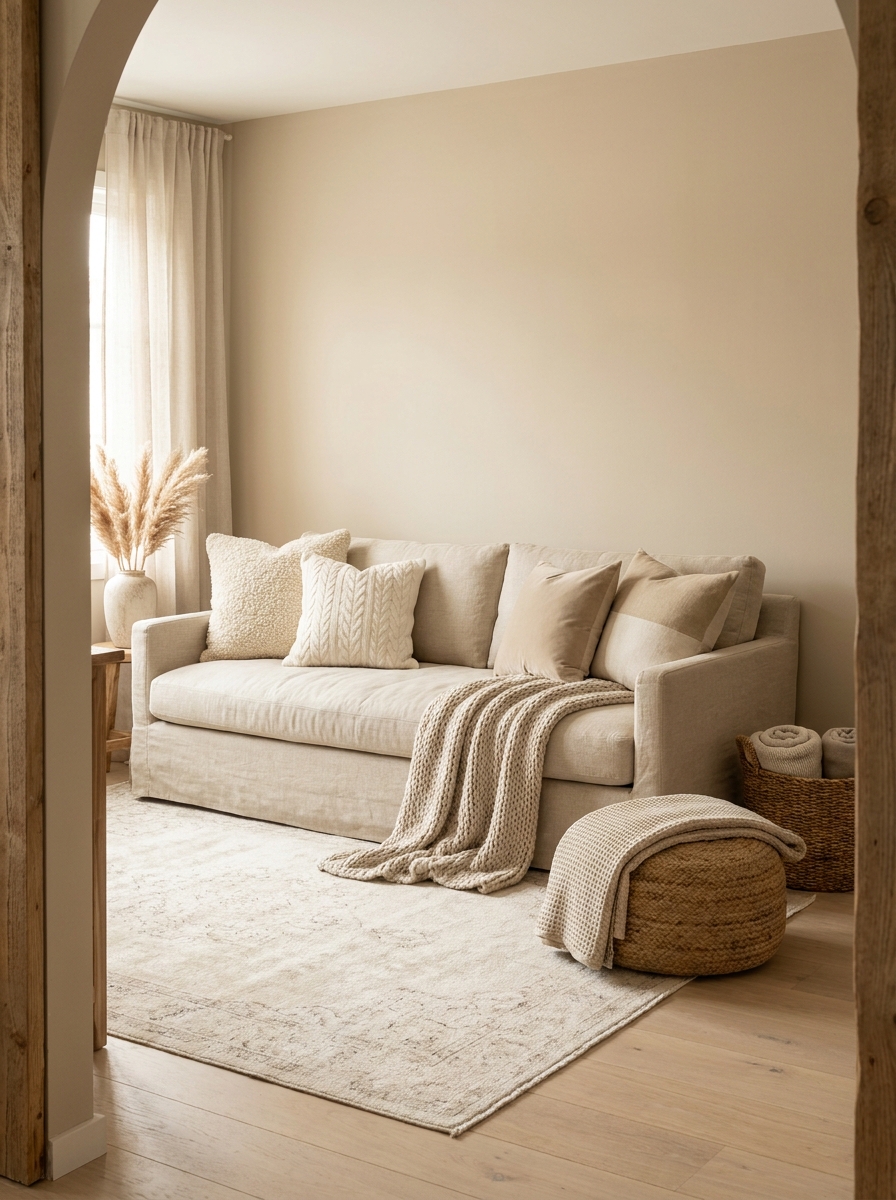
This is where neutral rooms come alive. When you’re working within a tight color palette, texture does the heavy lifting. And woven or knit fabrics are absolute workhorses.
Think chunky knit throws, nubby boucle pillows, linen slipcovers, and cable-knit poufs. Each one catches light differently and adds dimension to your space. A smooth velvet pillow next to a rough jute cushion creates contrast that’s way more interesting than two different colors would be.
Pile them on without guilt. Drape a knit throw over your sofa arm. Toss a few textured pillows in different weaves across your seating. Layer a chunky knit blanket in a basket for easy grabbing. Your living room should feel like you want to sink into it, and touchable textures make that happen. The more layers, the cozier and more intentional it looks.
4. Choose a Soft Greige Foundation
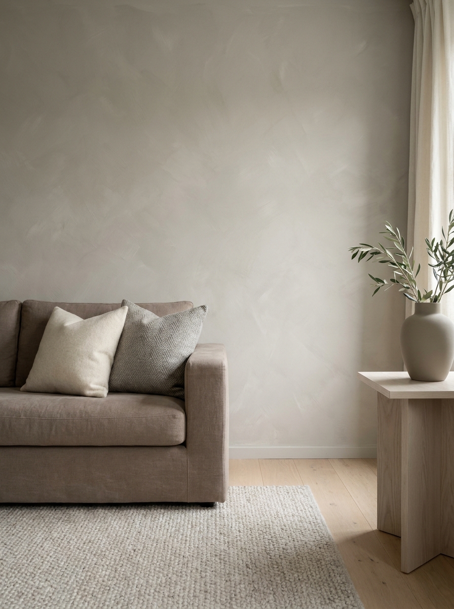
Greige is that perfect middle ground between grey and beige, and it’s honestly magic for neutral living rooms. It’s sophisticated without being cold, warm without being too cozy-cottage.
When you use greige on your walls, it creates this beautiful backdrop that makes everything else look more expensive. It plays well with cool whites and warm creams. It doesn’t fight with your wood tones. And it photographs like a dream, which matters if you’re anything like me and constantly taking pictures of your space.
The trick is finding the right greige for your light. Some lean more grey, some more beige. Test a few samples on your wall and live with them for a few days. Watch how they shift from morning to evening. The right greige will feel like it’s barely there but somehow makes everything in the room look better. That’s when you know you’ve found your match.
5. Mix Matte and Glossy Surfaces for Depth
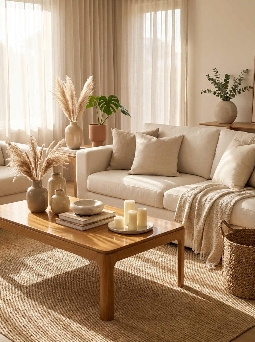
This is where your neutral living room goes from flat to fascinating! You need contrast between finishes to make everything pop. I love pairing a matte linen sofa with a glossy ceramic side table, or rough jute rugs with smooth marble coasters.
The magic happens when light hits these different surfaces throughout the day. Your matte fabrics absorb light and feel cozy, while glossy elements reflect it back and add a little sparkle. It’s like having built-in jewelry for your room! I always make sure I have at least three different finishes going on — maybe a velvet pillow, a polished wood coffee table, and a matte ceramic vase.
This trick works especially well in all-neutral spaces because you’re not relying on color for interest. Instead, you’re creating visual texture through how materials interact with light. It’s subtle but so effective! Your eye naturally moves around the room, catching these little moments of reflection and absorption. That’s what makes a neutral room feel expensive and thoughtfully designed.
6. Introduce Organic Shapes to Soften the Space
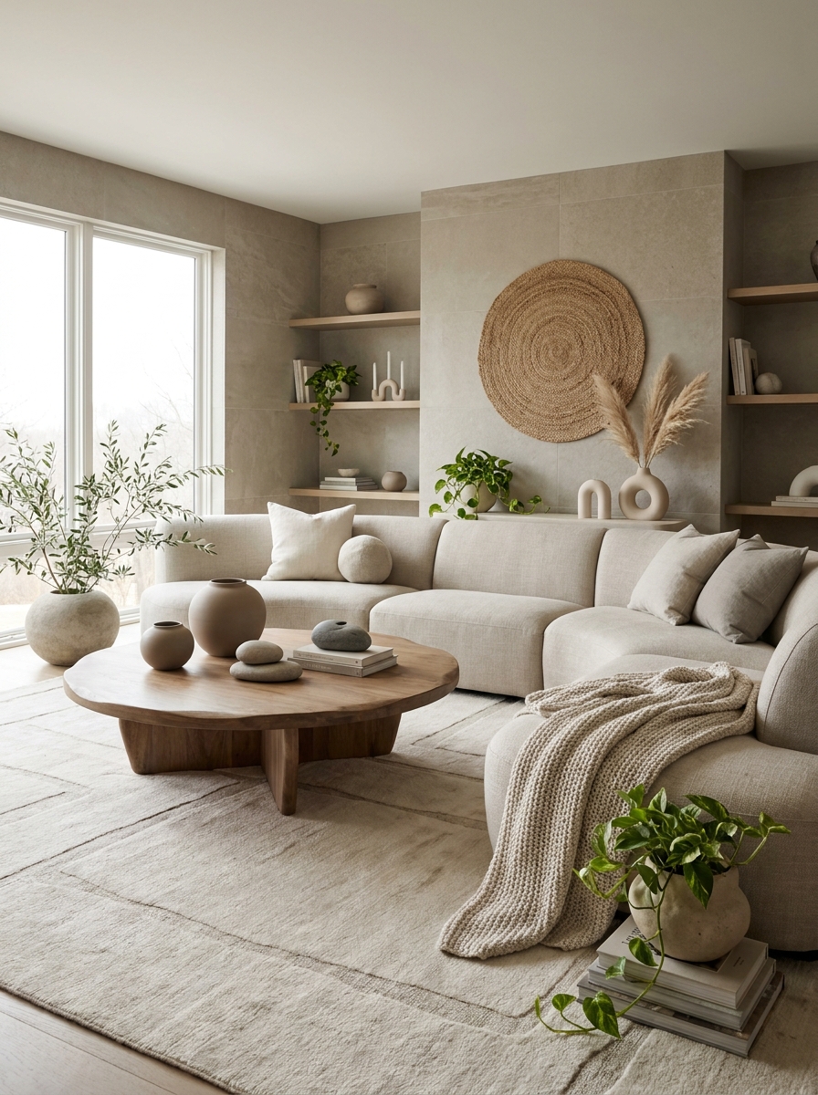
Straight lines everywhere can make a neutral room feel a bit corporate, you know? That’s why I’m obsessed with bringing in curves and organic shapes. A round coffee table, an arched floor lamp, or even just a curvy vase completely changes the energy from rigid to relaxing.
I learned this trick when I swapped my rectangular coffee table for a round wooden one. Suddenly my whole living room felt more inviting! People naturally gathered around it differently. Organic shapes mimic what we see in nature — smooth river stones, rounded hills, curved tree branches. Our brains read these forms as safe and calming.
You don’t need to go full circle on everything. Sometimes it’s just about adding a sculptural bowl with irregular edges or choosing pillows with rounded corners instead of sharp ones. Even your art can play into this — abstract prints with flowing lines work beautifully. The goal is to create visual flow so your eye travels smoothly around the room instead of bouncing from corner to corner.
7. Ground the Room with a Statement Natural Fiber Rug
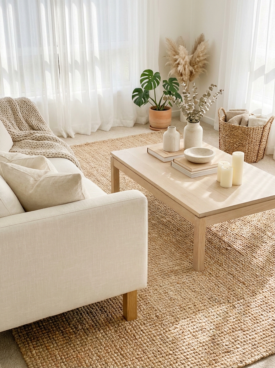
A beautiful natural fiber rug is basically the foundation of every calm neutral living room I’ve ever designed. Jute, sisal, seagrass — they all bring this earthy, grounded feeling that you just can’t get with synthetic materials. Plus, the texture is incredible underfoot!
I always go bigger than I think I need. Your front furniture legs should sit on the rug, not float around it. This anchors everything together and makes your seating area feel intentional and cozy. A good natural fiber rug also adds that essential layer of warmth without introducing any color that might compete with your carefully curated neutral palette.
The beautiful thing about these rugs is how they age. They get softer, more broken-in, and develop this gorgeous patina over time. I love that lived-in, collected look! And they’re surprisingly forgiving with stains since the natural variations hide little imperfections. Just make sure you get a rug pad underneath — it’ll prevent slipping and make everything feel more cushioned and luxurious.
8. Let Natural Light Be Your Main Feature
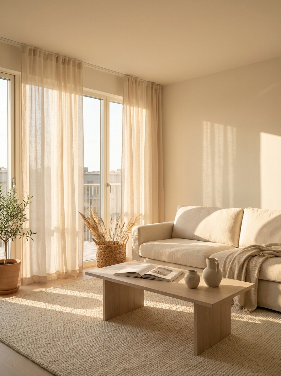
Honestly, the best thing you can do for a neutral living room is get out of natural light’s way! I keep my window treatments minimal and sheer so sunlight can flood in and show off all those beautiful neutral tones. The way light moves across beige and cream throughout the day is pure magic.
I’m talking about those moments when morning sun makes your white walls glow warmly, or when afternoon light creates long shadows that add depth to your texture layers. This is free, constantly changing artwork for your walls! Position your seating to take advantage of the best light. I always place my favorite reading chair near a window where I can soak up that natural brightness.
Ditch heavy drapes and dark blinds if you can. Go for linen sheers, bamboo shades, or even leave windows completely bare if privacy allows. Your neutral palette will literally transform hour by hour as the sun shifts. It’s like having a completely different room morning versus evening, all without changing a single thing!
9. Use Linen Everywhere for That Undone Elegance
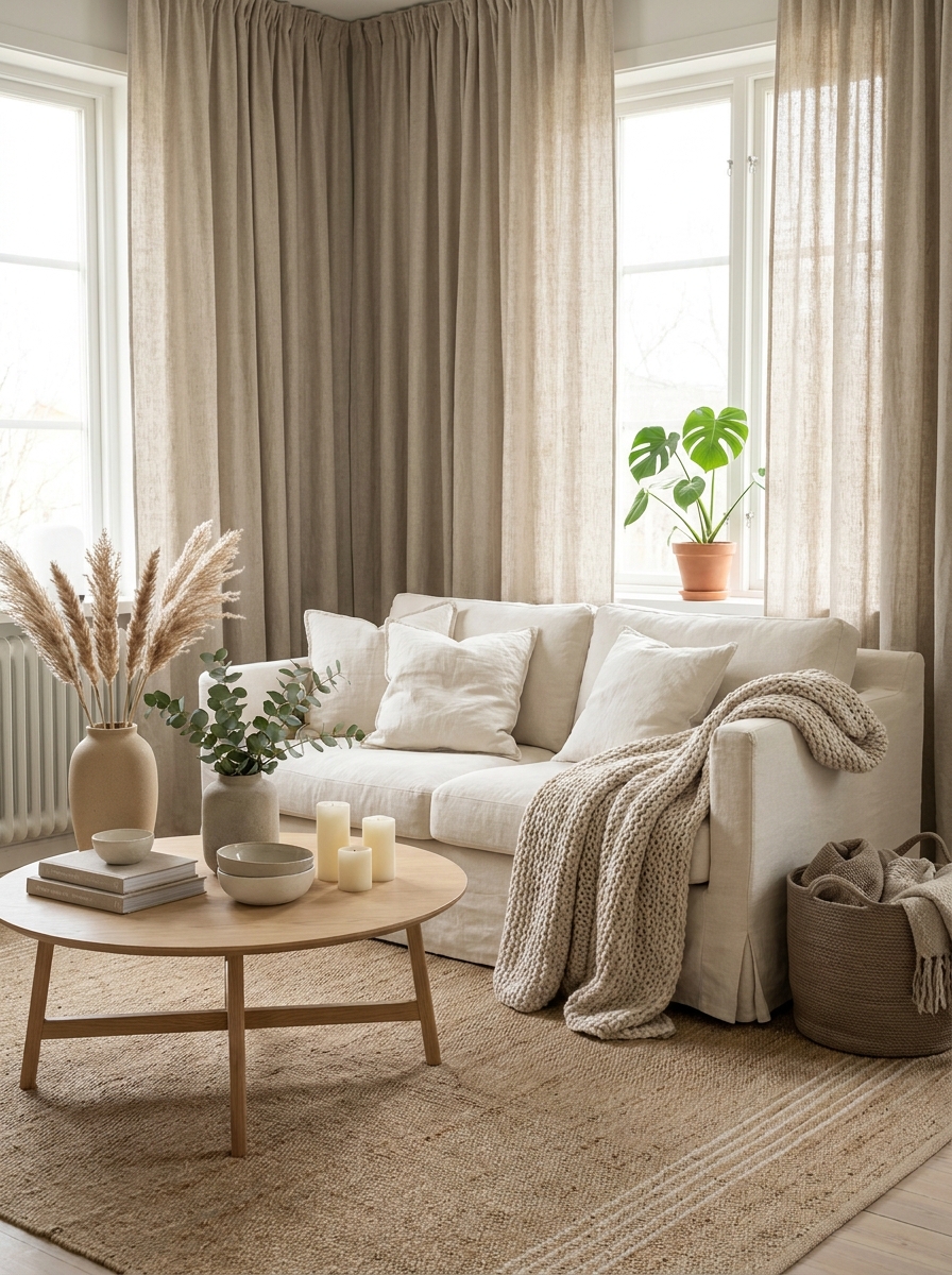
There’s something about linen that just screams effortless calm. It wrinkles, it softens with age, and honestly? That’s exactly why we love it. Linen curtains, linen slipcovers, linen throw pillows—they all bring this breezy, lived-in vibe that makes a neutral living room feel less precious and way more inviting.
I’m obsessed with how linen catches light differently throughout the day. In the morning, it looks crisp and fresh. By evening, it’s got this gorgeous relaxed drape that makes everything feel cozy. And the wrinkles? They’re not a bug, they’re a feature. They add character and movement without trying too hard.
The beauty of going linen-heavy in a neutral space is that it adds subtle texture without introducing busy patterns or bold colors. You get visual interest from the fabric’s natural variations and that slightly nubby texture. Plus, it works with literally every other neutral material—wood, stone, wool, you name it.
10. Create a Gallery Wall with Neutral Art Only
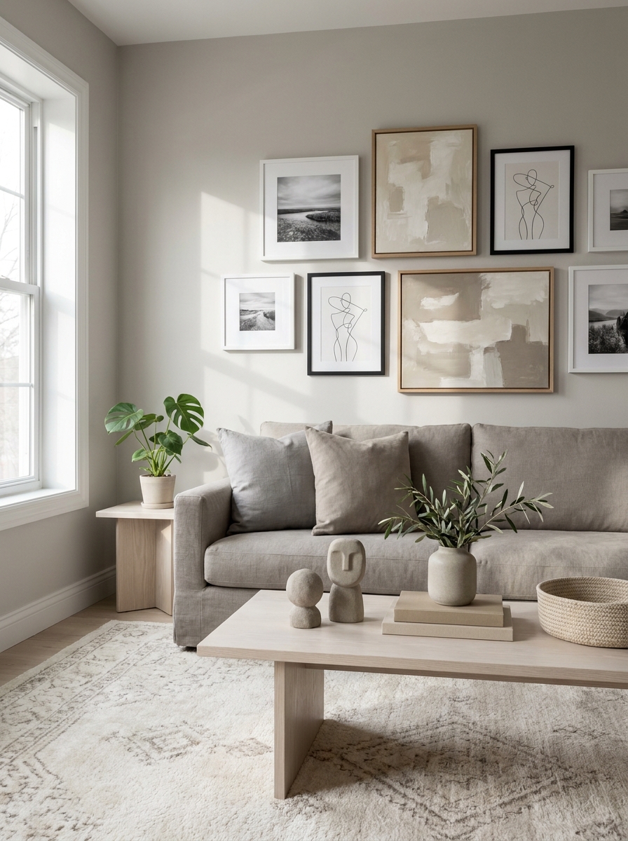
A gallery wall doesn’t have to be colorful to make an impact. Actually, sticking to neutral artwork can feel even more sophisticated and calming. Think black-and-white photography, line drawings, abstract pieces in cream and taupe, or botanical prints with soft beige backgrounds.
What I love about a neutral gallery wall is how it adds personality without disrupting that serene vibe you’ve worked so hard to create. It’s like visual poetry for your walls—interesting enough to draw the eye but gentle enough to keep the space feeling restful. The key is varying the frame styles and art sizes so it doesn’t look too matchy-matchy.
This is where you can show off your personal style while staying in that calm neutral zone. Mix mediums—a framed linen textile sample next to a charcoal sketch next to a simple line drawing. The variation in texture and subject matter keeps things interesting without the visual noise that bright colors would bring.
11. Layer Neutrals in Different Temperatures
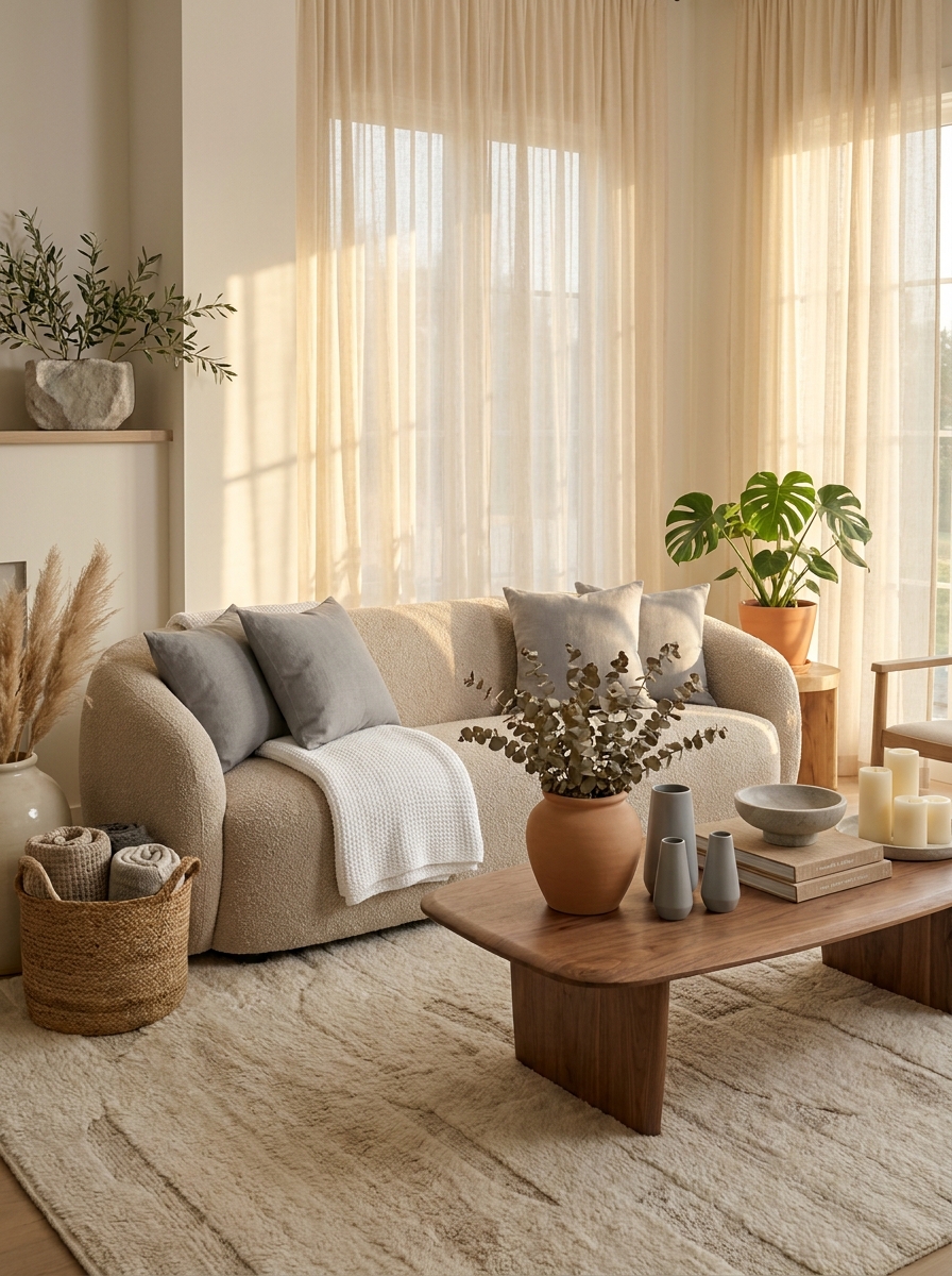
Here’s the secret to a neutral room that doesn’t feel flat: you’ve gotta play with warm and cool tones together. I’m talking about mixing your creamy ivories with cooler greys, or pairing warm beiges with crisp whites. It’s this temperature contrast that makes everything feel dimensional and alive.
When you layer different neutral temperatures, you create this subtle push-pull that’s incredibly soothing to look at. Your eye travels around the room picking up on these gentle variations—a cool grey throw pillow against a warm oatmeal sofa, a crisp white vase on a honey-toned wood table. It’s sophisticated without being stuffy.
This approach also keeps your space from skewing too yellow-beige or too sterile-grey. You get the best of both worlds—that cozy warmth and that fresh, airy coolness all in one room. It’s like the perfect neutral balancing act that makes the space feel naturally harmonious.
12. Keep It Minimal with Intentional Negative Space
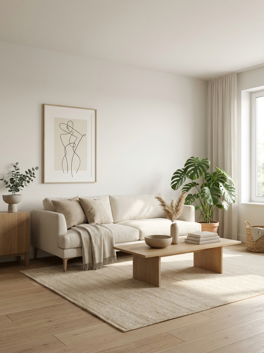
Sometimes the calmest thing you can do in a neutral living room is just… stop decorating. Negative space—those empty, breathing areas—is what makes a room feel truly serene instead of cluttered. It’s about knowing when enough is enough and letting your beautiful neutral palette do the talking.
I’ve learned that every surface doesn’t need something on it. That blank wall? It’s perfect as is. That empty corner? Let it be. When you give your room space to breathe, everything you do include gets to shine. Your eye can actually rest instead of frantically scanning from object to object.
This is especially powerful in neutral spaces because you’re already working with a limited color palette. The simplicity of the colors paired with intentional emptiness creates this spa-like feeling that’s honestly addictive. It’s minimalism with warmth—not cold or stark, just beautifully restrained and peaceful.
13. Anchor with One Sculptural Piece in the Room
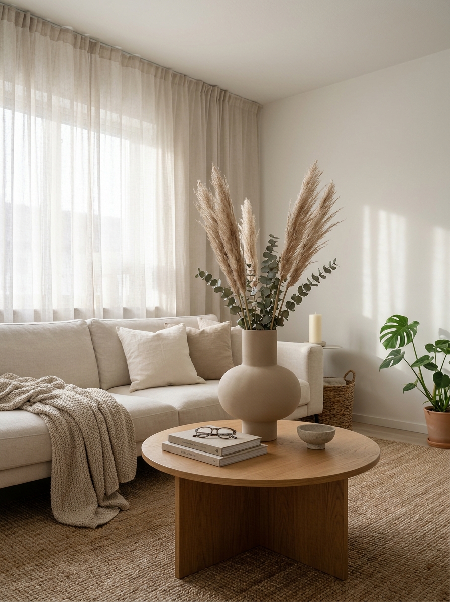
You know what makes a neutral room feel collected instead of boring? One sculptural piece that draws the eye without screaming for attention.
I’m talking about an oversized ceramic vase, a curvy floor lamp, or a statement chair with organic lines. It doesn’t need to be colorful or loud. In fact, the beauty is in the shape itself. When everything around it is soft and understated, that sculptural moment becomes the quiet star of the room.
This is how you create a focal point without using color. The curves, the height, the unexpected silhouette—that’s what makes people stop and look. And because it’s still in your neutral palette, it never fights with the calm vibe you’re building. It just adds that little bit of visual interest that keeps the space from feeling flat. I’ve seen people do this with a chunky clay pot, a rounded mirror, even a beautiful arched floor lamp. It works every single time.
14. Mix Hard and Soft Elements for Balance
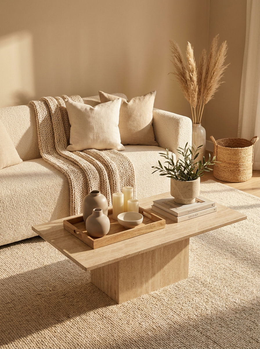
Here’s the thing about neutral rooms—they can feel too soft and cloud-like if you don’t balance them out. That’s where mixing hard and soft elements comes in.
Think about pairing that plush bouclé sofa with a sleek marble coffee table. Or placing a chunky ceramic vase next to your fluffiest knit throw. The contrast is what makes everything feel grounded and real. Too much softness can look like a hotel lobby, but add in some stone, metal, or polished wood? Now it feels like an actual home.
I love using this trick with side tables—a smooth concrete or travertine surface next to all those cozy textiles just works. Or even something as simple as a wood tray on top of a soft ottoman. It’s about creating little moments of tension that make the room more interesting to look at. Your eye needs somewhere firm to land among all that lovely softness.
15. Embrace Imperfect Handmade Details
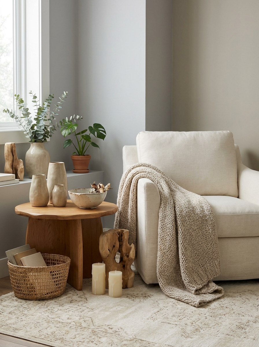
Perfect can feel cold, especially in a neutral space. That’s why I’m obsessed with handmade details that have a little wobble, a little irregularity, a little soul.
A hand-thrown ceramic bowl that’s not quite symmetrical. A woven basket with loose threads. A chunky knit blanket where you can see the actual stitches. These imperfect touches make a room feel human and collected, not staged. They tell a story that mass-produced stuff just can’t.
In neutral rooms especially, these handmade moments become the personality. They add warmth without adding color. I’ve started hunting for pottery at local markets, and honestly? Those wonky little vases and bowls make my living room feel more like me than any perfectly styled catalog piece ever could. The imperfections are the whole point—they’re what make your space feel lived-in and loved instead of like a showroom.
16. Use Monochromatic Layers to Add Quiet Drama
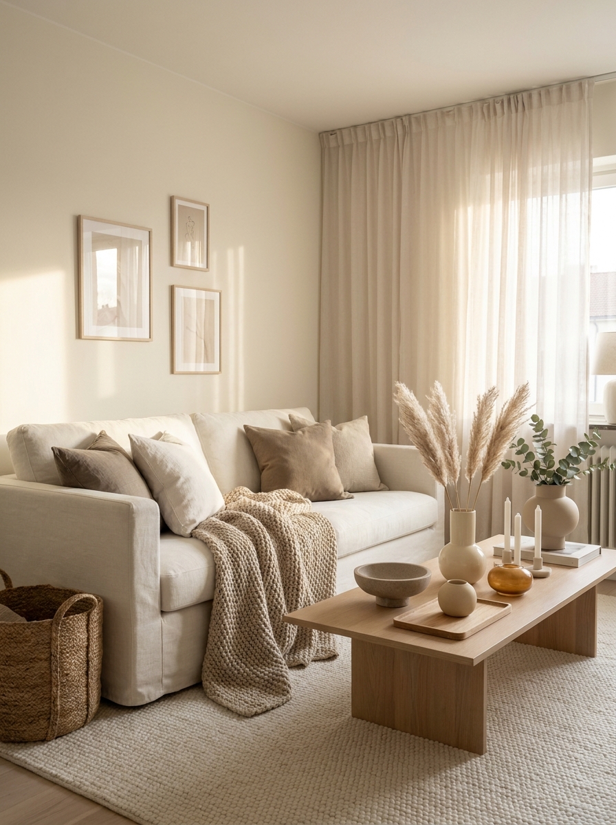
Want to know a secret? You can create tons of visual interest without ever leaving the neutral zone. It’s all about monochromatic layering—using different shades of the same color family to build depth.
Start with your lightest shade on the walls, then go slightly darker with your rug, then add dimension with throw pillows in even deeper tones of the same neutral. Maybe your walls are the palest cream, your sofa is a warmer beige, and your throws are a rich caramel-toned tan. It’s all still neutral, but there’s movement and rhythm happening.
This technique is so underrated. It gives you that designer layered look without any of the risk that comes with mixing different color families. And because everything’s in the same tonal family, it feels incredibly cohesive and calming. Your eye travels through the room smoothly, picking up on the subtle shifts in shade. It’s quiet drama at its absolute best.
17. Add Warmth Through Terracotta and Clay Accents
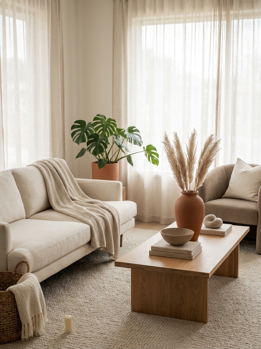
You know what stops a neutral room from feeling cold? Those gorgeous earthy terracotta tones. Just a few clay pots or a dusty terracotta vase can completely shift the temperature of your space from stark to inviting.
I’m obsessed with how terracotta plays with creams and beiges. It’s warm without being loud, grounded without being heavy. Think unglazed ceramic planters, a handmade terracotta bowl on your coffee table, or even a clay sculpture tucked on a shelf. These pieces bring just enough warmth to make everything feel cozy.
The beauty is in keeping it subtle. You’re not painting an accent wall burnt orange here. You’re adding quiet moments of warmth that make the whole room feel lived-in and loved. A single terracotta pot with a leafy monstera does more for a space than you’d think.
18. Play with Scale Using Oversized Neutral Elements
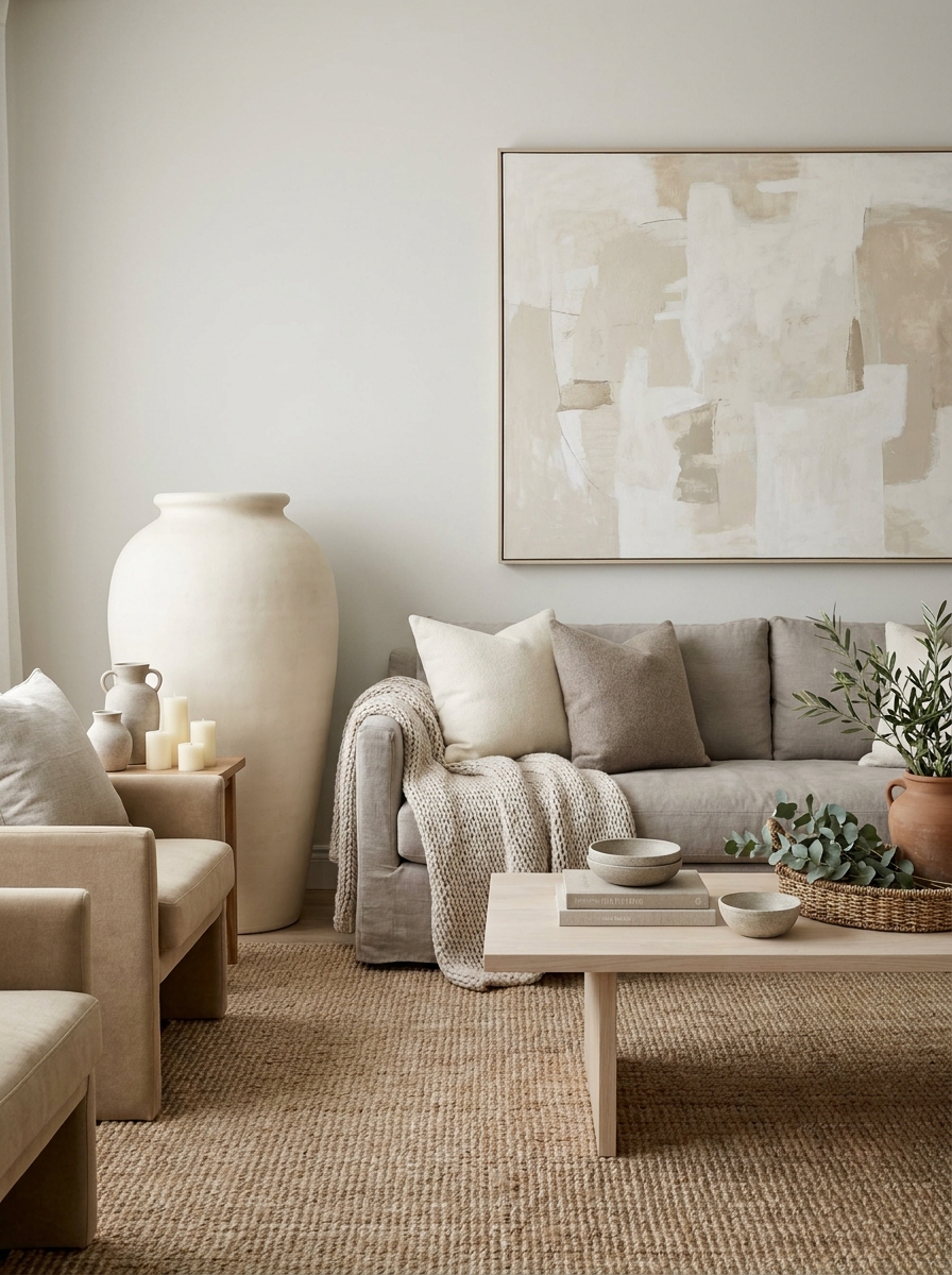
Here’s a trick that instantly makes a neutral room feel intentional instead of boring: go big with at least one thing. An oversized floor vase, a huge piece of abstract art, a massive woven basket. Scale creates drama without color.
When everything in a room is medium-sized, it all blends together and nothing feels special. But when you throw in something unexpectedly large, it becomes an anchor point. Your eye goes there first, and suddenly the whole space feels designed.
I love using an oversized ceramic vase in a corner or a giant piece of textured artwork above the sofa. It gives the room a focal point that feels calm but commanding. The best part? In a neutral palette, you can go bold with size without overwhelming the serene vibe you’re creating.
19. Introduce Subtle Pattern with Tone-on-Tone Textiles
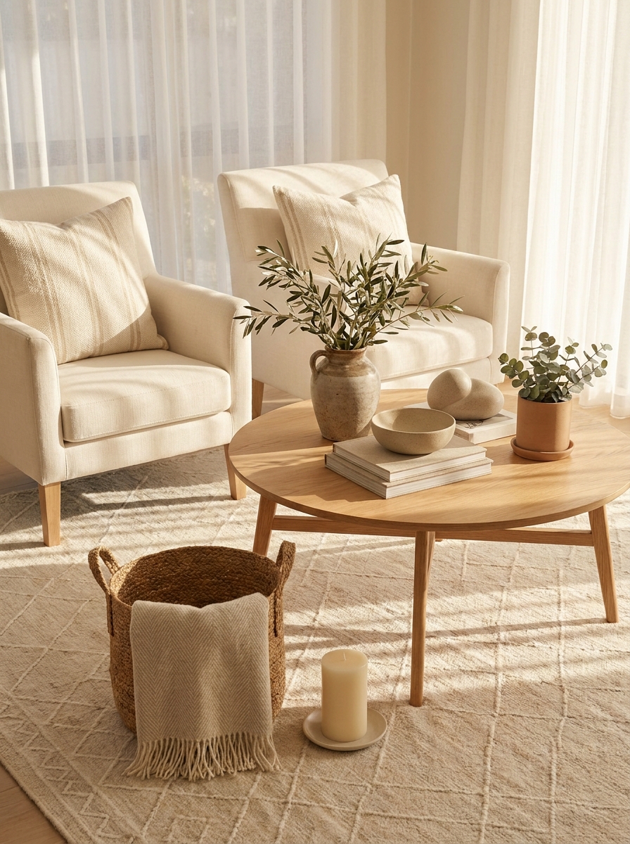
Neutrals don’t have to mean solid everything. Actually, some of the most interesting neutral rooms I’ve seen use pattern — just really quietly. Tone-on-tone patterns add movement without breaking your calm color story.
Think cream stripes on an ivory pillow, beige geometric print on a taupe throw, or a subtle damask pattern in the same shade family. Your eye picks up the texture and detail, but it doesn’t scream for attention. It’s pattern that whispers instead of shouts.
This is such an easy way to add visual interest when you’re committed to keeping things neutral. A patterned rug in two shades of beige, textured wallpaper in soft greige, or even a quilted linen pillow can make everything feel more layered and intentional without adding color chaos.
20. Let One Texture Dominate the Entire Room
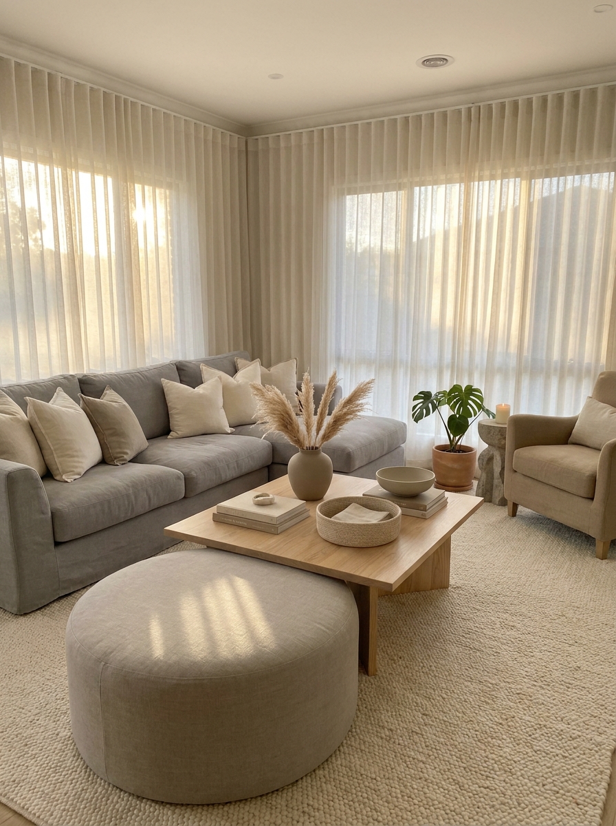
Instead of mixing a million different textures, what if you let one really own the space? Maybe it’s linen everything, or chunky knits, or smooth plaster-like finishes. When one texture repeats throughout, it creates this beautiful cohesive calm.
I’ve seen rooms where nearly every soft surface is linen — the sofa, curtains, pillows, even a linen shade on the lamp. It feels so intentional and soothing. Or a room where chunky textures dominate with boucle chairs, a thick knit throw, and a nubby wool rug all playing together.
This doesn’t mean everything has to match exactly, but choosing one hero texture and letting it show up in multiple places creates rhythm. It’s like your room has a signature, and that makes it feel so pulled together without trying too hard.
21. Create Cozy Corners with Soft Curved Furniture
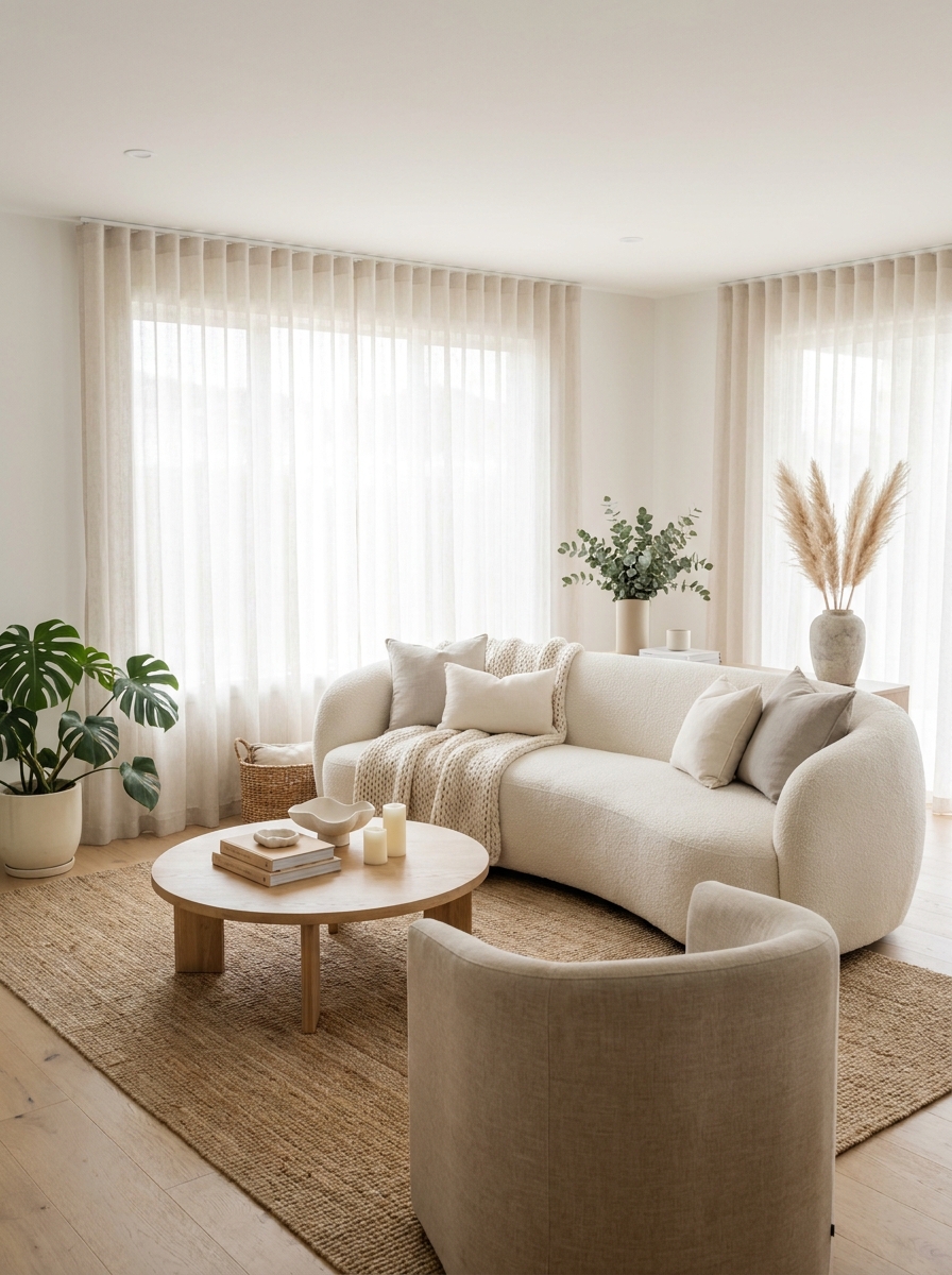
Sharp angles can make a space feel a bit tense, you know? But when you bring in curved furniture—a rounded sofa, a barrel chair, an arched floor lamp—everything instantly softens. It’s like the room takes a deep breath.
I’m obsessed with how a curved piece changes the energy. It invites you to curl up, to linger a little longer. In a neutral palette, these organic shapes become even more important because you’re not relying on color to add visual interest. The silhouette does all the talking.
Think about swapping out one angular piece for something with a gentle curve. A round ottoman instead of a square one. A scalloped armchair. Even a curved coffee table can completely shift the vibe. It makes the whole space feel more embracing, less formal, more like somewhere you actually want to hang out on a Sunday morning with your coffee and absolutely no plans.
22. Use Reflective Surfaces to Bounce Light Around
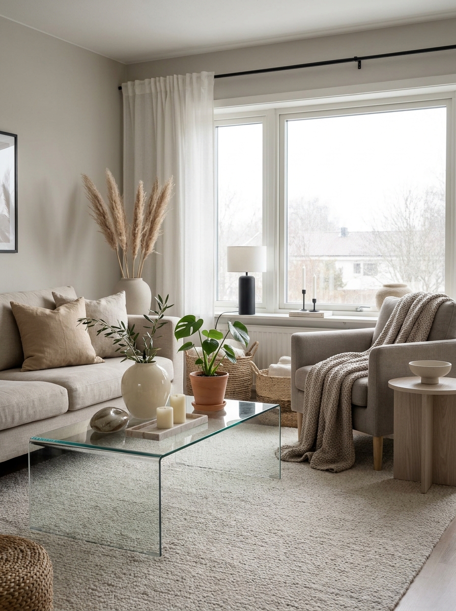
Here’s a little trick that makes neutral spaces feel bigger and brighter: bring in subtle reflective surfaces. Not shiny or flashy—just enough to catch the light and spread it around the room like magic.
I’m talking about a glass coffee table, a lightly glazed ceramic vase, maybe a pale marble tray or a brushed brass accent. These surfaces don’t scream for attention, but they quietly amplify whatever natural light you’ve got. In a neutral room, this makes everything feel more open and airy without adding a single new window.
The key is keeping it understated. You don’t want mirror-finish everything—that’s too much. Just a few thoughtfully placed pieces that give light somewhere to dance. It’s like adding a glow from within, and it keeps your calm neutral palette from ever feeling flat or dull. It’s one of those small changes that makes a surprisingly big difference.
23. Ground Your Space with Low-Profile Furniture
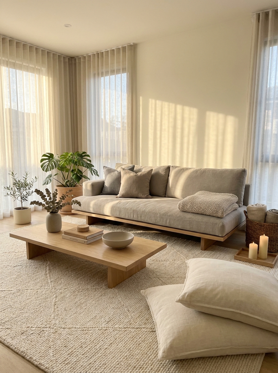
Want to know a secret for making a room feel instantly more peaceful? Go low. Low-profile furniture—sofas with short legs, coffee tables that sit close to the ground, floor cushions—creates this grounded, zen-like calm that taller pieces just can’t match.
There’s something about lowering the visual weight that makes a space feel more expansive and serene. Your eye travels across the room instead of bumping into tall furniture. It’s a very Japandi approach, and it works beautifully in neutral palettes because everything feels cohesive and intentional.
I love pairing a low sofa with a chunky, ground-hugging coffee table and maybe a floor pouf or two. It makes the room feel like a retreat—somewhere you want to kick off your shoes and settle in. The whole vibe becomes more relaxed, more human-scale, less formal. It’s the kind of space where you can actually breathe.
Quick Guide
## Neutral Color Palette Quick Guide
Not sure which neutral direction to go? Here’s a simple breakdown:
Cool Neutrals (grey, silver, cool white): Best for modern spaces with lots of natural light. Pair with black accents and glass.
Warm Neutrals (beige, cream, ivory): Perfect for cozy, inviting rooms. Pair with natural wood and warm metals like brass.
Greige (grey + beige): The versatile middle ground. Works in almost any light and pairs with everything.
True White: Crisp and clean but needs lots of texture to avoid feeling sterile. Layer in tons of natural materials.
Pro move: Stick to one temperature family (all warm or all cool) for a cohesive look, or intentionally mix them with greige as your bridge color.
Your Calm Space Is Waiting
Creating a neutral living room isn’t about playing it safe. It’s about choosing peace. It’s about building a foundation that lets you breathe, that doesn’t demand your attention the second you walk through the door.
These 23 ideas give you so many ways to play with texture, light, and subtle variations that keep things interesting without being overwhelming. You can start small — maybe just a chunky throw and some new pillows. Or you can go all in and repaint everything in soft whites and warm woods.
The beautiful thing about neutral spaces is they grow with you. You’re not locked into a trend or a specific look. You can shift things seasonally, add in personal touches, and it all just works together. Your neutral living room becomes this flexible, calming backdrop for whatever your life looks like right now. So pick the ideas that made you feel something, start with one or two, and see where it takes you. Your calm, beautiful space is closer than you think.
Frequently Asked Questions
How do I keep a neutral living room from looking boring or washed out?
Layer different textures like crazy — that’s the secret. Mix smooth velvet with rough jute, chunky knits with smooth linen, matte ceramics with natural wood grain. Texture creates visual interest that color would normally provide. Also vary your neutral tones slightly instead of matching everything perfectly. A room with five different shades of cream and beige has way more depth than one that’s all the exact same color.
What’s the best neutral paint color for a living room with low natural light?
Go with warm neutrals that have beige or cream undertones rather than grey-based neutrals, which can look muddy in low light. Colors like accessible beige, shaker beige, or warm whites with yellow undertones will reflect what light you have and feel cozy rather than dark. Test samples on the wall and check them at different times of day, especially in the evening when you’ll use the room most.
Can I mix different wood tones in a neutral living room?
Absolutely, and it actually looks more collected and interesting than matching everything. The key is keeping them within the same general temperature — all warm-toned woods or all cool-toned woods. Light oak, ash, and maple play beautifully together. Just make sure you have at least two pieces in similar tones so nothing looks like an accident.
How do I add personality to a neutral living room without breaking the color scheme?
Use natural elements and organic shapes for personality. A sculptural ceramic vase, interesting coffee table books, a vintage wooden bowl, or unique woven baskets all add character while staying neutral. Vary your furniture shapes too — a round mirror with a rectangular sofa, curved chairs with a straight coffee table. Personality comes through in the details and the pieces you choose, not just color.
What’s the difference between a neutral living room and a minimalist one?
A neutral living room focuses on a calm color palette but can still have lots of layers, textures, and stuff. Minimalism is about having less of everything — fewer pieces, less decoration, more empty space. You can have a maximalist neutral room with tons of pillows, throws, and decor, or a minimal colorful room with just a few bright pieces. They’re different concepts that can overlap but don’t have to.