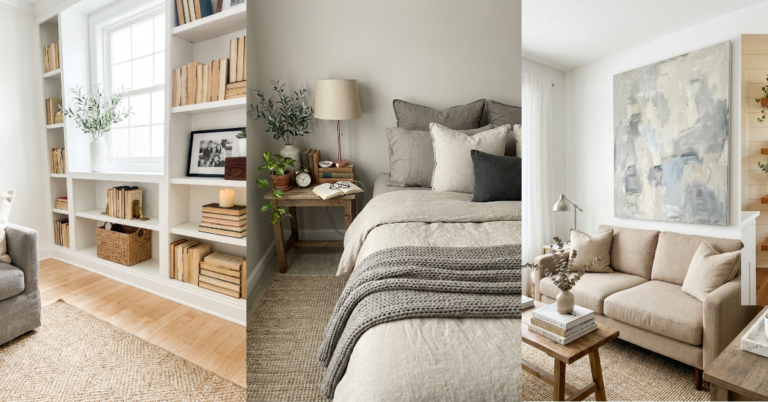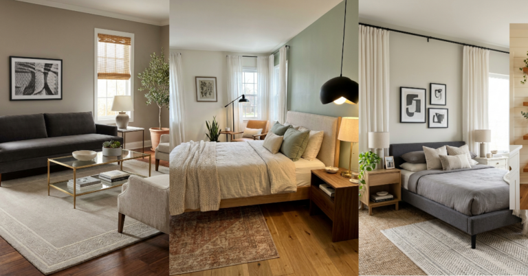
24 Gorgeous Living Room Wall Decor Ideas Above the Sofa
You know that moment when you finally get the sofa you love, position it perfectly, and then… stare at the giant blank wall behind it? Yeah, we’ve all been there. That wall space above your sofa is basically prime real estate in your living room, and leaving it empty feels like such a missed opportunity. But figuring out what to hang there? That’s where things get tricky. Too small and it looks awkward. Too cluttered and it’s overwhelming. Too matchy-matchy and it feels boring. The good news is there are so many ways to style that space — from classic gallery walls to unexpected sculptural pieces — and most of them are way easier than you think. Whether you’re working with a tiny apartment sofa or a massive sectional, there’s a wall decor solution that’ll make your whole room feel pulled together. Let’s get into it.
1. The Classic Large-Scale Statement Art
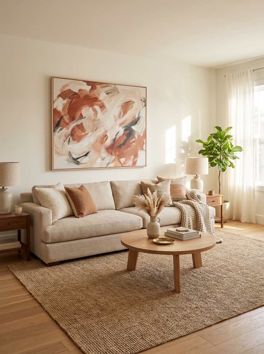
There’s something so effortlessly chic about one big, beautiful piece of art centered above your sofa. It’s the design equivalent of a little black dress — timeless, elegant, and it just works. The key is scale. You want your artwork to take up about two-thirds to three-quarters of your sofa’s width. Any smaller and it’ll look like it’s floating awkwardly in all that wall space.
Abstract art works beautifully here because it doesn’t compete with your other decor. You can pull colors from the piece into your throw pillows and accessories, creating a cohesive look without being too matchy. Or go bold with a landscape or figurative piece that becomes the room’s focal point. Either way, this approach keeps things simple and sophisticated.
And here’s the thing about oversized art — it actually makes your room feel bigger and more intentional. It draws the eye up and gives your space visual weight in all the right ways. You don’t need a museum budget either. Large canvas prints, framed posters, or even DIY abstract paintings can have the same impact as expensive originals.
2. The Layered Gallery Wall
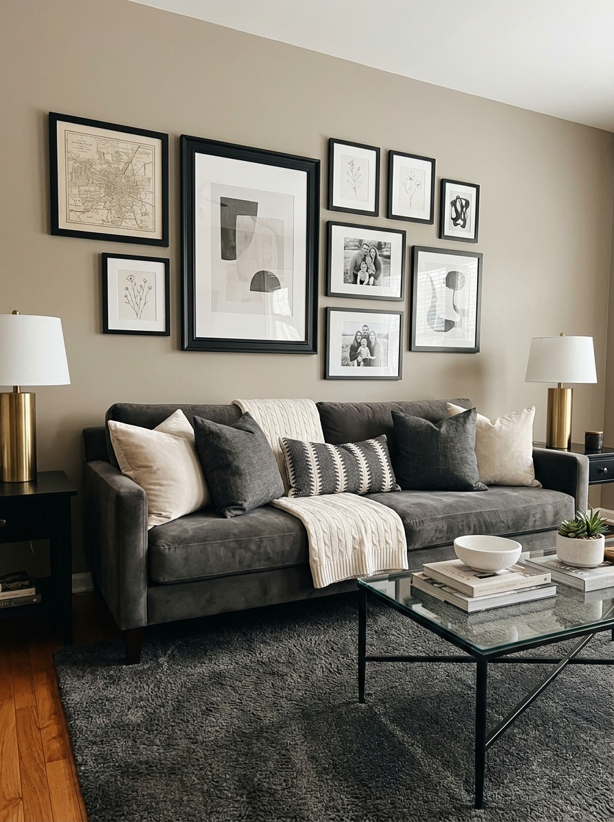
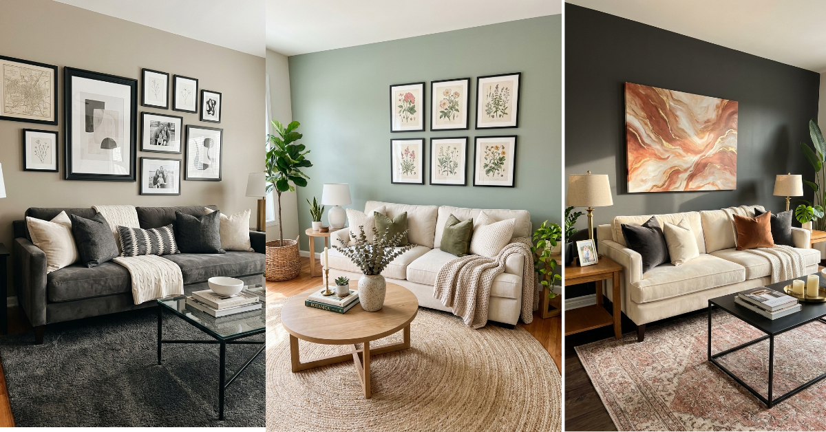
Gallery walls get a bad rap for being fussy, but honestly? They’re one of the most forgiving ways to fill that sofa wall. You can mix frame sizes, art styles, and even add in little objects like small shelves or mirrors. The eclectic vibe means nothing has to match perfectly, which takes so much pressure off.
Start with your largest piece and position it slightly off-center as an anchor. Then build around it with smaller frames, mixing orientations — some vertical, some horizontal, some square. Leave about 2-3 inches between frames for breathing room. The trick is laying everything out on the floor first and taking a photo from above. This lets you play with arrangements without putting a million holes in your wall.
What makes a gallery wall feel current instead of dated is keeping your frames cohesive — all black, all wood, or all white. Let the art itself provide the variety. And don’t overthink it. Real homes have personality, and a slightly imperfect gallery wall tells a story way better than a sterile, measured-to-the-millimeter version.
3. The Oversized Round Mirror Magic
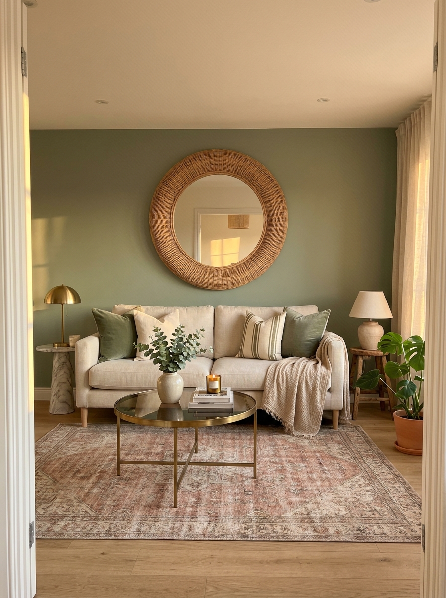
Mirrors above sofas are having such a moment right now, and for good reason. They bounce light around, make your room feel twice as big, and add this unexpected sculptural element that flat art just can’t match. A large round mirror feels softer and more modern than the traditional rectangular ones our moms hung everywhere.
The beauty of a mirror is that it works in literally any design style. A chunky wood-framed round mirror brings warmth to modern spaces. A sleek black metal one adds industrial edge. Rattan or wicker frames give major bohemian coastal vibes. And if you’ve got a dark living room or one without much natural light? A mirror is basically magic for brightening things up.
Size matters here too. Go big — like 36 to 48 inches in diameter. A tiny mirror above a full-size sofa looks lost and weird. You want it to command attention and feel like a deliberate design choice, not an afterthought you grabbed from the clearance aisle.
4. The Floating Shelf Display
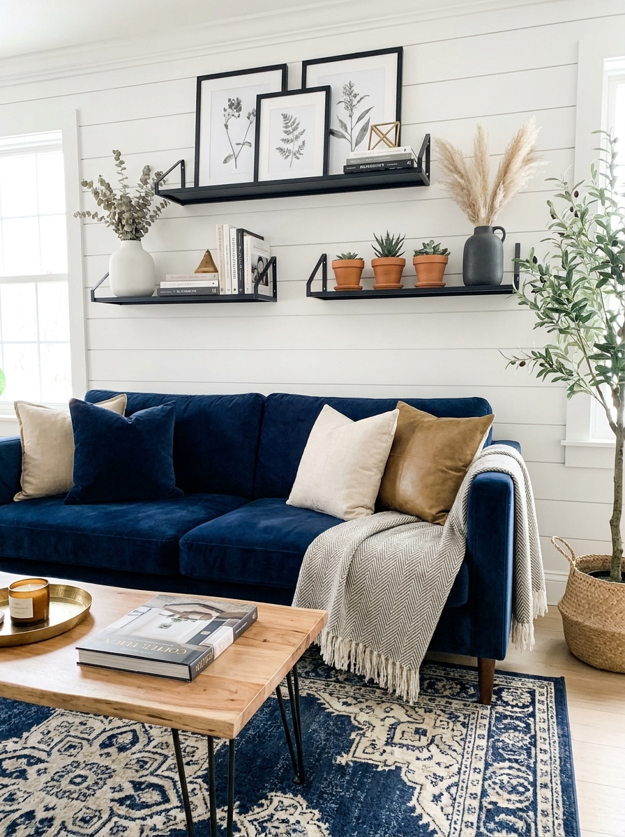
Floating shelves give you the best of both worlds — art and function. You can lean framed prints against the wall, stack your favorite design books, add small plants, and switch things up whenever you’re bored. It’s like having a gallery wall that you can rearrange without tools.
Two or three shelves staggered above your sofa create visual interest without overwhelming the space. The key is styling them with intention. Start with larger items like framed art or tall vases, then layer in smaller objects in front. Vary heights, add greenery, include one or two sculptural pieces. But don’t fill every inch — negative space makes everything look more curated and less cluttered.
This approach is perfect if you’re indecisive or love changing your decor seasonally. Swap in fall pumpkins, holiday greenery, or summer florals without committing to permanent holes in your wall. Plus shelves add actual storage, which is always a win in real homes where we need places for remotes, coasters, and all the random stuff that accumulates.
5. The Botanical Print Collection
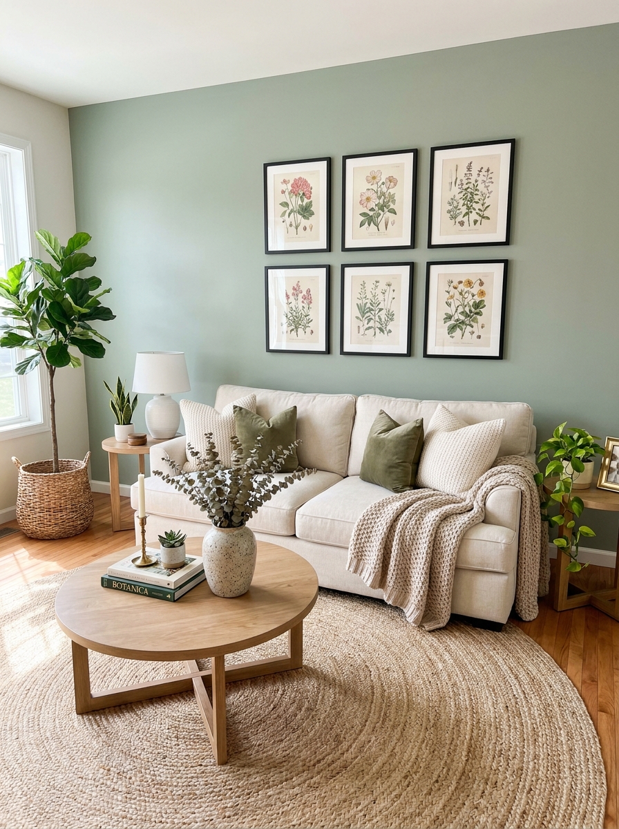
There’s something instantly calming about botanical prints. I’m talking pressed ferns, vintage flower illustrations, those gorgeous leaf studies that look like they came straight from a botanist’s journal. Group them in matching frames for a cohesive look, or mix frame styles if you want something more collected over time.
I love how botanical prints work in literally any room. They bring nature inside without committing to keeping actual plants alive (though we’ll add those too, obviously). The key is choosing prints that share a similar style—all watercolor, all line drawings, or all vintage book pages.
What makes this approach so genius is the flexibility. Start with three prints and add more as you find them. Arrange them in a grid for modern vibes, or create an organic cluster for something more relaxed. The natural subject matter means they’ll never feel too formal or stuffy.
6. The Dramatic Dark Wall Moment
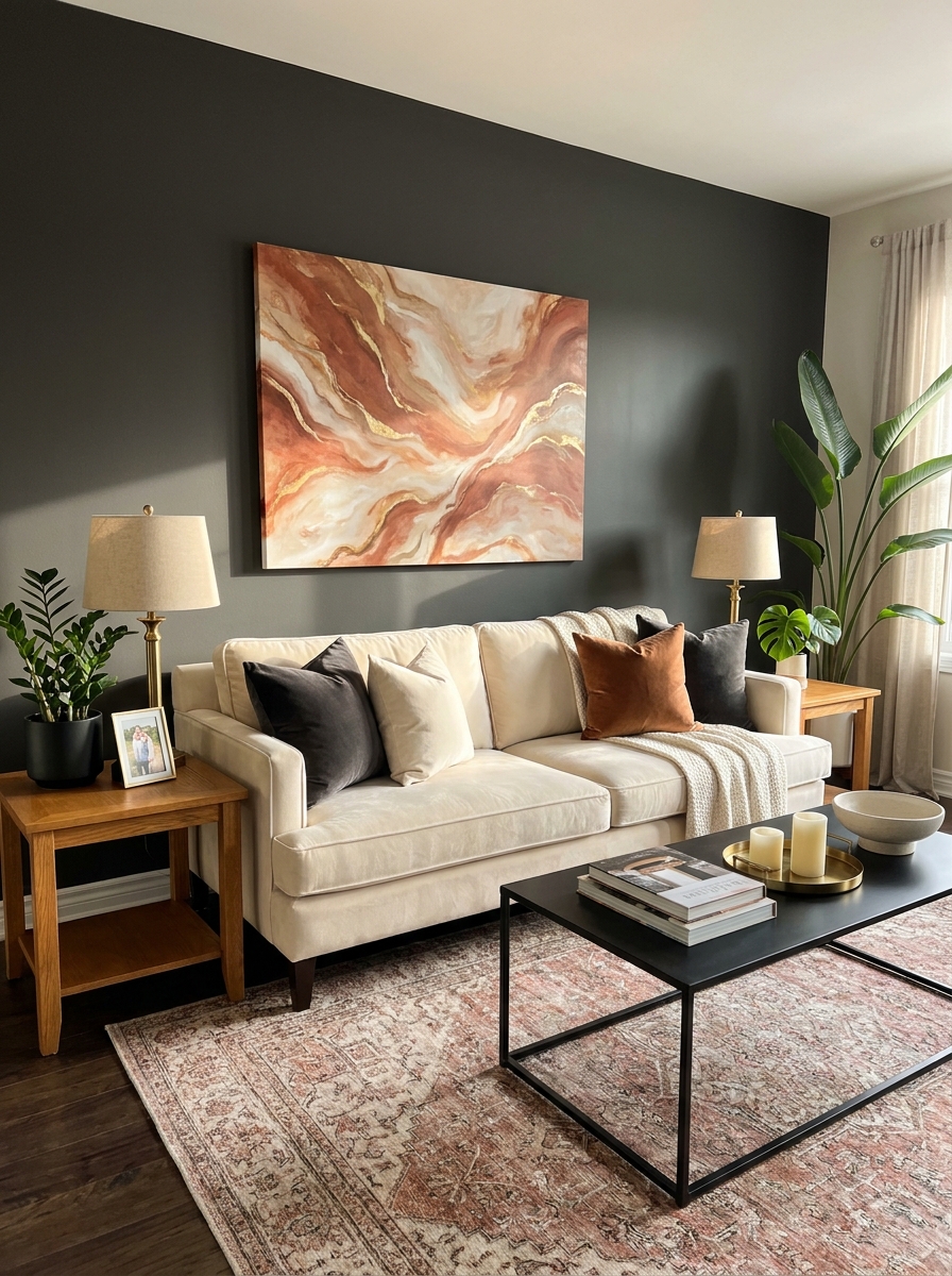
Okay, hear me out on this one. A dark painted wall behind your sofa completely transforms the entire vibe of your room. Navy, charcoal, deep forest green—these colors make your wall decor pop like nothing else can.
I was nervous about dark walls for years, thinking they’d make my space feel smaller. Total myth! Dark walls actually create depth and make the room feel more intentional and designed. Plus, they’re incredibly forgiving when it comes to what you hang on them. Brass frames? Stunning. Light wood? Gorgeous. White matting? Chef’s kiss.
The contrast is what makes this work. Your white or cream sofa suddenly looks so crisp and fresh against that moody backdrop. And any art you choose—whether it’s colorful, black and white, or gold-framed mirrors—gets this incredible spotlight effect. It’s like your wall became a gallery without you even trying.
7. The Symmetrical Double Frame Approach
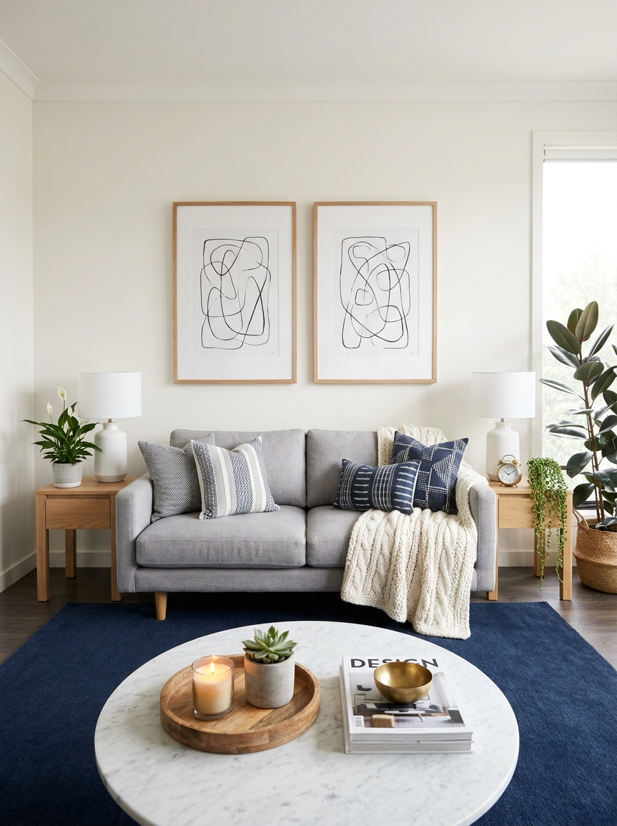
Sometimes the simplest solutions are the most elegant. Two identical frames, same size, hung with perfect spacing—it’s classic, balanced, and honestly so easy to pull off. This is my go-to recommendation for people who get overwhelmed by gallery walls but still want visual impact.
The beauty of this approach is in the repetition. Whether you choose matching art prints, black and white photography, or even mirrors, that symmetry creates instant sophistication. Your eye travels smoothly from one to the other, and the whole setup feels intentional and put-together.
I especially love this for longer sofas where one piece of art might look lost. The double frame gives you presence without requiring you to nail twenty different arrangements. Just measure carefully, use a level, and you’re golden. Bonus: if you ever want to change your art, you only need to find two pieces instead of an entire collection.
8. The Textural Woven Wall Hanging
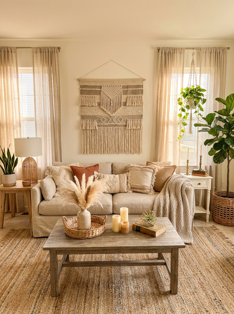
Let’s talk texture! Woven wall hangings, macramé pieces, fiber art—whatever you want to call it, this trend brings so much warmth and dimension to your wall. Unlike flat art, these pieces cast shadows and create actual depth, which is incredibly satisfying.
I love how a large woven hanging softens the whole room. There’s something about natural fibers that makes a space feel more relaxed and livable. It works beautifully in boho spaces, obviously, but I’ve also seen it look stunning in modern rooms when you choose a piece with clean lines and neutral tones.
The scale matters here. Go big or go home—a tiny macramé piece will look lost above your sofa. You want something substantial that commands attention. And the best part? These pieces are often lighter than framed art, so they’re easier to hang and less stressful on your walls.
9. The Abstract Triptych Arrangement
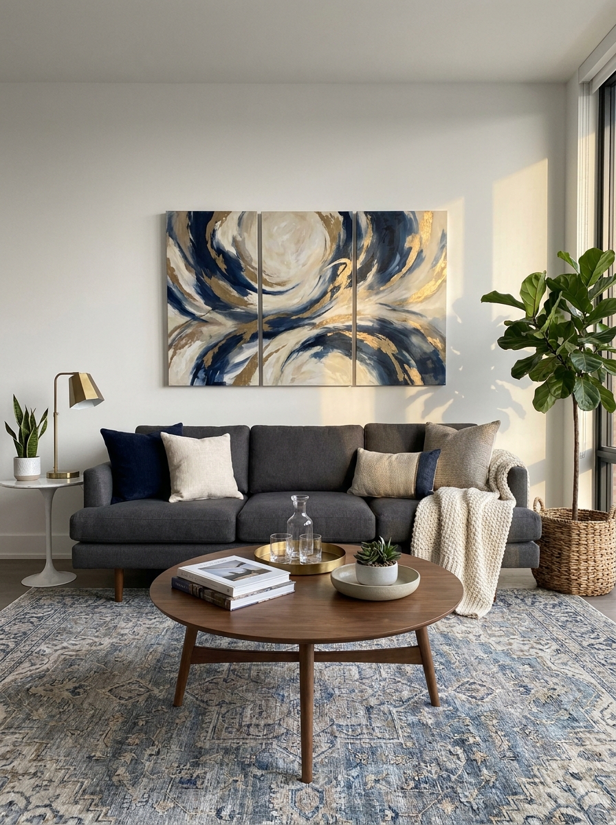
Three’s the magic number, right? A triptych gives you that big visual impact without committing to one massive piece. I love how it creates movement across your wall while still feeling cohesive and intentional.
The trick is spacing them close enough that they read as one installation, not three random pieces. I usually keep about 3-4 inches between each panel. And honestly? Abstract art is so forgiving here because you can’t hang it “wrong.” No one knows if that blue swirl is upside down or not!
This setup works brilliantly in modern spaces, but I’ve also seen it look stunning in traditional rooms when you use ornate frames. The three-panel format naturally fills that awkward horizontal space above most sofas without looking too stretched or cramped. Plus, if you ever rearrange your furniture, you can easily reconfigure these pieces in different rooms. They’re like the modular sofa of wall art!
10. The Vintage Window Frame Revival
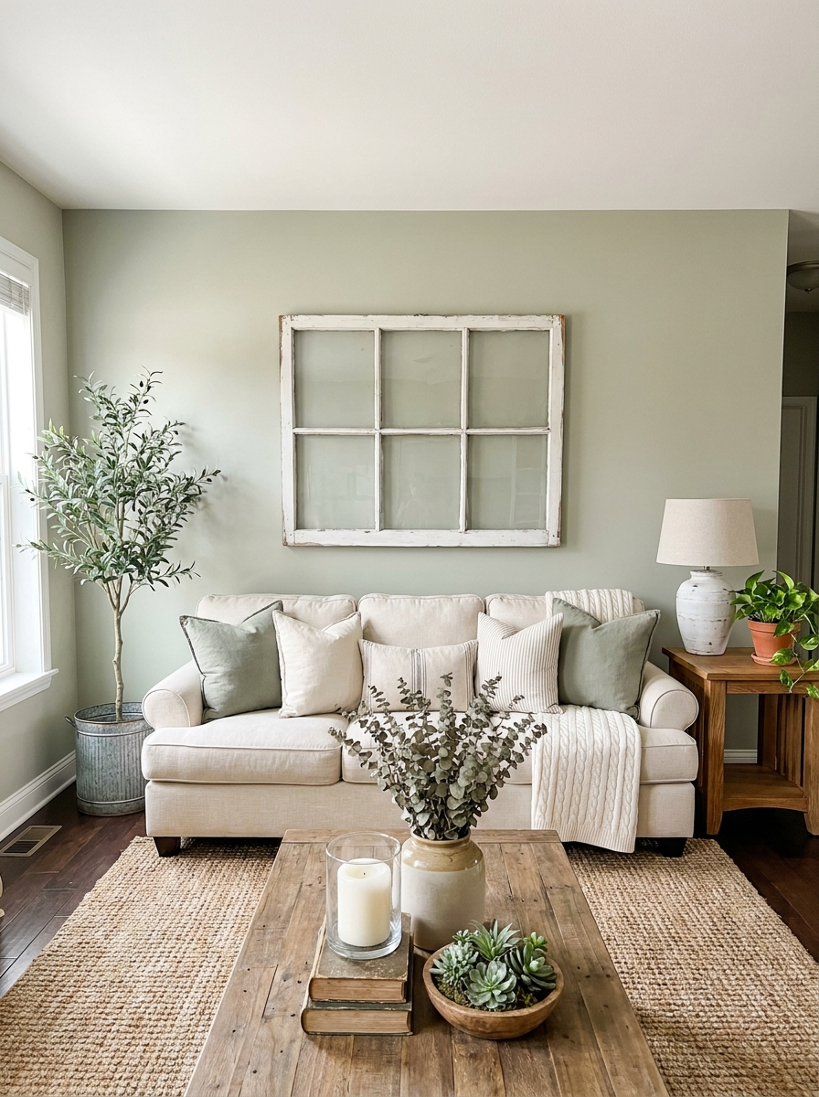
Okay, can we talk about old windows for a second? I’m obsessed with using vintage window frames as wall decor. There’s something so charming about those weathered frames with their peeling paint and authentic patina. They add instant character without trying too hard.
I found mine at a flea market for twenty bucks, but architectural salvage shops and even Facebook Marketplace are goldmines. The beauty is you don’t need to do anything to them. That chippy paint? Keep it. Those wavy glass panes? Even better. They tell a story that new decor just can’t.
What I love most is how they work in literally any style home. Farmhouse? Obviously. But I’ve seen them look incredible in modern spaces too, creating that perfect high-low mix. Hang one large window or create a collection of smaller ones. Some people even remove the glass and use them as picture frames. The architectural detail brings so much visual interest to your wall without feeling fussy or overdone.
11. The Horizontal Wood Plank Accent Wall
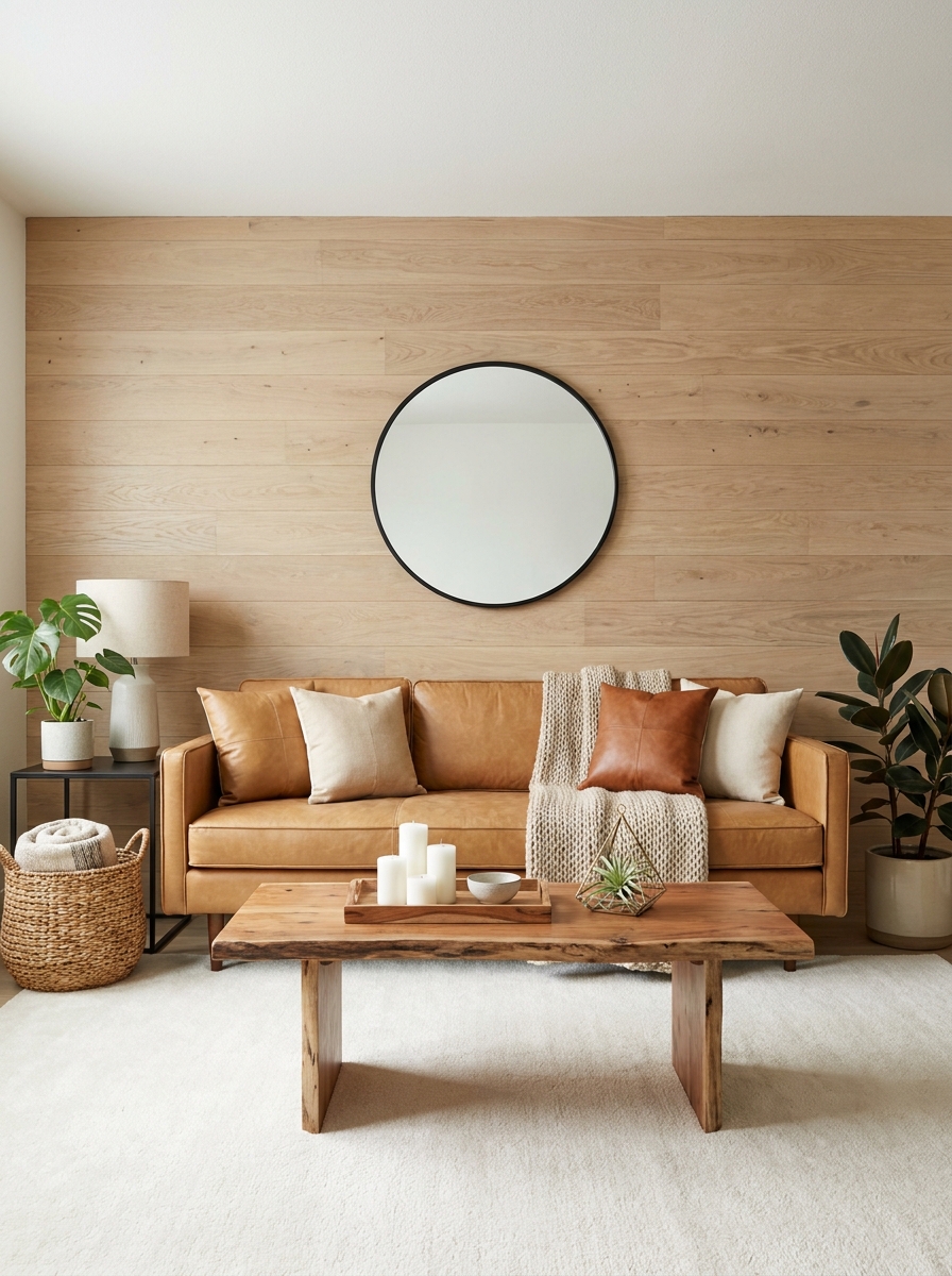
Sometimes the wall itself becomes the decor, you know? I’m talking about horizontal wood planks that create texture and warmth without adding a single thing to hang. It’s like your wall is wearing the perfect outfit all on its own.
Shiplap gets all the attention, but there are so many options! Reclaimed barn wood, stained pine, even peel-and-stick wood panels if you’re renting. I did a whitewashed version in my living room, and it completely transformed the space. The horizontal lines make your wall feel wider, which is perfect behind a sofa.
The best part? You don’t need to cover the entire wall. Doing just the section behind your sofa creates a defined zone that makes your seating area feel intentional and pulled-together. And since the wall has so much going on, you can keep your accessories minimal. Maybe one piece of simple art or a small shelf, but honestly, the wood does the heavy lifting. It’s texture, pattern, and visual interest all rolled into one gorgeous backdrop.
12. The Collected Plate Wall Display
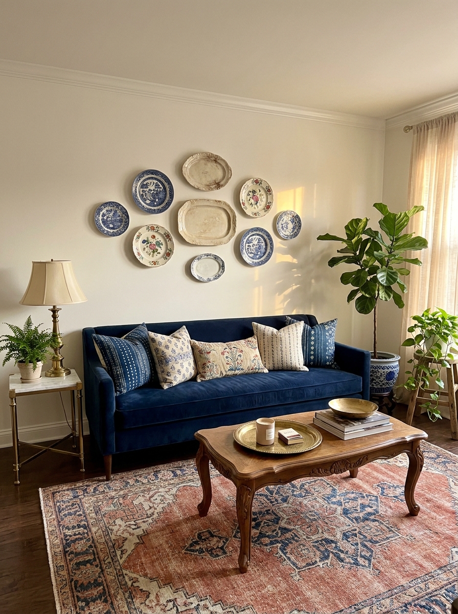
Here’s an idea that might surprise you: decorative plates! Before you think “grandma’s china cabinet,” hear me out. A curated collection of plates in varying sizes and patterns creates the most amazing textural gallery wall that feels collected over time, not bought all at once.
I’m talking vintage ceramic plates, modern artisan pieces, even thrifted finds with interesting patterns. The dimensional quality of plates gives you something flat art just can’t achieve. They catch light differently throughout the day, and that curved surface adds softness to your wall. Mix white ironstone with blue and white patterns, or go monochromatic with all cream pieces for a subtle, sophisticated look.
The arrangement is key here. I like starting with one large plate in the center, then building around it with smaller pieces. Don’t make them perfectly symmetrical—that collected, organic placement is what makes it feel special and personal. And plate hangers have come so far! The disc hangers are nearly invisible, so all you see is beautiful pottery floating on your wall.
13. The Arched Mirror Statement
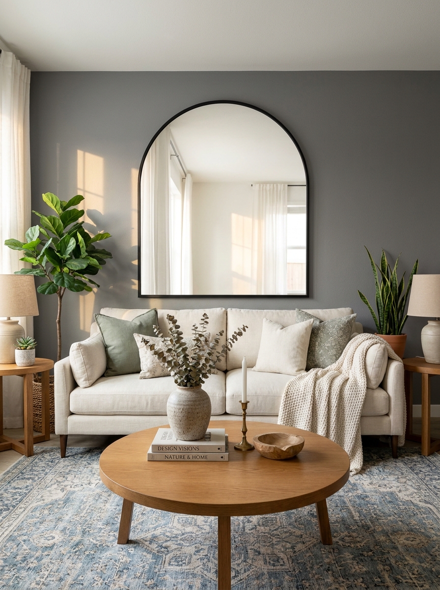
There’s something so elegant about an arched mirror above a sofa. It softens all those straight lines and brings this gorgeous architectural moment to your wall without any construction.
I love how an arched mirror tricks your eye into thinking the room is bigger and brighter. It reflects light around the space in the prettiest way, especially if you have windows nearby. The curved shape feels both classic and totally current right now. You can go full-size drama with one giant arched mirror, or do a double situation with two smaller ones side by side.
The beauty here is versatility. A brass-framed arch works in traditional spaces, while a simple black frame keeps things modern. Even a windowpane-style arch with divided glass adds character without feeling stuffy. I’ve seen people lean a massive floor mirror behind their sofa too, which gives you that arched moment with zero wall damage. It’s like bringing a doorway to somewhere dreamier right into your living room.
14. The Sculptural Metal Wall Art
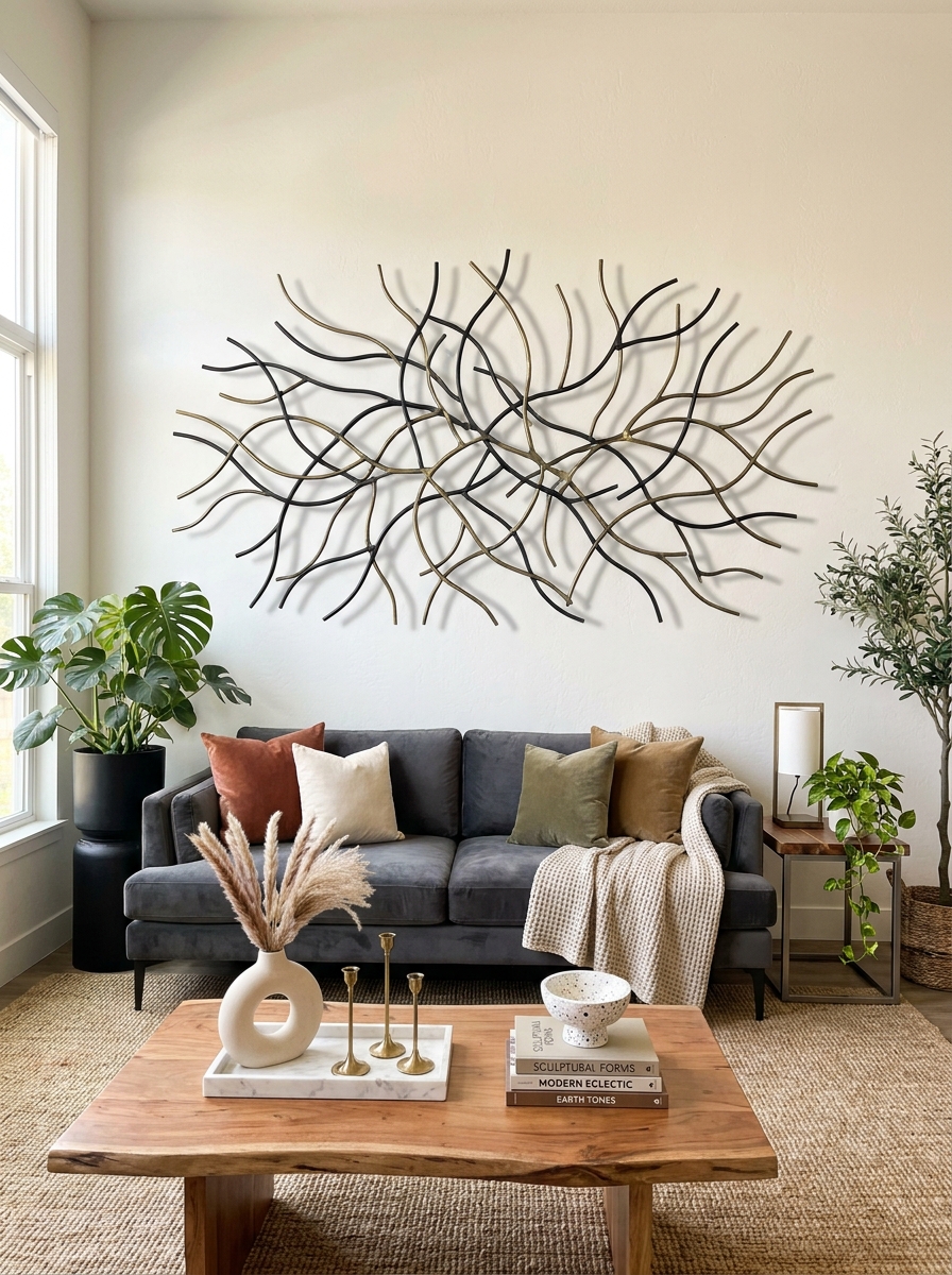
Okay, can we talk about how metal wall art has totally evolved? I’m not talking about those generic sunburst things from 2010. Modern metal sculptures add this incredible three-dimensional texture that makes your wall feel alive.
What I love most is how metal art catches light differently throughout the day. A brass piece glows warm in afternoon sun. Black metal creates dramatic shadows. Even painted metal in soft colors brings depth that flat art just can’t match. You can find abstract shapes, organic branch-like designs, or geometric patterns that feel like wearable jewelry for your walls.
The scale matters here. Go big and bold with one statement piece, or create a clustered arrangement with multiple smaller sculptures. I’ve seen gorgeous installations where different metal finishes mix together—brushed gold with matte black, or copper with iron. It’s sculptural and artistic without being too precious. Plus, it’s lighter than you’d think, so installation is actually pretty straightforward.
15. The Ledge Shelf Gallery System
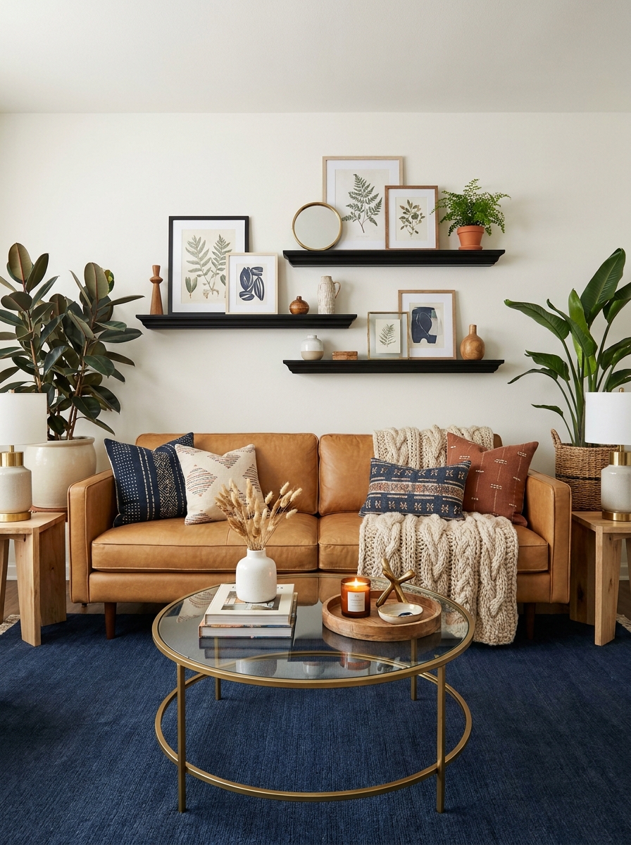
Picture ledges changed my whole perspective on gallery walls. Instead of committing to hammering a dozen nails, you install a few ledge shelves and then play around with what sits on them. It’s like a gallery wall that you can remix whenever the mood strikes.
I’m obsessed with the layered look you can create. Lean artwork against the wall, then overlap smaller frames in front. Add a little sculptural object or a plant. Everything feels collected and intentional but also relaxed, like you’ve been gathering these pieces over time. The beauty is in that slightly imperfect arrangement—nothing too matchy or staged.
Two or three ledges at different heights create the most visual interest. You can do all black ledges for a modern gallery vibe, or natural wood for something warmer. I love mixing frame styles, sizes, and even orientations. Portrait and landscape frames together, a small round mirror tucked in—it all works. This approach is especially great for renters or commitment-phobes who want flexibility.
16. The Maximalist Pattern Play Wall
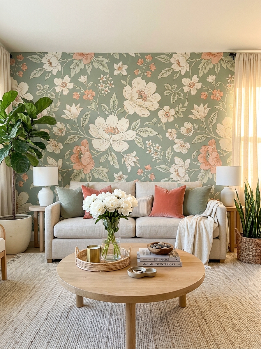
Sometimes more is more, you know? A maximalist wall moment behind your sofa makes such a joyful statement. I’m talking bold wallpaper, vibrant prints, or even a painted mural that brings serious personality into your space.
The trick is picking a pattern that excites you but doesn’t overwhelm the entire room. Large-scale florals feel romantic and lush. Geometric patterns add structure and energy. Even a colorful abstract mural can ground your whole design scheme. What’s fun is that a busy wall actually lets you keep everything else simpler—your sofa and decor can be more neutral because the wall is doing all the talking.
I love seeing people embrace color here. A rich emerald palm leaf print, a terracotta Moroccan tile pattern, or even a moody dark floral. You can wallpaper the whole wall or just create a framed section for a more contained pop. If permanent wallpaper feels scary, removable options are shockingly good now. It’s your living room—let it have some fun.
17. The Monochromatic Photography Series
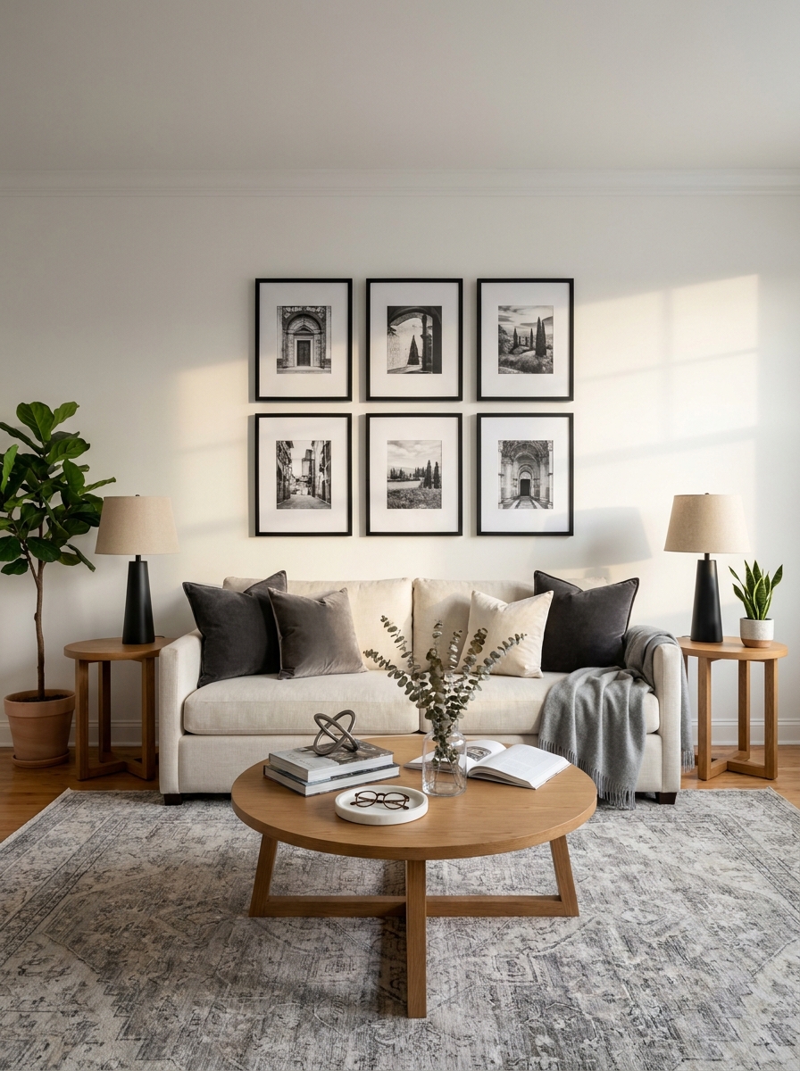
There’s something so sophisticated about a series of black-and-white photographs hung above your sofa. I’m talking architectural shots, candid portraits, nature close-ups—all united by that gorgeous grayscale palette. It creates this instant gallery vibe that feels curated and intentional.
The beauty here is consistency. When you remove color from the equation, suddenly texture, composition, and subject matter become the stars. Four to six same-size frames in a grid pattern? Chef’s kiss. Or you could go for varied sizes in a more organic arrangement—both work beautifully.
I love mixing photography subjects to keep things interesting. Maybe one abstract shot, a couple of landscapes, and a portrait or two. The monochrome treatment ties everything together even when the subjects are wildly different. It’s like giving your wall a cohesive uniform that still lets each piece shine on its own.
18. The Modern Mural Moment
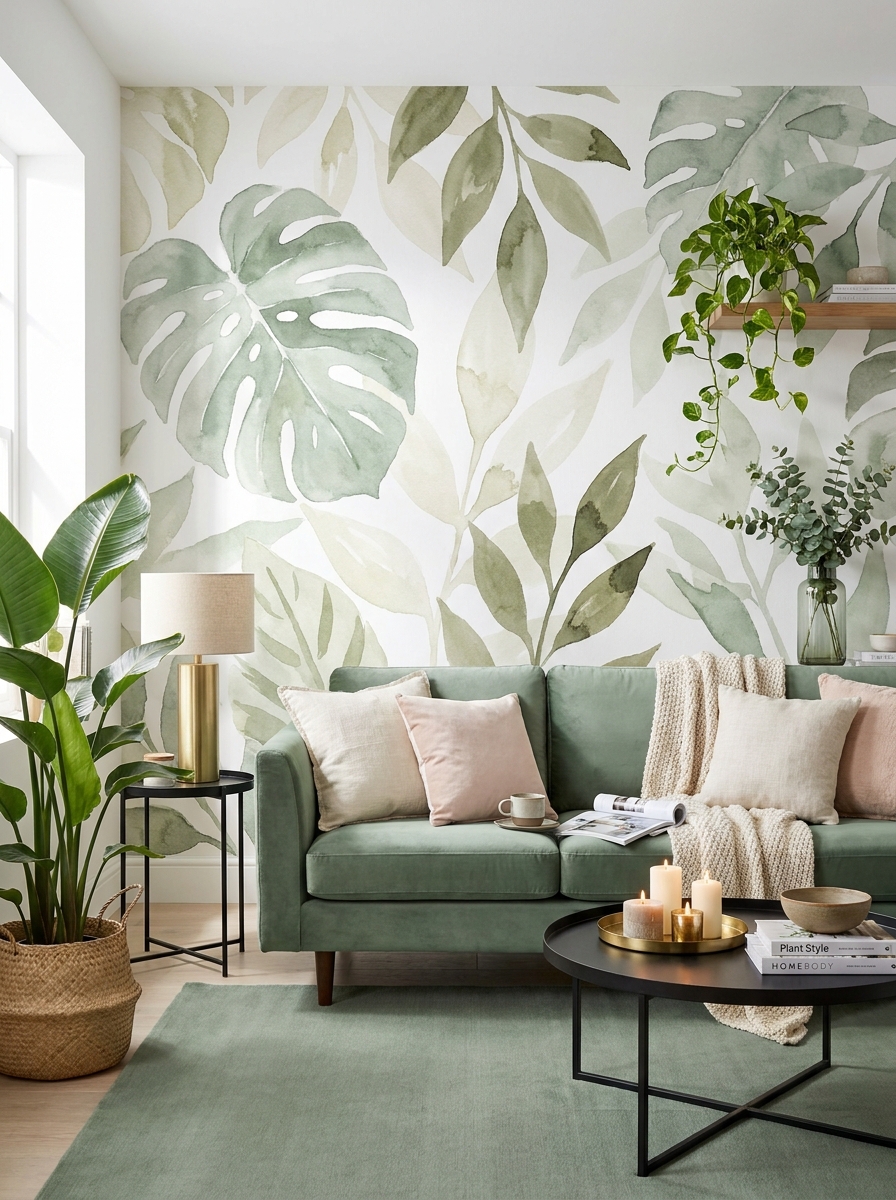
Okay, can we talk about how wallpaper murals have completely changed the game? I’m obsessed with the ones that create an entire scene behind your sofa—think dreamy landscapes, abstract watercolors, or botanical gardens that make you feel like you’re sitting in nature.
The trick is treating the mural itself as your art. You don’t need anything else on that wall when you’ve got a stunning mural doing all the heavy lifting. It’s basically a floor-to-ceiling masterpiece that happens to also be your wall. The sofa becomes part of the composition instead of competing with separate art pieces.
I especially love murals in smaller living rooms because they actually make the space feel bigger. A landscape mural with depth and perspective? It’s like adding a window that opens up the whole room. And installation is easier than you think—lots of peel-and-stick options now that renters can use too.
19. The Asymmetrical Balance Trick
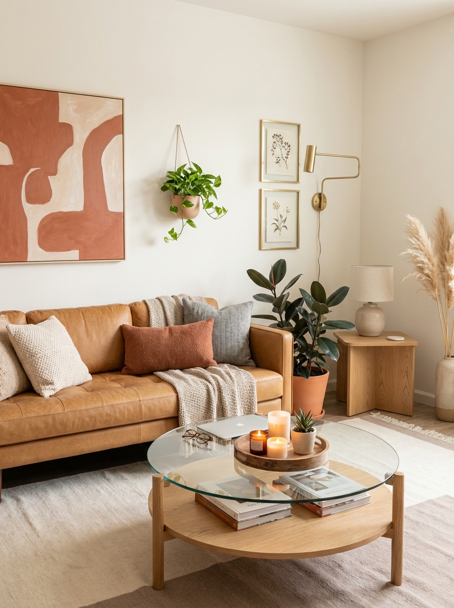
Here’s where we break some rules in the best way. Instead of centering everything perfectly above your sofa, try an intentionally off-center arrangement that still feels balanced. Maybe a large piece on one side with a smaller piece and a sconce on the other. It’s unexpected and so much more interesting than predictable symmetry.
The secret is visual weight, not perfect matching. A big piece of art on the left can be balanced by two smaller frames plus a tall plant on the right. Your eye travels across the arrangement and finds harmony even though nothing’s identical. It’s like a conversation between different elements instead of a formal portrait.
This approach works especially well if you have an off-center window or architectural feature you’re working around. Instead of fighting it, you embrace the asymmetry and make it look completely intentional. Suddenly that awkward layout becomes your signature style moment.
20. The Backlit Display Shelf System
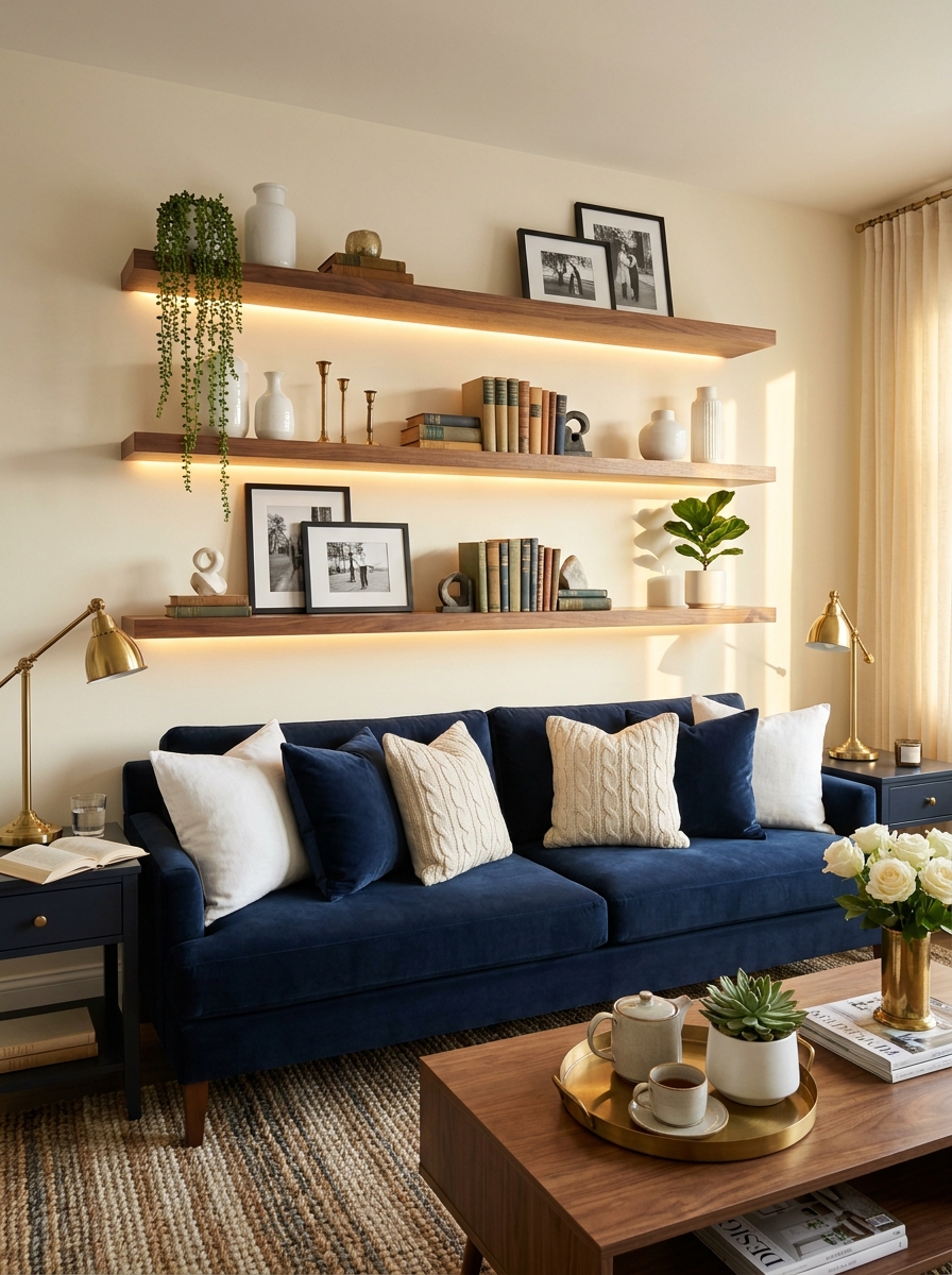
This one’s a total showstopper—floating shelves with integrated LED strip lighting that makes your displayed objects glow like a museum exhibition. I’m talking about transforming your wall above the sofa into an illuminated gallery that looks completely different when the sun goes down.
The lighting changes everything. Suddenly those ceramic pieces cast interesting shadows, your books have a warm glow, and the whole arrangement becomes a focal point even in a dark room. It’s functional lighting that doubles as art in itself. You can dim it for movie nights or brighten it when you’re entertaining.
I love mixing illuminated and non-illuminated shelves for depth—maybe one glowing shelf flanked by two regular ones. The contrast makes the lit section pop even more. And you can change what you display seasonally knowing it’ll always look intentional and curated with that gorgeous backlighting highlighting everything.
21. The Organic Natural Element Wall
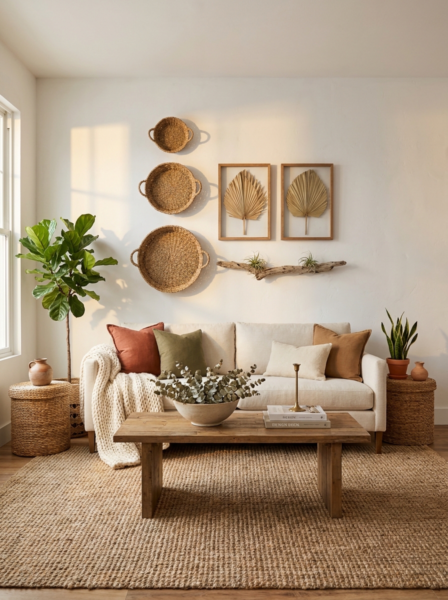
Okay, this one’s for the nature lovers. Think driftwood, woven baskets, dried palm leaves—anything that brings that earthy, collected-over-time vibe.
I’m obsessed with how textural this look is. You’re not just adding color to your wall, you’re adding dimension and actual touchable interest. A big woven basket trio feels so different from a framed print, right? It softens the whole room and makes everything feel less “decorated” and more lived-in. I’ve seen people hang gorgeous dried pampas stems in simple frames, or even mount real tree branches horizontally. It’s sculptural without feeling cold.
The key here is balancing the organic chaos with intention. You don’t want it looking like random stuff you tossed up there. Group similar tones together—all natural woods, all warm browns, maybe one pop of dried terracotta florals. It should feel curated, like each piece has a story. This style works especially well if your sofa is neutral because the wall becomes this warm, textural focal point that grounds everything.
22. The Bold Graphic Line Art Feature
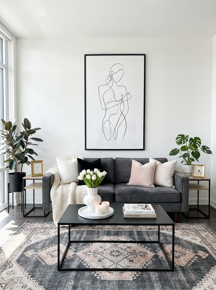
Simple line drawings are having such a moment, and I’m here for it. One large-scale line art piece above your sofa feels fresh, modern, and honestly a little sophisticated without trying too hard.
What I love about this approach is how clean it feels. If your living room already has a lot going on—patterned pillows, textured throws, a busy rug—a single bold line drawing calms everything down. It gives your eye somewhere to rest. But here’s the thing: it can’t be too small. We’re talking big, statement-sized art that fills that wall space with confidence. Think abstract faces, flowing body lines, or those gorgeous minimal botanical line drawings. Black on white is classic, but I’ve also seen gorgeous versions in navy, terracotta, or even soft sage.
This works beautifully in modern spaces but also adds an unexpected contemporary edge to more traditional rooms. It’s that perfect mix of “I have taste” without being stuffy about it.
23. The Curated Book Shelf Wall Display
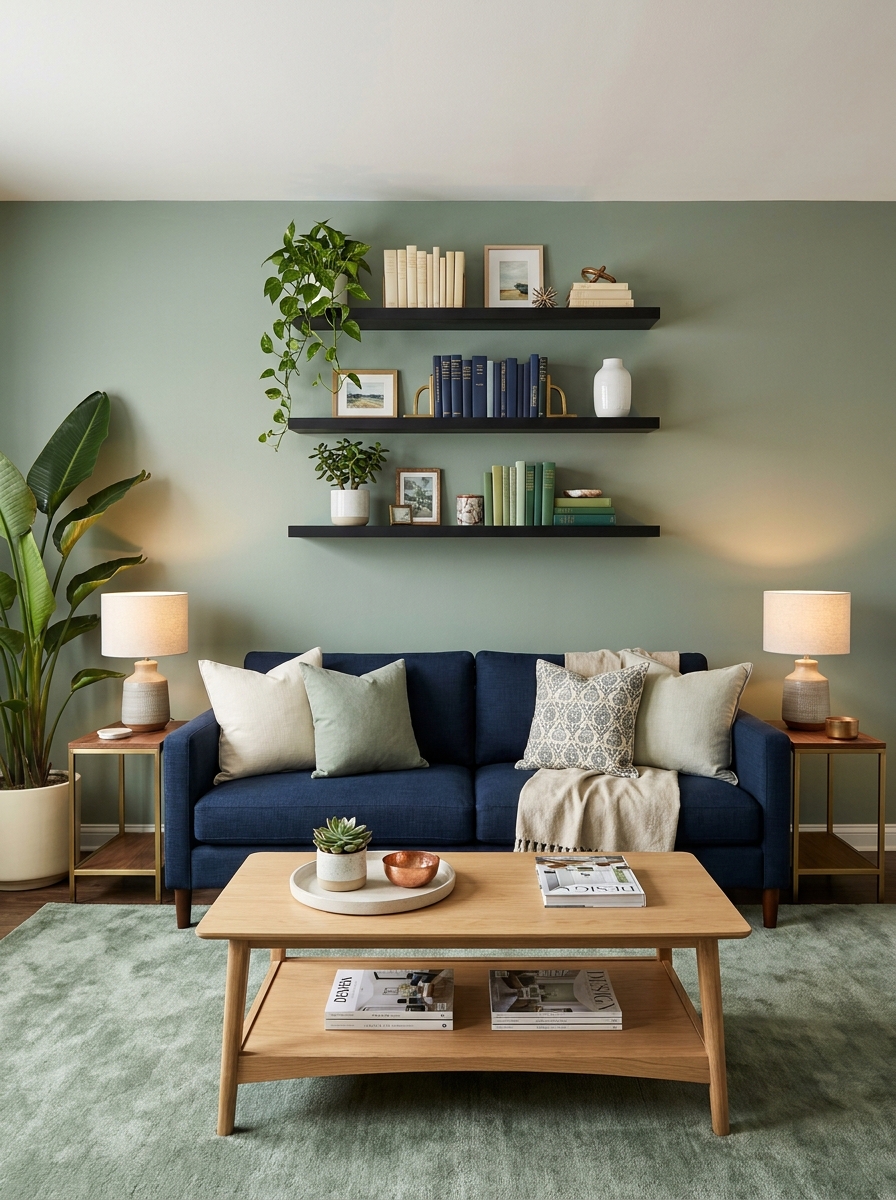
What if your wall decor could be both beautiful and functional? Enter the styled bookshelf wall above your sofa. Not those bulky entertainment centers—I’m talking sleek floating shelves arranged to show off your favorite books like art.
This is perfect if you’re a reader or just love the cozy intellectual vibe that books bring. Stack them horizontally, display spines out in color order, mix in small art pieces and plants between them. It instantly makes your living room feel more personal and collected. I always tell people this is the move if your sofa wall feels empty but you don’t want to commit to permanent art. You can change the whole look seasonally just by swapping which books you display.
The trick is editing ruthlessly. Only show your prettiest books—the ones with gorgeous spines or interesting covers. Hide the ratty paperbacks elsewhere. And leave breathing room. A crammed bookshelf looks messy; a curated one looks intentional and expensive.
24. The Unexpected Ceiling-to-Floor Vertical Moment
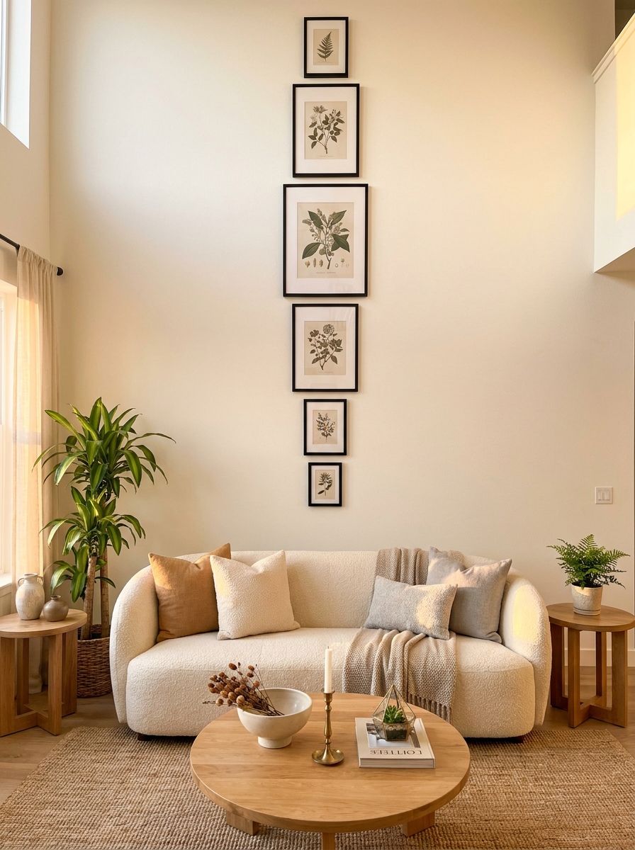
Here’s something you don’t see every day: taking your wall decor all the way up. Like, ceiling to sofa-back vertical drama. This could be a tall vertical canvas, a floor-to-ceiling gallery wall, or even decorative molding treatment that draws the eye upward.
Why do I love this? Because it completely changes your room’s proportions. Low ceilings suddenly feel taller. That awkward blank wall space becomes architectural. It’s bold without being loud, you know? I’ve seen people do this with three matching vertical canvases hung in a column, or a collection of small frames arranged in a tall narrow gallery. Even a vertical garden wall or a collection of hanging planters creates this effect.
The psychology here is real—when you lead the eye upward, the whole room feels more spacious and intentional. Just make sure whatever you’re hanging is properly anchored. We’re talking serious wall anchors here, not just those sad little nails that come with frames.
Quick Guide
Quick Style Match: Which Wall Decor Fits Your Vibe?
Love clean lines and simplicity? → Go for one large statement piece or an oversized mirror. Less is more for you.
Collect art and treasures? → Gallery walls or floating shelves let you showcase your personality without feeling cluttered.
Renting or commitment-phobic? → Lean art on shelves or use removable hooks for frames you can easily swap.
Traditional home with character? → Ornate mirrors, framed botanical prints, or symmetrical paired art feels classic and elegant.
Modern minimalist? → Abstract art, geometric mirrors, or sleek floating shelves in monochrome palettes keep things sophisticated.
Bohemian soul? → Mix textures with woven wall hangings, rattan mirrors, macramé pieces, and natural wood shelves.
The right choice depends less on trends and more on what makes you smile every time you walk into your living room.
Your Blank Wall Is Actually a Blank Canvas
Here’s what I love about decorating the wall above your sofa — there really are no wrong answers. Whether you go bold with a massive piece of art, play it safe with a classic mirror, or build out a gallery wall over time as you find pieces you love, you’re making that space yours. And that’s the whole point, right? Your living room should feel like you actually live there, not like a furniture showroom where everything’s too perfect to touch.
Start with one idea that excites you. Doesn’t have to be expensive or complicated. Maybe it’s a single frame you’ve been meaning to hang for months, or a mirror you scored at a thrift store, or even a DIY project you tackle on a Saturday afternoon. The wall isn’t going anywhere, and neither is your sofa, so you’ve got time to get it right. Trust your gut, measure twice, and don’t be afraid to put a few extra holes in the wall — that’s what spackle is for. Your living room is waiting for you to give it that finishing touch.
Frequently Asked Questions
How high should I hang artwork above my sofa?
Aim for 6-12 inches of space between the top of your sofa and the bottom of your artwork or decor. The center of your piece should sit roughly at eye level, around 57-60 inches from the floor. If you have really high ceilings, you can go a bit higher, but don’t let too much blank wall show between the sofa and art or it’ll feel disconnected.
What size art should I hang above a standard sofa?
For a standard sofa (around 84-90 inches wide), look for artwork that’s approximately 60-72 inches wide — roughly two-thirds to three-quarters of the sofa’s width. If you’re doing a gallery wall, the entire arrangement should fill this space. Going too small is the most common mistake and makes everything look off-balance.
Can I hang a TV above my sofa instead of art?
Technically yes, but it’s not ideal for your neck or your design. TVs are best viewed straight-on from seating, not from above. If your room layout absolutely requires it, make sure it’s mounted at a comfortable viewing height and consider a frame TV or surrounding it with art to make it feel more intentional.
What’s the easiest way to decorate above a sofa if I’m renting?
Leaning art on floating shelves, using removable picture-hanging strips, or propping a large mirror against the wall are all renter-friendly options. You can also use lightweight frames and small Command hooks that won’t damage walls. Gallery walls work great with removable adhesive strips rated for the right weight.
Should my wall decor match my throw pillows?
Not exactly match, but coordinate. Pull one or two colors from your artwork into your pillows and other accessories to create visual flow. The colors don’t need to be identical — in fact, varying shades adds depth and keeps things from looking too catalog-perfect.