21 Gorgeous Gallery Wall Ideas to Transform Your Space
You’ve been staring at that blank wall for months now. You know, the one behind your sofa that’s basically screaming for something—anything—to break up all that emptiness. You’ve pinned a thousand gallery walls on Pinterest, bought a few frames that are still sitting in their packaging, and maybe you’ve even held a picture frame up to the wall while squinting, trying to imagine how it would look. But here’s the thing: gallery walls aren’t as scary as they seem. They’re actually one of the most forgiving ways to add personality to your home because there’s no single “right” way to do them. Whether you’re drawn to perfectly symmetrical grids or wild, eclectic salon-style arrangements, there’s a gallery wall formula that’ll work in your space. And yes, I’m going to show you exactly how to hang them without losing your mind or putting seventeen unnecessary holes in your wall. Let’s get into it.
1. The Classic Grid Gallery Wall
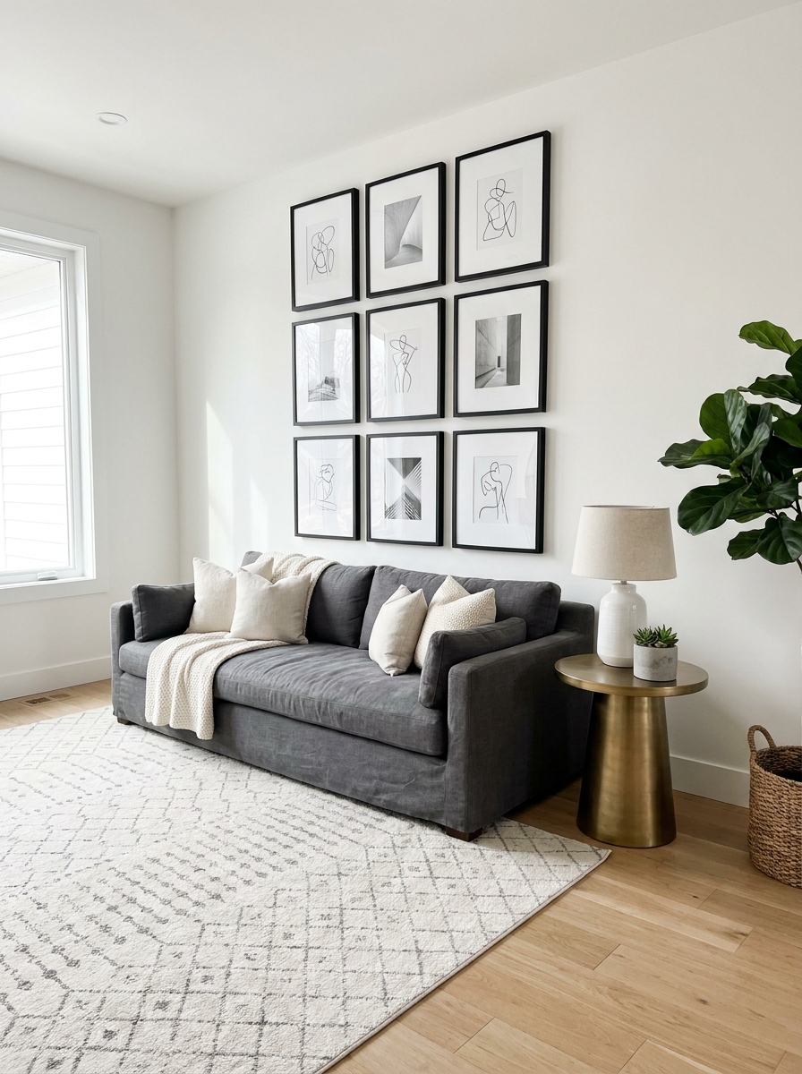
There’s something so satisfying about a perfectly aligned grid. It’s clean, it’s organized, and it works in literally any room without feeling too stuffy. The key here is consistency—same-sized frames, equal spacing, and a layout that follows straight lines both horizontally and vertically. I love this approach for modern spaces or when you want your art to feel cohesive without a lot of visual chaos.
Start by choosing frames that are identical in size and finish. Black frames on white mats create that gallery-worthy look, but white frames can feel softer and more casual. Measure the wall space you’re working with, then map out your grid on paper first. Most people do a 3×3 or 4×4 arrangement, but you can go bigger if your wall allows it.
The spacing is everything here. Keep it consistent—usually 2 to 3 inches between each frame works beautifully. Use a level and painter’s tape to mark your layout on the wall before you start hammering. Trust me, this front-load work saves you from that sinking feeling when you step back and realize everything’s slightly crooked.
> Pro Tip: Use identical frames with different art styles inside—it keeps the look structured while letting your personality show through the actual images.
2. Salon-Style Eclectic Mix
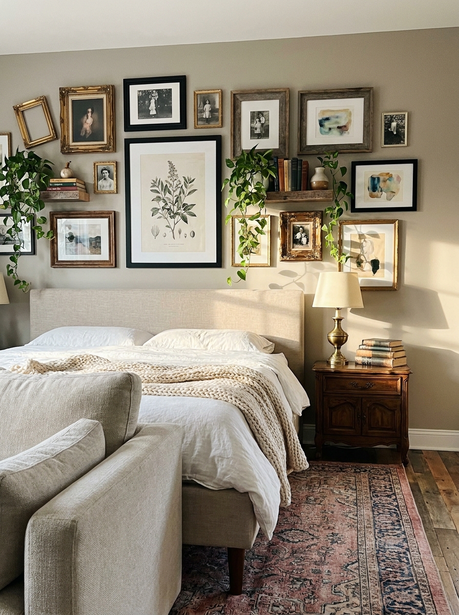
If the grid feels too buttoned-up for you, the salon-style gallery is where you get to play. This is that collected-over-time look with frames of all different sizes, finishes, and styles packed together in a way that somehow just works. It’s artistic, it’s personal, and honestly? It’s way more forgiving than you’d think.
The secret to pulling off salon-style is starting with your largest piece first—usually positioned slightly off-center or at eye level. Then you build around it, filling in with medium and smaller frames. Mix ornate gold frames with simple black ones, throw in a small mirror or two, maybe even a three-dimensional object like a small shelf or wall-hanging.
Don’t overthink the spacing here. Salon walls actually look better when frames are closer together—about 1 to 2 inches apart. Lay everything out on the floor first until you find an arrangement that feels balanced (not symmetrical, just balanced). Take a photo of your floor layout so you can reference it when you’re hanging.
> Pro Tip: Keep at least one unifying element—maybe all gold-toned frames, or all black-and-white photos—so it looks curated instead of chaotic.
3. Symmetrical Statement Above the Sofa
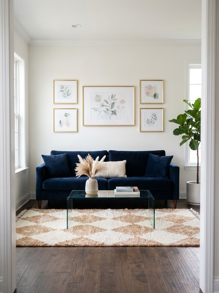
Sometimes you just want impact without the guesswork, and that’s where symmetrical gallery walls come in. Picture this: a large central piece flanked by matching smaller frames on each side, creating perfect balance. It’s classic, it’s elegant, and it makes your sofa look way more expensive than it probably was.
This works beautifully in formal living rooms or anywhere you want a polished look. The key is centering everything over your sofa with the middle of your arrangement hitting around 57 inches from the floor (standard gallery height). Your largest piece anchors the center, then you mirror identical or very similar frames on either side.
I like using this approach with three, five, or seven pieces total—odd numbers create better visual flow. Keep your frames the same finish for maximum symmetry, though the art inside can vary in color and subject as long as there’s some common thread. Make sure the overall width of your gallery is about two-thirds the width of your sofa for proper proportion.
> Pro Tip: Use picture-hanging strips instead of nails for this layout—it’s easier to adjust if your symmetry is slightly off without creating extra holes.
4. Floor-to-Ceiling Drama in the Hallway
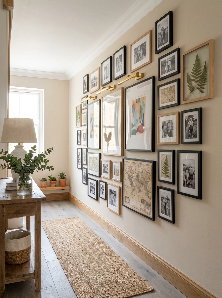
Hallways are so underrated. Most of us just use them to get from point A to point B, but a floor-to-ceiling gallery wall turns that boring corridor into an actual destination. This is where you go big—really big—with frames that climb all the way up the wall, making your ceilings feel taller and your hallway feel like a proper art gallery.
Start at eye level and work your way both up and down. You can do this in a loose grid pattern or go more organic with varied frame sizes creating an asymmetrical flow. The beauty of hallway galleries is that people experience them while walking, so the arrangement doesn’t need to make sense from one single viewpoint. Layer in different depths too—some frames flush to the wall, others with deeper matting that creates shadow boxes.
Lighting makes or breaks this look. If your hallway is dim, add picture lights above key pieces or install subtle track lighting. The goal is to create that “wow” moment when someone walks through. And don’t forget to include some lower frames that kids or shorter guests can actually see and enjoy—not everything needs to be at adult eye level.
> Pro Tip: In narrow hallways, keep frames to one side of the wall only, so the space doesn’t feel too crowded or overwhelming as you walk through.
5. Bedroom Gallery Wall Above the Headboard
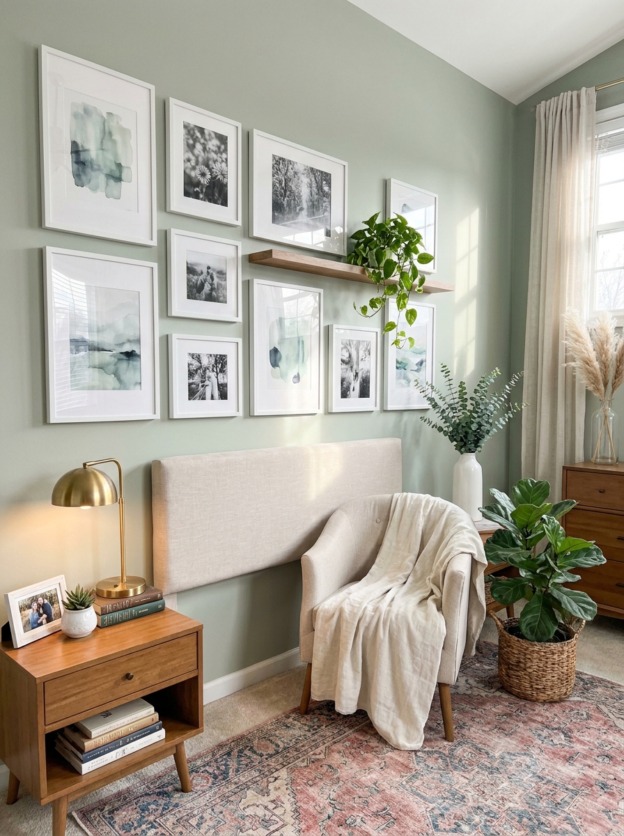
Your bedroom deserves art that makes you smile every morning. A gallery wall above your bed transforms that big blank space into something really special.
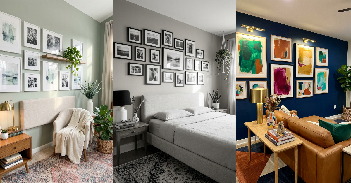
I love mixing personal photos with abstract prints here. Think vacation snapshots next to dreamy watercolors or pressed botanicals. Keep the vibe soft and personal—this is your private retreat, after all. Black frames look incredibly chic against white walls, but don’t be afraid to try all-white frames on a sage green accent wall for a calming, spa-like feel.
The key is centering your arrangement above the headboard, just like you would a single statement piece. Start about 6-8 inches above your headboard and build out from there. I usually keep bedroom galleries slightly smaller than living room ones—you want visual interest without overwhelming the space where you’re trying to relax and sleep.
6. Corner Gallery Wall Wrapping Two Walls
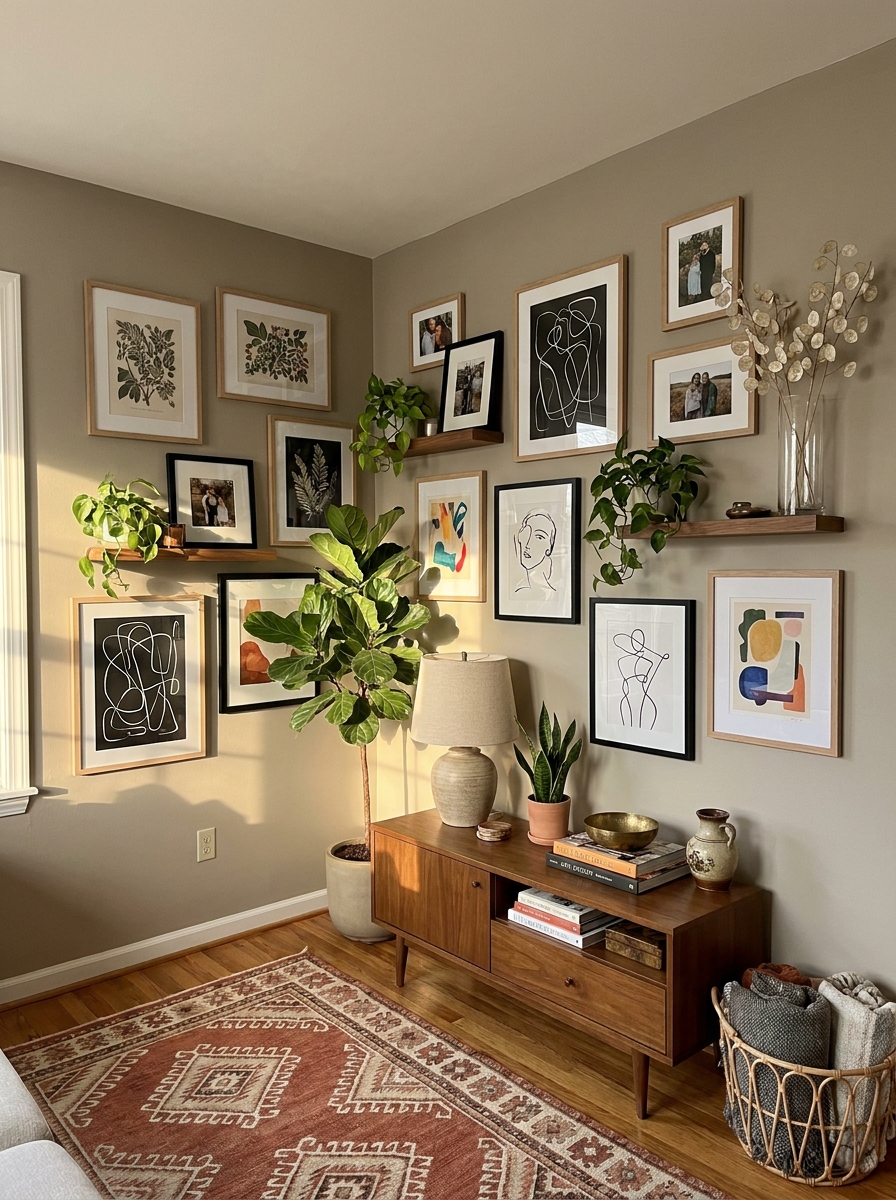
Here’s a fun challenge: taking your gallery wall around a corner! This works beautifully in living rooms or at the top of staircases where two walls meet.
The trick is treating the corner as the anchor point. I like placing a medium-sized square or rectangular piece right at the corner intersection, then letting the gallery flow naturally onto both walls. It creates this really cool wrap-around effect that draws your eye through the space. You can go symmetrical (mirroring similar arrangements on each wall) or asymmetrical for a more relaxed, collected-over-time vibe.
This approach is perfect for odd architectural spaces that feel tricky to decorate. Instead of fighting the corner, you’re celebrating it! Mix your frame finishes—natural wood frames create warmth against greige walls, while the variety keeps things interesting as you turn the corner. It’s like your art is giving the room a big hug.
7. Stairway Gallery Wall That Follows the Angle
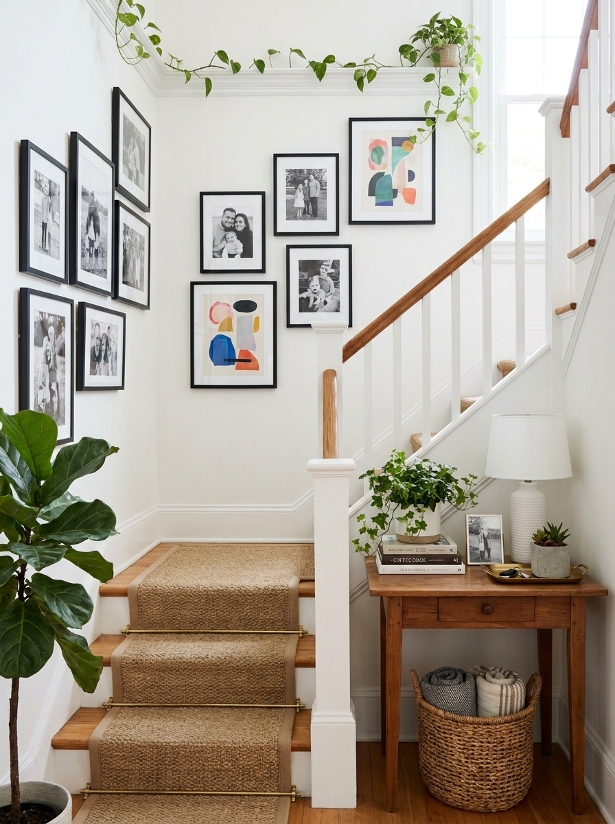
Stairway walls are some of the most underused spaces in our homes. But a gallery wall that follows your staircase angle? That’s pure magic.
The key is following the line of your stairs, creating a diagonal flow that guides you up (or down). I always start at the bottom of the stairs and work my way up, keeping the bottom edge of each frame roughly parallel to the stair railing. It sounds complicated, but once you see it, it clicks. This arrangement naturally draws your eye upward and makes the whole stairway feel intentional and designed.
Mix frame sizes but keep a consistent style—maybe all black frames or all matching wood tones. The diagonal line already creates visual interest, so you don’t need wildly different frames fighting for attention. Family photos work beautifully here since you pass them multiple times a day. It’s like a timeline of your life climbing the stairs with you.
8. Dining Room Gallery Wall with Oversized Pieces
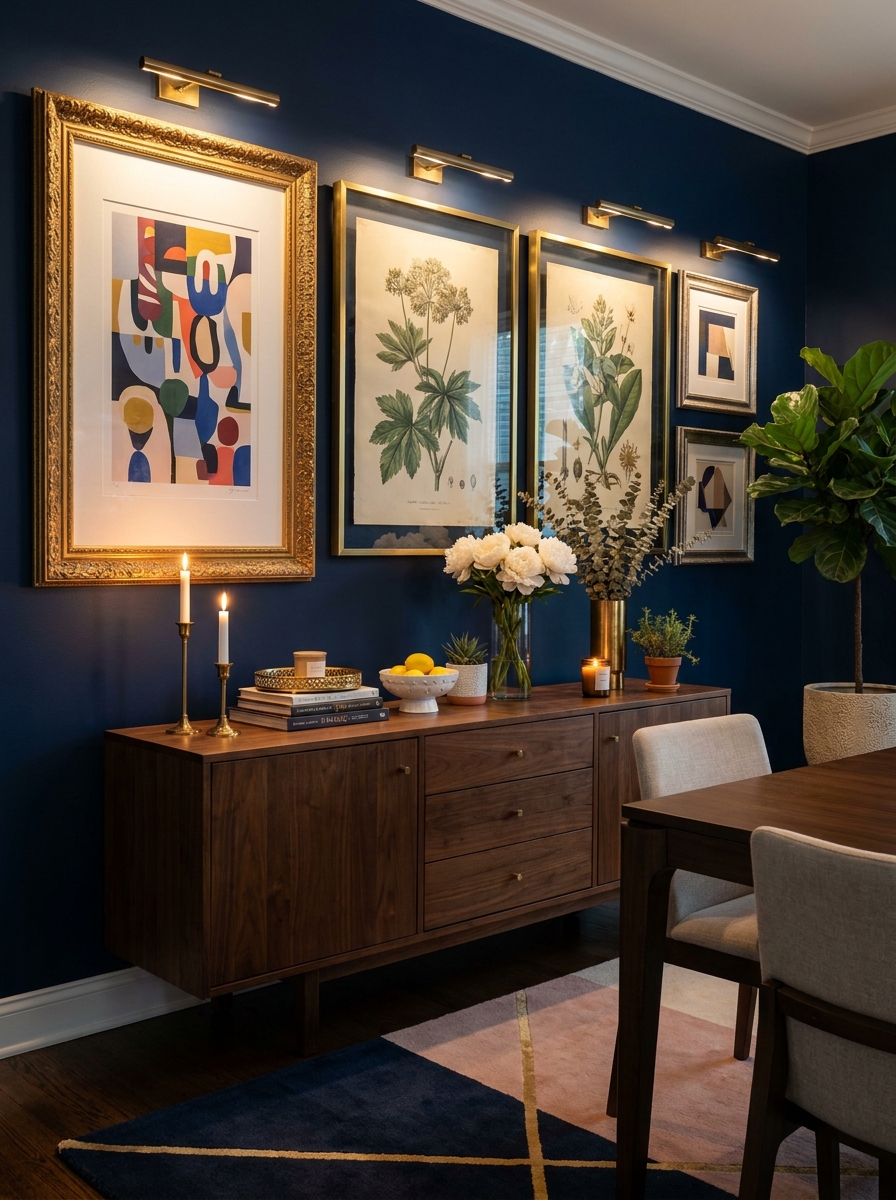
Your dining room is basically a captive audience situation—people sit there for meals, conversations, dinner parties. Why not give them something gorgeous to look at?
I’m obsessed with using larger-scale pieces in dining rooms. Think 24×36 inch prints or bigger. You can do a small gallery of just 3-5 oversized frames instead of tons of tiny ones. It feels more sophisticated and less busy, which is perfect when you’re already dealing with table settings and centerpieces. Mixed metallic frames against a navy accent wall create serious drama, especially in candlelight during dinner parties.
Go bold with your art choices here! Oversized food photography, vintage botanical prints, abstract pieces in your room’s color palette—this is where you can have fun. The dining room isn’t an everyday hangout space for most of us, so it can handle more personality and visual punch than, say, your bedroom.
9. Ledge and Frame Combo Gallery Wall
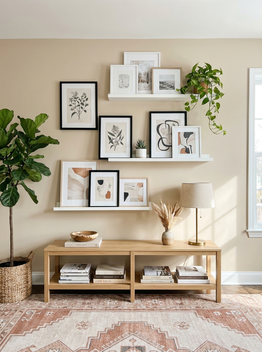
This is for everyone who hates commitment! Picture ledges mixed with permanently hung frames give you the best of both worlds. You can rotate art seasonally without creating new nail holes, and it adds beautiful dimension to your wall.
I mount two or three floating picture ledges at different heights, then fill in the spaces between and around them with traditionally hung frames. The ledges hold smaller pieces you can swap out whenever the mood strikes, while the hung frames anchor the whole arrangement.
The layered look is so good. Lean a large frame against the wall on a ledge, then prop a smaller piece in front of it. Add a tiny plant or decorative object, and suddenly your gallery wall feels collected over time instead of installed in one afternoon. It’s casual and sophisticated at the same time, which is my favorite vibe.
10. Black and White Photography Gallery Wall
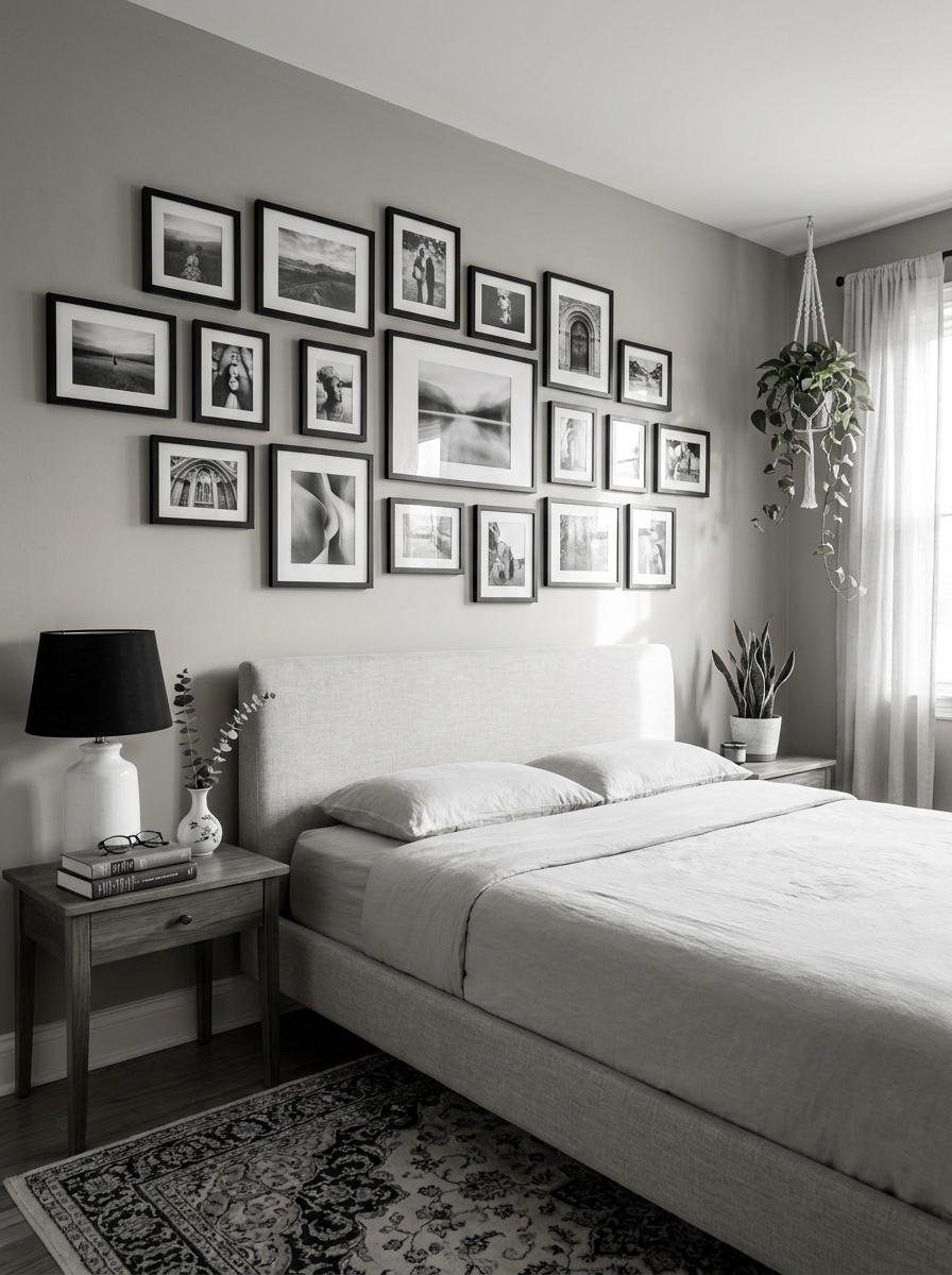
There’s something timeless about a gallery wall of all black and white photos. It instantly makes any room feel more sophisticated, more pulled together, more “I definitely have my life figured out” even if you absolutely don’t.
The beauty of going monochrome is that everything automatically coordinates. You don’t have to worry about colors clashing or one piece feeling out of place. Family photos, vintage finds, modern abstracts, travel shots—they all play nicely together when they’re black and white. I love mixing personal photos with art prints for a gallery that tells your actual story.
Frame choice matters here more than anywhere else. I usually stick with identical black frames in varying sizes for a cohesive look, but mixing in a few thin metal frames adds just enough visual interest without breaking the sophisticated vibe. It’s classic without feeling stuffy.
11. Colorful Abstract Art Gallery Wall for Bold Rooms
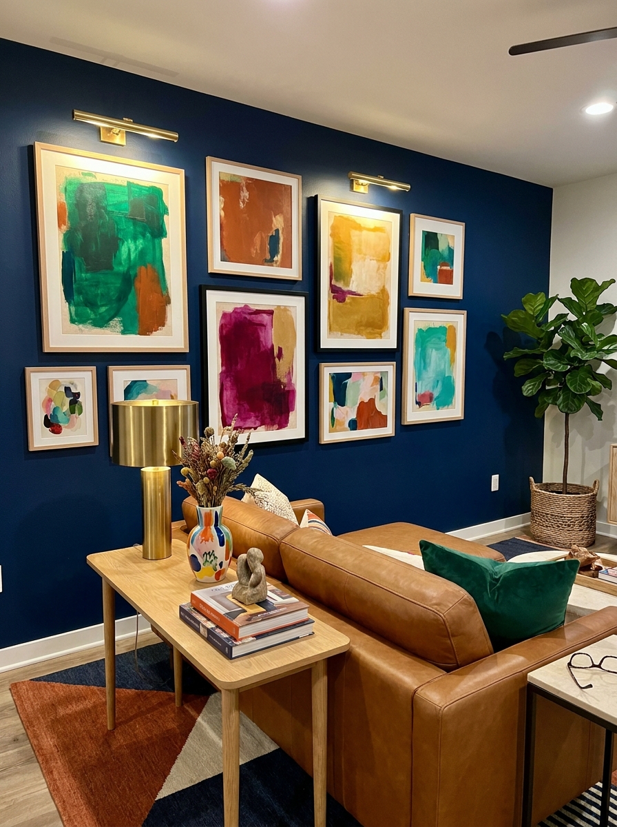
If you love color like I do, this one’s for you! A gallery wall of vibrant abstract art completely transforms a room’s energy. It’s like hanging joy and personality directly on your wall, and it makes neutrals everywhere else feel intentional instead of boring.
I choose pieces with a connecting thread—maybe they all share one accent color, or they’re all done in a similar style even if the colors vary. This keeps the wall from looking chaotic. Warm-toned abstracts create a cozy vibe, while cool blues and greens feel fresh and calming. Don’t overthink matching your art to your throw pillows though. Let the art be the statement.
The frames should fade into the background here. Simple wood or thin black frames let those gorgeous colors take center stage without competing for attention. And spacing! Give each piece a little breathing room so your eye can appreciate the individual artwork before taking in the whole collection.
12. Gallery Wall Inside Built-In Shelving or Bookcase
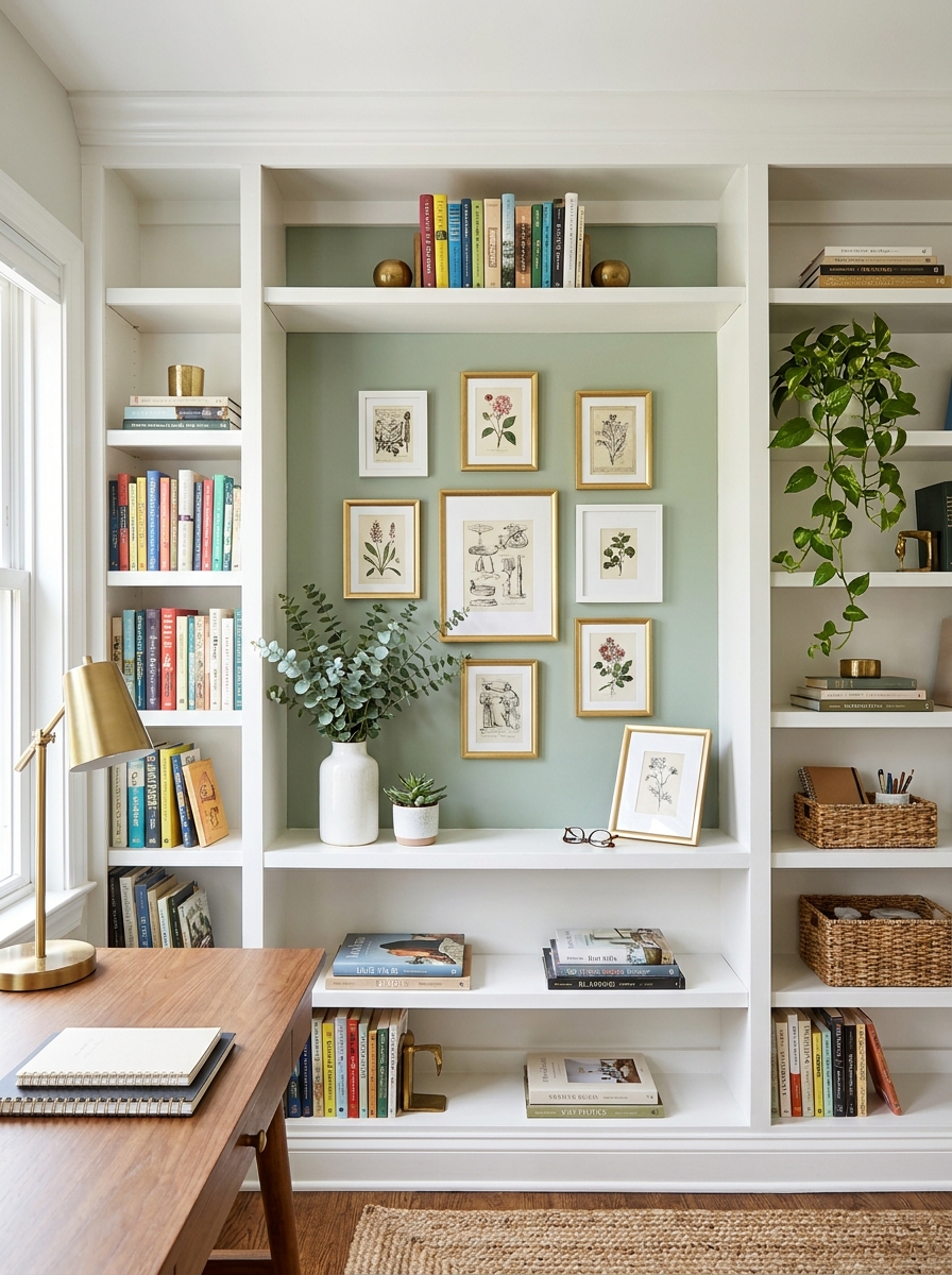
This is such an unexpected twist! Instead of covering an entire blank wall, create a mini gallery wall on the back panel of your built-in shelves or bookcase. It turns boring beige backing into a curated focal point and makes your shelving feel so much more custom and designed.
I like to paint the back panel a contrasting color first—deep green, warm terracotta, or even black—then hang small to medium frames right over it. Mix the framed art with your regular shelf styling, letting books and decorative objects interact with the gallery. Some frames can even lean on the shelves instead of hanging, which adds that casual collected vibe.
This works especially well in home offices, dining rooms, or living rooms where you already have built-ins. It’s like getting a gallery wall and functional storage in the same footprint. Plus, the frames add visual interest at eye level where you need it most.
13. Gallery Wall Around the TV (Yes, Really!)
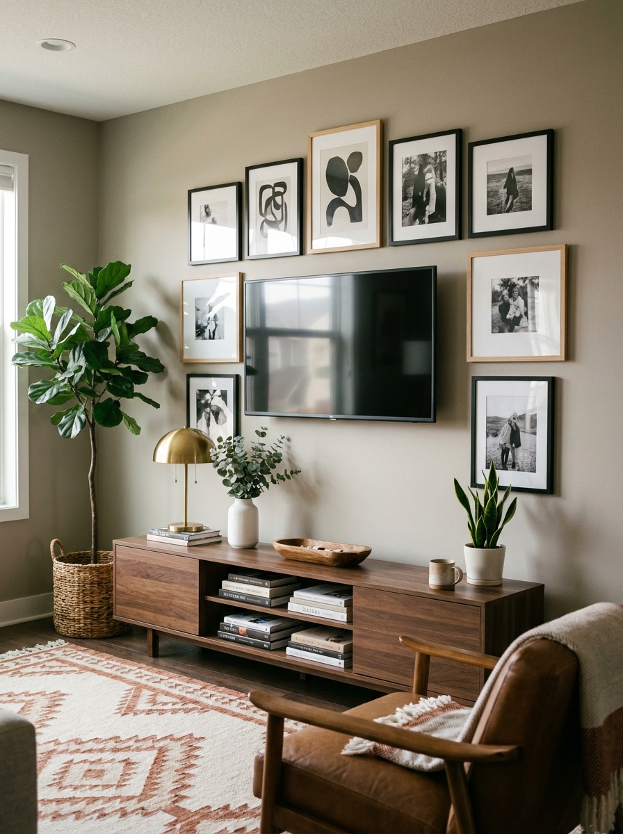
I know what you’re thinking—a gallery wall around the TV sounds chaotic. But hear me out! When done right, it actually makes that big black screen feel intentional instead of awkward.
The trick is treating your TV like it’s just another frame in the arrangement. Surround it with art pieces that are similar in size or slightly smaller, so the TV doesn’t look like a giant hole in your wall. I love mixing in a few sculptural pieces or small shelves to break up all the flat frames.
This works especially well in living rooms where the TV is your focal point anyway. Instead of trying to hide it or make it disappear, you’re embracing it and making the whole wall feel curated and intentional. It’s like saying, “Yes, we watch TV here, and we also love beautiful things.” The gallery wall gives your eye somewhere else to land when the screen is off.
14. Tiny Gallery Wall in Unexpected Spaces
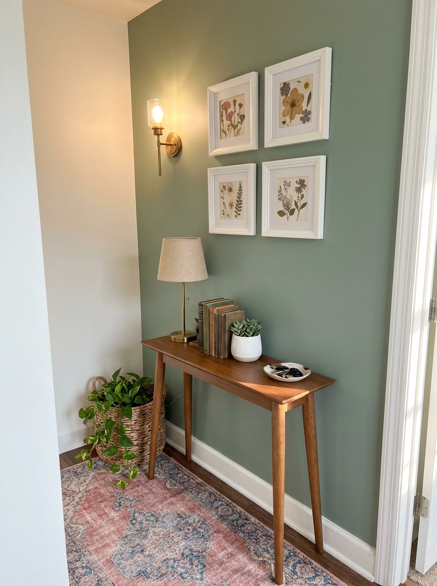
Who says gallery walls need to be massive? Some of my favorite gallery moments happen in the tiniest, most unexpected spots. I’m talking about that weird wall space next to your bathroom door, the narrow strip between two windows, or that awkward nook by the kitchen.
A mini gallery wall with just 3-5 small frames can make these forgotten spaces feel special and intentional. It’s like a little surprise when you walk by—a moment of beauty where you didn’t expect it. I love using these tiny galleries for really personal stuff: vintage family photos, small watercolor paintings, or even framed postcards from trips.
These mini moments don’t need to match your big living room gallery. They can have their own personality. Maybe it’s all vintage botanical prints in your powder room, or a collection of black-and-white concert posters in the hallway. Small doesn’t mean boring!
15. Nature-Themed Gallery Wall with Pressed Botanicals
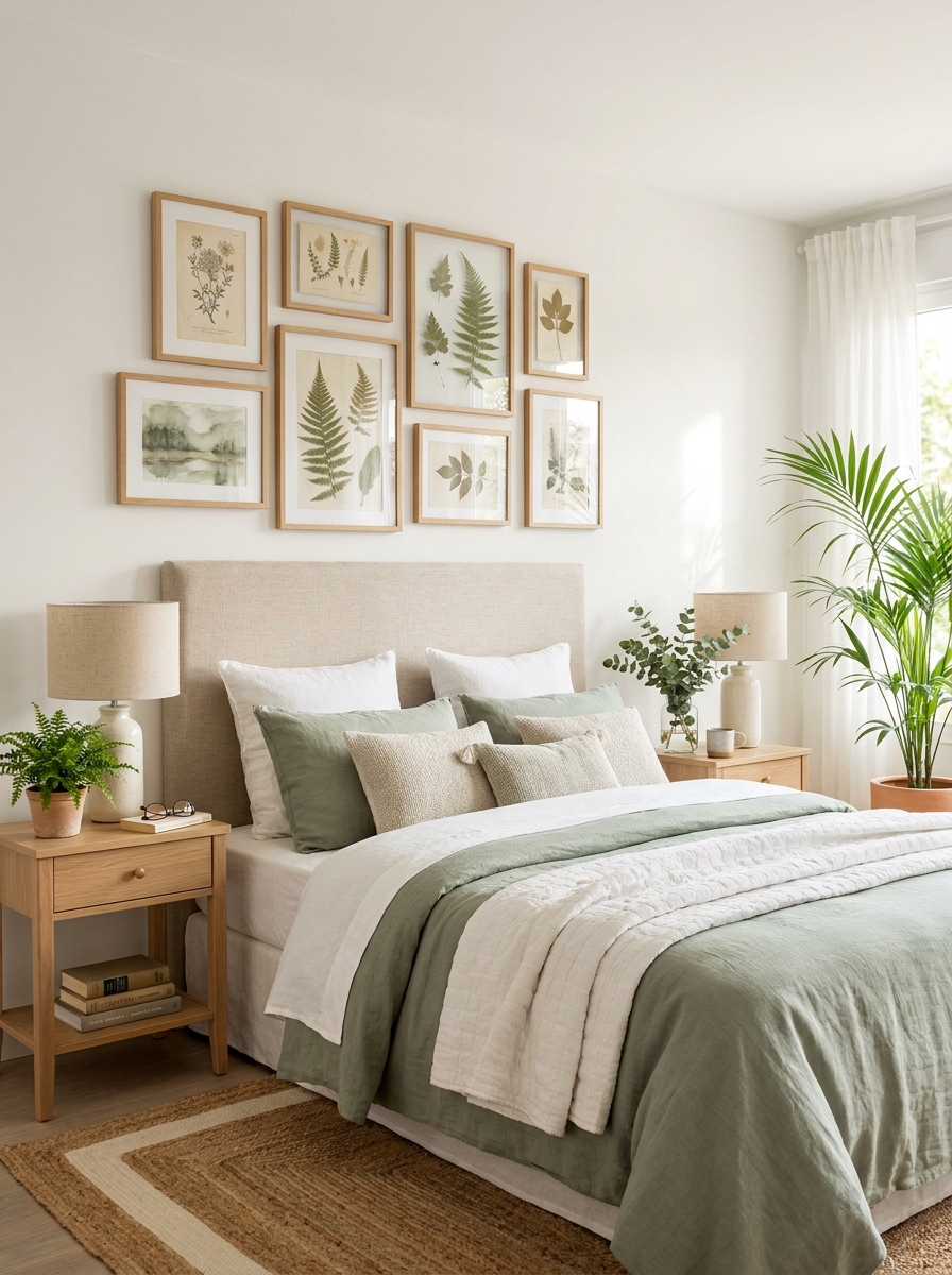
There’s something so peaceful about a gallery wall filled with botanical prints, pressed flowers, and nature photography. It brings the outdoors in and creates this calm, collected vibe that works in literally any room.
I’m obsessed with mixing real pressed botanicals in clear frames with vintage botanical illustrations and modern leaf photography. The combination of old and new, real and printed, makes the whole thing feel like a curated collection you’ve gathered over time. Use lots of white matting to give each piece breathing room—it makes everything feel light and airy.
This style works beautifully in bedrooms where you want a serene vibe, or in dining rooms where you want something elegant but not too formal. The muted greens, soft browns, and cream tones create a palette that’s sophisticated without being stuffy. It’s nature-lover chic.
16. Kids’ Art Gallery Wall That Actually Looks Good
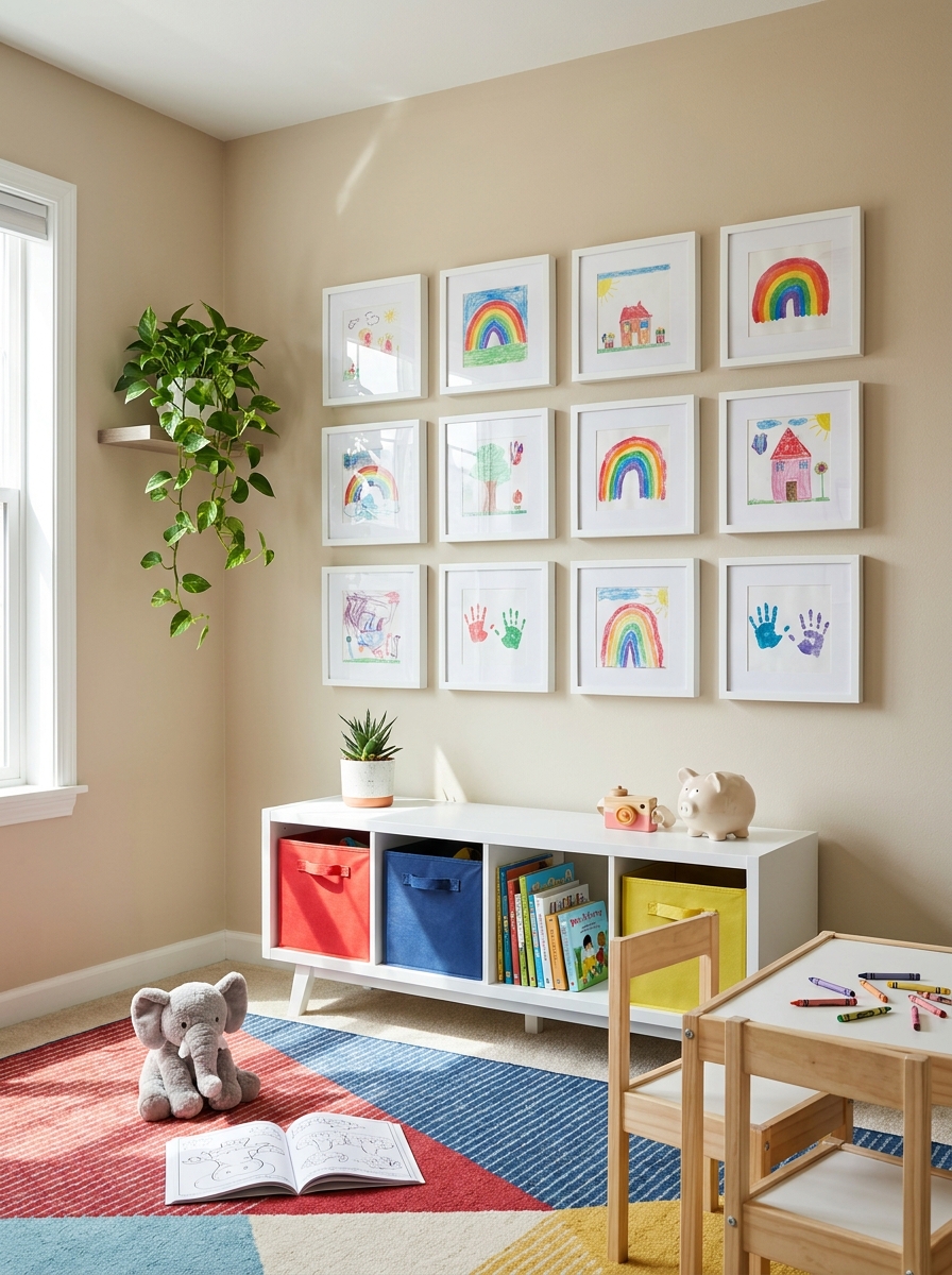
Let’s be honest—most kids’ artwork displays look chaotic. But you can absolutely create a gallery wall that showcases your little one’s masterpieces without your home looking like a preschool classroom. The secret? Matching frames and a structured layout.
I love using all identical frames (like simple black or white) and swapping out the artwork inside as new pieces come home. Mount them in a clean grid pattern, and suddenly those finger paintings and crayon drawings look like legitimate modern art. Because honestly? Kids’ art is often more interesting than half the stuff we buy at HomeGoods.
This works especially well in playrooms, kids’ bedrooms, or even a hallway leading to their rooms. It makes kids feel proud and seen, and it gives you a system for dealing with the never-ending pile of school projects. Win-win!
17. Vintage Frame Mix with Thrifted Finds
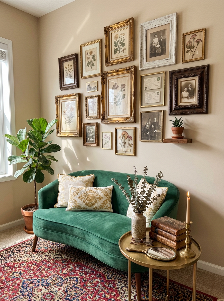
There’s something magical about a gallery wall built entirely from vintage frames you’ve hunted down over time. Flea markets, estate sales, grandma’s attic—each frame tells its own story before it ever holds your art.
I love mixing ornate gold frames with simple wood ones, chunky carved pieces with delicate filigree. The mismatched charm is the whole point. You’re not going for matchy-matchy perfection here. You’re creating a collected-over-years vibe that feels authentic and personal. Fill them with vintage portraits, old postcards, pressed flowers, or even fabric swatches. The worn patina on the frames adds so much character that honestly, what’s inside almost doesn’t matter.
This approach takes patience, but that’s what makes it special. You can’t rush to Target and buy this look. Each piece gets added when you find it, and the wall evolves naturally. It’s like a visual diary of your treasure-hunting adventures, and guests will actually want to get close and study each unique frame.
18. Travel Memories Gallery Wall with Maps and Photos
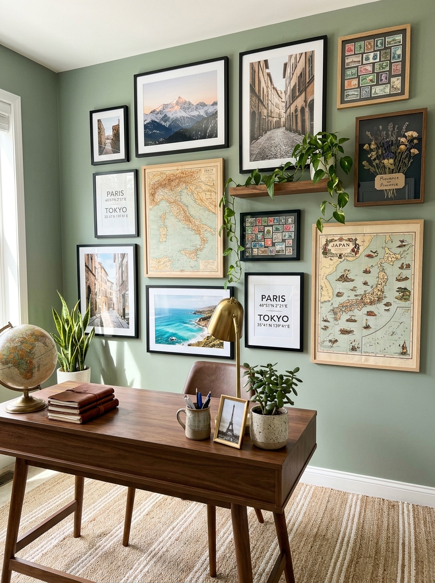
Turn your wanderlust into wall art! A travel-themed gallery is such a fun way to relive your favorite trips every single day. I’m talking vintage maps, postcard prints, your own travel photos printed large, maybe even a few ticket stubs framed under glass.
What makes this gallery special is the story it tells. Each piece connects to a specific memory—that cafe in Paris, the hike in Colorado, the beach in Thailand. You can organize it by destination, by color palette, or completely randomly. I like mixing actual photographs with map prints and typography art that says city names or coordinates. It feels adventurous and personal without being cheesy.
The key is printing your photos properly. Don’t just stick phone pics in frames—get them professionally printed in good quality so they look intentional. Mix sizes and frame styles, but keep a somewhat cohesive color scheme in the mats or frames so it doesn’t feel too chaotic. This is your travel resume on the wall, make it gorgeous.
19. Matching Frame Gallery in One Bold Color
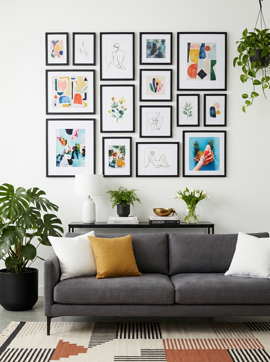
Sometimes the most striking gallery walls are the simplest ones. Same frame style, same color, different art inside. It’s clean, it’s cohesive, and it lets your art do all the talking without the frames competing for attention.
I especially love this approach with bold frame colors—think deep navy, forest green, or even glossy black. When every frame matches, your eye focuses on the arrangement and the artwork itself. You can mix art styles wildly—abstract next to photography next to illustration—and it still feels pulled together because of those identical frames. It’s like giving your art a uniform that makes them all part of the same team.
This is also the easiest gallery to execute if you’re not super confident about mixing and matching. You remove one variable (frame style) and suddenly the whole project feels less overwhelming. Just pick your frame color, buy a bunch in various sizes, and arrange away. Instant sophistication.
20. Oversized Single Statement with Smaller Satellites
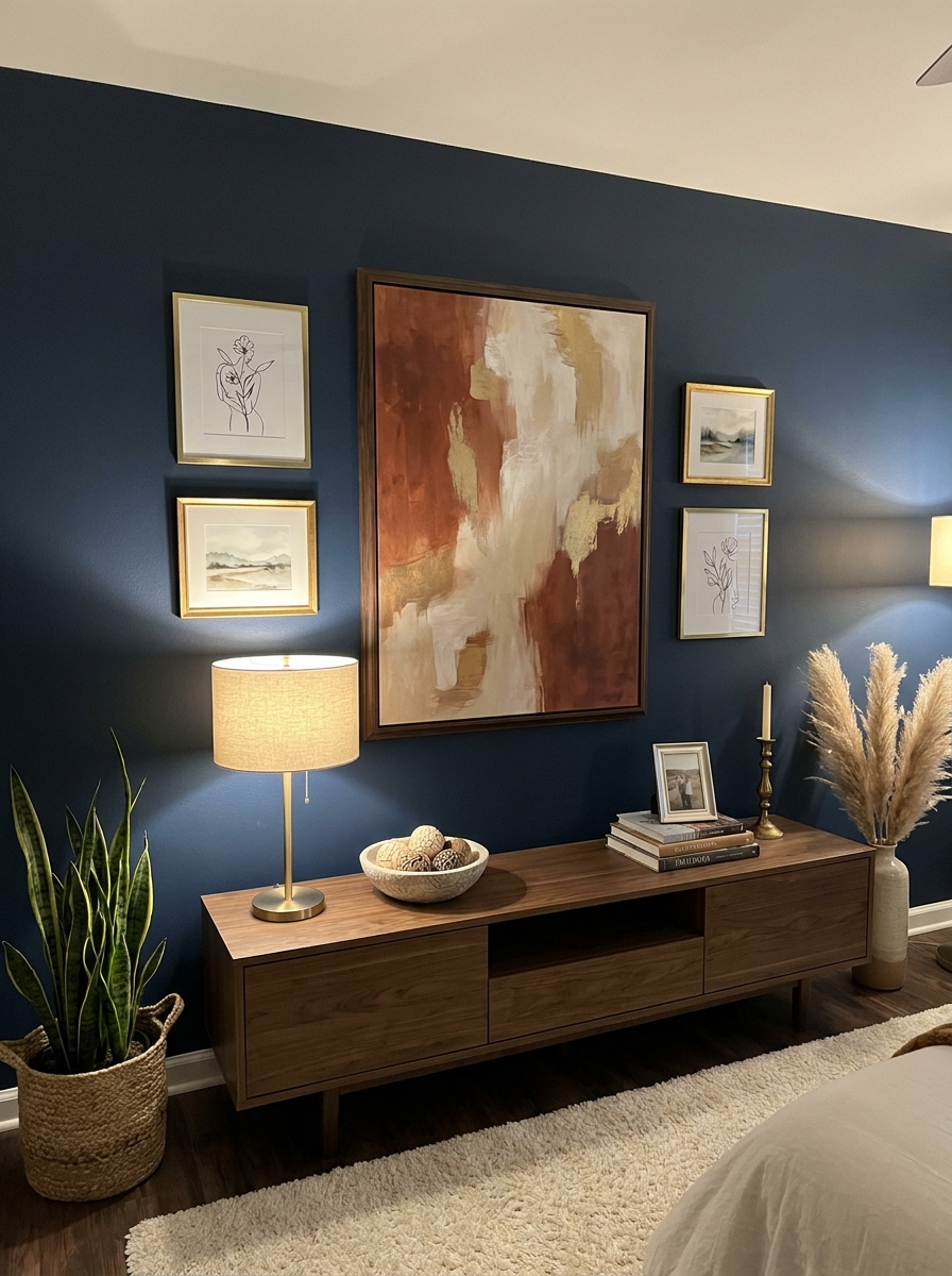
Not every gallery wall needs dozens of frames. Sometimes one big showstopper piece surrounded by a few smaller supporting players is all you need. This layout gives you drama without overwhelming the space—perfect for rooms where you want impact but not visual chaos.
Start with your hero piece—something large, bold, and eye-catching. Then cluster 3-5 smaller frames around it asymmetrically, like planets orbiting the sun. The big piece anchors everything and draws the eye first, while the smaller ones add interest and keep things from feeling too heavy or formal. I love this approach above a dresser or console where you want one strong focal point but still that layered gallery vibe.
The trick is making sure your big piece is really big—at least 24×36 or larger. If it’s too small, the whole thing looks unbalanced. And keep your satellite pieces quite a bit smaller so there’s clear hierarchy. You want one star, not five pieces competing for attention.
21. Monochromatic Gallery Wall for Calming Minimalism
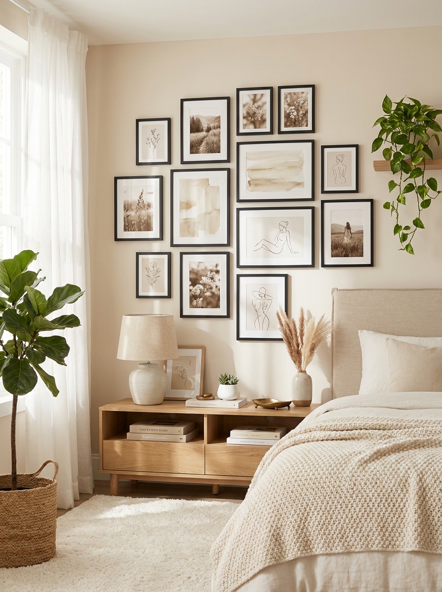
Sometimes the most powerful gallery walls whisper instead of shout. I’m obsessed with monochromatic galleries where every piece stays within the same color family—all warm browns and creams, or cool grays and blacks, or dreamy blues.
This approach creates such a soothing, cohesive look that feels intentional without being boring. You can mix photography, line drawings, watercolors, and prints as long as they all speak the same color language. It’s like giving your wall a uniform that somehow makes each individual piece stand out more, not less.
I love this style in bedrooms where you want calm vibes, or in living rooms that already have a lot going on with furniture and textiles. The restraint in color lets you play with different frame finishes—mixing matte black with warm brass or natural wood. Your eye moves smoothly across the whole arrangement instead of bouncing around. It feels grown-up and collected without being stuffy.
Quick Guide
## Quick Guide: Gallery Wall Hanging Essentials
Tools You Actually Need:
– Level (or use your phone’s level app)
– Measuring tape
– Painter’s tape or kraft paper for templates
– Pencil
– Hammer and picture hooks OR adhesive strips
– Command strips for renters or commitment-phobes
The Golden Rules:
1. Center of main frame should hit 57″ from floor
2. Keep 2-3″ spacing for grids, 1-2″ for salon style
3. Gallery width = 2/3 furniture width below it
4. Always lay it out on the floor first
5. Take a photo of your floor layout before hanging
Frame Shopping Tips:
Buy more than you think you need—you can always return extras. Mix frame depths for visual interest. Start with neutral frame colors (black, white, natural wood) that work with any art. Thrift stores and estate sales often have amazing vintage frames for a fraction of retail prices.
Your Walls Are Waiting for This
Here’s what I want you to remember: your gallery wall doesn’t need to be perfect to be beautiful. It doesn’t need to cost a fortune or feature original art from fancy galleries. What it needs is to feel like you—your memories, your style, your story told in frames and images that make you happy every time you walk past them.
Some of my favorite gallery walls include kids’ artwork next to vintage prints, or travel photos mixed with abstract pieces that just felt right. The beauty of this whole thing is that it’s never really finished. You can swap out pieces, add new frames, rearrange things when you get bored. It’s art, but it’s also deeply personal and totally flexible.
So grab those frames you’ve been hoarding, print out some of those photos sitting on your phone, or hit up that local art fair you’ve been meaning to visit. Your blank wall has been patient long enough. Start with one of these 21 ideas, trust your gut, and remember that even if you have to move a frame twice, you’re still creating something that’s entirely yours. That’s the whole point.
Frequently Asked Questions
What’s the best height to hang a gallery wall?
The center of your gallery wall (or the middle of your largest central piece) should sit at about 57 inches from the floor—that’s standard gallery height and roughly average eye level. If you’re hanging above furniture, leave 6-8 inches of space between the furniture top and the bottom frame. In hallways or spaces without furniture below, stick with that 57-inch guideline as your anchor point.
How do I plan a gallery wall layout without making tons of holes?
Cut out paper templates the exact size of each frame and tape them to the wall with painter’s tape. Arrange and rearrange until it looks right, then mark the hook placement with a pencil through the paper. Or lay everything out on the floor in your desired arrangement, take a photo, and measure the distances between frames to replicate on the wall. This saves you from the nail-hole nightmare.
Should all my gallery wall frames match?
Not necessarily! Matching frames create a cohesive, modern look (perfect for grids), while mixed frames give you that collected, salon-style vibe. If you go with mixed frames, keep one element consistent—like all black and white photos, or all warm-toned wood frames—so it looks intentional rather than random.
How far apart should I space frames in a gallery wall?
For grid-style galleries, keep 2-3 inches between frames for a clean, structured look. For salon-style or eclectic arrangements, you can go tighter—1-2 inches apart—which actually makes the collection feel more curated and intentional. Just keep the spacing consistent throughout whatever style you choose.
Can I create a gallery wall as a renter without damaging walls?
Absolutely! Use Command picture hanging strips rated for your frame weight—they hold surprisingly well and remove cleanly. For heavier pieces, try multiple strips or adhesive hooks. Another renter-friendly option is leaning larger frames on a ledge or console and building your gallery on floating shelves instead of directly on the wall.