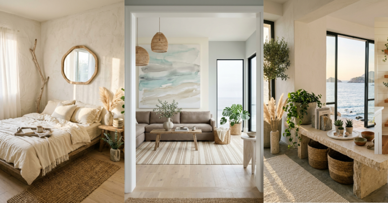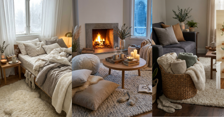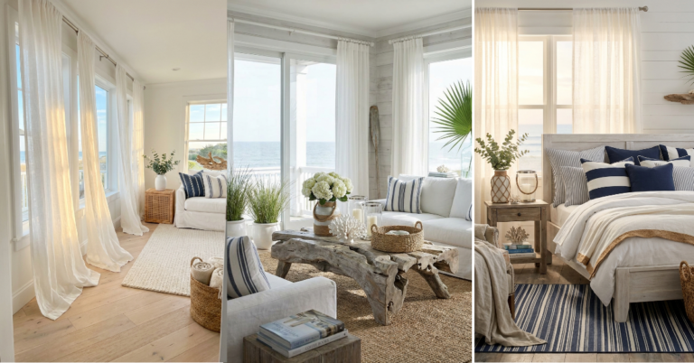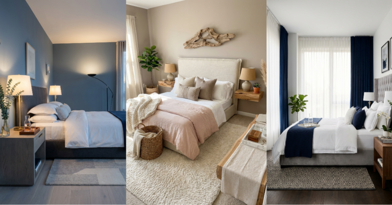
15 Calming Bedroom Paint Colors That Transform Sleep Spaces
You know that feeling when you walk into a hotel room and instantly exhale? That’s what the right paint color can do for your bedroom. It’s not about trends or what looks good in someone else’s house. It’s about finding that one shade that makes your shoulders drop and your brain quiet down after a long day. I’ve tested more paint samples than I care to admit, and I’ve learned that calming doesn’t mean boring. Some of the most beautiful bedrooms I’ve seen use color in surprising ways. Soft doesn’t always mean beige. Tranquil can be blue, green, or even a whisper of purple. The trick is understanding undertones and how light plays with color throughout the day. And honestly? The right paint color might be the easiest transformation you’ll ever make. Here’s what actually works.
1. Whisper White with Warm Undertones
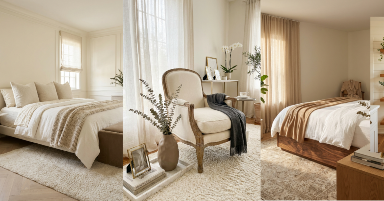
True white can feel cold and clinical in a bedroom, but a white with just a hint of warmth? That’s where the magic happens. These creamy whites have the tiniest touch of yellow or beige that makes them feel soft instead of stark. They reflect light beautifully during the day and create a cozy glow at night when your bedside lamp is on.
I love how these shades work with literally everything. Your navy duvet? Perfect. That thrifted oak dresser? Suddenly looks expensive. And if you’re someone who changes your bedding seasonally, you’ll never have to worry about clashing. The beauty is in the subtlety. Most people can’t even tell it’s not pure white, but they always comment on how peaceful your room feels.
These whites also make small bedrooms feel bigger without that sterile hospital vibe. They’re forgiving with imperfect walls too, which is a bonus if you’re in an older home. The warmth keeps the space from feeling cold even on cloudy days.
2. Soft Sage Green for Natural Calm
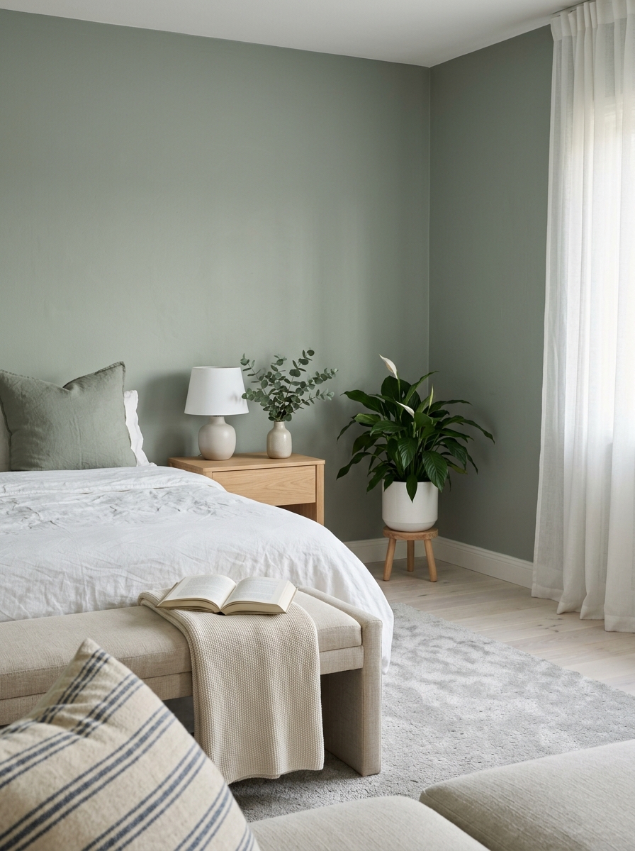
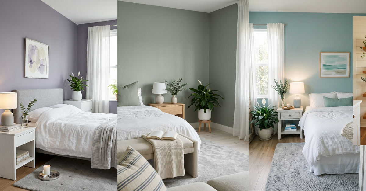
There’s something about sage that just works in a bedroom. It’s nature-inspired without being too literal, and it has this incredible ability to feel both fresh and calming at the same time. The gray undertones keep it sophisticated instead of nursery-cute. I’ve noticed that sage green has staying power too—it doesn’t feel trendy even though it’s having a moment right now.
This color plays beautifully with natural materials. Think linen bedding, rattan furniture, and plenty of plants. It creates this organic, spa-like vibe that makes you want to spend Sunday mornings in bed with coffee and a book. And it photographs incredibly well if you’re into sharing your space on Instagram.
One thing I love about sage is how it adapts to different lighting. In bright morning light, it feels energizing and fresh. By evening, it takes on a softer, more muted quality that’s genuinely soothing. It’s also surprisingly versatile with accent colors—works with everything from terracotta to navy to blush pink.
3. Pale Blue-Gray for Airy Serenity
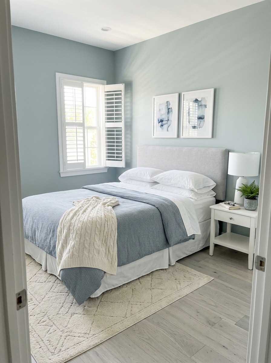
Blue-gray is that perfect in-between shade that can’t decide if it’s blue or gray, and honestly, that’s its superpower. These colors have a breezy, coastal quality without screaming “beach house.” They make your bedroom feel like a breath of fresh air, literally. There’s science behind why blue tones help us relax—they lower blood pressure and slow breathing.
What I appreciate most about these shades is their chameleon nature. They shift throughout the day in the most beautiful way. Morning light brings out the blue, making the room feel crisp and awake. Evening light emphasizes the gray, creating a cozy cocoon. It’s like having two different rooms in one.
This color family also has incredible range. You can go super pale and almost-white, or choose something with a bit more presence. Either way, you’re getting that calm, collected vibe. And if you’re worried about it feeling cold, just layer in warm wood tones and soft textiles. Problem solved.
4. Warm Greige for Versatile Comfort
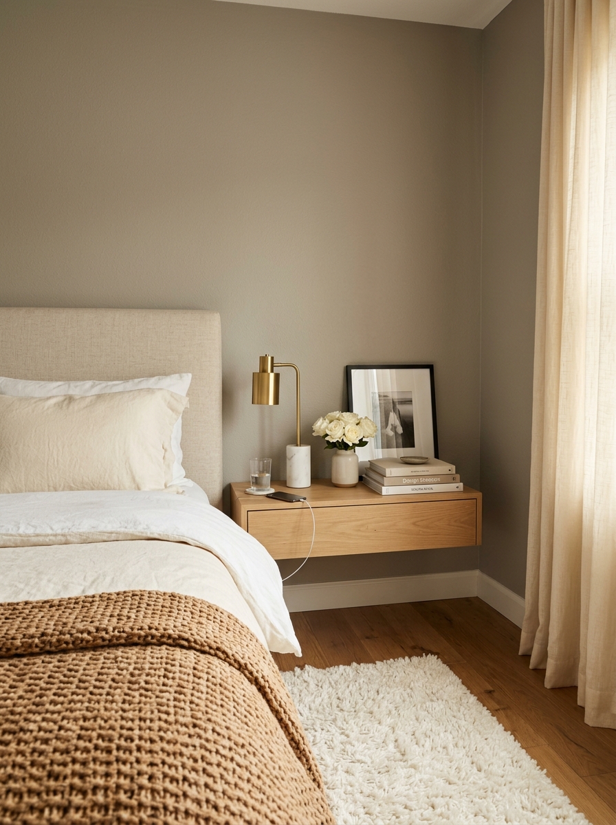
Greige gets a bad rap for being boring, but hear me out. The right greige is anything but basic. It’s the chameleon of paint colors, working with warm and cool tones equally well. This is the color for people who want calm but can’t commit to something as stark as white or as bold as a true color. There’s comfort in its neutrality.
The magic of greige is in the balance. Too much gray and your room feels cold. Too much beige and it can read dated. But when you find that sweet spot? It’s perfection. These shades create the most peaceful backdrop for layering textures and colors. Your bedroom becomes this cozy envelope that wraps around you.
I especially love greige for rooms that don’t get tons of natural light. It adds warmth without going yellow or dingy. And it’s incredibly forgiving when it comes to furniture mixing. That hand-me-down dresser and your new modern nightstands? They’ll suddenly look like they were always meant to be together.
5. Dusty Lavender for Gentle Sophistication
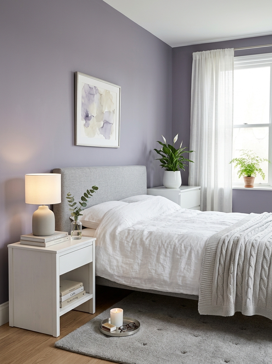
Okay, hear me out on this one. Dusty lavender sounds fancy, but it’s actually one of the most calming colors I’ve ever slept in. We’re not talking bright purple here—think faded wildflowers or the softest watercolor wash. It’s got this dreamy, almost-gray quality that keeps it from feeling too sweet or childish.
What I love about dusty lavender is how it changes throughout the day. Morning light makes it feel fresh and airy, while evening lamplight brings out these warm, cozy undertones that make you want to curl up with a book. It pairs beautifully with dove gray linens and crisp white trim—suddenly your bedroom feels like a boutique hotel.
This color is perfect if you want something a little more interesting than beige but still incredibly soothing. It’s sophisticated without trying too hard, and it makes every other color in the room look more expensive. Plus, it photographs like a dream if you’re into that sort of thing.
6. Pale Seafoam for Coastal Tranquility
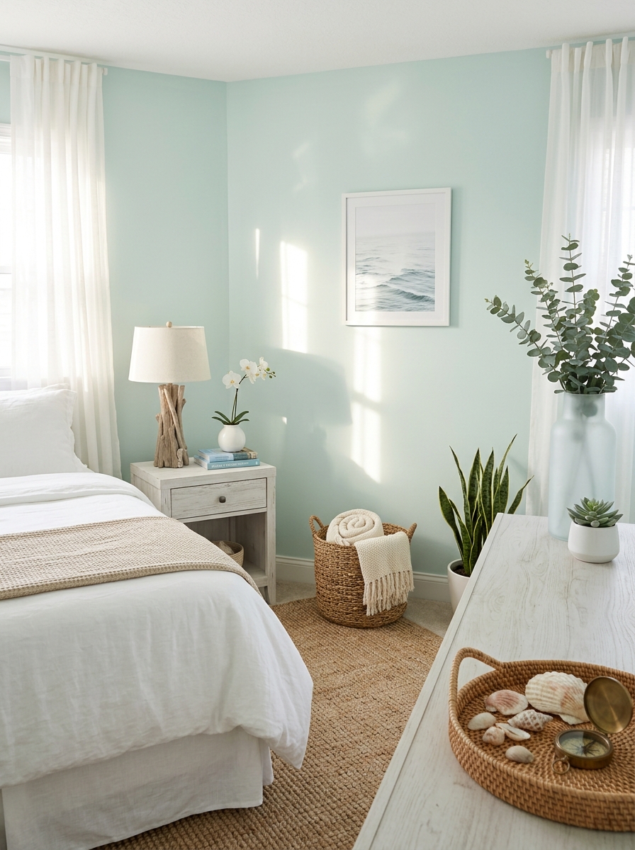
If you’ve ever woken up by the ocean and felt instantly relaxed, that’s the feeling pale seafoam brings to your bedroom. It’s that perfect soft green-blue that reminds you of shallow tropical waters—minus the sand in your sheets. This color literally makes me breathe deeper just looking at it.
The magic of pale seafoam is how incredibly versatile it is. It works with almost every decorating style, from coastal casual to modern minimalist. Pair it with natural textures like jute and linen, and you’ve got a beachy retreat. Add crisp whites and weathered wood, and it feels fresh and clean without being cold.
What really sold me on this color was how forgiving it is with lighting. North-facing room? It stays soft and gentle. Lots of windows? It glows without getting washed out. It’s one of those rare colors that actually delivers on the promise of being calming—your bedroom will feel like a permanent vacation.
7. Warm Taupe for Grounded Elegance
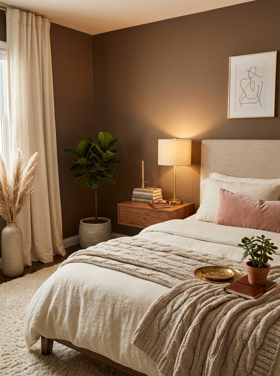
Taupe gets a bad rap for being boring, but warm taupe? That’s a whole different story. This is the color that makes your bedroom feel like a luxury hotel—sophisticated, grounded, and wrapped-in-cashmere cozy. It’s got these beautiful brown undertones that make everything feel warmer and more inviting than regular gray ever could.
I’m obsessed with how warm taupe creates this cocooning effect without making the room feel dark or small. It’s neutral enough to work with literally any accent color you throw at it, but interesting enough that your walls don’t just disappear. Pair it with ivory bedding and you’ve got instant elegance. Add some blush pillows and brass accents? Chef’s kiss.
The real genius of warm taupe is how timeless it is. You won’t get sick of it in six months like you might with trendier colors. It’s that perfect middle ground between too boring and too bold—just right for a space where you want to feel calm and settled every single night.
8. Soft Ivory with Gray Undertones
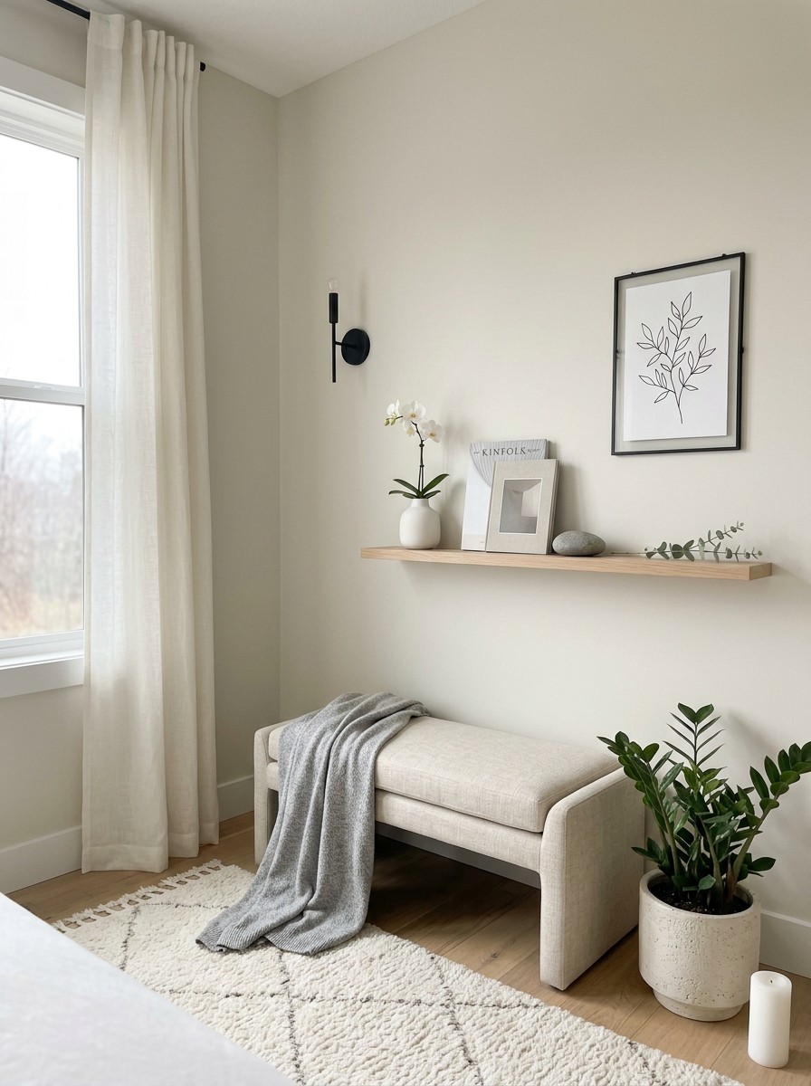
This is the color for people who think they want white walls but actually need something with way more depth. Soft ivory with gray undertones is like the smartest person in the room—quietly sophisticated without showing off. It’s warmer than stark white but cooler than cream, hitting that sweet spot that makes everything in your bedroom look more expensive.
What makes this color absolutely magical is how it reflects light. It brightens your space without that harsh, sterile feeling pure white can have. The subtle gray undertones keep it from going yellow or dingy, which is honestly a game-changer if you’ve ever painted a room cream and regretted it when the lighting changed.
I love using this color when you want a true blank canvas but still want your walls to feel intentional. It works with literally every design style and color scheme—from moody and dramatic to light and airy. Your furniture pops, your art stands out, and you still get that serene, peaceful bedroom vibe. It’s basically the little black dress of paint colors.
9. Blush Beige for Cozy Warmth
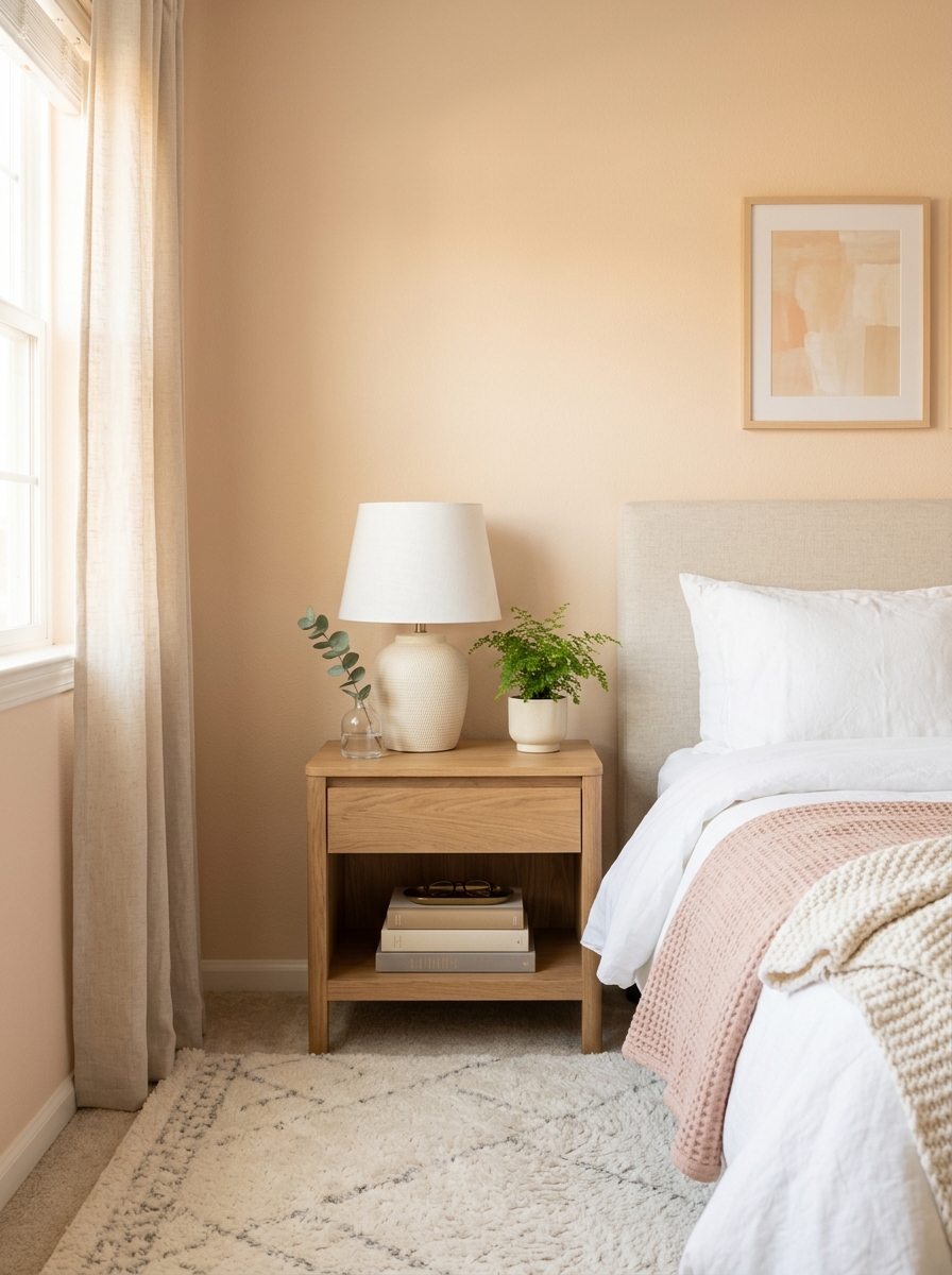
There’s something about blush beige that feels like a gentle hug. It’s not quite pink, not quite tan—it sits right in that sweet spot where warmth meets subtlety. This color wraps your bedroom in the softest glow, especially when natural light hits it throughout the day.
What I love most is how it plays with different lighting. Morning sun brings out those peachy undertones that feel energizing but never jarring. By evening, it settles into a creamy, almost buttery warmth that makes you want to climb into bed immediately. It’s incredibly forgiving too—works beautifully whether your style leans modern or traditional.
This shade is perfect if you want your bedroom to feel intimate without being dark. It pairs like a dream with white bedding, natural wood furniture, and those gorgeous brass or gold accents. I’ve seen it look stunning with both cool-toned grays and warm terracotta accessories. It’s one of those colors that makes everything else in your room look better and more pulled-together.
10. Pale Dove Gray for Modern Tranquility
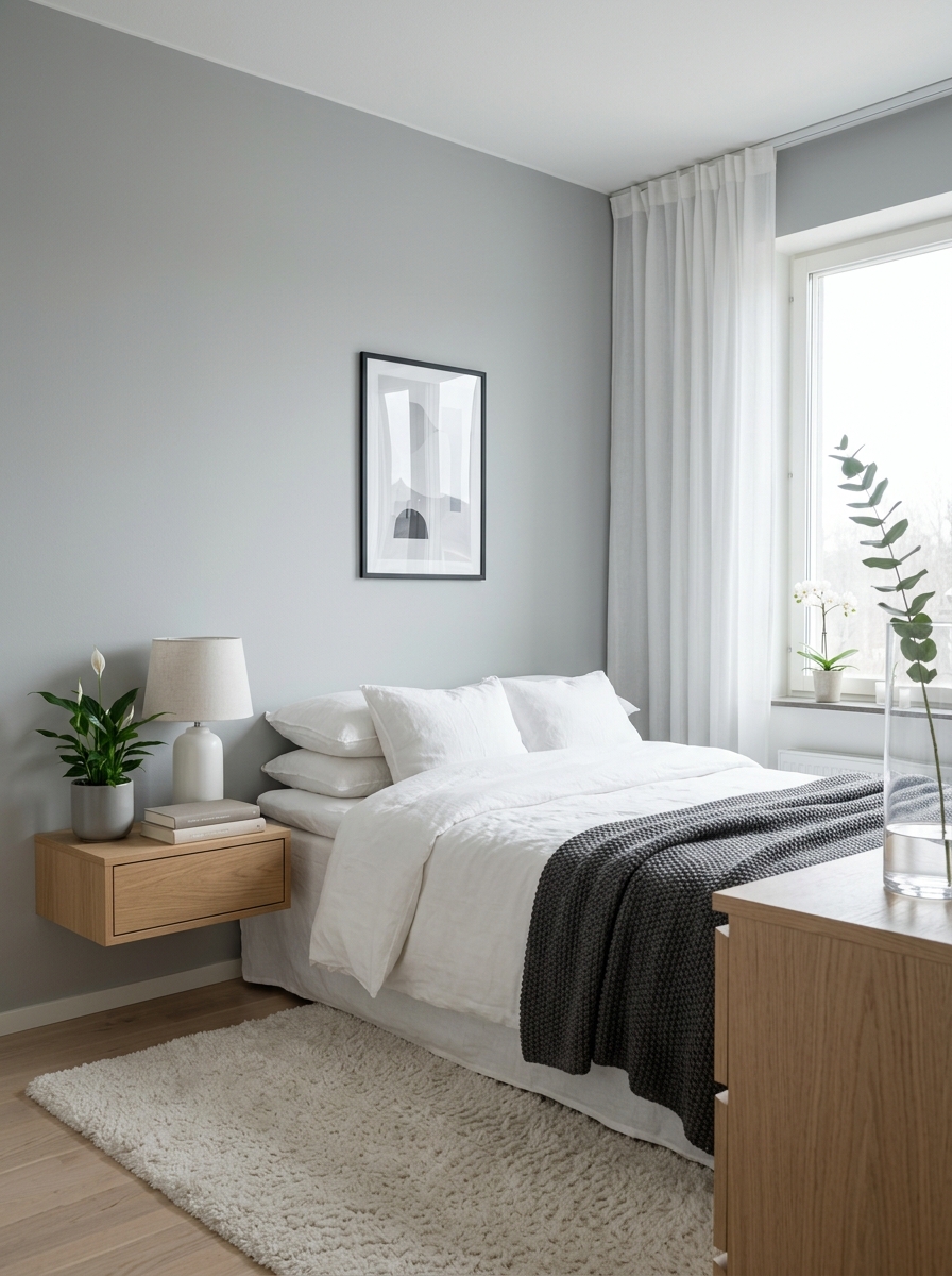
Dove gray is having such a moment right now, and honestly? I get it. This isn’t your grandmother’s gray—it’s softer, lighter, with just enough warmth to keep it from feeling cold or institutional. It creates this beautiful cocoon effect that’s both sophisticated and deeply calming.
The magic of pale dove gray is in its chameleon quality. In bright daylight, it reads almost silvery and ethereal. As the day softens, it takes on subtle blue or lavender undertones that shift the whole mood of your room. It’s like living inside a cloud, but make it chic. I especially love how it makes white bedding look crisp and hotel-luxe.
This color is a dream if you’re into that minimalist Scandi vibe but still want warmth. It plays incredibly well with natural textures—think chunky knit throws, linen everything, raw wood accents. And here’s the best part: it makes colorful accents pop without competing. Your blush pillow or that vintage blue chair suddenly becomes a statement piece against this serene backdrop.
11. Soft Butter Yellow for Gentle Cheerfulness
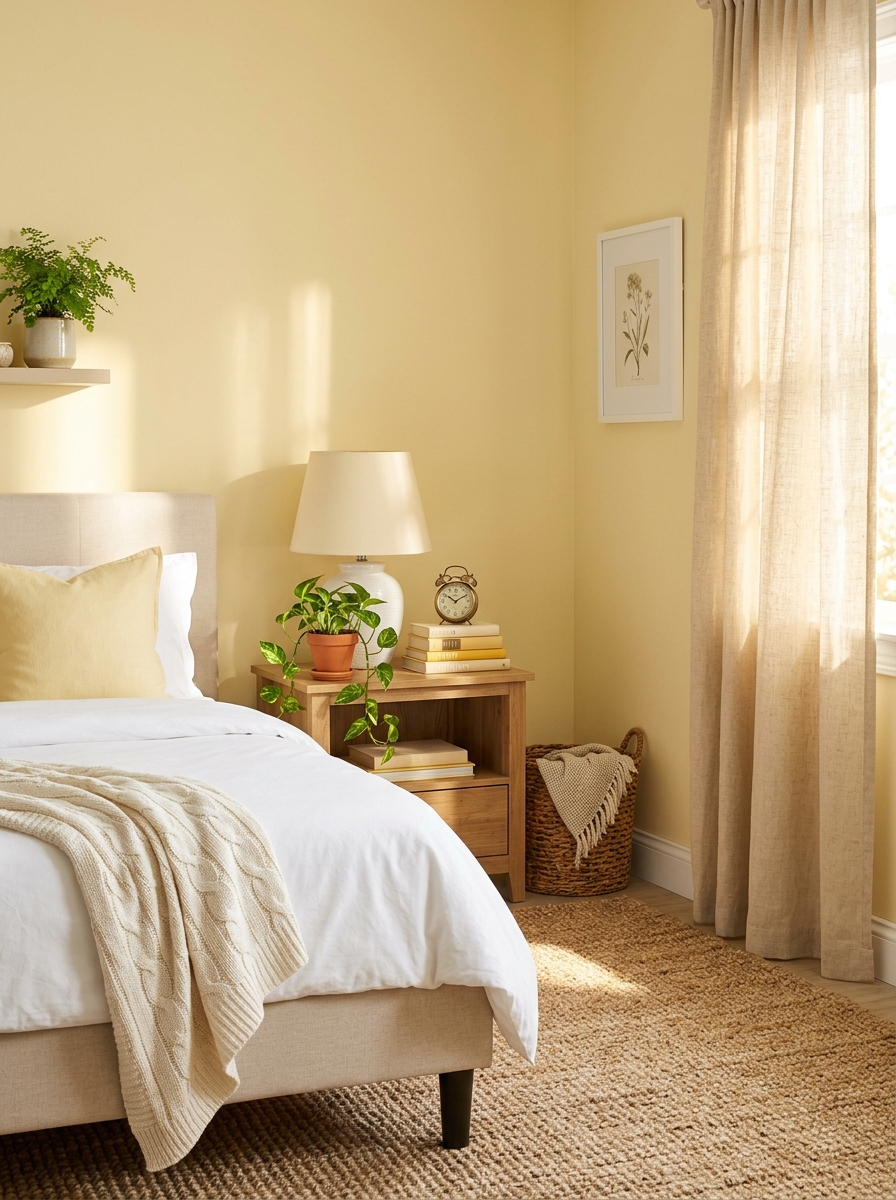
Okay, hear me out on soft butter yellow! I know yellow can be tricky, but when you go pale and creamy—almost like whipped butter—it transforms your bedroom into the happiest, most peaceful space. It’s sunshine without the intensity, warmth without being loud.
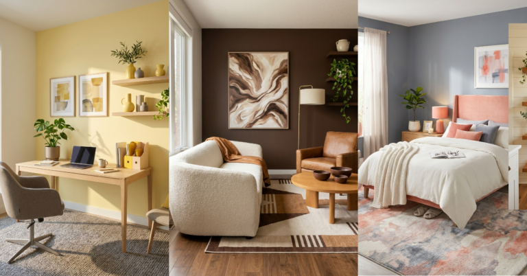
This color is absolute magic for rooms that don’t get tons of natural light. It brings its own glow, making even north-facing bedrooms feel brighter and more welcoming. In morning light, it’s fresh and energizing (perfect for those of us who struggle to wake up). By evening, it mellows into this buttery, candlelit warmth that feels incredibly cozy.
What surprised me most about soft butter yellow is how calming it actually is. You’d think yellow would be stimulating, but at this whisper-pale level, it’s more soothing than energizing. It pairs beautifully with white trim, natural jute rugs, and those earthy terracotta accessories. I love it with soft gray-blue accents too—the combination feels fresh and unexpected but totally harmonious.
12. Misty Blue-Green for Spa-Like Escape
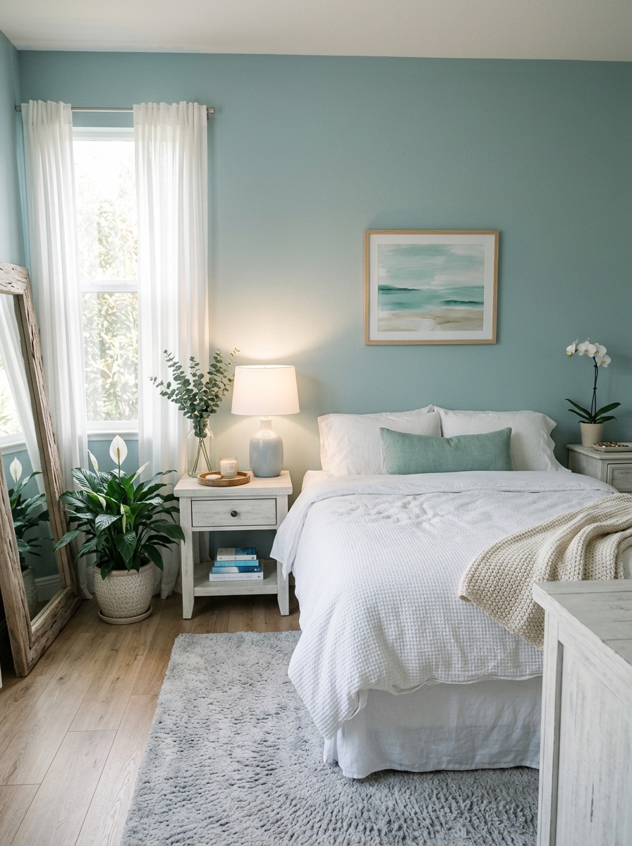
Misty blue-green is like bringing the calmest day at the ocean right into your bedroom. It’s that perfect in-between color—not quite teal, not quite gray—that makes you feel like you’re floating somewhere peaceful and faraway. Every time I see this color, I immediately think of spa days and deep breaths.
This shade has this incredible ability to make your bedroom feel cooler in summer and somehow still cozy in winter. The green undertones keep it from feeling too icy, while the blue notes prevent it from being too earthy. In natural light, it’s absolutely ethereal—almost like morning mist over water. With lamps on at night, it takes on a slightly deeper, more enveloping quality that’s perfect for winding down.
I’m obsessed with how this color works with both warm and cool accents. White bedding looks fresh and crisp against it. Natural wood adds that organic spa vibe. Even metallic accents—think brushed nickel or oil-rubbed bronze—look sophisticated and intentional. It’s one of those rare colors that genuinely makes you feel calmer the moment you walk in.
13. Soft Clay Rose for Earthy Romance
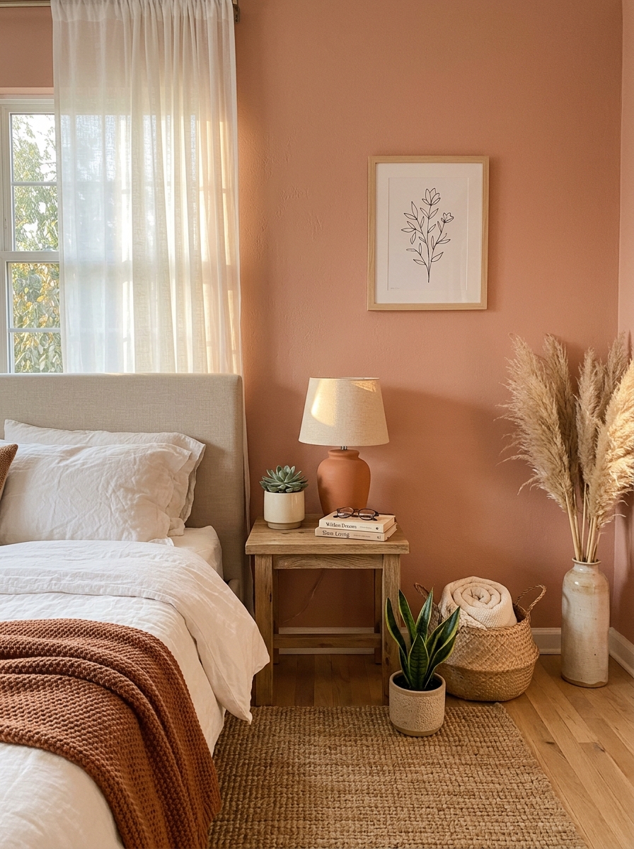
This isn’t your grandma’s dusty rose—it’s a sophisticated, muted terracotta-pink that feels incredibly grounding. I’m obsessed with how this color creates instant warmth without being too sweet or too bold. It’s like wrapping your bedroom in a sunset glow that never fades.
What I love most is how versatile clay rose is. It plays beautifully with natural textures like linen and jute, and it looks stunning against crisp white trim. The color has enough depth to feel cozy but stays soft enough to keep the space feeling open and breathable. It’s honestly one of those colors that photographs beautifully but feels even better in person.
This shade works magic in bedrooms with good natural light—it shifts from peachy-warm in morning sun to a deeper, more romantic tone in evening lamplight. If you’ve been scared of pink, this is your gateway color. It’s earthy, it’s sophisticated, and it makes your bedroom feel like a chic desert retreat.
14. Pale Oat for Soft Minimalism
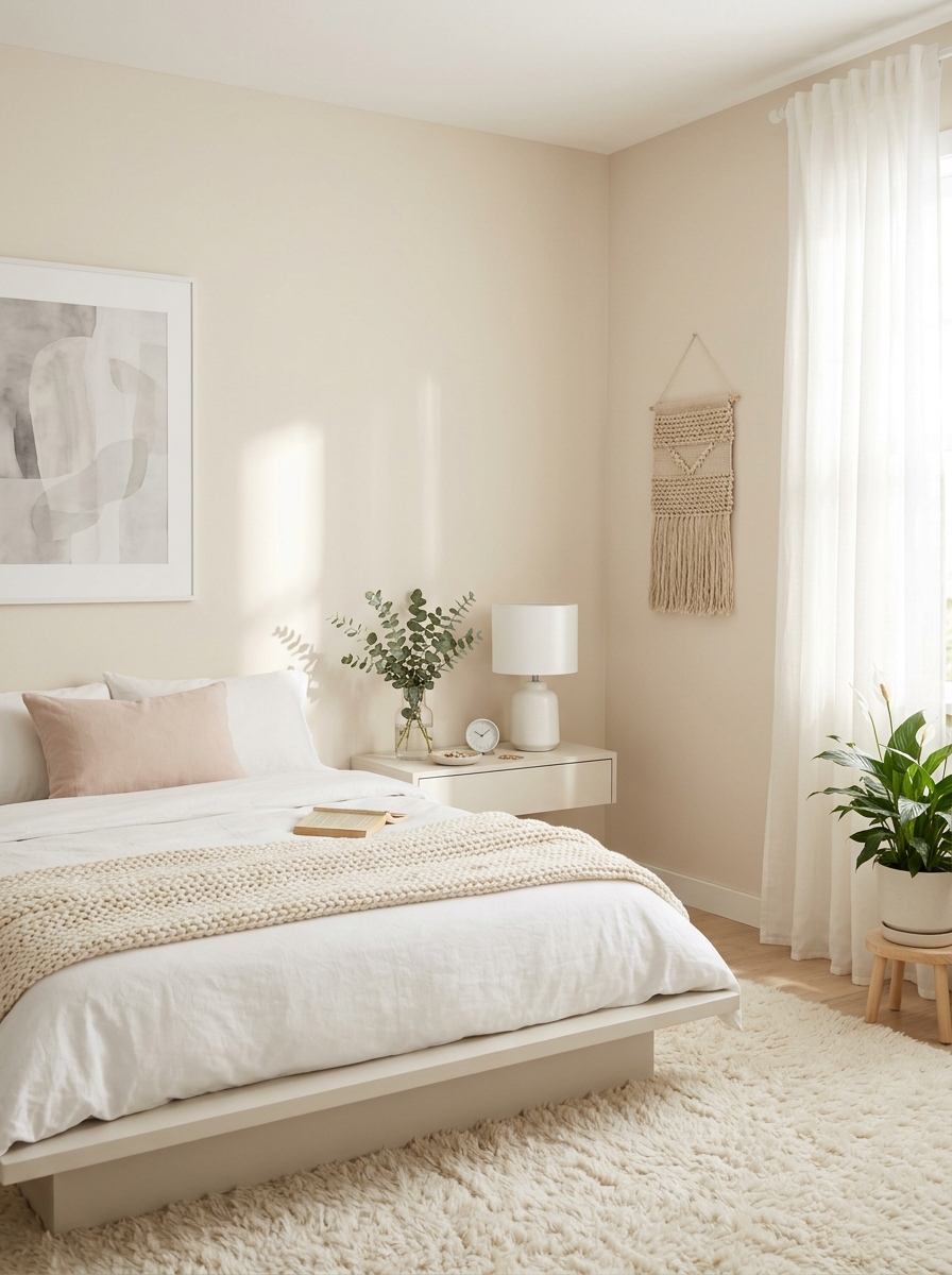
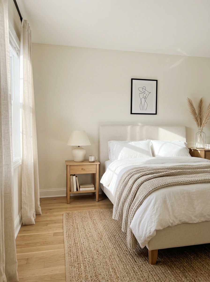
If you’re craving that effortlessly chic Scandinavian vibe, pale oat is your answer. This barely-there neutral sits somewhere between cream and beige with the tiniest hint of warmth—it’s like the color equivalent of a cashmere sweater. It creates the most serene backdrop without ever feeling cold or sterile.
I’m totally here for how this color makes everything in your bedroom look more expensive. It highlights your furniture and textiles instead of competing with them, which is exactly what you want in a calming space. The subtle warmth keeps it from feeling too stark, but it’s light enough to make even small bedrooms feel spacious and airy.
Pale oat is especially gorgeous in rooms with lots of natural light—it just glows. But here’s the secret: it also works beautifully in north-facing rooms because that gentle warmth compensates for cooler natural light. It’s one of those foolproof colors that works in literally any bedroom and never goes out of style.
15. Soft Celadon for Peaceful Retreat
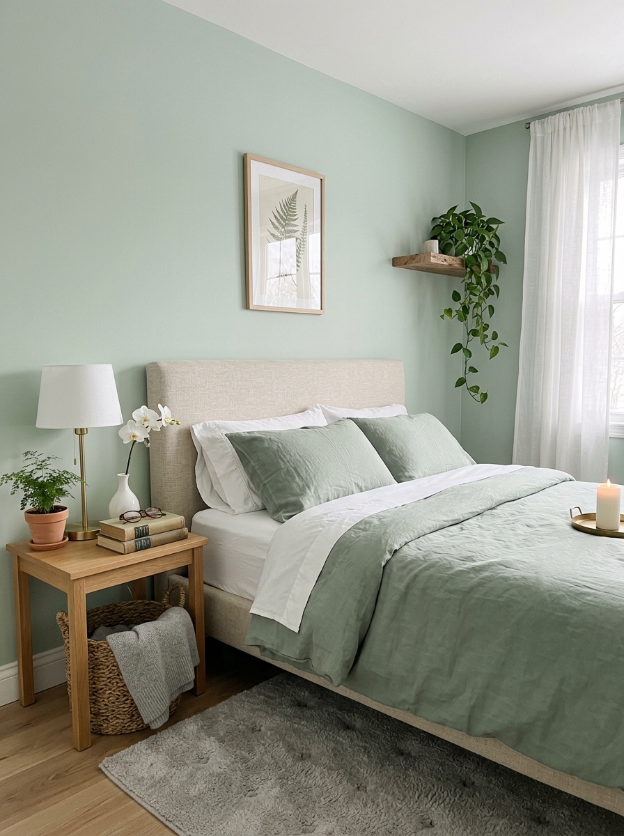
This pale jade-green is basically nature’s chill pill in paint form. Celadon has been beloved in Asian ceramics for centuries, and now it’s having a major moment in bedrooms—and I totally get why. It’s cooler than sage but warmer than seafoam, hitting that perfect sweet spot that feels both fresh and timeless.
What makes celadon so special is how it brings the outdoors in without feeling too literal. It has this spa-like quality that instantly makes you want to take a deep breath and relax. The color shifts beautifully throughout the day—more blue-green in morning light, softer and grayer in the evening. It’s like having a little piece of a misty garden right in your bedroom.
I especially love celadon in bedrooms where you want to create a sophisticated, grown-up sanctuary. It pairs gorgeously with natural wood tones, brass fixtures, and crisp white linens. This is the color for anyone who wants their bedroom to feel like a five-star boutique hotel—calm, collected, and effortlessly elegant.
Quick Guide
## Quick Paint Selection Guide
By Room Light Level:
– Bright, South-Facing: Go bolder with color—sage, dusty blue, soft lavender
– Limited Natural Light: Stick to warm whites, greige, or pale warm neutrals
– North-Facing Cool Light: Choose warm undertones to balance the blue cast
By Your Style:
– Modern Minimalist: Crisp whites, pale grays, cool taupes
– Cozy Traditional: Warm greiges, soft creams, gentle beiges
– Organic/Natural: Sage, clay, warm whites with green undertones
Testing Tips:
– Paint samples on poster board, not directly on walls
– Observe colors for at least 48 hours in different light
– Look at samples next to your bedding and furniture
– Check how they look with lights on at night
Your Bedroom Deserves This Kind of Peace
The truth is, you spend a third of your life in your bedroom. Maybe more if you’re a weekend nap enthusiast like me. It should be the one room in your house that feels like a genuine sanctuary, not an afterthought. And paint? It’s the quickest way to completely transform how a space feels. You don’t need new furniture or a full renovation. Just the right color on those four walls.
Whichever shade speaks to you from this list, trust that feeling. Your bedroom should feel like a deep exhale at the end of a chaotic day. It should be the place where your brain finally gets quiet. So grab those paint samples, tape them up, and live with them for a few days. The right color will make itself known. And when you find it? When you wake up that first morning in your freshly painted room? You’ll wonder why you waited so long. Go create that calm space you’ve been dreaming about.
Frequently Asked Questions
What’s the most calming color to paint a bedroom for better sleep?
Soft blue-grays and pale sage greens consistently rank as the most sleep-inducing colors because they lower heart rate and promote relaxation. That said, the “best” color is whatever makes you personally feel calm—some people find warm greiges more soothing than cool blues. Trust your gut and test samples in your actual bedroom lighting.
Should I use flat or eggshell paint finish in a bedroom?
Eggshell or matte finish works best for bedroom walls. Flat paint looks beautiful and hides imperfections, but it’s harder to clean. Eggshell has a slight sheen that’s still subtle but wipes down easier if you get fingerprints or scuffs. Save satin or semi-gloss for trim and doors only.
How do I pick a calming paint color if my bedroom has very little natural light?
Stick with warm undertones—think creamy whites, warm greiges, or soft beiges rather than cool grays or blues. Colors with warmth reflect light better and prevent dark rooms from feeling cave-like. Also consider going slightly lighter than you think you need, since low light makes colors appear darker and more saturated.
Can I use dark or bold colors in a bedroom and still keep it calming?
Absolutely, but choose muted or dusty versions rather than bright saturated shades. A soft charcoal, dusty navy, or muted terracotta can feel incredibly cozy and enveloping—like being wrapped in a blanket. The key is pairing darker walls with plenty of soft textiles, warm lighting, and lighter bedding to balance the mood.
What’s the difference between calming bedroom colors and just boring neutral colors?
Calming colors have intentional undertones that create mood—they’re not just absence of color. A boring beige looks flat and lifeless, while a carefully chosen warm greige with slight green undertones feels sophisticated and peaceful. The difference is in the nuance and how the color shifts in different lighting throughout the day.