18 Designer Secrets to Style Your Living Room Like a Pro
You know that feeling when you walk into a beautifully designed living room and everything just feels right? The pillows look perfectly imperfect, the coffee table is styled but not cluttered, and somehow the whole space feels both pulled-together and completely livable. Meanwhile, your own living room has good furniture but something’s… off. Maybe the sofa feels lonely against that big wall. Or your decor looks a little too matchy-matchy. Here’s the thing: designers aren’t working with magic. They’re using specific tricks that anyone can learn. And I’m talking about real techniques that work in actual homes, not just staged showrooms with unlimited budgets. From furniture placement to the art of layering textures, these are the moves that separate a nice room from a wow room. Let’s get into it.
1. Anchor Your Seating with a Properly Sized Rug
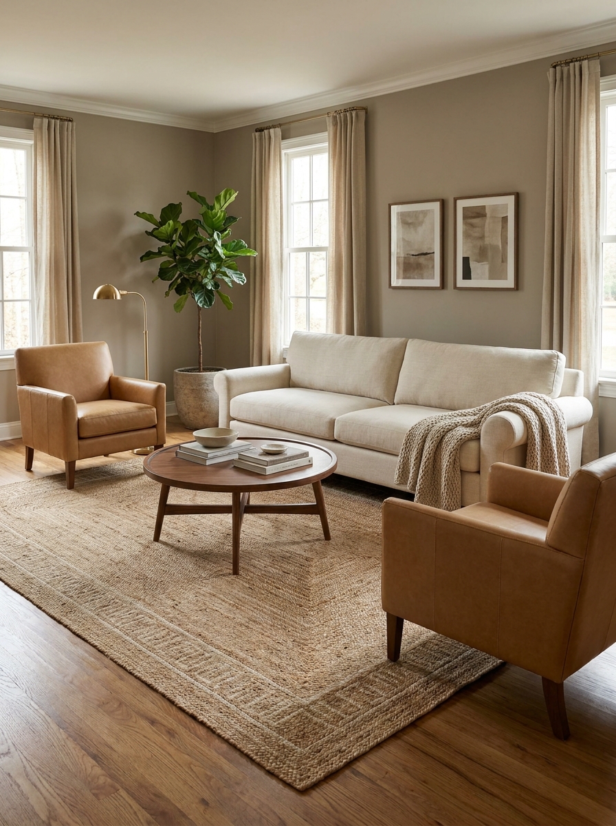
This is where so many people go wrong right out of the gate. A rug that’s too small makes your whole room feel disconnected and awkward. Designers know that your area rug should be large enough for at least the front legs of all your main seating pieces to rest on it. It anchors everything together and defines the conversation area.
Think of the rug as the foundation of your entire layout. It’s not just a decorative afterthought. When all your furniture floats around a tiny rug island, the room feels choppy and unfinished. But when that rug grounds your sofa, chairs, and coffee table together? Suddenly everything looks intentional.
The most common designer-approved size is 8×10 or 9×12 for a standard living room. If you’ve got a sectional, you might even need bigger. And yes, this often means investing in a larger rug than you initially thought you needed. But it’s one of those game-changing purchases that instantly elevates the entire space.
2. Create Conversation Areas, Not Furniture Lineups
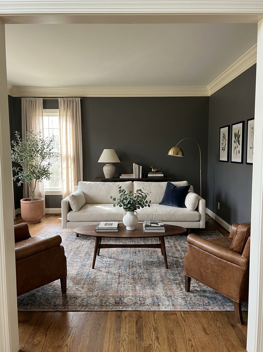
Stop pushing all your furniture against the walls like you’re setting up for a middle school dance. Designers pull seating pieces away from walls to create intimate conversation groupings. This makes rooms feel intentional and inviting, not like a waiting room.
The magic number? Aim for seating pieces to be about 8 to 10 feet apart, max. That’s close enough for comfortable conversation without shouting across the room. Your sofa and chairs should face each other or angle toward a focal point, creating a natural flow that draws people in.
And here’s something most people don’t realize: floating your furniture actually makes a room feel bigger, not smaller. It creates breathing room and defines zones. Even in a small space, pulling your sofa just 12 inches off the wall and adding a narrow console table behind it adds so much visual interest and function.
3. Layer Lighting at Three Different Heights
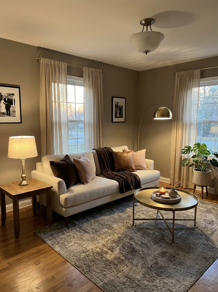
One overhead light is the fastest way to make a room feel flat and boring. Designers always layer lighting at multiple levels: ambient (overhead), task (reading lamps), and accent (table lamps for mood). This creates depth and lets you adjust the vibe throughout the day.
Start with your overhead fixture, but put it on a dimmer. Then add table lamps on side tables or consoles at eye level when you’re seated. Finally, bring in a floor lamp to fill dark corners or arc over a reading chair. When you turn on these layers together at different brightness levels, the room instantly feels warmer and more expensive.
The other secret? Designers almost never use overhead lighting at full blast. They rely on those layered lamps to create pools of warm light that make spaces feel intimate and welcoming, especially in the evening.
4. Style Your Coffee Table in Odd-Numbered Groups
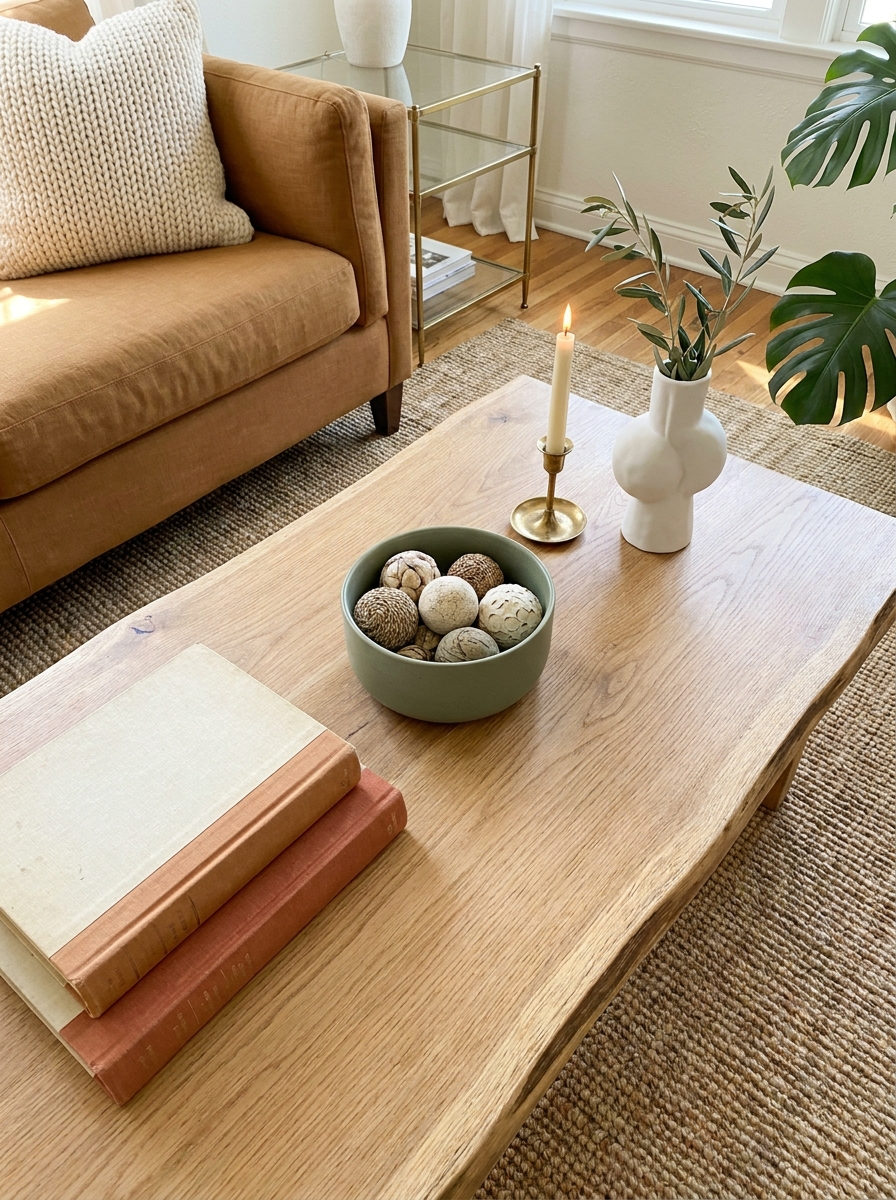
There’s actual psychology behind why designers group decor in threes and fives. Our brains find odd numbers more visually interesting and dynamic than even numbers, which feel too symmetrical and static. This tiny trick works on coffee tables, shelves, and mantels.
For your coffee table, think in thirds. You might have a stack of two or three books on one side, a small sculptural object or candle in the middle, and a low bowl or small plant on the other end. Not a perfect triangle, but a casual arrangement that follows the rule of thirds. Vary the heights for visual interest.
But here’s the thing designers also know: leave some empty space. A coffee table that’s covered edge-to-edge looks cluttered and stressful. You should still be able to actually use it for drinks and remotes. Aim to style about two-thirds of the surface and leave the rest open.
5. Add Height Variation with Sculptural Decor
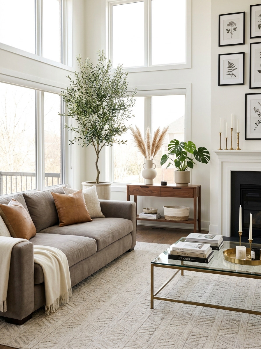
Here’s what separates a designer room from a regular one: the eye travels up and down, not just side to side. You need tall moments that draw your gaze upward.
Think oversized floor vases with branches, tall candlesticks on the mantel, or a generous fiddle leaf fig in the corner. These vertical elements make your ceilings feel higher and your space more dynamic. The trick is varying the heights throughout the room so nothing feels flat or one-dimensional.
I love using a tall ceramic vase on the floor next to the sofa. It fills that awkward empty spot and adds drama without taking up surface space. Pair it with medium-height table lamps and low coffee table books, and suddenly you’ve got this beautiful rhythm happening. Your room feels layered and complete, like a designer actually planned every single element. Because that’s exactly what designers do.
6. Mix Textures Like You’re Creating a Recipe
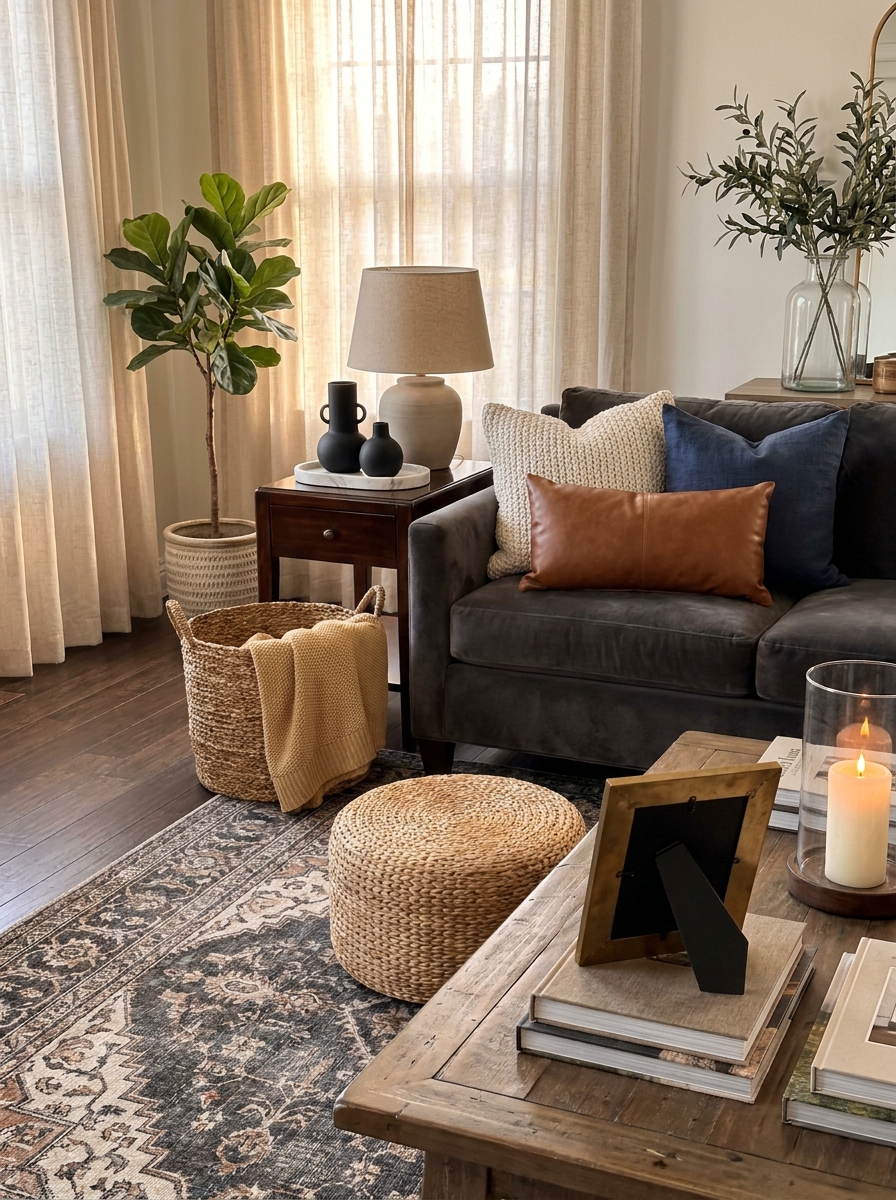
A room that’s all smooth surfaces feels cold and unwelcoming. A room with too much texture feels chaotic. You want that perfect middle ground where every piece adds something different to the touch.
Start with your anchor texture, usually your sofa fabric. Then layer in contrasting materials: a chunky knit throw, smooth leather pillows, a nubby linen curtain, glossy ceramic vases, matte wood furniture. Each texture catches light differently and creates visual interest that flat surfaces simply can’t deliver.
I always include at least five different textures in my living room. Velvet pillow, jute rug, leather ottoman, linen curtains, ceramic lamp. It sounds like a lot, but when you mix them thoughtfully, they create this rich, collected-over-time feeling that screams professional design. Your guests won’t know why the room feels so good, but you’ll know it’s because you layered textures like an absolute pro.
7. Create a Focal Point That Commands Attention
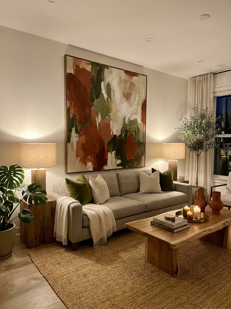
Every designer living room has one thing that makes you stop and look. It might be a stunning piece of art, a beautiful fireplace, or an accent wall that steals the show. Without a clear focal point, your room feels directionless.
Your focal point should be the first thing people notice when they walk in. Arrange your furniture to face it or frame it. If you have a fireplace, style the mantel like it’s a magazine shoot. No fireplace? Create a gallery wall or hang one oversized piece of art behind your sofa. Even a beautiful built-in bookshelf can become your star attraction with the right styling.
Here’s the thing: once you establish your focal point, everything else becomes supporting cast. Your furniture arrangement, your lighting, even your rug should all work together to highlight that one special feature. It’s like staging a play where everyone knows who the lead actor is.
8. Style Surfaces with Breathing Room
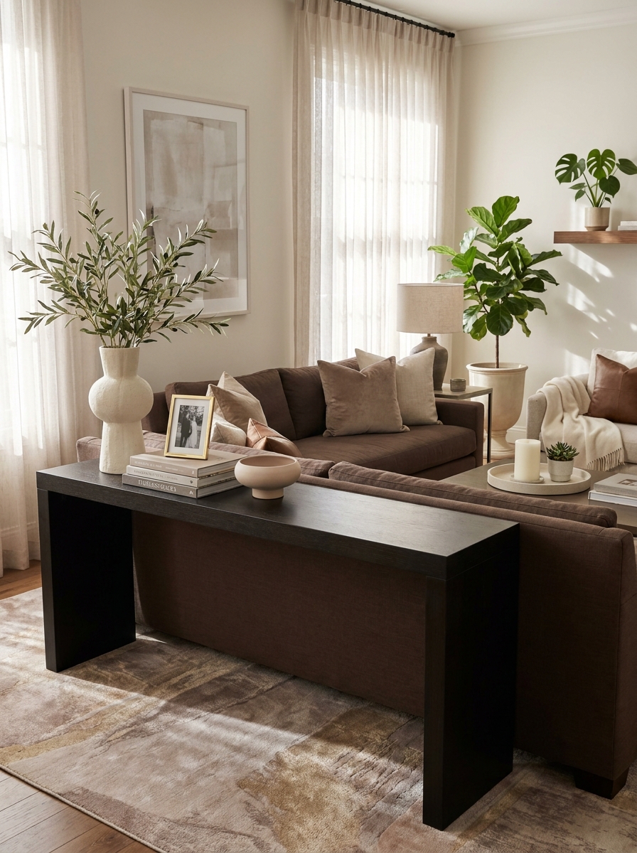
This is where most people go wrong. They either leave surfaces completely bare or pile on every pretty thing they own. Designers know the magic is in the negative space.
Every styled surface needs room to breathe. On your console table, group three to five items together, then leave the rest empty. On your coffee table, style one section and leave space for actual coffee cups. Your mantel should have purposeful gaps between objects. This breathing room is what makes everything look intentional instead of cluttered.
I used to fill every inch of my shelves and tables. Then I started editing ruthlessly, removing pieces until what remained felt special. Now I style in small, curated groups with plenty of empty space around them. The impact is so much stronger. Each object gets its moment to shine instead of competing for attention in a crowded lineup.
9. Balance Symmetry and Asymmetry for Visual Interest
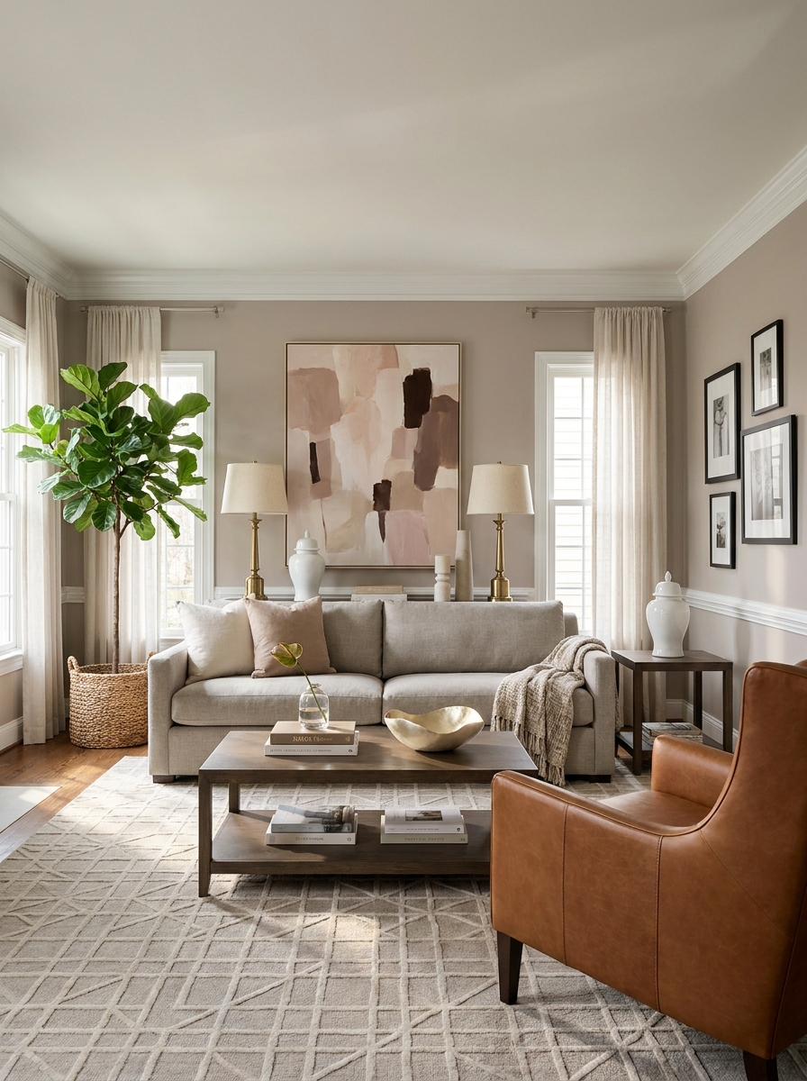
Here’s a secret designers know: perfect symmetry feels formal, total chaos feels messy, but mixing both? That’s where the magic happens.
Start with symmetrical anchor pieces. Maybe matching table lamps flanking your sofa, or two identical chairs facing each other. This creates order and calm. Then break it up asymmetrically. Add a tall plant on one side only. Hang three different-sized frames in a gallery wall. Place an oversized floor lamp where you’d never expect it.
Your eye craves both. The symmetry feels intentional and grounding. The asymmetry keeps things interesting and collected-over-time. When you walk into a room that balances both, you feel it. It’s sophisticated but not stuffy. Curated but not contrived. Think of symmetry as your foundation and asymmetry as your personality. One chair can anchor a corner while two matching ottomans center your coffee table. A single dramatic piece of art over the sofa while varied heights of decor style the console table. You’re creating rhythm, not rigidity.
10. Add a Secondary Seating Area for Depth
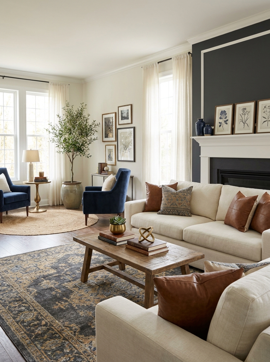
One seating area? Fine. Two seating areas? Now we’re talking designer-level space planning.
Even in smaller living rooms, carving out a secondary spot instantly makes your room feel more intentional and layered. It doesn’t need to be huge. Two accent chairs angled in a corner with a small side table between them. A window-side bench with a floor lamp and throw pillow. A cozy reading nook with one statement chair and a bookshelf nearby.
This second zone creates visual depth and tells your room’s story. It says this space serves multiple purposes and moods. Morning coffee here, evening conversation there. It breaks up that sea-of-sofa feeling and adds architectural interest where walls alone can’t.
Designers always think in zones, not just one big seating blob. Your main area handles the TV and gatherings. Your secondary spot? That’s where personality lives. It draws people deeper into the room and creates those magazine-worthy layers you’re always pinning. Plus, it’s incredibly functional when you actually need more seating.
11. Incorporate One Unexpected Element
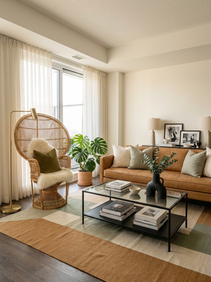
You know what separates a nice room from a designer room? One piece that makes you stop and say, “Wait, what is that?”
It’s the vintage Moroccan pouf where you’d expect another throw pillow. The oversized sculptural branch arrangement instead of a predictable fiddle leaf fig. The antique trunk serving as a coffee table. The bold patterned chair in an otherwise neutral room. That one thing that doesn’t quite match but somehow makes everything else make sense.
This is where personality overrules the rulebook. Designers aren’t afraid of the unexpected because they know it creates memorable spaces. It’s the piece people ask about, the thing that gives your room a signature.
Don’t go wild with ten unexpected things—that’s just chaos. One is your sweet spot. It anchors your story. Maybe it’s something you found at a flea market, an heirloom that doesn’t match your aesthetic but you love anyway, or a bold art piece that feels risky but right. This single element gives your perfectly styled room a pulse.
12. Finish with Fresh Florals or Greenery in Every Sightline
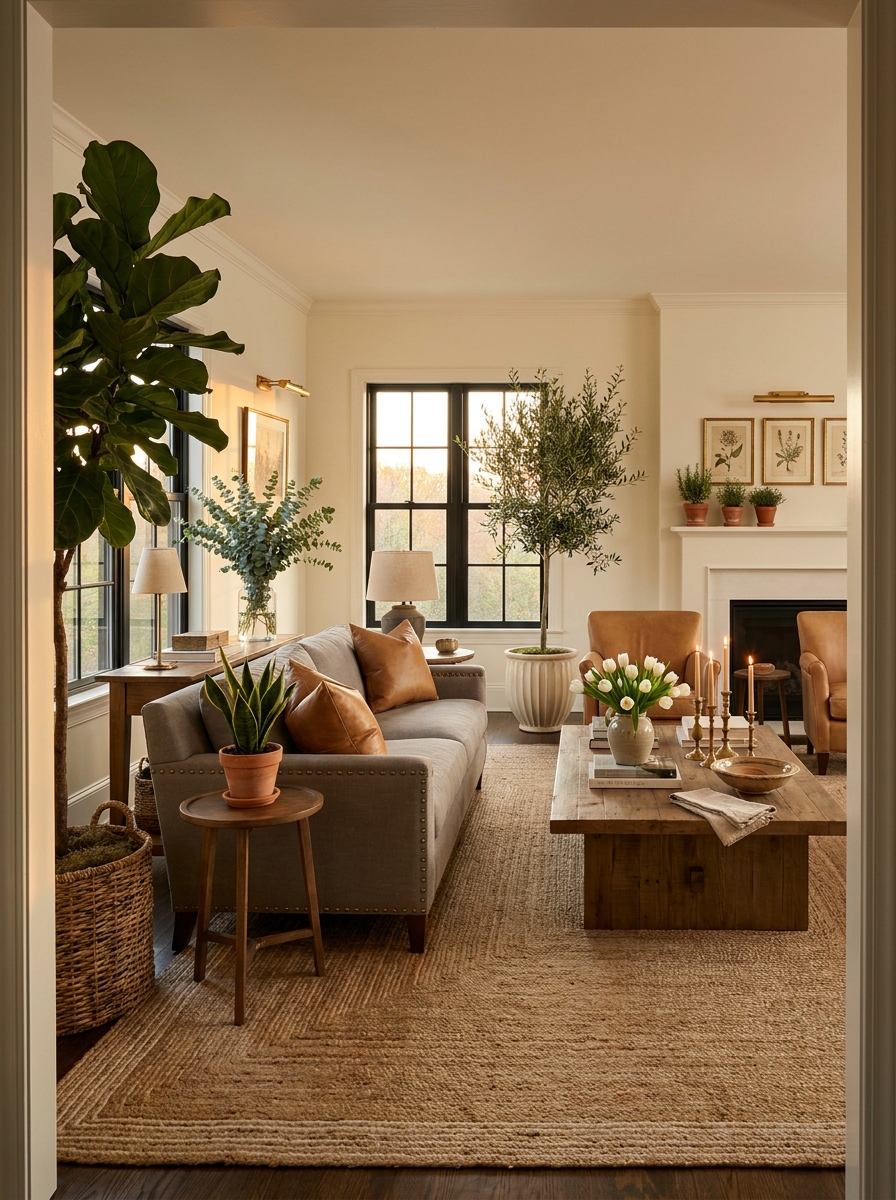
Walk into any designer’s room and you’ll spot it immediately: living, breathing greenery. Not fake. Not dusty. Real plants and fresh stems that say someone actually lives here and cares.
This is your final layer, and honestly? It’s the one that brings everything to life. A fiddle leaf fig anchoring an empty corner. Olive branches in a tall vase on the console. A small potted succulent on the coffee table. Even a single stem in a bud vase counts.
The trick is placing greenery in every major sightline. When you scan the room from the doorway, from the sofa, from the opposite corner—you should catch a glimpse of something organic. It softens hard edges, adds movement, and creates that expensive, fresh-from-the-florist feeling.
Designers know that styled rooms without greenery feel flat and staged. But add those living elements? Suddenly your space breathes. It feels warm and current and like a place you’d actually want to spend your evening. Greenery is the difference between “styled” and “alive.”
13. Use the Color 80/20 Rule for a Cohesive Palette
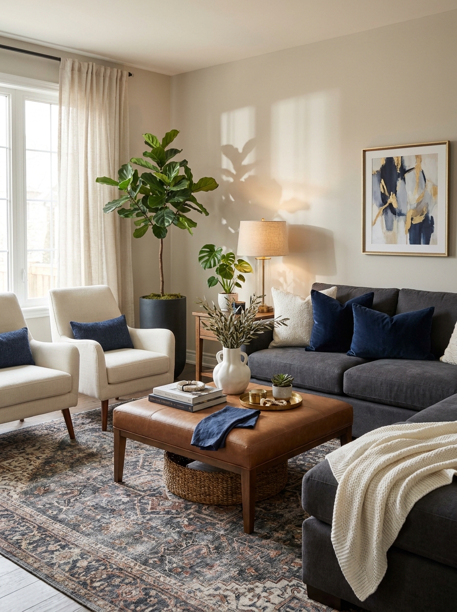
Designers never wing their color schemes. They follow the 80/20 rule: 80% neutral foundation, 20% accent colors. This keeps your space grounded while giving you room to play.
Your walls, major furniture pieces, and large rugs should be in your neutral palette. Think creams, grays, taupes, or soft whites. These create a calming backdrop that won’t compete with your statement pieces. Then bring in your personality through that remaining 20%—pillows, throws, art, decorative objects.
The magic happens when you repeat your accent color at least three times around the room. Maybe it’s a deep navy that shows up in a pillow, a vase, and a piece of art. This repetition creates visual rhythm that feels intentional, not random. Your eye travels around the room and everything makes sense together.
14. Frame Your Windows to Create Architectural Interest
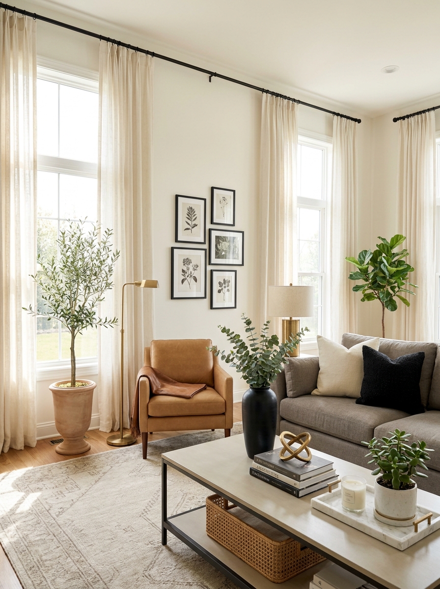
Your window treatments aren’t just about privacy. They’re vertical architecture that can completely transform your room’s proportions. Designers always hang curtains high and wide to make windows look grander than they actually are.
Mount your curtain rod as close to the ceiling as possible, not right above the window frame. Then extend the rod 8-12 inches beyond each side of the window. When the curtains are open, they frame the window instead of covering it. This trick makes your ceilings look taller and your windows more impressive.
Choose curtains that puddle slightly on the floor or just kiss it. That extra length adds a luxurious, custom look. Skip the matchy-matchy and pick a texture that complements your palette but doesn’t fight for attention. Linen, velvet, or textured cotton all work beautifully.
15. Establish Clear Pathways with Strategic Furniture Placement
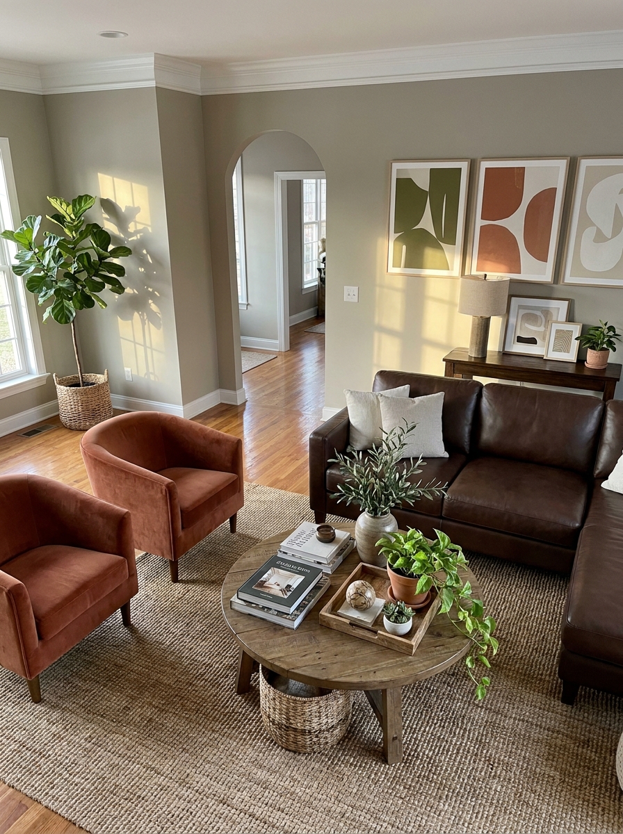
Traffic flow is the unsexy thing that separates amateur rooms from designer spaces. You need at least 30 inches of clearance for main walkways and 18 inches between furniture pieces for easy movement.
Look at how people naturally move through your room. Where do they enter? Where do they go? Never make someone navigate an obstacle course to sit down. Float your furniture away from walls to create defined pathways around conversation areas, not through them.
The sofa shouldn’t block the natural flow from the entry to other rooms. Position it perpendicular to the main traffic route, with chairs creating a cozy cluster that’s off to the side. Think of your furniture arrangement like a river with islands—the seating areas are destinations, and the open spaces around them let people flow freely.
16. Finish with Personal Touches That Tell Your Story
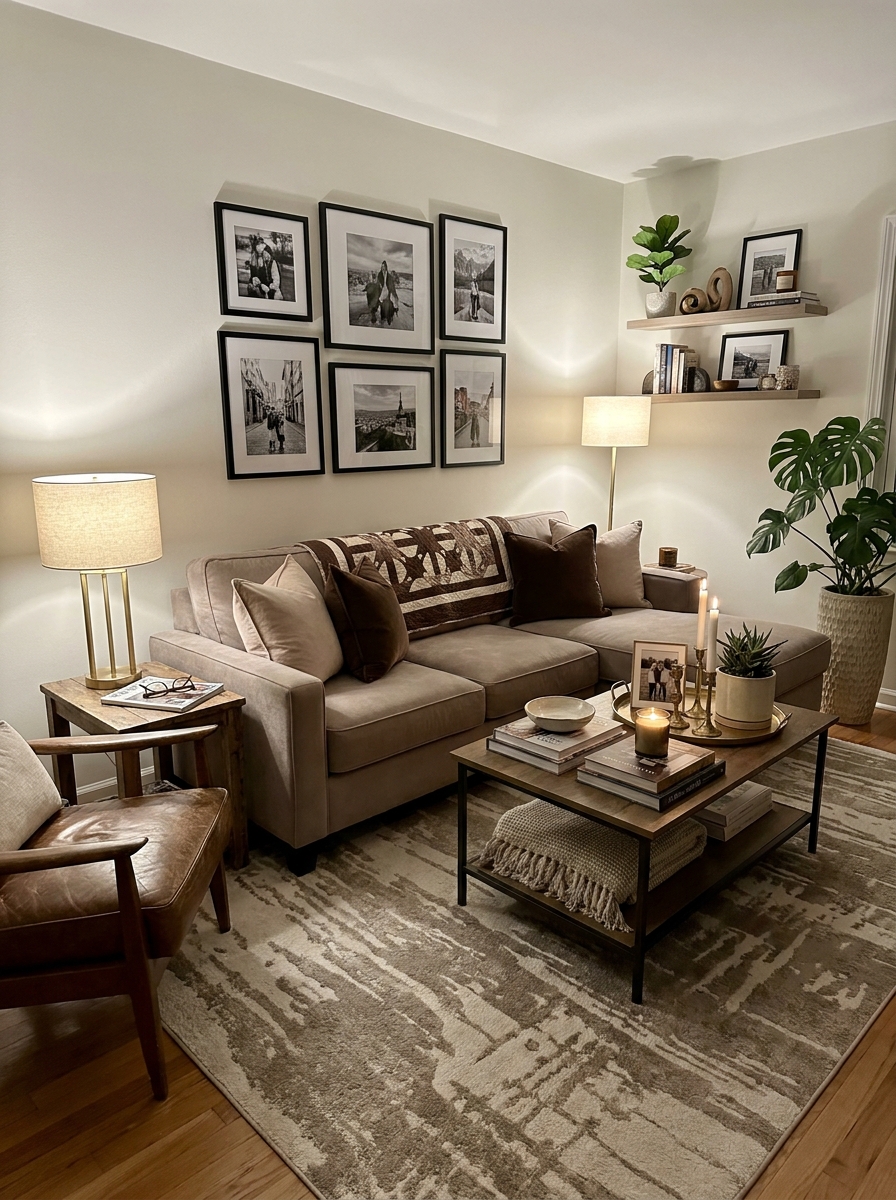
Here’s the secret designers won’t always tell you: perfectly styled rooms feel cold without personal history woven in. The best living rooms have layers of meaning, not just layers of texture.
Mix in pieces that matter to you. That vintage clock from your grandmother, the pottery you bought on vacation, the quirky sculpture you found at a flea market. These imperfect, personal items give your space soul. They’re conversation starters and memory holders.
The trick is in the balance. Style these personal treasures alongside your more polished pieces. Put that sentimental vase on a beautiful tray. Frame that travel photo in museum-quality matting. Honor your memories by giving them the same thoughtful presentation as your designer finds. This is what makes a house feel like your home, not a showroom.
17. Use the Designer Triangle Rule for Styling Objects
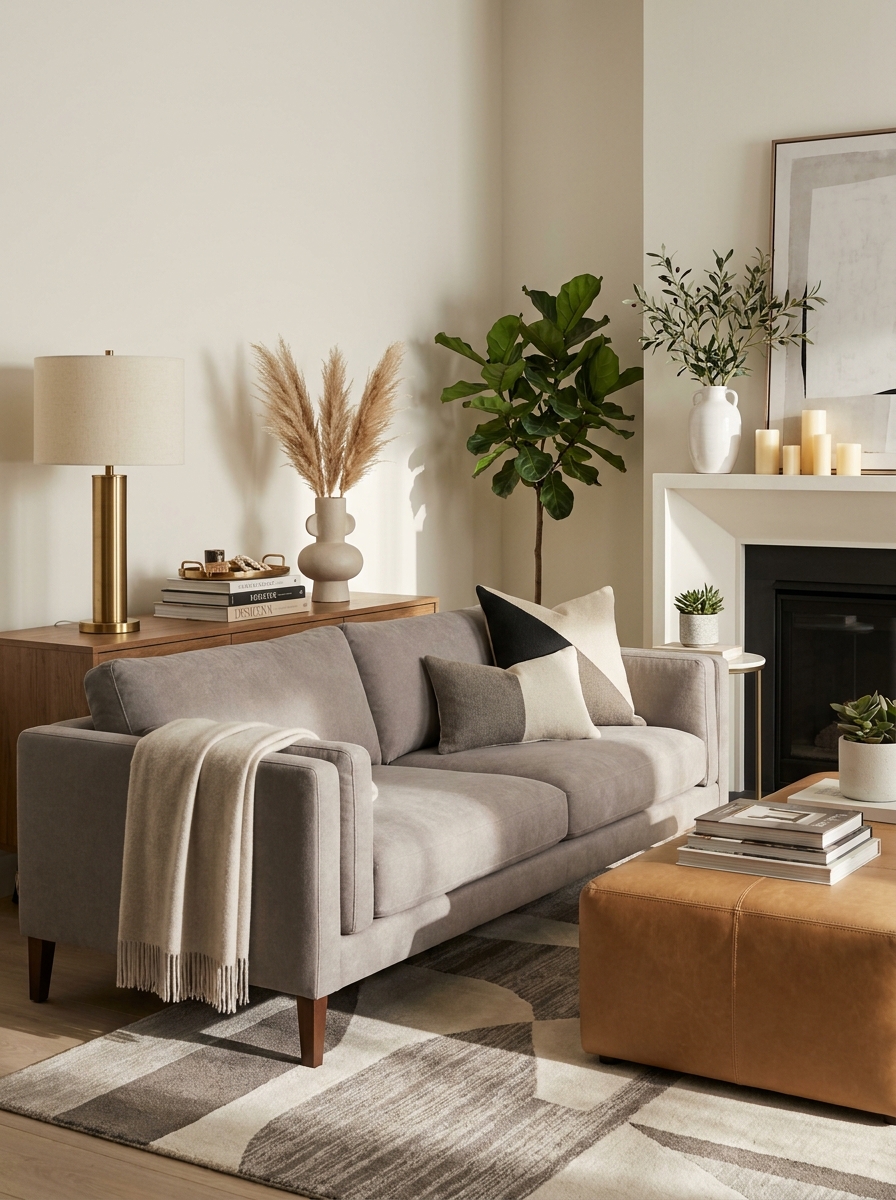
Here’s a secret designers use everywhere: arrange decorative objects in triangular patterns. Your eye naturally follows triangle shapes, creating movement and balance that feels totally natural.
Look at any beautifully styled surface and you’ll see it. Three candlesticks at different heights forming a triangle. A tall lamp, medium vase, and low bowl creating invisible diagonal lines. Even throw pillows arranged in triangular groupings across your sofa. It’s like magic once you notice it.
This works because triangles give your eye somewhere to travel. They create visual rhythm without feeling rigid or matchy-matchy. You can use actual triangles (three objects) or implied ones (items at varying heights that your eye connects). The key is avoiding straight horizontal lines, which feel static and boring. Think diagonally. Let your styling breathe and move. This one trick will make every surface in your living room look professionally arranged, even if you’re just winging it with things you already own.
18. End Furniture Legs at Different Depths for Dimension
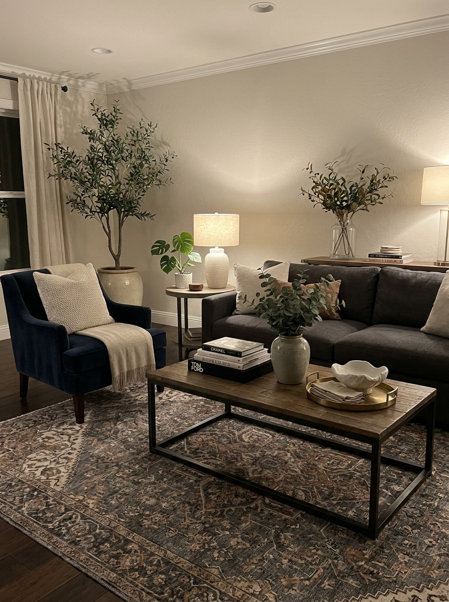
This is such a pro move. Instead of lining up all your furniture legs at the same depth, stagger them. Pull your coffee table slightly forward. Angle your accent chair inward. Let your side table sit a little deeper than the sofa arm. These tiny adjustments create major visual interest.
When everything sits flush at exactly the same distance from the wall, your room looks flat and staged, like a furniture showroom floor. But when pieces sit at varying depths, you create layers that make the space feel lived-in and thoughtfully designed. It’s dimensional. Dynamic. Way more interesting to look at.
This also helps with traffic flow because angled or slightly pulled-forward furniture naturally creates pathways. Your living room stops feeling like a box filled with stuff and starts feeling like an intentionally composed space. Designers obsess over these small positioning tweaks because they completely change how a room photographs and how it feels when you walk in. It’s the difference between flat and fabulous.
Quick Guide
Designer Budget Breakdown: Where to Splurge vs. Save
SPLURGE ON:
• Sofa ($1,200–3,000) — You use it daily; quality matters for comfort and durability
• Area rug ($400–1,200) — Large rugs anchor the whole room; cheap ones look it
• Window treatments ($300–800) — Custom or high-quality panels frame your space beautifully
SAVE ON:
• Accent pillows ($15–40 each) — Mix affordable finds with one or two splurges
• Coffee table styling ($50–150 total) — Thrift books, budget vases, and DIY touches work perfectly
• Side tables ($100–250) — Vintage finds or budget retailers offer great options
• Artwork ($30–100 per piece) — Frame affordable prints or your own photography
THE SWEET SPOT:
• Accent chairs ($350–700) — Mid-range gives you style and decent quality without breaking the bank
Your Living Room, Your Way
Here’s what I want you to remember: designer-level styling isn’t about having unlimited money or perfect taste. It’s about understanding a few key principles and applying them in ways that make sense for your actual life. You don’t need to implement all 18 of these tricks at once. Start with one or two that excite you most—maybe it’s finally getting that larger rug or rearranging your furniture away from the walls.
The rooms that feel the most special aren’t the ones that look like magazine shoots. They’re the ones that reflect the people who live in them while still feeling pulled-together and intentional. So yes, learn from designers. But then make it yours. Add the weird vintage find you scored at the flea market. Mix in that pillow your kid picked out. Leave the art slightly off-center if it feels right.
Your living room should make you happy every single time you walk into it. That’s the real designer secret. Now go move some furniture around and see what happens.
Frequently Asked Questions
How can I make my small living room look bigger using designer tricks?
Pull furniture slightly away from walls to create flow, not push everything against them. Use one large rug instead of small scattered ones to unify the space. Layer lighting at multiple heights to eliminate dark corners, and choose a light neutral wall color to reflect more light. Mirrors placed opposite windows also bounce natural light beautifully.
What’s the biggest mistake people make when styling their living room?
Using a rug that’s way too small for the space. Your rug should be large enough that at least the front legs of all major seating pieces rest on it. This anchors the furniture grouping and makes the whole room feel intentional instead of disconnected.
How do I choose throw pillows like an interior designer?
Mix three different textures and patterns in a cohesive color palette—think one solid, one subtle pattern, one statement pattern. Vary the sizes too, using 22-inch and 20-inch squares plus a lumbar pillow. Designers use odd numbers (3, 5, or 7 pillows) and aren’t afraid to mix high and low price points.
Do I really need to hire a designer to get a professional-looking living room?
Absolutely not. Professional designers use learnable techniques like proper furniture scale, layered lighting, and the rule of thirds. Study rooms you love on Pinterest, measure carefully before buying, and implement one principle at a time. The key is understanding why designers make certain choices, then adapting them to your space and budget.
What’s the best way to arrange furniture in a long narrow living room?
Create two separate zones instead of one long lineup. Float a sofa perpendicular to the long wall to break up the length, then add a console table behind it to define the space. Use area rugs to anchor each zone separately, and consider placing a pair of chairs at the far end to create a reading nook or secondary seating area.