30 Decorating Mistakes That Kill Your Home’s Vibe
You’ve scrolled through a thousand Pinterest boards. You’ve bought the pretty throw pillows. You’ve rearranged your living room three times this month. But something still feels… off. Here’s the truth nobody wants to admit: most of us are making the same decorating mistakes over and over, wondering why our homes don’t look like the ones we save online. And it’s not about budget or square footage. It’s usually about a few sneaky missteps that throw everything out of balance. The good news? Once you know what to watch for, fixing these issues is way easier than you think. We’re talking simple tweaks that make a massive difference. From furniture that’s the wrong size to rugs that disappear under your sofa, these 30 mistakes are probably happening in your home right now. But don’t worry — we’re going to fix them together. Here’s what’s actually holding your space back.
1. Pushing All Your Furniture Against the Walls
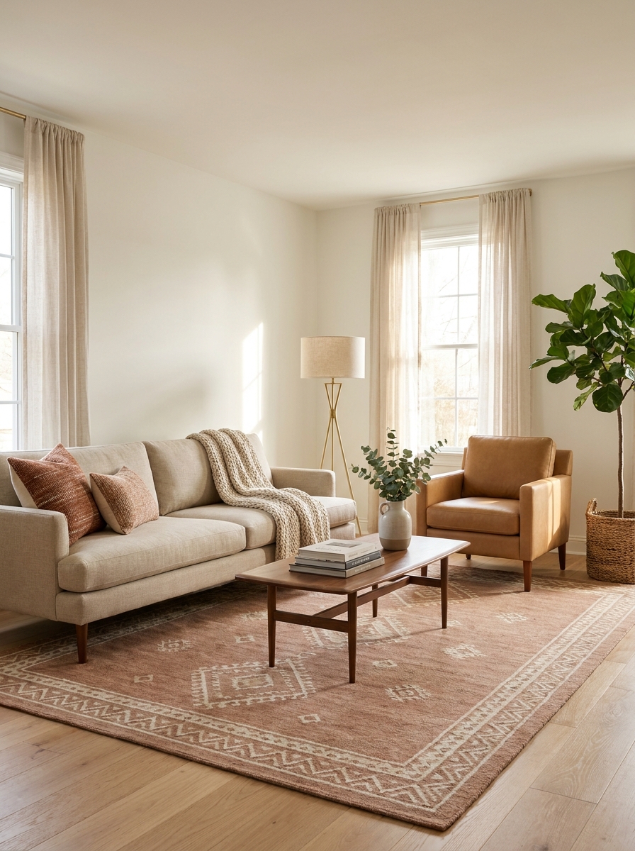
This one’s so common it hurts. We think pushing everything to the edges creates more space, but it actually makes rooms feel awkward and uninviting. Your sofa floating a few feet from the wall? That’s not wasted space. That’s breathing room. It creates intimate conversation areas and makes even small rooms feel intentionally designed instead of like a waiting room.
When furniture hugs the walls, you lose that cozy, pulled-together vibe. Everything feels disconnected. People don’t know where to naturally gather. And honestly, it screams “I don’t know what I’m doing” louder than almost any other mistake.
Pull your sofa away from the wall by at least 12 inches if you can. Angle a chair slightly. Create little zones instead of one big empty center. The goal is conversation, not a dance floor. Your room should feel like a hug, not a hallway.
2. Choosing a Rug That’s Way Too Small
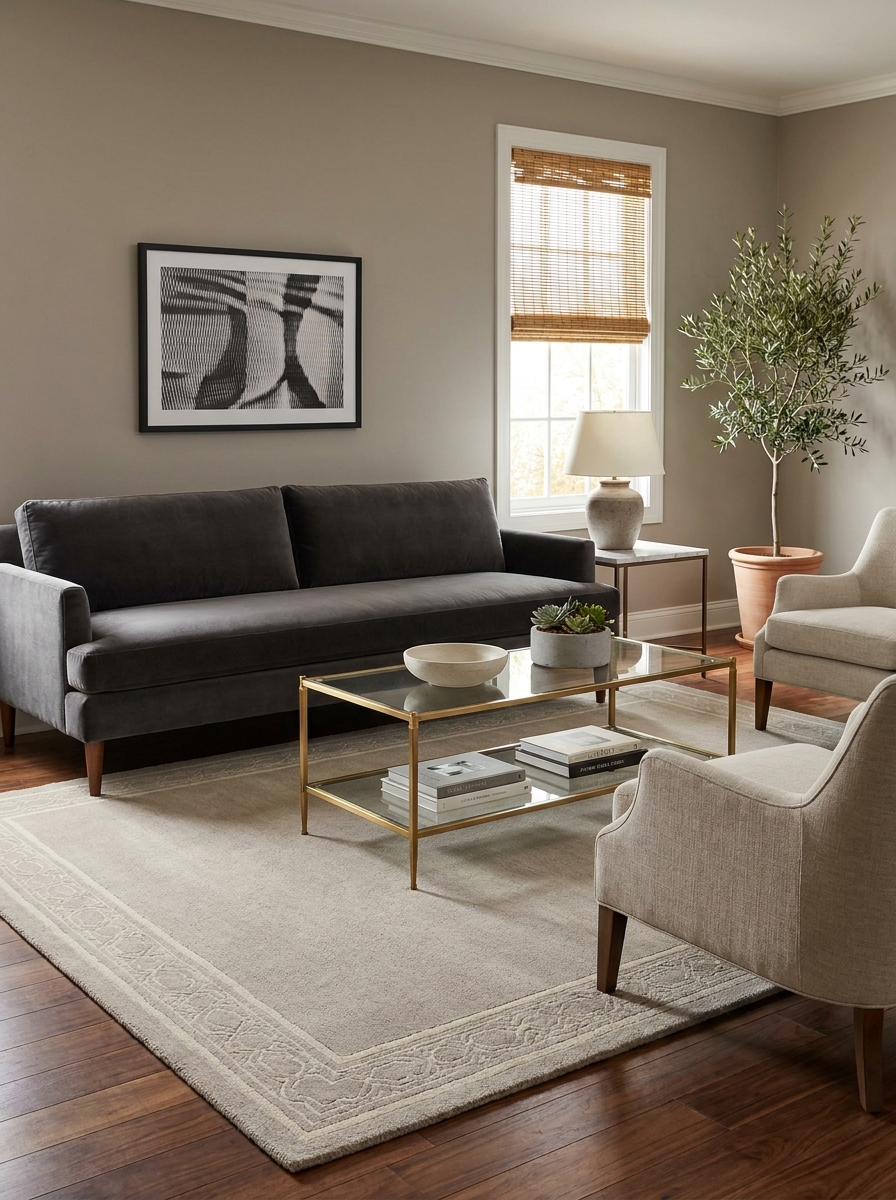
If your rug looks like a bath mat under your coffee table, we need to talk. Too-small rugs are the fastest way to make a room look cheap and disjointed. A proper area rug anchors your furniture and visually expands the space. But when it’s tiny? Everything floats awkwardly, and the whole room feels choppy.
Here’s the rule that changes everything: at least the front legs of all your major furniture should sit on the rug. Ideally, all the legs. This creates a cohesive zone that tells your eye “these pieces belong together.” When your sofa and chairs are completely off the rug, they’re just random items scattered around.
Yes, larger rugs cost more. But this is one of those investments that makes every other piece in the room look better. A properly sized rug can make a mediocre sofa look expensive. A tiny rug makes even designer furniture look like an afterthought. Size matters here more than pattern or price.
3. Hanging Your Artwork at the Wrong Height
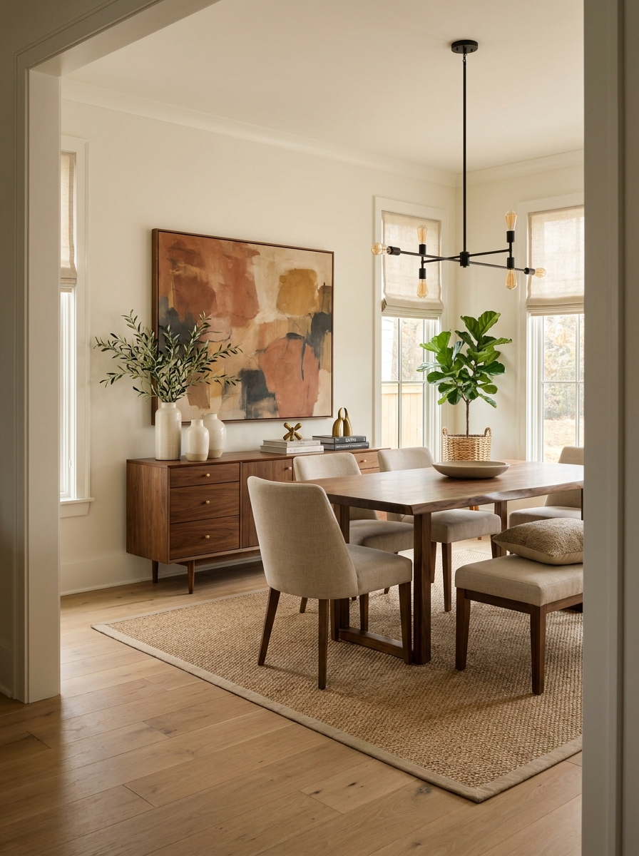
Walk into most homes and you’ll see art floating near the ceiling like it’s trying to escape. Or grouped so low it looks like it’s meant for toddlers. The center of your artwork should hit around 57 to 60 inches from the floor — that’s average eye level. This one simple measurement makes everything look instantly more professional.
When art is too high, it disconnects from your furniture and feels like an afterthought stuck wherever there was wall space. Too low, and it crowds your surfaces, making the whole room feel bottom-heavy. And please, don’t hang a tiny 8×10 frame on a huge wall and call it done. Scale matters just as much as height.
If you’re hanging a gallery wall, treat the whole collection as one piece and center that grouping at eye level. Above a sofa, leave about 6 to 8 inches between the frame and the furniture. This creates visual connection without making things feel cramped. Your art should feel like it belongs in the conversation, not like it’s observing from the rafters.
4. Ignoring the Power of Layered Lighting
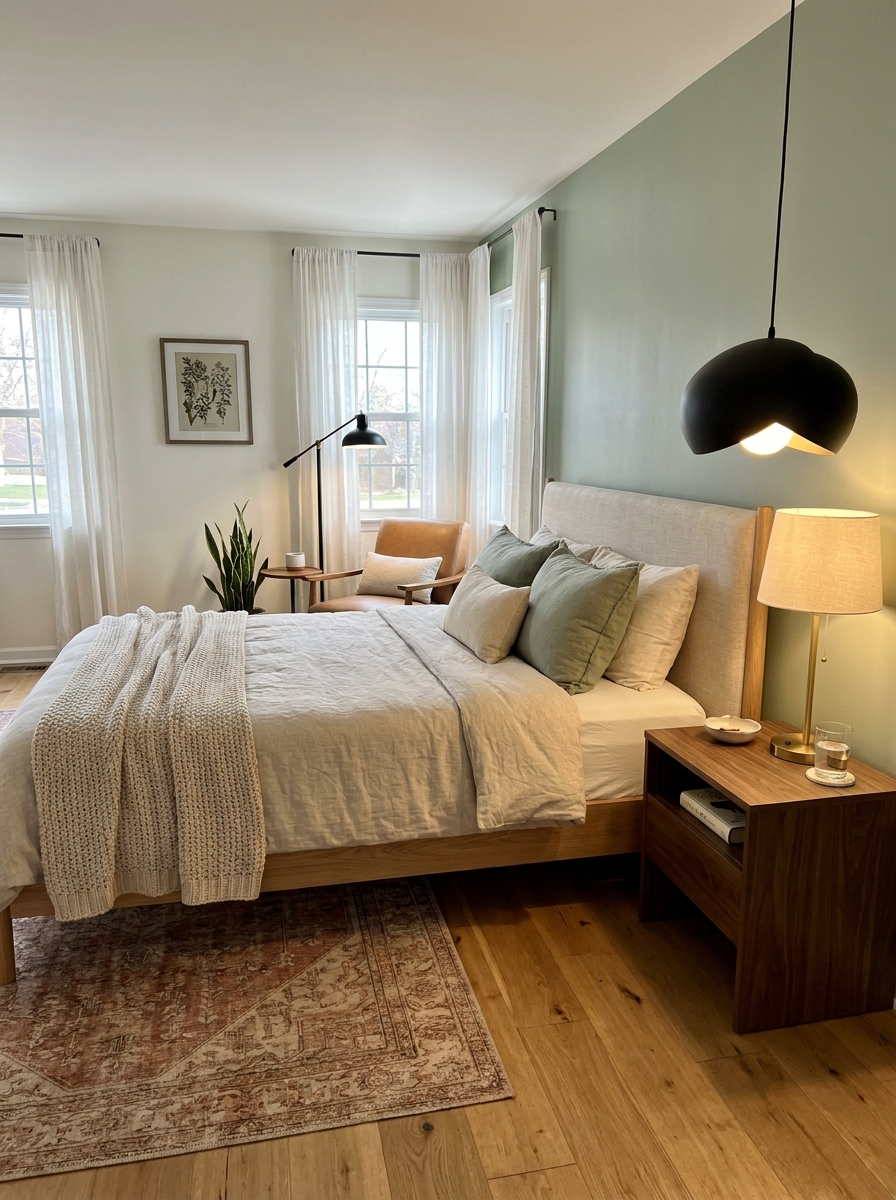
Overhead lighting only? That’s not a lighting plan — that’s a recipe for harsh shadows and zero ambiance. Rooms need layers: ambient, task, and accent lighting working together. One ceiling fixture might illuminate the space, but it won’t make it feel warm or inviting. That’s why your room can be bright but still feel… blah.
Table lamps, floor lamps, sconces — these aren’t just decorative. They create pools of light at different heights, which adds dimension and warmth. When you only light from above, everything falls flat. You lose shadows, texture, and that cozy glow that makes people actually want to hang out in a room.
Think about how light moves around your space. You want it at eye level when you’re sitting, which means lamps on side tables. You want it highlighting architectural features or artwork, which means picture lights or adjustable sconces. And yes, you want overhead lighting too — but on a dimmer, so you control the mood. Lighting is the fastest way to transform a space from cold to cozy.
5. Overcrowding Your Space with Too Much Furniture
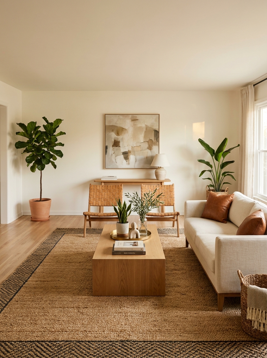
I get it—you want every room to be functional and pretty. But here’s what happens when you cram in too much furniture: your space feels claustrophobic, cluttered, and honestly kind of stressful.
I learned this the hard way in my first apartment. I squeezed in a sofa, two armchairs, a coffee table, AND two side tables into a tiny living room. It looked like a furniture showroom exploded. You couldn’t walk through without doing this awkward sideways shuffle.
Negative space isn’t wasted space—it’s breathing room. It’s what makes a room feel calm and intentional instead of chaotic. Think about those beautiful magazine rooms you love. They’re not packed to the brim. They have empty corners, clear pathways, and room to actually move around. Less furniture, placed thoughtfully, always looks more expensive and more inviting than a room stuffed with pieces fighting for attention.
6. Matching Everything Too Perfectly
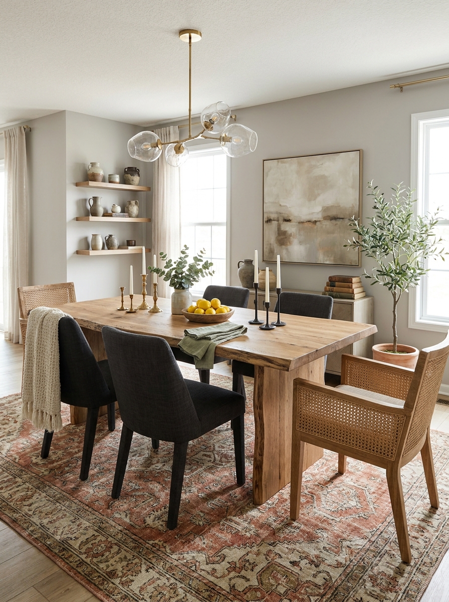
Oh, the dreaded matching furniture set. You know the one—the sofa, loveseat, and chair that all come together in one coordinated package. It seems like the easy solution, but it usually ends up looking flat and, honestly, a little boring.
Here’s the thing: real homes don’t look like they were ordered from one catalog page. They evolve. They have personality. They mix different woods, different textures, different eras. That’s what makes a space feel collected and interesting instead of like a hotel lobby.
I’m not saying everything should clash—there should absolutely be a thread connecting your pieces. But that thread can be color, or style, or mood, not identical matching. Mix your modern sofa with a vintage side table. Pair those sleek dining chairs with a rustic wood table. Combine metals. Layer patterns. That’s where the magic happens and your space starts feeling like YOU instead of a showroom floor.
7. Forgetting About Window Treatments (or Hanging Them Wrong)
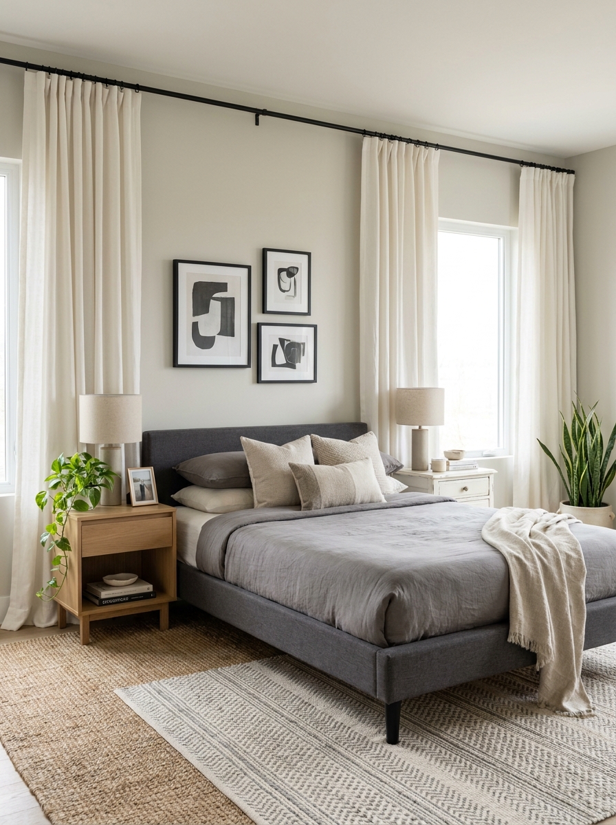
Bare windows or sad little curtains hung right at the window frame—I see this mistake everywhere! And it’s such a missed opportunity because the right window treatments can completely transform a room.
When you hang curtains too low or too narrow, you make your windows (and your whole room) look smaller and kind of unfinished. It’s like wearing pants that are two inches too short—technically functional, but something just looks off.
The secret? Hang your curtain rod HIGH—like, right below the ceiling or crown molding—and WIDE, extending at least 6-8 inches beyond the window frame on each side. This creates the illusion of taller ceilings and bigger windows. When you pull those curtains open, they stack neatly on the sides instead of blocking precious natural light. Even if you never close your curtains, they frame your windows beautifully and add that finished, polished layer that makes a room feel complete and intentional.
8. Ignoring Scale and Proportion Between Pieces
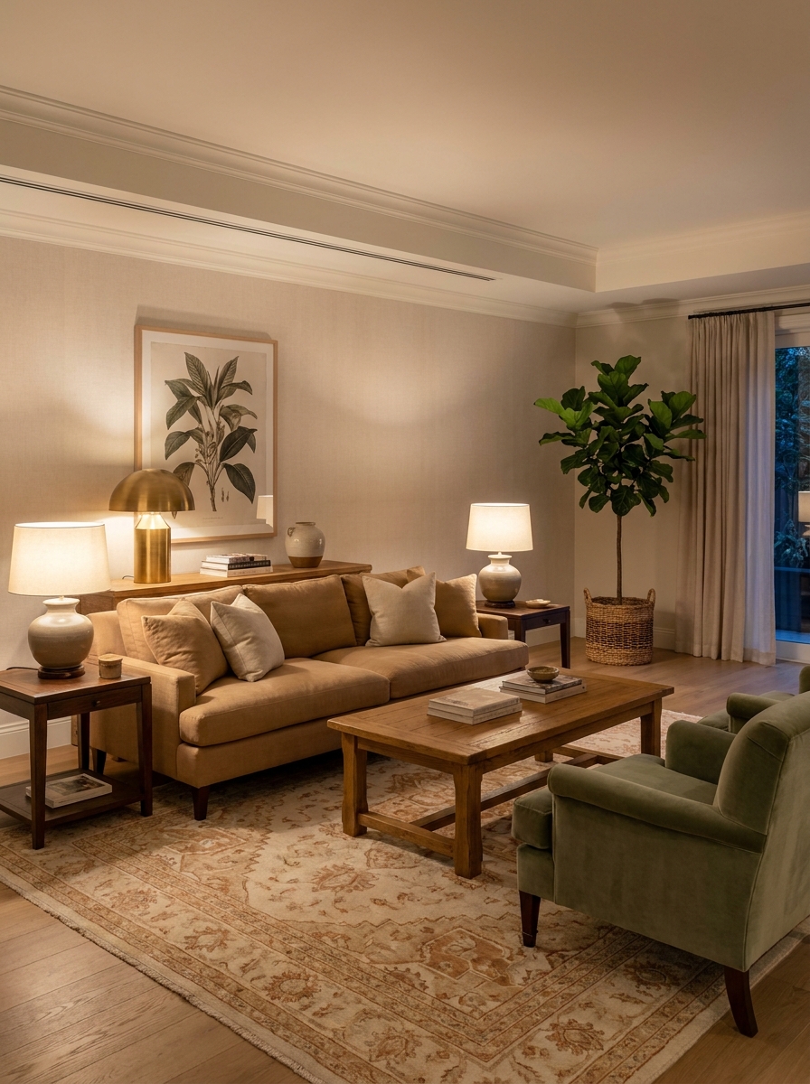
This one’s sneaky because you might not even realize what’s wrong—something just feels… off. Usually, it’s because your furniture pieces aren’t talking to each other in terms of size and weight.
I see this all the time: a massive sectional with tiny little side tables that look like toys beside it. Or a delicate dining table with chunky oversized chairs that swallow it whole. A huge bed with itty-bitty nightstands. It’s like pairing a ballgown with flip-flops—each piece might be fine on its own, but together? Awkward.
Your furniture should have a visual relationship. If you have a substantial sofa, you need coffee and side tables with enough presence to hold their own. If your dining table is light and airy, choose chairs that match that energy. Think about visual weight, not just actual measurements. A chunky wooden piece feels heavier than a glass one of the same size. Play with that balance and suddenly everything just clicks together.
9. Hanging Curtains Too Short or Too Low
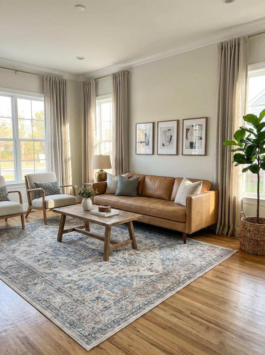
Oh my gosh, this one makes such a huge difference! I see it all the time—curtains hung right at the window frame, or worse, stopping awkwardly mid-wall. It instantly makes your ceilings look lower and your windows look tiny.
Here’s the magic formula: hang your curtain rod as close to the ceiling as possible (or at least 6-8 inches above the window frame), and let those panels kiss the floor. Seriously, this one trick makes any room look taller and more elegant. Even budget curtains look expensive when they’re hung right!
And length matters too. Your curtains should either just touch the floor or have a slight break (about half an inch of extra fabric pooling). Anything shorter—like those awkward curtains that stop at the windowsill—just looks unfinished. I learned this the hard way in my first apartment, and once I rehung everything properly, the whole space felt completely transformed.
10. Neglecting the Five Senses (Especially Touch and Smell)
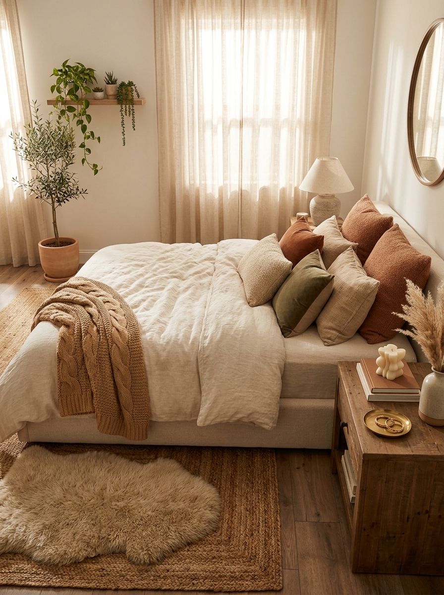
We get so focused on how a room looks that we totally forget about how it feels and smells! But honestly, a beautiful room that’s cold, hard, and stuffy? Not inviting at all.
Think about it—when you walk into a really amazing space, you notice more than just the pretty colors. You want to sink into that chunky knit throw, run your hands over that smooth velvet pillow, light that gorgeous candle. Texture is everything! Mix smooth with rough, soft with structured. Add that chunky knit blanket, those linen curtains, a nubby jute rug, some velvet cushions.
And please don’t ignore how your home smells. I’m not talking about those overpowering plug-ins (yikes), but maybe a subtle candle, fresh flowers, or even just opening your windows regularly. A room can look perfect on Instagram but feel totally lifeless in person if you’re only designing for the camera.
11. Using Only Overhead Lighting (The Harsh Light Trap)
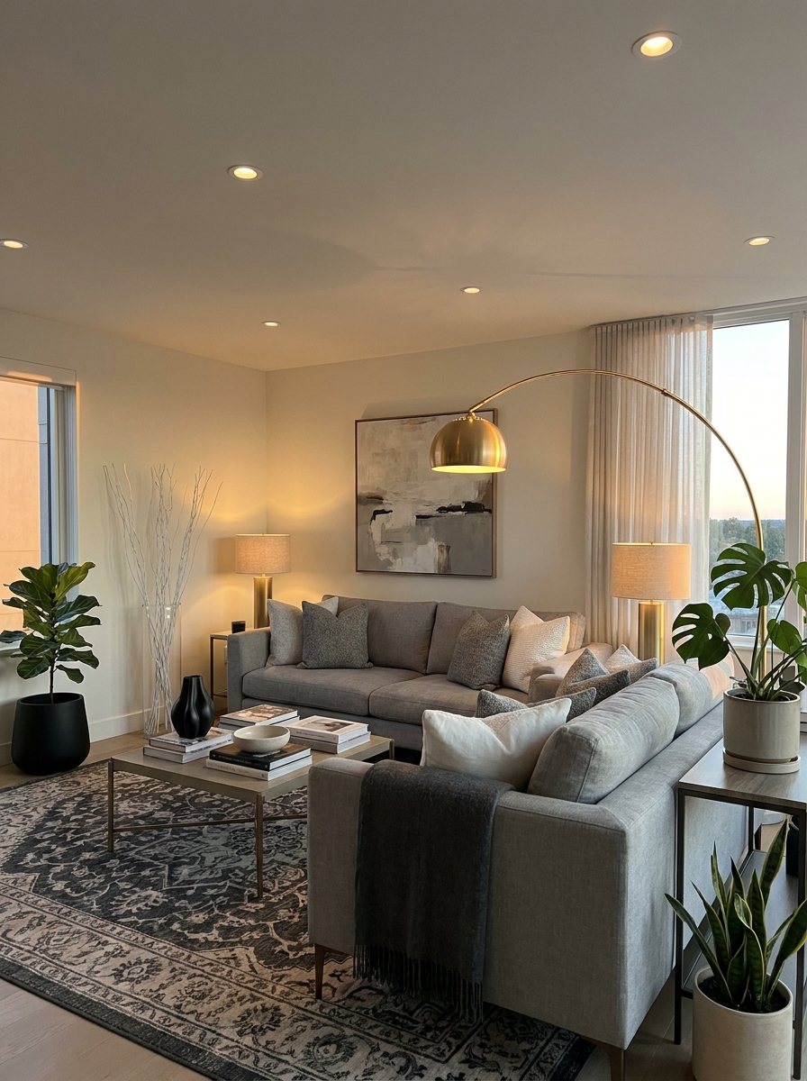
If your only light source is that harsh overhead fixture, we need to talk! Overhead lighting alone is so unflattering and creates this cold, flat atmosphere that makes even beautiful rooms feel like waiting rooms.
The secret to cozy, inviting spaces? Multiple light sources at different heights. I’m talking table lamps, floor lamps, maybe some sconces, even candles. This is what designers mean by “layered lighting,” and it’s honestly a game-changer. When you have light coming from different spots around the room, it creates depth, warmth, and actual ambiance.
I like to have at least three light sources in every room—more if it’s a bigger space. And here’s the thing: you don’t turn them all on at once! Having options means you can adjust the mood. Watching a movie? Just the floor lamp. Reading? Add the table lamp. Having people over? Everything glowing softly. It’s like magic for making your home feel expensive and thoughtfully designed.
12. Forgetting to Edit and Leaving Everything on Display
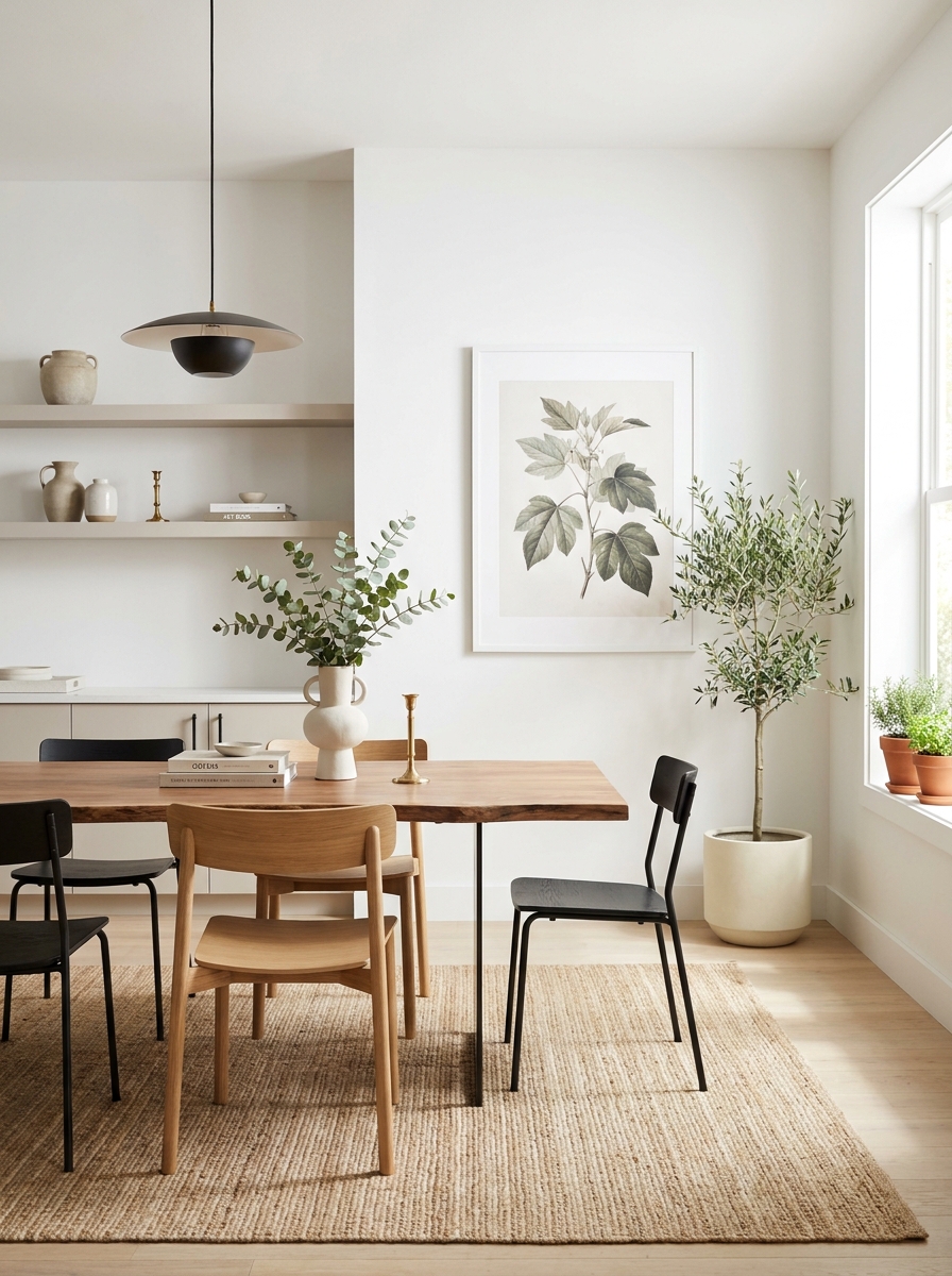
Look, I get it—you love all your stuff! But here’s some tough love: displaying everything you own makes your space feel cluttered and chaotic, no matter how cute each individual item is.
The homes that look effortlessly styled? They’ve been edited. Those designers aren’t showing you every single thing they own—they’re curating what goes on display. That stack of mail, those random knick-knacks, the collection of 47 coffee mugs? They’re hidden away. What you see is intentional.
I do a quarterly edit where I box up about a third of my decorative stuff and rotate things seasonally. It keeps everything feeling fresh, and honestly, you appreciate your favorite pieces so much more when they have room to breathe. Open surfaces, empty corners, blank wall space—these aren’t mistakes, they’re design choices! Your eye needs places to rest. A thoughtfully placed vase of flowers makes way more impact than ten things fighting for attention.
13. Following Trends Without Considering Your Lifestyle
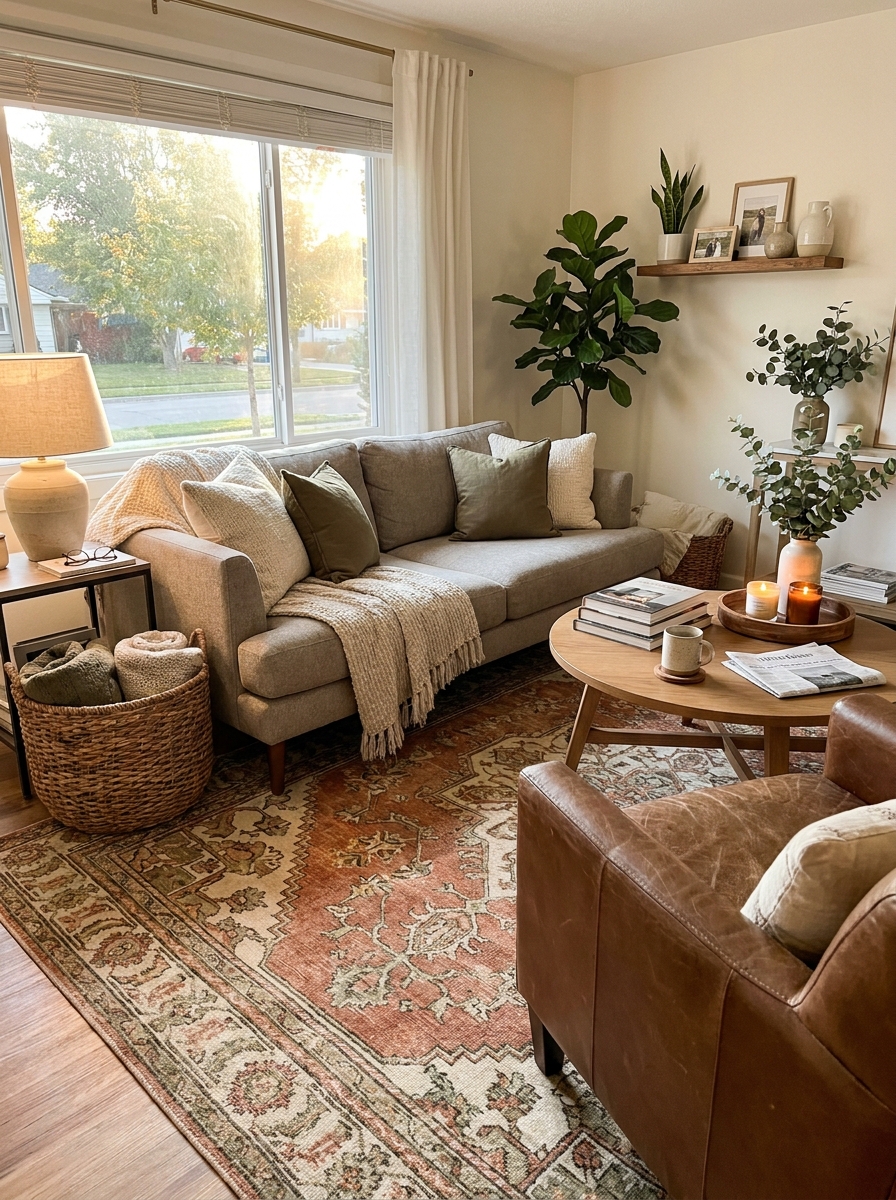
Oh, that velvet tufted bench looks stunning on Instagram! But do you actually need seating at the foot of your bed, or will it just become a clothes-dumping station by Wednesday?
I’ve been there. I once bought a gorgeous white linen sofa because everyone had one. Guess who has a toddler and two dogs? This girl. It lasted approximately three weeks before looking like a disaster zone. Trends are fun and inspiring, but your home needs to work for YOUR actual life, not someone else’s carefully curated feed.
Think about how you really live. Do you eat dinner on the couch every night? Then maybe skip that impractical light-colored upholstery. Have pets? Consider that before installing cream carpeting. Work from home? Don’t sacrifice a functional office setup just because open-concept everything is trendy right now. Your home should make your daily life easier and more enjoyable, not harder. The best design choices are the ones that look great AND actually function for the way you live every single day.
14. Ignoring the Room’s Architecture and Fighting Its Natural Character
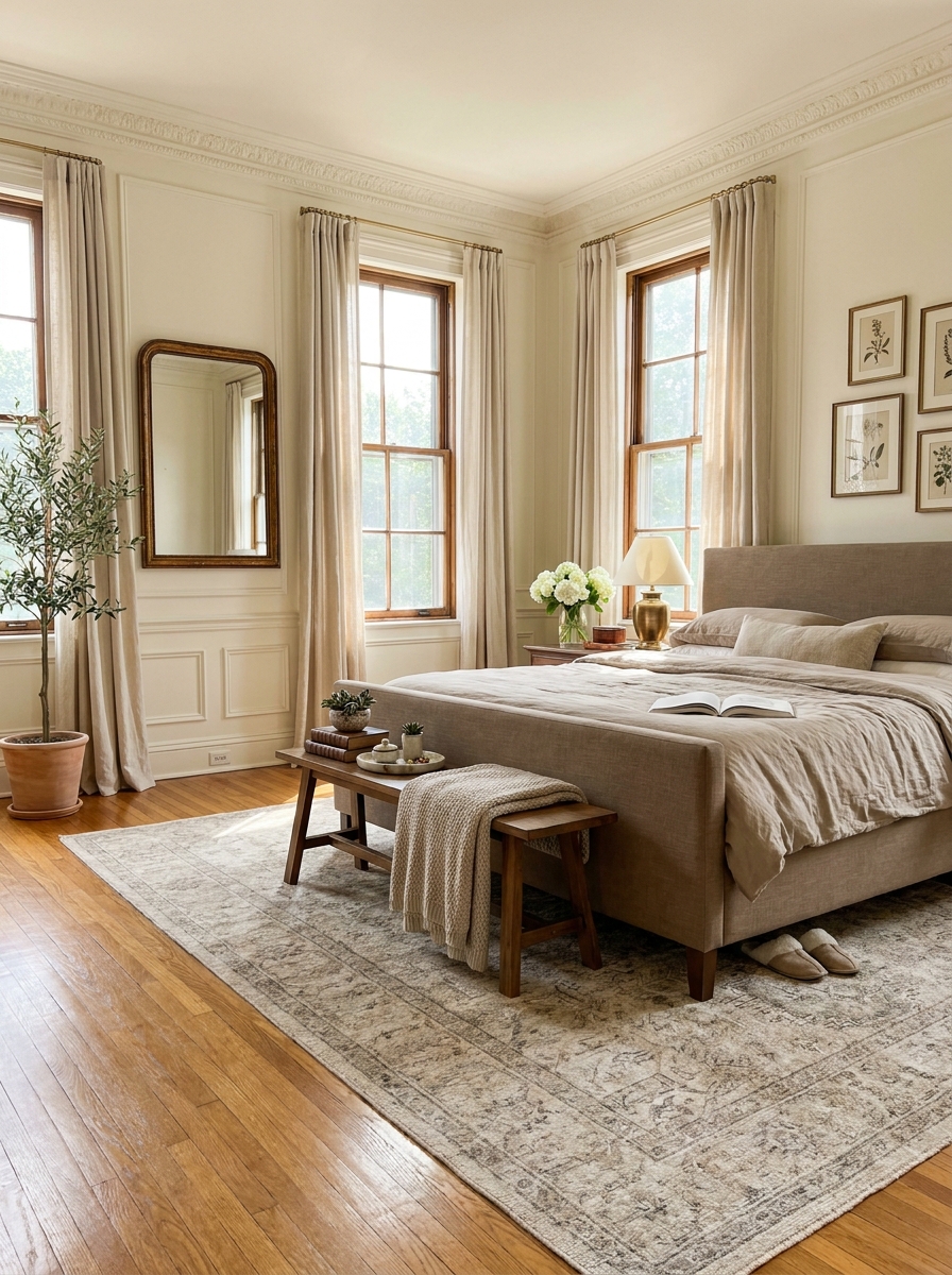
Your room is trying to tell you something. Those beautiful original crown moldings? They’re saying “classic elegance.” That exposed brick wall? It’s screaming “industrial charm.” But sometimes we ignore what the room is naturally good at and try to force it into something it’s not.
I see this all the time. Someone has a gorgeous traditional home with beautiful architectural details, but they try to make it ultra-modern minimalist. It just feels… off. Or they’ve got a sleek contemporary loft and fill it with heavy traditional furniture. The room fights back every time.
Work WITH your space, not against it. If you have beautiful hardwood floors, show them off instead of covering every inch with rugs. Got great natural light? Don’t block it with heavy drapes. Awkward angles or low ceilings? Embrace them as character instead of trying to hide them. Your room has a personality. Once you figure out what it wants to be and enhance those natural features, everything else falls into place so much easier.
15. Creating a Room With No Focal Point (or Too Many Competing Ones)
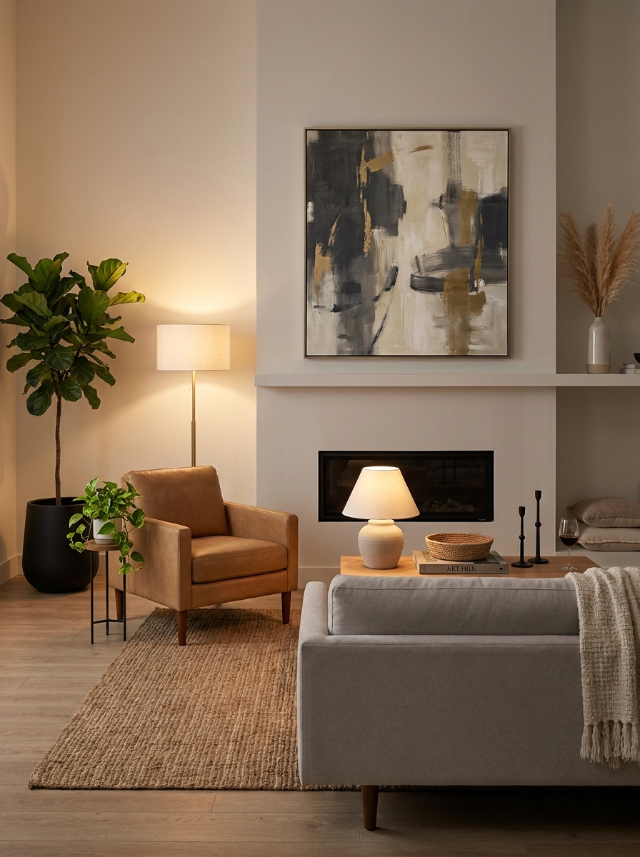
Your eye needs somewhere to land when you walk into a room. Without a clear focal point, everything competes for attention and nothing wins. The room just feels… chaotic and uncomfortable, even if you can’t figure out exactly why.
I learned this the hard way in my first apartment. I had a bold gallery wall, colorful curtains, a patterned rug, and a bright accent wall all fighting each other. My guests’ eyes didn’t know where to look. It was visually exhausting. Once I chose ONE star (the gallery wall) and let everything else support it, the room finally felt calm and intentional.
Every room needs a hero. Maybe it’s a fireplace, a stunning view, beautiful artwork, or even a gorgeous headboard. Once you identify it, arrange your furniture to highlight it and keep other elements more subdued. If your room doesn’t have a natural focal point, create one with a large piece of art, an accent wall, or a statement furniture piece. Just remember: one star per room. Everything else is the supporting cast.
16. Decorating Without a Clear Color Story or Palette
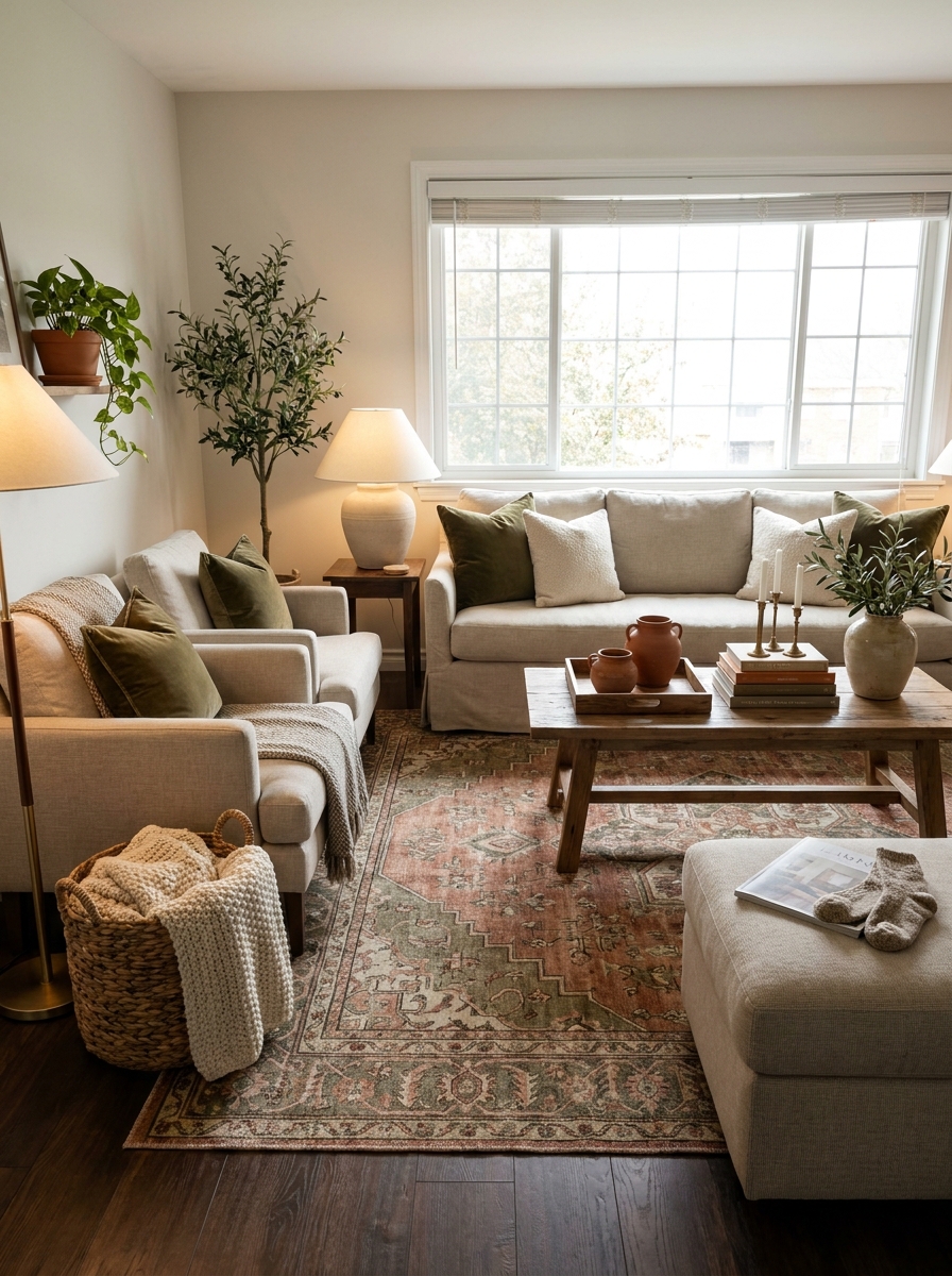
Randomly adding colors because you like them individually is like throwing ingredients into a pot without a recipe. Sure, you love that turquoise pillow AND that coral throw AND those yellow curtains, but do they love each other? Probably not.
This was my mistake for years. I’d see something pretty and bring it home without considering what was already there. My living room looked like a rainbow exploded. Nothing felt cohesive or intentional. It just looked… accidentally collected from random garage sales. Once I committed to a palette of warm neutrals with black accents and one green accent color, everything clicked. Suddenly the room felt pulled together and grown-up.
You don’t need to be boring or matchy-matchy, but you DO need a plan. Pick 3-4 colors that work together and stick with them throughout the room. Use different shades and textures to keep things interesting, but stay within your family of colors. This doesn’t mean everything has to match perfectly, but there should be a clear color thread connecting everything together.
17. Treating Your Walls Like an Afterthought
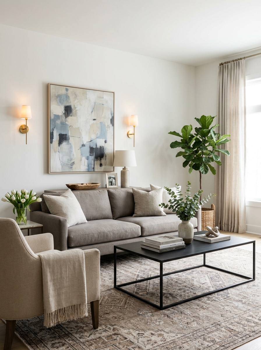
Blank walls feel unfinished. Overstuffed walls feel chaotic. Finding that sweet spot is where the magic happens.
I see this constantly—people either leave their walls totally bare (thinking minimalism means empty) or they go wild and cover every inch with random stuff. Neither extreme works. Your walls need intention, but they also need breathing room.
Think of your walls as supporting actors, not the main event. They should enhance the room without screaming for attention. A beautiful large-scale piece of art, a thoughtfully arranged gallery wall, textured wall treatments, or even architectural details like board-and-batten can transform a space. The key is giving each element room to breathe. White space around artwork isn’t wasted space—it’s what makes your eye focus on what matters. And please, don’t hang tiny frames scattered randomly across a huge wall. Scale matters here too!
18. Skipping the Finishing Touches That Make a Room Feel Complete
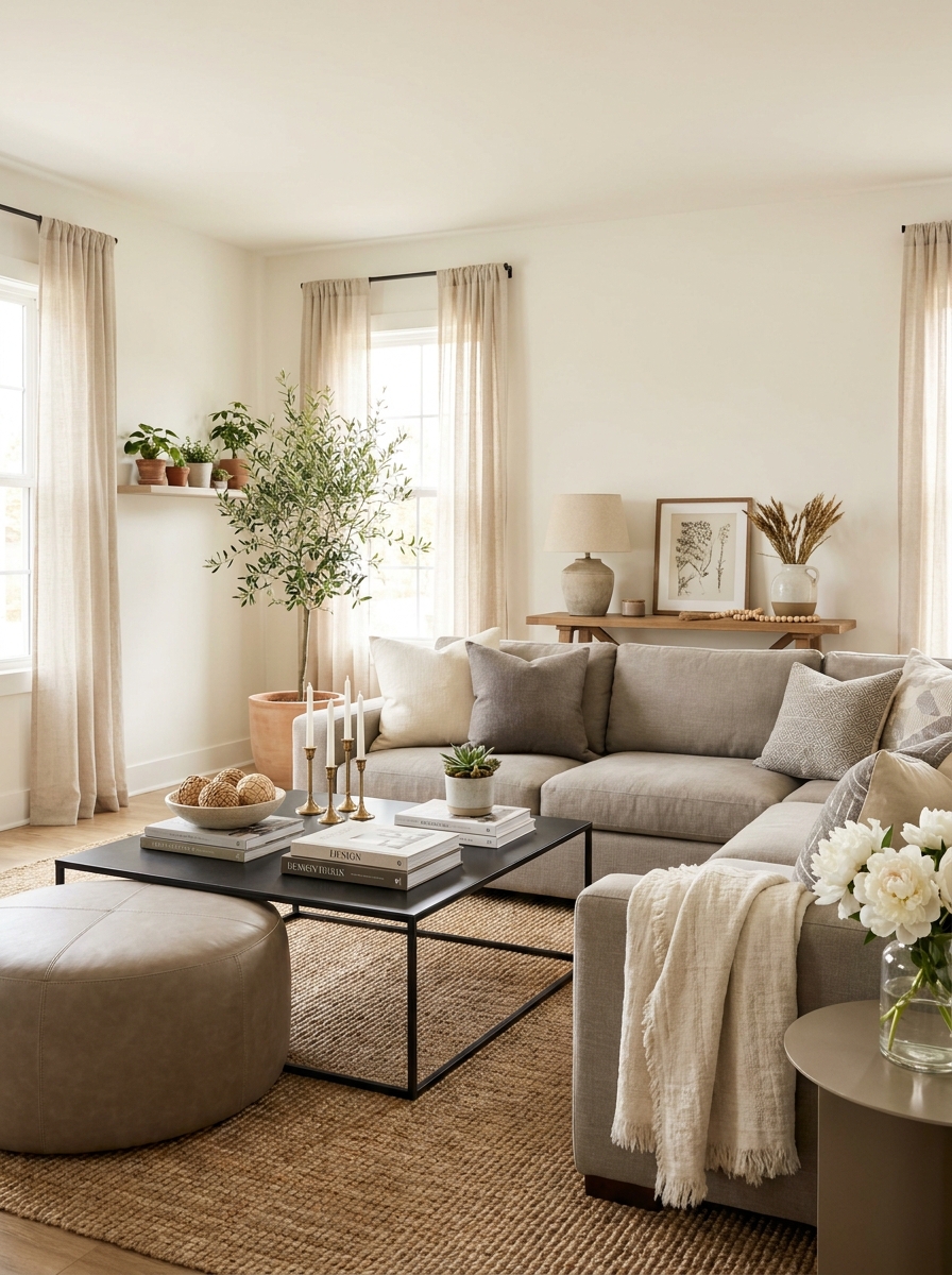
You know that feeling when a room is almost there but something’s missing? That’s usually the finishing touches talking.
These are the details that make a space feel like someone actually lives there and loves it. Fresh flowers. A cozy throw. Books you actually read stacked on the coffee table. Candles that smell amazing. These aren’t just “extra” things—they’re what transform a room from looking staged to feeling lived-in and loved.
But here’s the thing: finishing touches should feel natural, not fussy. You’re not trying to recreate a store display. You’re adding personality and warmth. A vintage bowl you found at a flea market. Your favorite coffee table books. A beautiful tray corralling your remote controls. These little moments of intentionality make all the difference between a room that feels sterile and one that feels like home.
19. Ignoring Traffic Flow and Creating Obstacle Courses
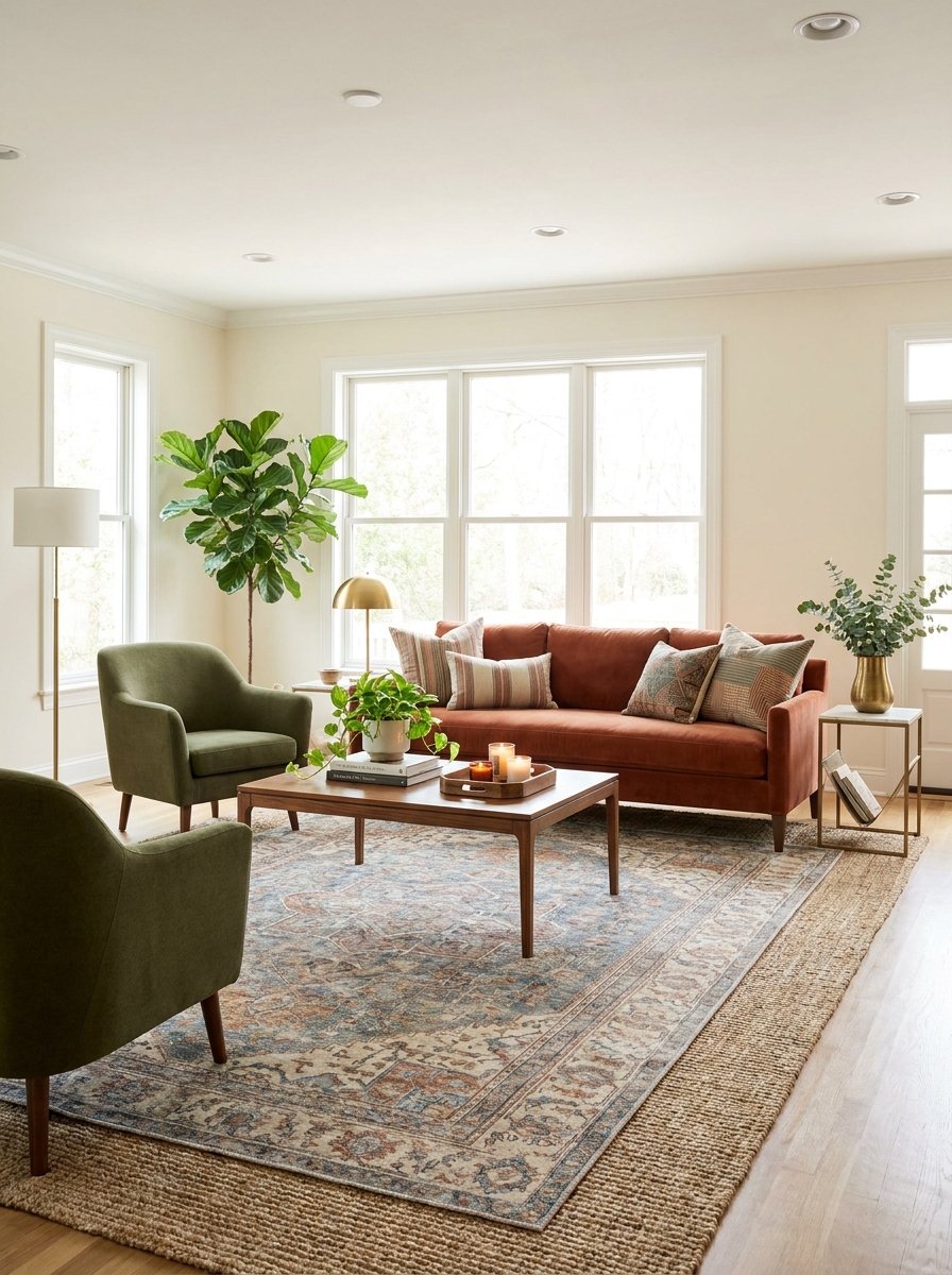
If you’re doing furniture gymnastics just to walk through your living room, we need to talk about traffic flow.
Every room has natural pathways—the routes you take from the door to the sofa, from the hallway to the window, from one space to another. When you ignore these invisible highways and plop furniture wherever it looks good, you end up bumping into coffee tables and squeezing sideways past chairs. Not cute.
Good traffic flow means you can move through a space easily and naturally. Aim for at least 30 inches of walking space in main pathways and 18 inches minimum between furniture pieces. Your coffee table shouldn’t require a detour. Your chairs shouldn’t block the natural route to the window. Think about how you actually live in the space, then arrange furniture to support those movements. A beautiful room that’s annoying to navigate isn’t really beautiful at all.
20. Forgetting That Rooms Need Personality and Soul
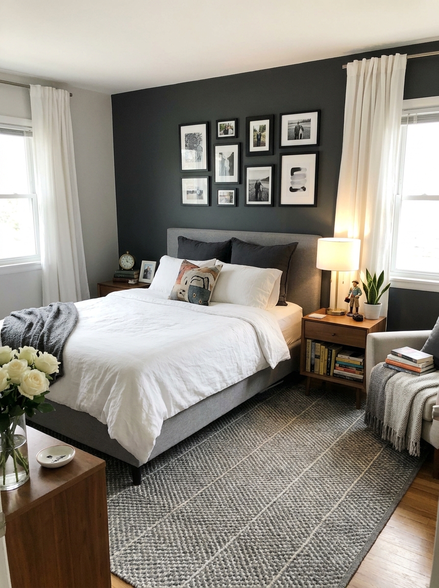
The most technically perfect room can still feel completely lifeless if it doesn’t have personality.
I’m talking about the things that make a space uniquely yours—travel souvenirs that tell stories, artwork from local artists, your grandmother’s vintage lamp, collections that make you smile. These personal touches are what separate a generic showroom from a home that feels authentic and warm. Pinterest inspiration is great, but carbon-copy rooms feel flat.
Personality doesn’t mean clutter or chaos. It means being intentional about including things you genuinely love alongside all those design rules. Maybe it’s a gallery wall of family photos in beautiful frames. Vintage finds mixed with new pieces. Books that reflect your actual interests. A bold paint color that makes you happy. The goal is a space that feels like you while still looking pulled-together and beautiful. That’s the sweet spot where good design and real life meet.
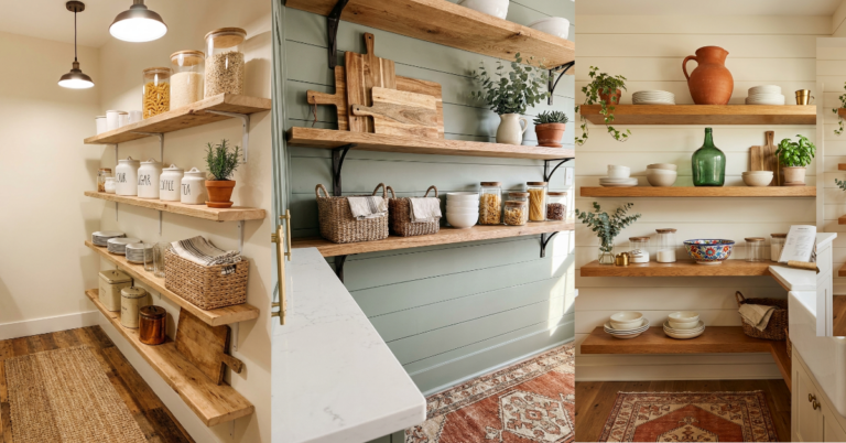
21. Installing Shelves Without Thinking About What Goes On Them
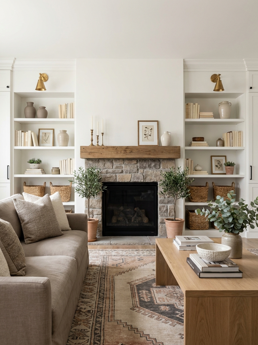
Oh, I’ve seen this so many times! You install beautiful floating shelves or a whole wall of built-ins, and then… you have no idea what to put on them. So they either sit empty (awkward!) or get crammed with random stuff that doesn’t look intentional at all.
Here’s the thing: shelves are only as good as what you display on them. Before you drill a single hole, think about what you actually want to showcase. Do you have a book collection? Gorgeous ceramics? Travel souvenirs? Your shelving should work for YOUR stuff, not the other way around.
And please, leave some breathing room! Not every inch needs to be filled. The best styled shelves have a mix of books, objects, small plants, and—this is key—empty space. That’s what makes the eye rest and the whole thing feel curated instead of cluttered. Think of it as creating little vignettes that tell a story about you.
22. Buying Furniture Before You Know Your Measurements
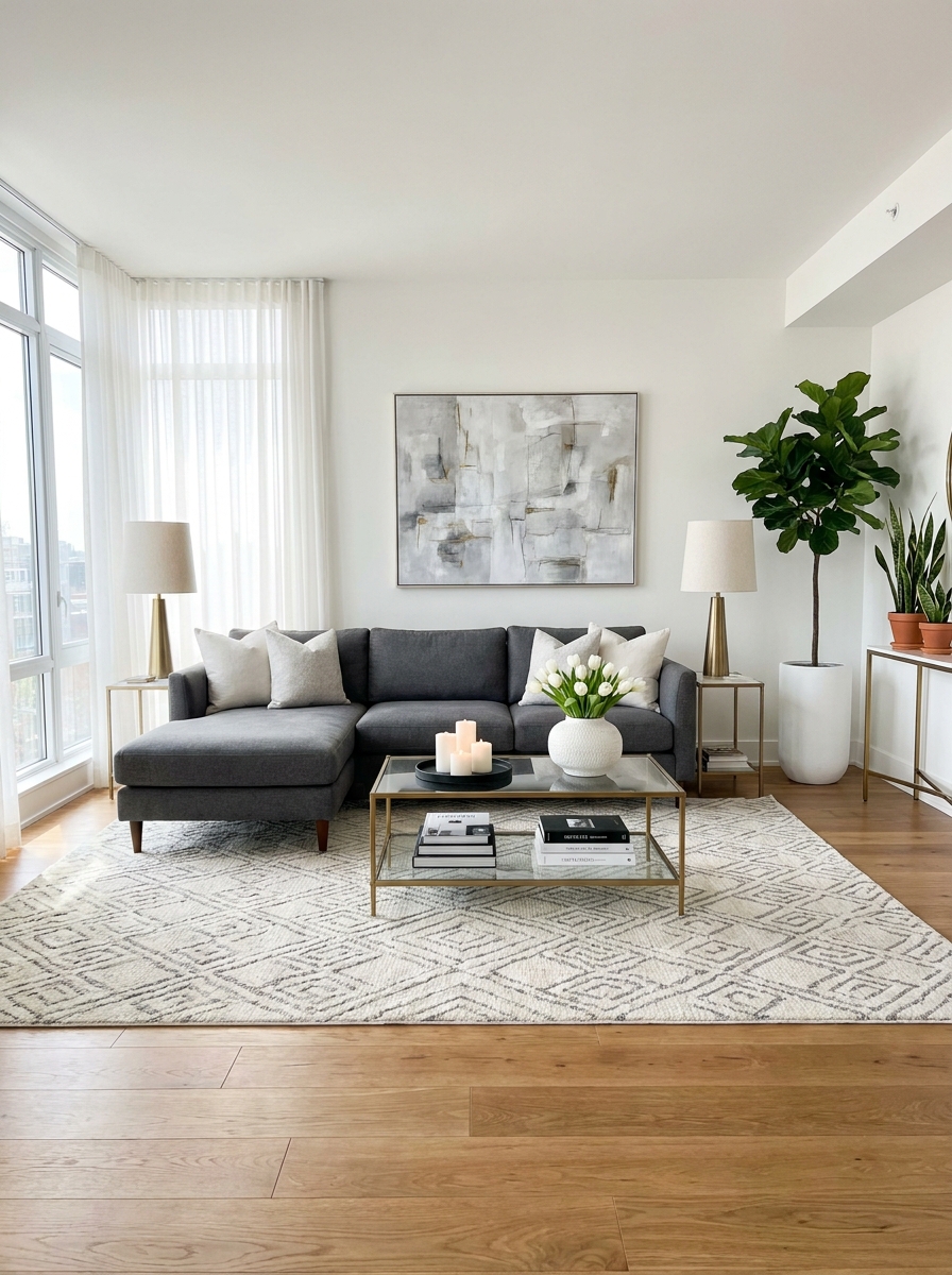
This mistake breaks my heart every single time. Someone falls in love with a gorgeous sofa online, clicks buy, and then it arrives and… it’s way too big. Or too small. Or it blocks the doorway. Or it makes the whole room feel off-balance.
I get it—measuring feels boring and tedious when you just want to shop. But trust me, it’s the unsexy step that saves you from expensive mistakes and major regret. You need to know your room dimensions, your doorway widths, and where your electrical outlets are before you buy anything significant.
And here’s something most people don’t think about: measure the pathway from your front door to the room too! I once had to return a beautiful armchair because it literally couldn’t make the turn into my living room. Learn from my tears. Measure twice, buy once. Use painter’s tape on the floor to map out furniture sizes before committing. It sounds excessive, but it works.
23. Decorating Every Room the Same Way (Hello, Monotony!)
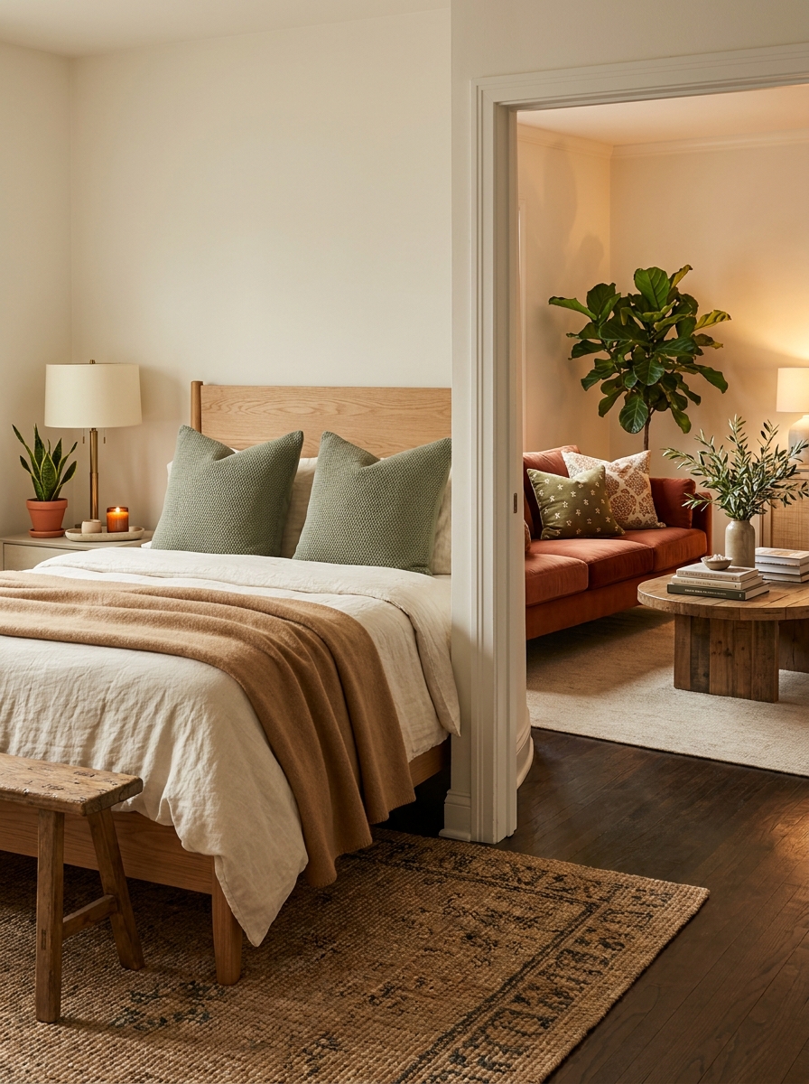
Your bedroom shouldn’t look exactly like your living room, which shouldn’t look exactly like your dining room. But I see this all the time—someone finds a style they love and then copies and pastes it into every single space. Same colors, same vibe, same energy everywhere.
Different rooms serve different purposes, and they should feel different too! Your bedroom should feel calming and restful. Your living room might be more energetic and social. Your home office needs focus and clarity. When every room has the identical aesthetic, your home starts feeling flat and one-note.
This doesn’t mean your house should look like seven different people decorated it. You definitely want a cohesive thread—maybe it’s your color palette, or your love of natural materials, or your modern-meets-vintage vibe. But let each room have its own personality within that framework. Change up your accent colors. Use different textures. Let rooms breathe and be themselves.
24. Forgetting That Negative Space Is Actually Positive
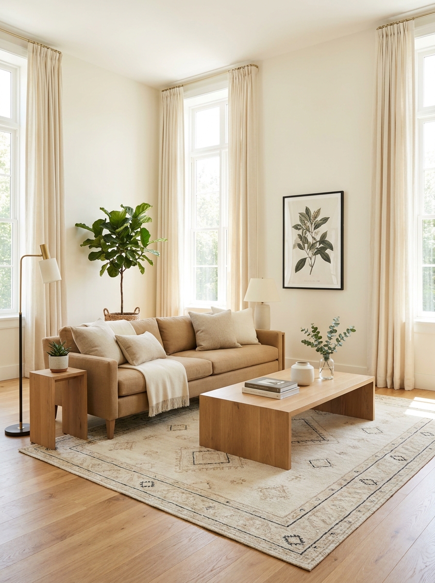
Here’s a secret that took me years to learn: empty space is not wasted space. In fact, it’s some of the most valuable real estate in your home! But so many of us feel this weird pressure to fill every surface, every corner, every wall. We think more stuff equals more style. Spoiler: it doesn’t.
Negative space—those empty, breathing areas—is what makes your beautiful things actually stand out. It’s what gives your eye a place to rest. It’s what makes a room feel calm instead of chaotic. When everything is crowded together, nothing gets appreciated. Your gorgeous vase gets lost next to seventeen other things.
Think about the homes you see in magazines that make you swoon. They’re not packed full of stuff, right? They have intentional emptiness. A beautiful chair standing alone. A single vase on a console. A stretch of blank wall that makes the art pop. That breathing room is doing serious design work! It’s not lazy—it’s strategic and sophisticated.
25. Treating Every Surface Like a Storage Opportunity
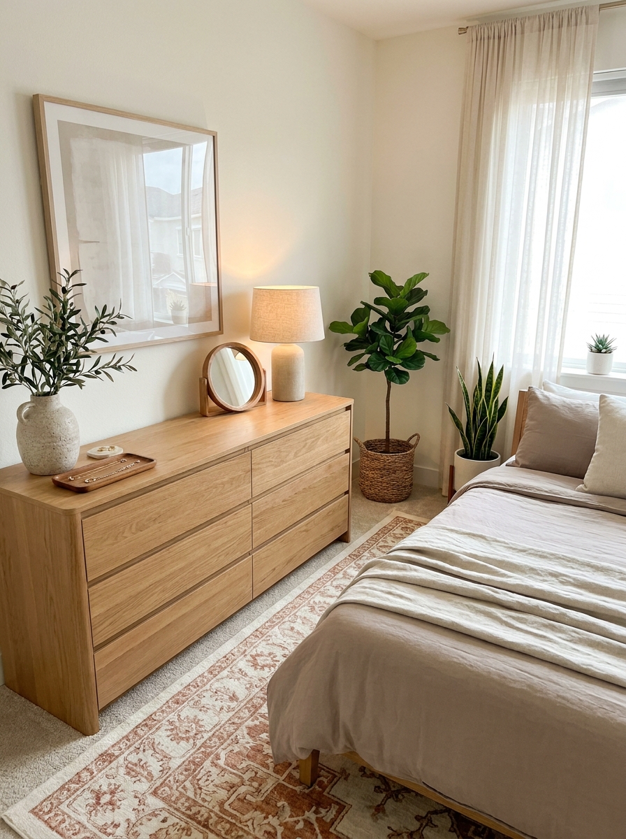
Just because you have a flat surface doesn’t mean something needs to sit on it. Every dresser, every shelf, every counter covered with stuff? That’s not cozy. That’s chaos pretending to be decorating.
I see this all the time. People fill every single surface with things because it feels empty otherwise. But here’s what actually happens: your eye has nowhere to rest. You walk into a room and feel instantly overwhelmed without knowing why. That beautiful credenza you saved up for? Totally invisible under seventeen framed photos and a basket of random stuff.
Learning to leave surfaces clear is honestly one of the hardest decorating skills. It feels wrong at first! But bare surfaces create visual breathing room. They let your actual decor shine instead of competing with everything else. Your prettiest vase makes way more impact when it’s not surrounded by clutter.
Start treating empty space like the design element it is. Not every surface needs decorating. Some spots are perfect exactly as they are: beautifully, intentionally bare.
26. Using Teeny Tiny Accent Pillows (They Look Lost and Sad)
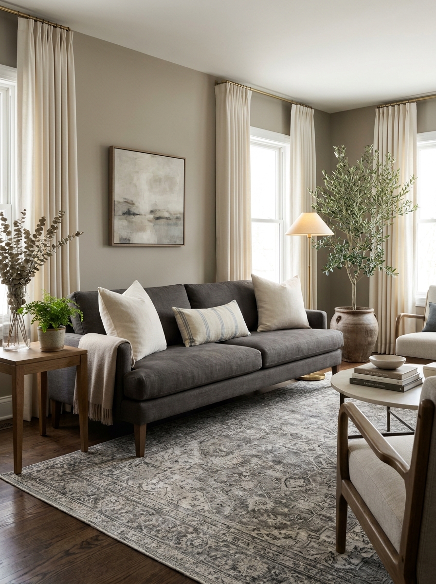
Those cute little 12-inch throw pillows scattered on your sofa? They’re doing absolutely nothing for you. They look like decorative afterthoughts that shrank in the wash. Accent pillows need presence to actually make an impact.
I don’t know why small pillows became a thing, but they’re everywhere. And they always look wrong. Too small for the sofa. Too wimpy for the scale of the room. You need three times as many to fill the space, which gets expensive and cluttered fast. Plus, you can’t actually lean against them comfortably. They’re just… there, looking ineffective.
Proper pillow sizing changes everything. Bigger pillows (20 inches, 22 inches, even 24 inches) look intentional and luxurious. They fill the sofa properly without needing a dozen of them. They photograph better. They feel better. They make your whole seating area look more expensive and considered.
Think of pillows like artwork. You wouldn’t hang a tiny 4×6 picture on a big blank wall, right? Same principle. Go bigger than feels safe. Your sofa will thank you.
27. Forgetting That Texture Matters As Much As Color
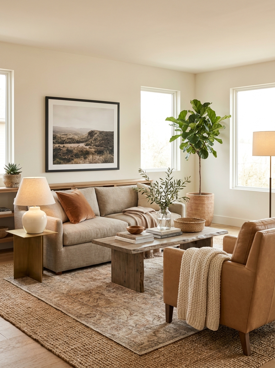
You can get your color palette absolutely perfect and still have a room that falls completely flat. The missing ingredient? Texture. When everything in a room has the same visual texture, it feels one-dimensional and boring, even if the colors are gorgeous.
I’ve walked into so many beautifully colored rooms that just didn’t feel right. Everything smooth and matte. Or everything shiny. Or all the fabrics soft and drapey with nothing crisp to balance them. Your eye needs variety in texture just like it needs variety in color. Mixing rough with smooth, matte with shiny, nubby with sleek—that’s what creates visual interest and depth.
Think about it: linen curtains, a chunky knit throw, a sleek leather chair, a rough jute rug, smooth ceramic lamps, a fuzzy sheepskin. All those different textures together create richness that color alone can’t achieve. It’s the difference between a room that photographs well and a room that actually feels amazing to be in.
Texture is especially crucial in neutral spaces. When you’re working with a tight color range, texture does all the heavy lifting.
28. Installing Open Shelving Without a Styling Plan (Recipe for Visual Chaos)
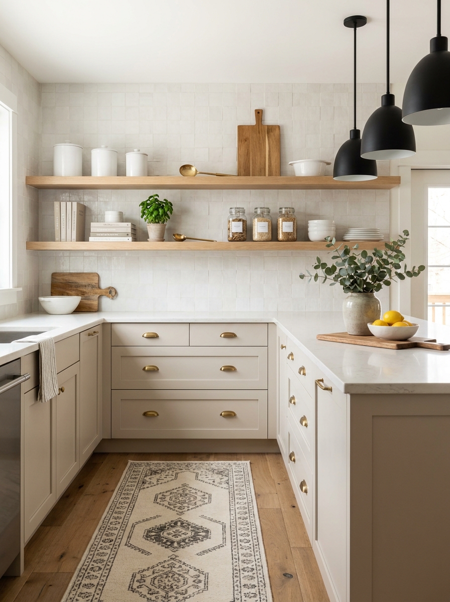
Open shelving looks amazing in magazine photos. In real life? It’s a high-maintenance relationship that requires actual commitment. If you install those beautiful floating shelves without thinking about what goes on them and how you’ll keep them looking good, you’re setting yourself up for frustration.
Here’s what usually happens: you put up the shelves, fill them with random stuff you need to store, and suddenly your wall looks cluttered and chaotic instead of chic and curated. Open shelving isn’t really storage—it’s display. Everything on those shelves is on stage all the time. Mismatched mugs, vitamin bottles, and that random pile of papers? Yeah, everyone sees all of it.
Successful open shelving requires editing, intentional styling, and ongoing maintenance. You need cohesive containers, things that look good together, a plan for the composition. It’s not grab-and-go storage. It’s curated display that happens to hold some functional items.
Before you rip out those upper cabinets, ask yourself honestly: am I going to style these shelves and keep them looking good? Or do I need the hidden storage more?
29. Picking Paint Colors in the Wrong Light (Then Regretting Everything)
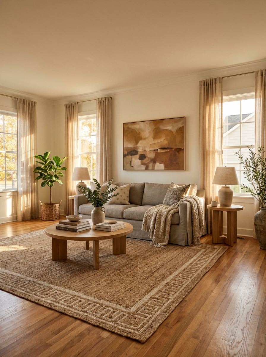
Here’s a scenario that’s happened to basically everyone: You see a gorgeous paint chip at the store, bring it home, paint an entire room, and then wonder why it looks completely different. Natural light changes EVERYTHING about how color appears.
That soft greige you loved? It might look lavender in north-facing light or peachy in evening sun. That crisp white? Could turn blue-grey on cloudy days or creamy gold in afternoon light. Every room has its own light personality throughout the day, and your paint needs to work with it, not against it.
The biggest mistake is picking colors under fluorescent store lighting or just looking at tiny chips. You need to see large swatches in YOUR actual space, in YOUR actual light, at different times of day. I’m talking morning, noon, evening, and overcast days. Yes, it takes patience, but it beats repainting everything two weeks later when you realize your “perfect neutral” looks like a sad hospital corridor.
30. Forgetting That Your Home Should Actually Reflect YOU (Not Just Pinterest)
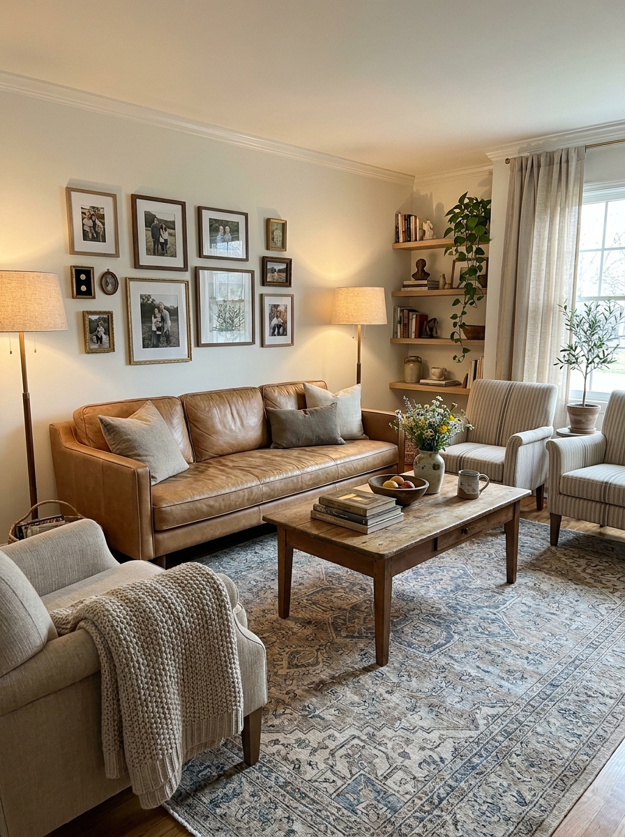
This might be the most important one on the whole list. Your home should tell YOUR story, not look like a greatest hits collection from someone else’s saved pins. I see so many gorgeous rooms that feel completely soulless because they’re just trend after trend with no personality.
There’s nothing wrong with finding inspiration online—we all do it! But if every single choice comes from what’s popular right now instead of what actually makes you happy, you’ll end up with a beautiful magazine-spread room that doesn’t feel like home. Where are your favorite books? Your travel memories? That weird vintage thing you inherited from your grandma?
The most beautiful rooms I’ve ever seen have that magic mix: good design principles PLUS personal touches that make you smile. Your home should feel like you walked in and created it over time, not like you ordered it from a catalog. Trust your gut. Mix in things you genuinely love. Break a design rule if it means including something meaningful. That’s when a house becomes a home.
Quick Guide
Quick Reference: Common Mistake Fixes
| Mistake | Quick Fix | Impact |
|———|———–|——–|
| Rug too small | Front furniture legs on rug minimum | Instant cohesion |
| Art hung too high | Center at 57-60 inches | Professional look |
| Furniture against walls | Pull sofa 12+ inches away | Cozy intimacy |
| Single light source | Add 2-3 lamps at different heights | Warm ambiance |
| Wrong pillow size | 20-24 inch pillows for sofas | Proper scale |
| Curtains too short | Hang rod near ceiling, puddle floor | Taller ceilings |
These six fixes alone will transform how your room feels. Start with whichever bugs you most — you’ll see the difference immediately.
Your Home, But Make It Feel Right
Look, decorating isn’t about following rigid rules or spending a fortune. It’s about understanding why certain things work and others don’t. Once you see these mistakes, you can’t unsee them — and that’s actually a good thing. You’ll walk into your living room and immediately know why it feels off. That tiny rug. That art floating near the ceiling. That harsh overhead light washing everything out.
But here’s what I love about these fixes: they’re not complicated. You don’t need to buy all new furniture or hire a designer. Most of these mistakes are about placement, scale, and proportion. Move your sofa. Swap your rug size. Add a lamp. Lower your artwork. Small shifts, big impact.
Your home should feel like the best version of itself — not like a showroom, but like a space that actually works for how you live. So pick one thing from this list. Just one. Fix it this weekend. Then notice how much better everything feels. That’s the magic of getting the fundamentals right.
Frequently Asked Questions
What’s the most common decorating mistake people make in living rooms?
Pushing all furniture against the walls is the biggest one. It makes rooms feel disconnected and awkward instead of cozy. Pulling your sofa even 12 inches from the wall creates intimacy and better flow. This one change transforms how a space feels.
How do I know if my area rug is too small for my space?
If only your coffee table sits on the rug, it’s too small. At minimum, the front legs of all your seating should rest on the rug. Ideally, all furniture legs fit on it. A properly sized rug anchors the room and makes everything look cohesive and intentional.
What height should I hang artwork above my sofa?
Leave 6 to 8 inches between the top of your sofa and the bottom of your frame. The center of the artwork should hit around 57 to 60 inches from the floor — that’s eye level. This creates proper visual connection between furniture and art.
Why does my room still feel dark even with overhead lighting?
Because overhead lighting alone creates harsh shadows and no warmth. You need layered lighting — table lamps, floor lamps, and ambient sources at different heights. This adds dimension and creates that cozy glow that makes spaces feel inviting instead of flat.
Can decorating mistakes make a room look smaller than it is?
Absolutely. Wrong-sized rugs, furniture crammed against walls, and poor lighting all make spaces feel choppy and cramped. Proper scale, smart furniture placement, and layered lighting actually make rooms feel larger and more intentional, even in small spaces.