21 Gorgeous Color Trends 2026 That Transform Any Room
You’re scrolling through Pinterest again, aren’t you? Saving color palettes you love but never quite know how to use in your actual living room. I get it. Every year brings new color trends, and 2026 is serving up some seriously gorgeous palettes that feel both fresh and surprisingly livable. We’re talking rich, complex hues that make your space feel intentional without looking like you’re trying too hard. The best part? These aren’t those intimidating colors that only work in million-dollar homes. They’re real-world shades that layer beautifully with what you already own. From moody earth tones to unexpected jewel combinations, these 21 color trends will give you that designer look without the designer budget. Some are bold. Others whisper. All of them work. Let’s get into it.
1. Terracotta Sunset: Warm Clay Meets Burnt Orange
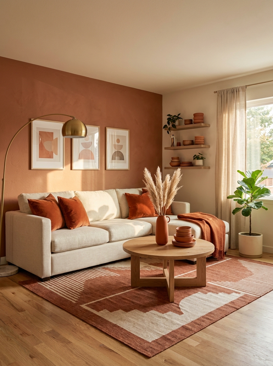
This palette feels like golden hour in your living room. Terracotta has been around, sure, but 2026’s version leans warmer and deeper, with burnt orange accents that add unexpected energy. Think sun-baked clay pots mixed with desert sunsets. What makes this combo work so well is how it grounds a space while still feeling alive and current.
Pair a terracotta accent wall with cream sofas and burnt orange pillows. The warmth wraps around you without overwhelming the room. It’s cozy without feeling heavy, which is exactly what we need as we move away from all those cool grays. Add in some natural wood tones and brass hardware, and you’ve got a palette that feels both modern and timeless.
This works beautifully in living rooms and dining spaces where you want conversation to flow. The colors are rich enough to make a statement but earthy enough that they won’t compete with your vintage rug or grandmother’s sideboard. It’s one of those palettes that somehow makes everything else in the room look better.
2. Forest Depth: Deep Green with Charcoal and Ivory
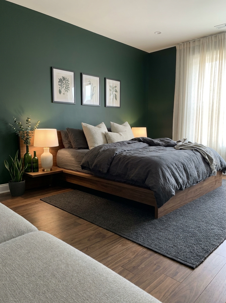
If terracotta feels too warm for you, this palette is your answer. Deep forest green is having a major moment, and when you pair it with charcoal gray and soft ivory, it creates this sophisticated, layered look that feels expensive. It’s moody without being dark, which is a tricky balance to strike.
The key is using forest green as your dominant color — maybe on your walls or a large piece of furniture like a velvet sofa. Then bring in charcoal through smaller pieces like picture frames, lamp bases, or a patterned rug. Ivory keeps everything from feeling too heavy. Think cream throw blankets, off-white curtains, or a chunky ivory knit pillow.
This palette works especially well in bedrooms and home offices where you want to feel calm and focused. There’s something about deep green that makes a space feel grounded and restorative. And unlike some trendy colors that scream “2026,” this combination has serious staying power. You won’t be repainting in two years.
3. Dusty Mauve and Sage: The New Neutral Pairing
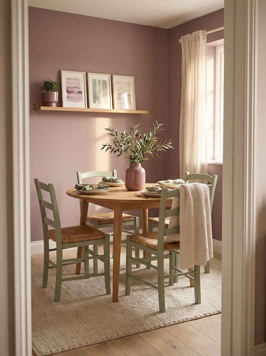
Okay, hear me out on this one. Dusty mauve isn’t your grandmother’s pink, and when you combine it with soft sage green, it creates this incredibly soothing palette that works like a neutral but feels way more interesting. It’s the perfect bridge if you’re trying to move away from beige but aren’t ready for bold color.
The trick is keeping both colors muted and soft. You want that washed-out, slightly grayed quality that makes them feel sophisticated rather than cutesy. Use sage on your walls and bring in mauve through upholstery, pillows, and artwork. Or flip it — mauve walls with sage accents. Both work beautifully.
This palette shines in spaces where you want to feel calm but not boring. Nurseries, obviously, but also living rooms, bathrooms, and even kitchens. There’s something universally appealing about these colors together. They’re gentle enough for everyday living but distinctive enough that people will notice and compliment them. And they photograph gorgeously, which matters if you’re the type who shares your home on Instagram.
4. Chocolate Brown Revival: Rich Cacao with Caramel and Cream
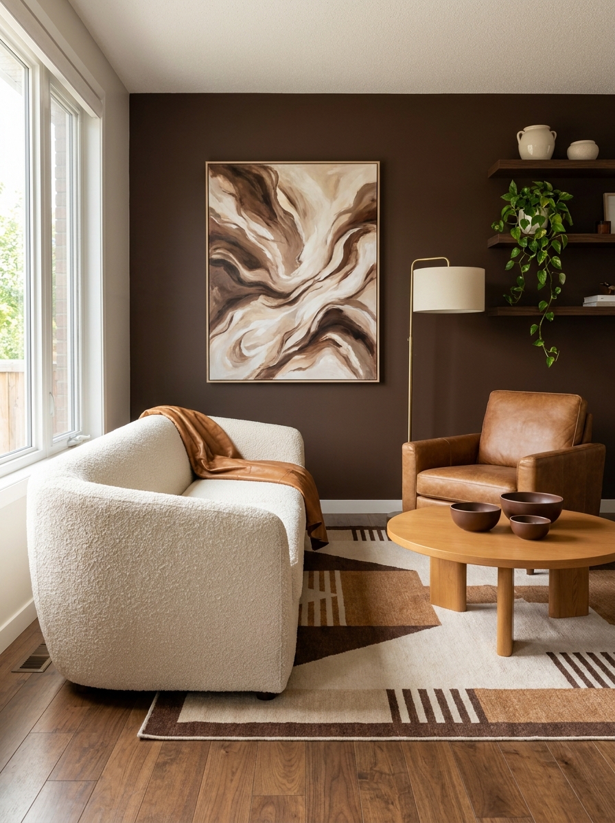
Brown is back, but not the way you remember it. Forget those muddy builder-grade browns from the 2000s. The 2026 version is rich, intentional, and totally craveable. We’re talking deep chocolate brown paired with warm caramel tones and plenty of cream to keep things from feeling too dark.
The secret to making this palette work is layering different shades of brown. A chocolate accent wall, caramel leather chairs, a cream sofa, maybe some lighter tan wood tones. When you stack these shades, you create depth and warmth that feels genuinely luxurious. It’s the kind of palette that makes your home feel like an expensive boutique hotel.
Use this in living rooms or bedrooms where you want serious coziness. Brown absorbs light in the best way possible, creating this enveloping feeling that’s perfect for spaces where you want to relax and unwind. And here’s the bonus: brown is incredibly forgiving. It hides wear and tear better than lighter colors, which makes it practical for real life with kids, pets, and the occasional red wine spill.
5. Ocean Blue and Sandy Beige: Coastal Sophistication
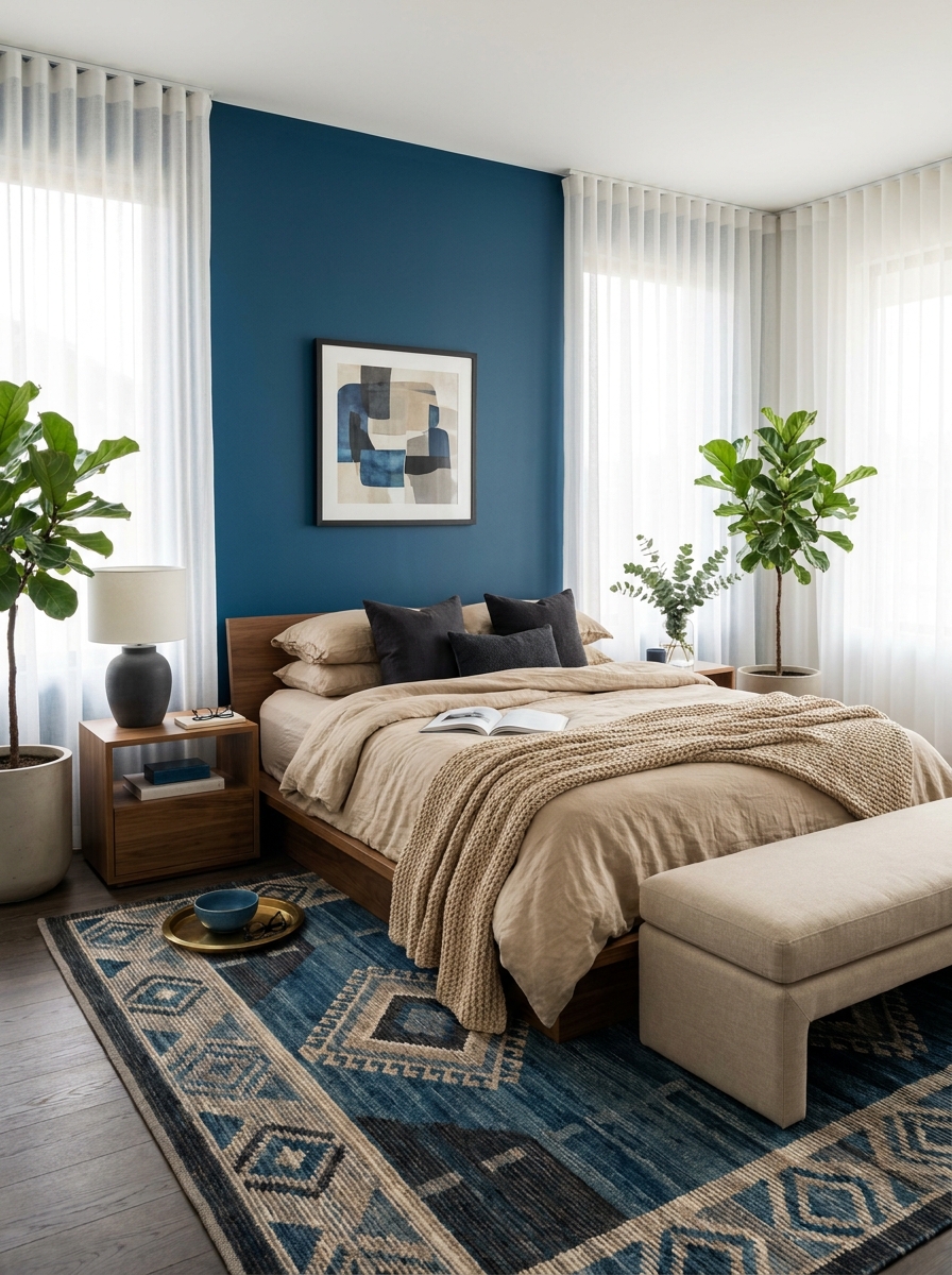
This isn’t your grandma’s nautical theme. The 2026 take on coastal colors skips the anchors and goes straight for sophisticated depth.
Think deep ocean blue—almost navy but with more warmth—paired with sandy beige and touches of charcoal. It’s moody coastal. The kind of palette that feels like a foggy morning walk on the beach, not a cheery summer postcard. I’m obsessed with how grounding this combo feels.
What makes this work is the balance. The blue brings drama and calm at the same time (how does it do that?), while sandy beige keeps everything from feeling too heavy. Add charcoal as your accent, and suddenly you’ve got a palette that works year-round. I’ve been using this in bedrooms because it’s incredibly soothing, but I’ve also seen it look stunning in dining rooms with brass fixtures. The beige warms up the blue just enough to make it feel inviting instead of cold. It’s coastal elegance without the clichés.
6. Soft Butter Yellow with Warm Gray: Cheerful Minimalism
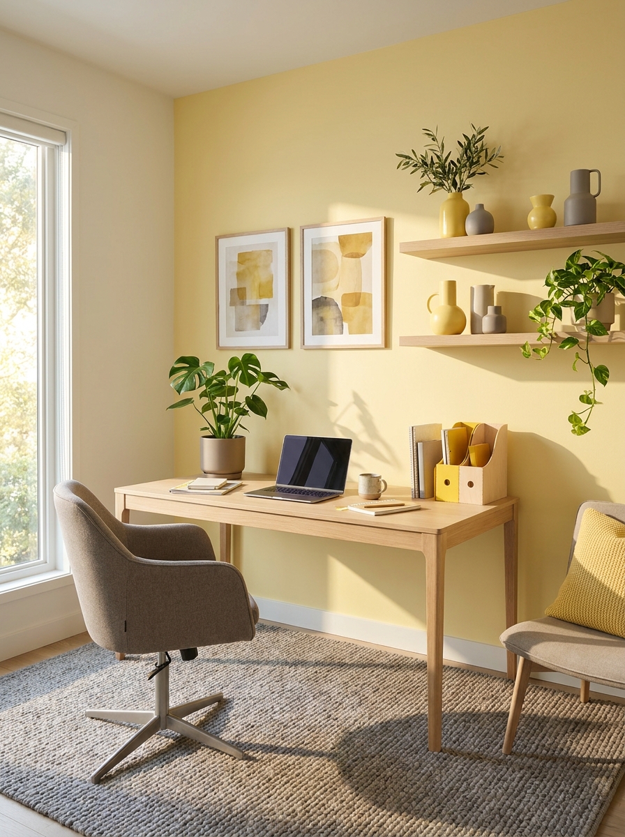
Yellow is having a moment, but not the yellow you’re thinking of. Forget bright sunshine—2026 is all about soft, buttery yellow that feels like the first light of morning.
Paired with warm gray (not cool, never cool), this combo is pure happiness without being childish. I was skeptical at first because yellow can go wrong so fast, but this softer version is shockingly easy to live with. It makes spaces feel larger and brighter without screaming for attention.
The trick is keeping the yellow really soft—almost cream with just a whisper of warmth. Then your warm gray does the heavy lifting, grounding everything so it doesn’t float away. I’m seeing this palette everywhere in kitchens and home offices, places where you want to feel energized but not overwhelmed. Add natural wood tones and suddenly you’ve got this Scandi-meets-sunshine thing happening. It’s minimalist but warm. Clean but cozy. Honestly, it’s the kind of palette that makes you smile every time you walk into the room.
7. Deep Plum with Blush and Brass: Luxe Drama
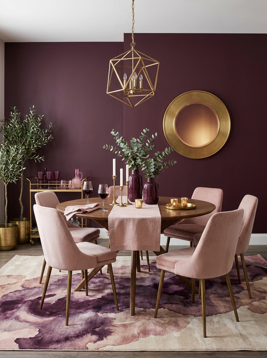
If you want to feel like you live in a boutique hotel, this is your palette. Deep plum—rich, almost burgundy but more sophisticated—paired with soft blush pink and warm brass accents.
This combination shouldn’t work as well as it does, but somehow the blush softens the plum just enough to keep it from feeling too gothic. And the brass? It catches the light and makes everything feel expensive. I used this in my dining room and now every dinner feels like an event.
The plum brings all the drama without being dark and depressing. It’s moody in the best way. The blush keeps things feminine and soft, while brass fixtures and accents add that jewel-box quality. I’m seeing this palette in powder rooms, bedrooms, and anywhere you want to make a statement. The key is balance—too much plum and it’s a cave, but get the proportions right and it’s pure magic. Think plum walls, blush textiles, and brass everywhere the light hits.
8. Warm Terracotta with Denim Blue: Southwestern Modern
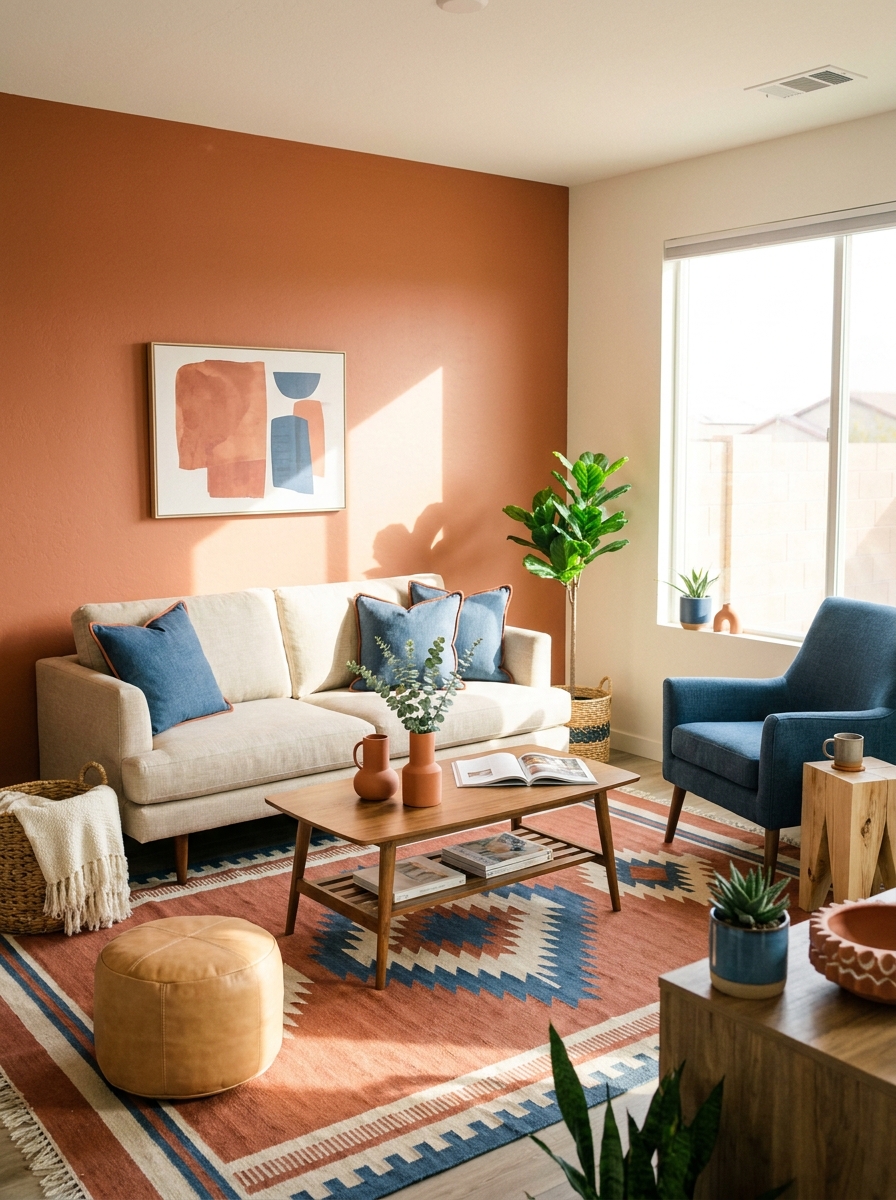
This palette takes Southwestern vibes and drags them into 2026. Warm terracotta paired with a true denim blue—not navy, not sky blue, but that perfect middle-ground wash.
What I love about this combo is how grounded it feels. The terracotta brings all that earthy warmth we crave, while the denim blue cools things down just enough to keep it modern. It’s desert sunset meets clear sky, and somehow it works in literally any room. I’ve been experimenting with this in living spaces and I’m hooked.
The magic happens when you layer in natural textures—think woven baskets, raw wood, linen, maybe some leather. The terracotta and denim create this instant sense of place without being too literal about it. You’re not decorating a Santa Fe condo; you’re bringing in those warm, organic tones in a fresh way. Add cream or off-white as your neutral, and you’ve got a palette that feels both timeless and totally current. It’s relaxed sophistication.
9. Pistachio Green with Peach and Cream: Fresh Retro Charm
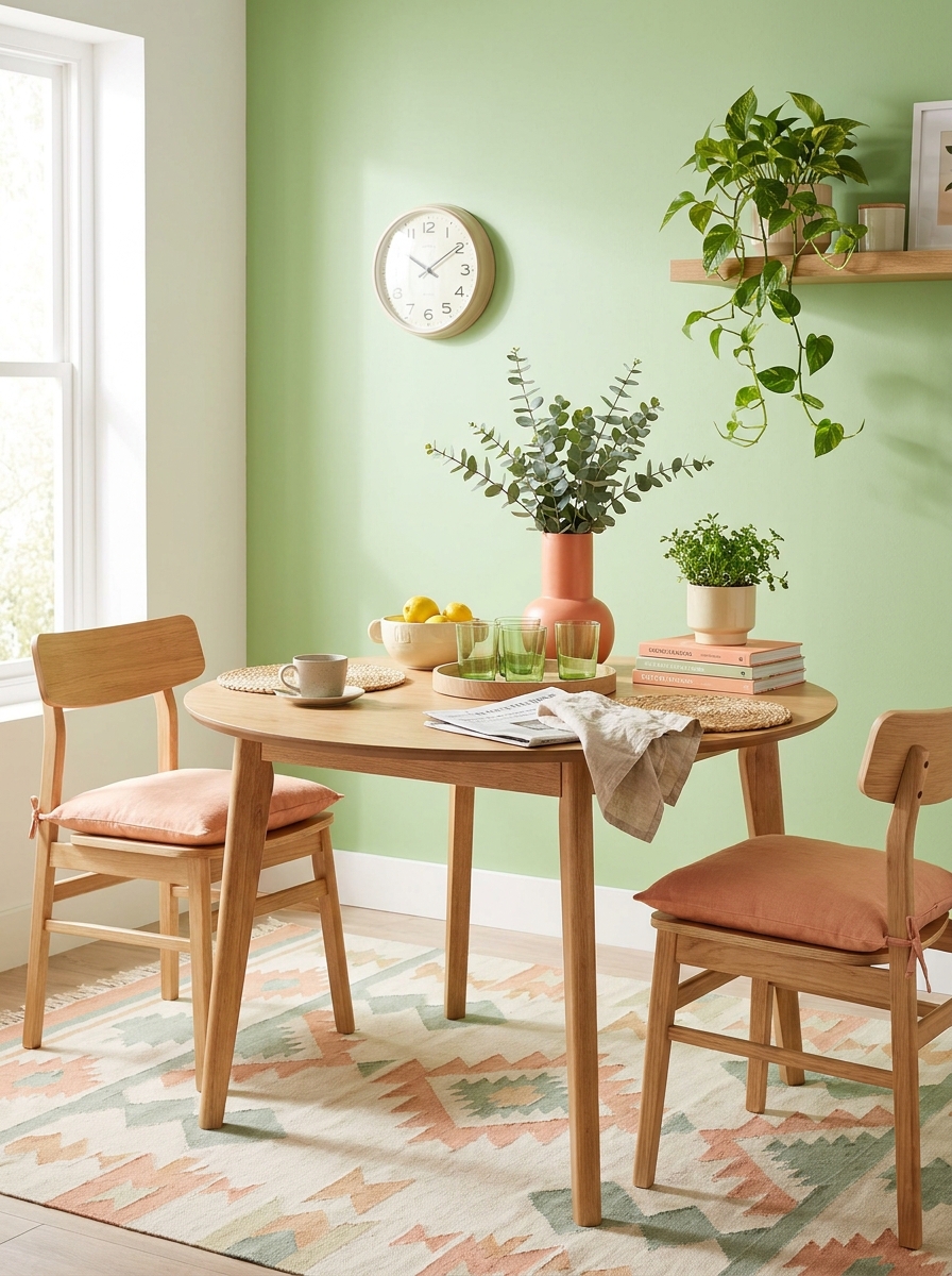
This combo is like a breath of fresh spring air mixed with vintage charm. Pistachio green—that soft, milky green—feels playful and unexpected. Pair it with warm peach and cream, and you’ve got something that’s retro without feeling dated.
I’m obsessed with how this palette works in kitchens and breakfast nooks. A pistachio accent wall behind open shelving? Chef’s kiss. The peach tones bring warmth, while cream keeps everything light and airy. It’s cheerful without being childish.
This palette loves texture. Think a nubby cream throw, peachy linen curtains, glossy pistachio ceramics. The colors are soft enough to layer without overwhelming, but bold enough to make a statement. It’s that sweet spot between neutral and colorful that just works.
10. Navy and Rust with Warm White: Classic with Edge
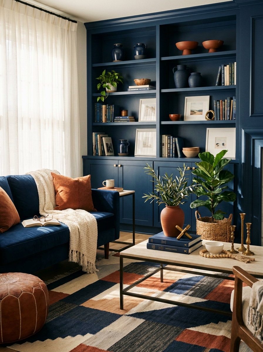
Navy and rust is the grown-up sibling of navy and orange—deeper, moodier, more sophisticated. The rust (think burnt sienna, not bright orange) adds earthiness that keeps navy from feeling too nautical or corporate.
This palette works beautifully in living rooms and home offices where you want something classic but not boring. Navy walls or a navy sofa become the anchor, rust accents add warmth, and warm white keeps everything from feeling heavy. It’s masculine without being exclusionary.
What I love most? This combo looks expensive. The depth of navy paired with the richness of rust just reads as high-end. Add some brass or aged gold hardware, and you’ve got a space that feels curated and confident. It’s timeless but totally on-trend for 2026.
11. Soft Coral with Slate Gray and Ivory: Modern Femininity
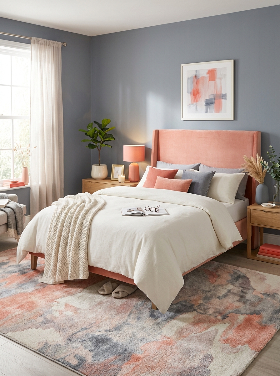
Coral is having a moment, but not the bright, tropical version from the 2010s. This is soft coral—more salmon than neon, more sophisticated than sweet. Paired with slate gray and ivory, it becomes modern, elegant, and totally livable.
I’m seeing this palette everywhere in bedrooms and powder rooms. The coral brings energy without being too stimulating, slate gray grounds it beautifully, and ivory keeps things light. It’s feminine without being frilly, colorful without being overwhelming.
This combination loves mixed metals and natural materials. Think brass lighting against slate walls, a coral velvet headboard, ivory linen bedding. The interplay between warm and cool tones creates visual interest that never feels boring. It’s fresh, current, and way more interesting than all-white everything.
12. Mustard Yellow with Charcoal and Cream: Bold Contemporary
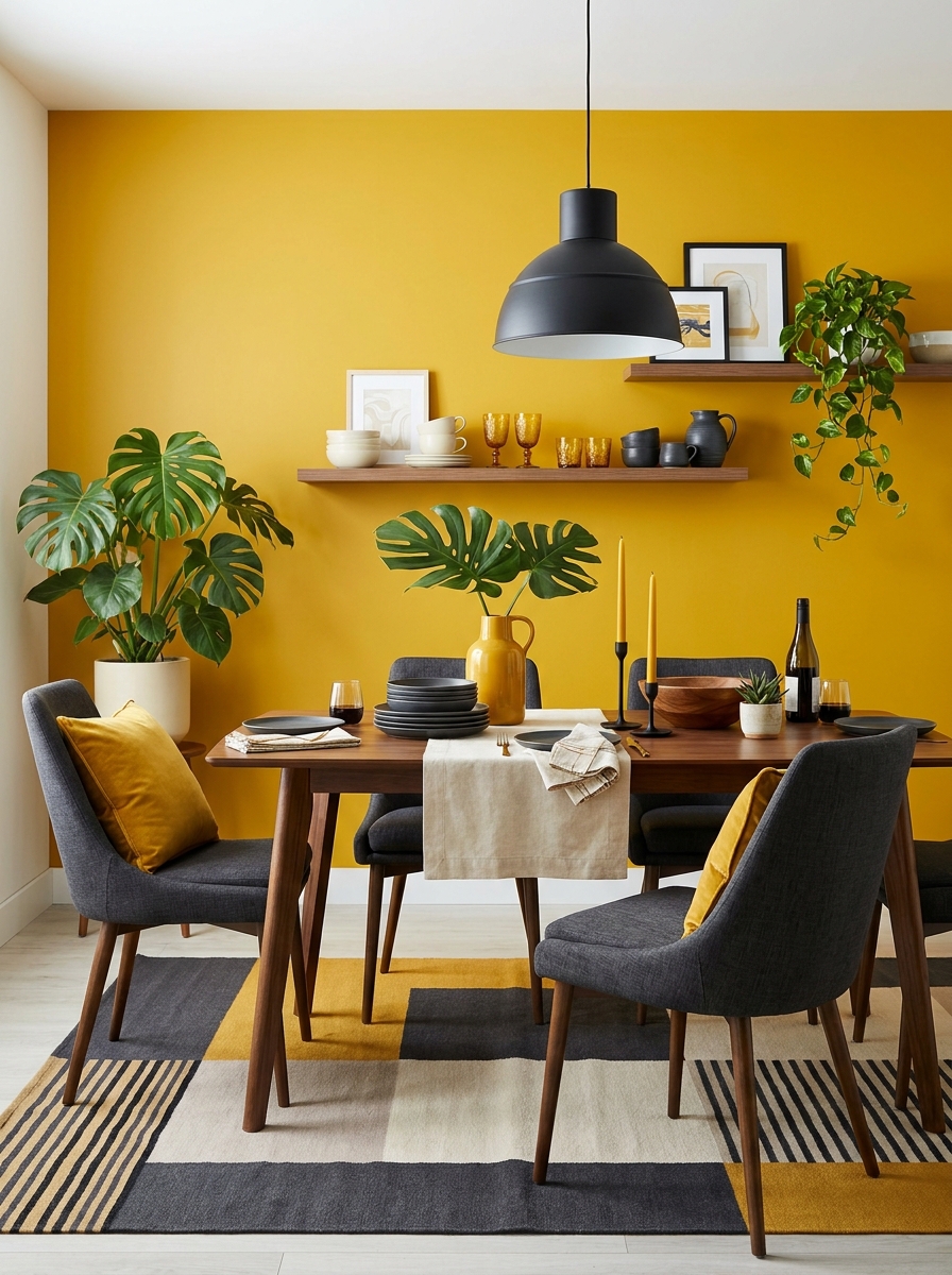
Mustard yellow is not for the faint of heart, but wow does it deliver impact. This deep, golden yellow paired with charcoal and cream creates a palette that’s bold, contemporary, and surprisingly versatile.
I’ve seen this work magic in dining rooms and entryways—spaces where you want drama but not darkness. A mustard accent wall becomes an instant focal point, charcoal adds depth, and cream softens everything. The yellow feels energizing but grounded, thanks to those cooler tones.
This palette loves pattern and texture. A charcoal and cream geometric rug, mustard velvet chairs, matte black hardware—it all comes together for a look that’s confident and collected. It’s the kind of color combination that makes guests say ‘wow’ when they walk in. Bold, yes. But totally worth it.
13. Jade Green with Copper and Cream: Jewel Tone Elegance
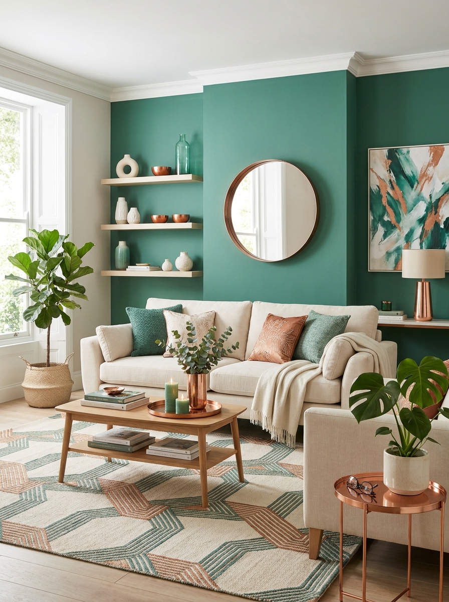
Jade green is having its moment, and honestly? It’s about time. This rich, saturated green sits somewhere between emerald and teal, with just enough warmth to feel inviting instead of cold.
Pair it with copper accents and creamy whites for a palette that feels expensive without trying too hard. The copper brings warmth and metallic shine that makes jade pop even more. Think copper table lamps, picture frames, or even just a tray on your coffee table.
This combo works beautifully in living rooms and bedrooms where you want sophistication with personality. Paint one accent wall jade, keep the rest cream, and layer in copper through lighting and accessories. The result? A space that feels like a luxury hotel suite but actually livable. I’m obsessed with how this palette photographs too—it just glows in natural light.
14. Warm Taupe with Burnt Sienna and Ivory: Earthy Minimalism
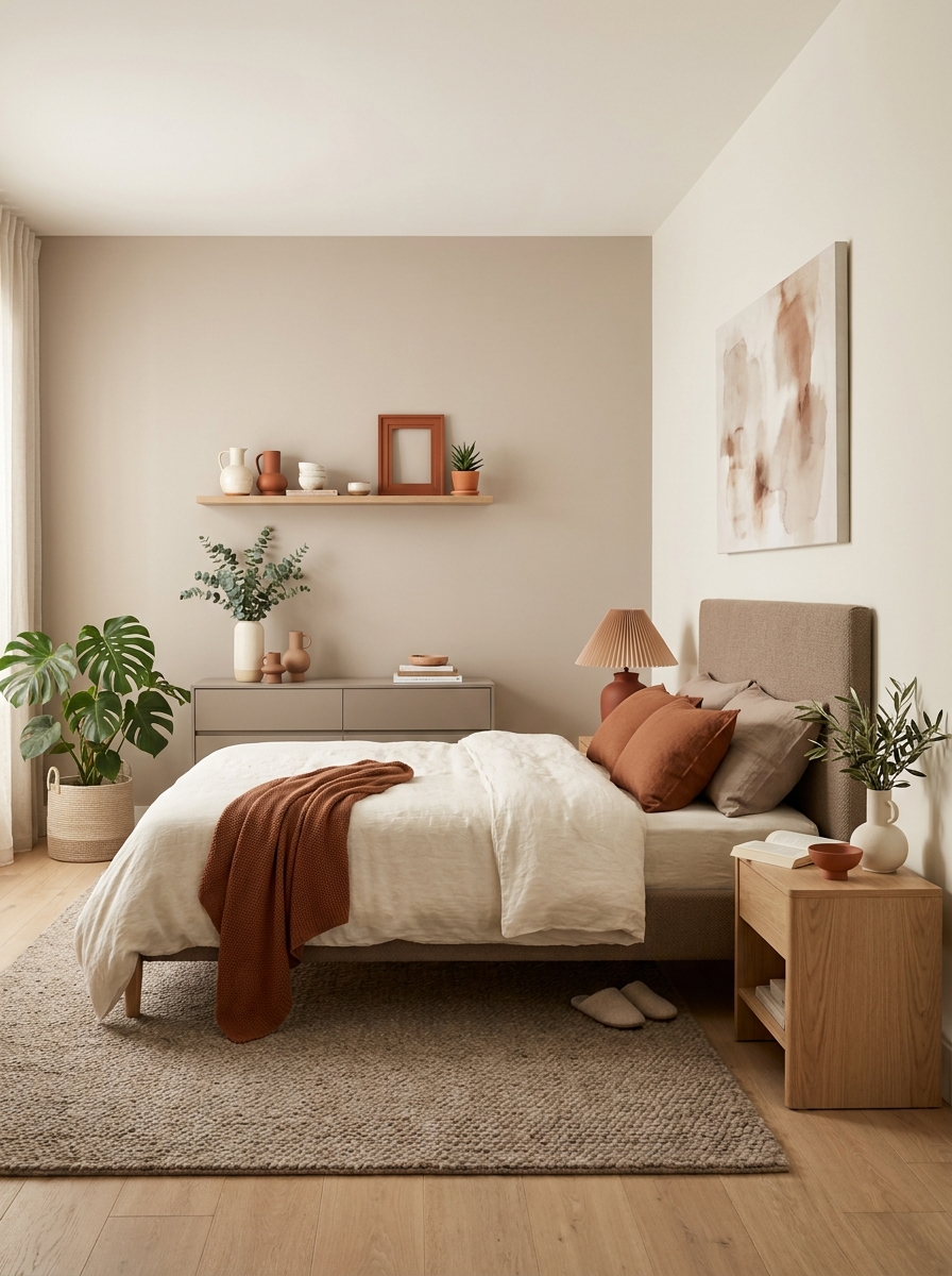
If you want a calm, grounded space that still has personality, this palette is calling your name. Warm taupe is the ultimate sophisticated neutral—way more interesting than beige, way warmer than gray.
Burnt sienna adds that earthy, terracotta-adjacent warmth without being too bold. It’s the color of desert sunsets and clay pottery. Use it in textiles, art, or one statement furniture piece. Ivory keeps everything light and airy so the space doesn’t feel heavy.
This combination is perfect for creating those serene, Instagram-worthy minimalist spaces that actually feel warm and livable. I love it in bedrooms where you want restful vibes, or in living rooms where you’re going for that expensive-casual look. Layer different textures—linen, wool, clay, wood—to keep the neutral palette from feeling flat. The magic is in the subtle warmth.
15. Lavender with Charcoal and Soft White: Moody Modern
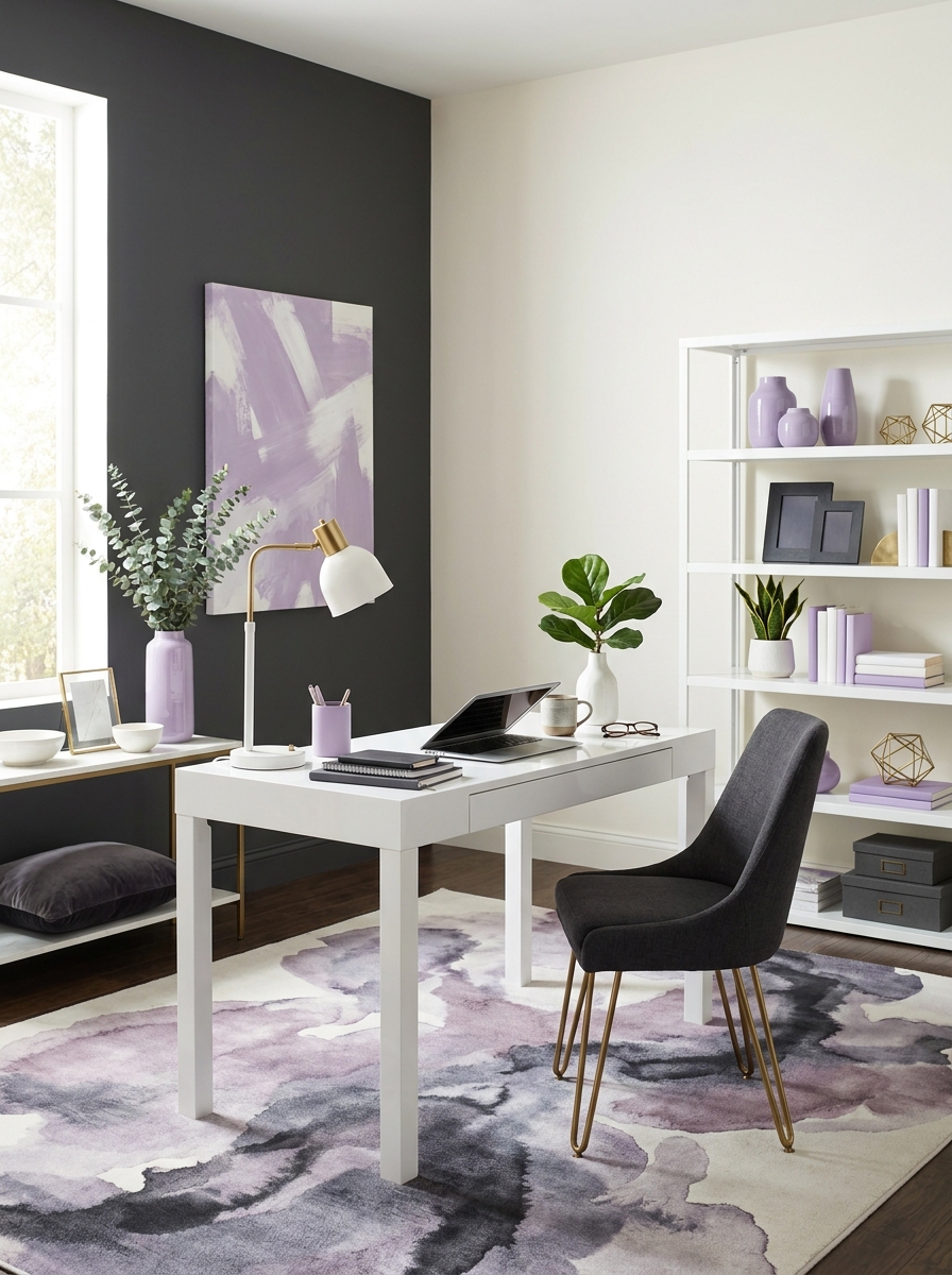
Lavender is stepping out of the “little girl’s room” box and into grown-up, moody interiors. When you pair soft lavender with charcoal gray and crisp white, it becomes sophisticated and completely modern.
The charcoal grounds the sweetness of lavender, giving it an edge. Think charcoal accent wall or dark furniture pieces that anchor the space. Soft white keeps everything from feeling too heavy or dark. The result is this gorgeous balance of light and shadow, soft and strong.
This palette works brilliantly in home offices, bedrooms, or even dining rooms where you want something unexpected. I’ve seen it done with lavender walls and charcoal furniture, or flipped with charcoal walls and lavender textiles. Either way, it’s striking. The trick is not making it too pastel-pretty—keep those charcoal elements strong and grounding.
16. Brick Red with Olive Green and Natural Linen: Heritage Modern
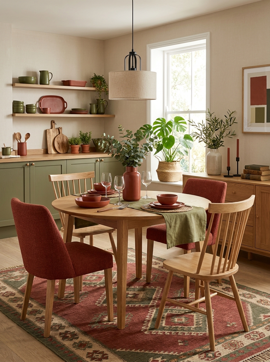
This palette feels like it has a story to tell. Brick red brings that vintage, European charm—think old terracotta roofs and aged clay pots. It’s warm, grounded, and just nostalgic enough without feeling dated.
Olive green is the perfect companion because it’s equally vintage-inspired but still feels fresh. Together they create this heritage vibe that works in both traditional and modern spaces. Natural linen tones (think warm off-whites and taupes) keep it from feeling too dark or heavy.
I love this combo in dining rooms and kitchens where you want that cozy, gathered-around-the-table feeling. It also works beautifully in living rooms with vintage or thrifted pieces mixed with modern furniture. Layer in natural materials—wood, rattan, ceramics—and you’ve got a space that feels collected over time instead of bought all at once.
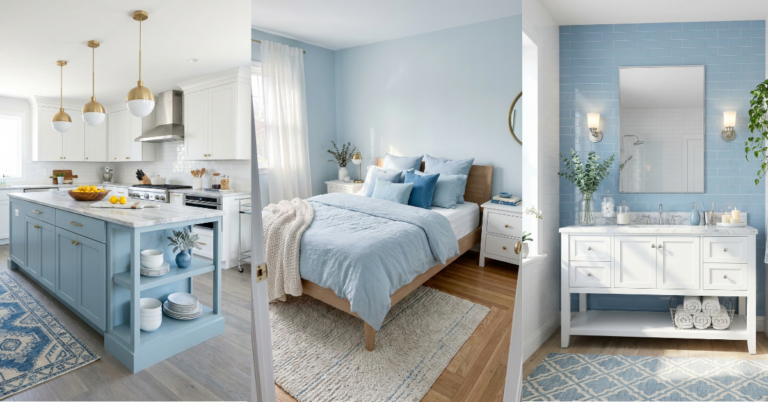
17. Sky Blue with Warm Walnut and Cream: Scandinavian Serenity
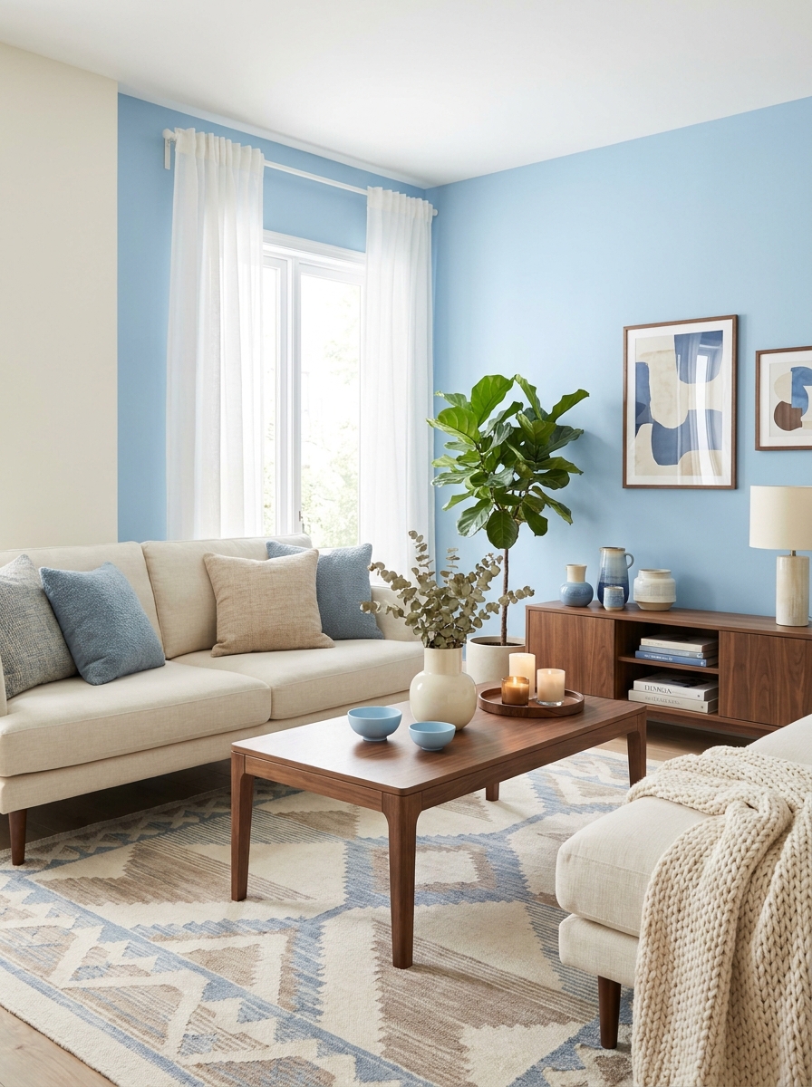
This palette brings that crisp Nordic air right into your living room. I’m talking soft sky blue walls paired with gorgeous warm walnut wood tones and creamy whites. It’s clean without being cold, minimal without being boring. The blue feels like a clear spring morning, while the walnut adds just enough richness to keep things cozy.
What I love most? This combination never fights for attention. The blue stays soft and airy, the wood brings natural warmth, and the cream ties everything together like the world’s most perfect neutral. It works beautifully in spaces that get tons of natural light because those blues just sing in sunshine. Try it in a bedroom where you want that peaceful, wake-up-happy vibe, or in a living room that needs to feel both put-together and relaxed. The trick is keeping your wood tones consistent and warm, not too orange or too gray. And let that blue breathe with plenty of cream and white to balance it out.
18. Spiced Cinnamon with Cream and Soft Gray: Warm Minimalism
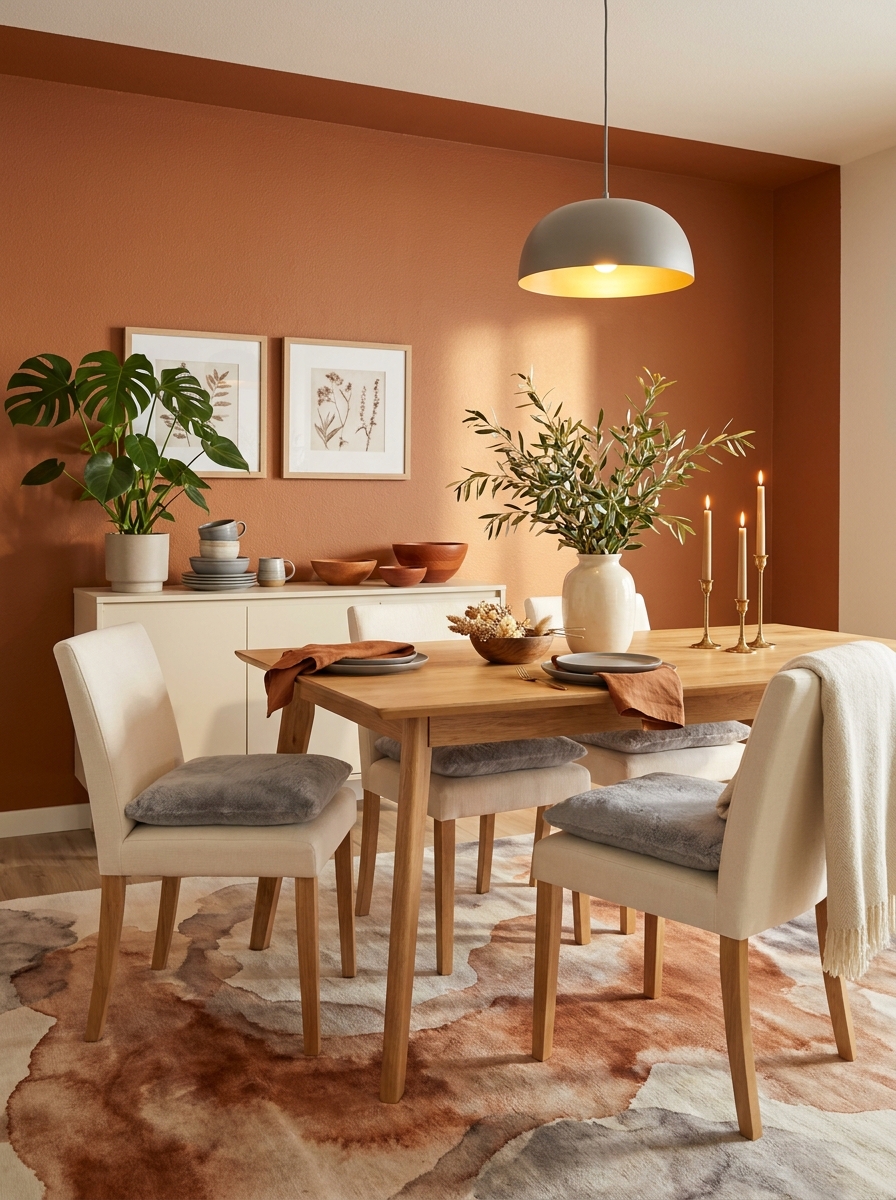
Okay, this palette is giving cozy coffee shop meets sophisticated minimalist home. Spiced cinnamon—that gorgeous reddish-brown that’s earthier than terracotta—paired with soft cream and the perfect cool gray. It’s warm but not overly rustic, modern but not cold. I’m obsessed with how grounded this feels.
The cinnamon brings all the warmth without being too bold or trendy. It’s one of those colors that photographs beautifully but feels even better in person. The cream softens everything and keeps it from feeling too heavy, while the gray adds just enough contrast to make the whole thing feel current and design-forward. This palette works magic in dining rooms where you want that inviting, linger-over-dinner feeling, or in a bedroom where warmth matters but you don’t want anything too stimulating. I’m seeing this as accent walls, upholstered headboards, or even painted kitchen cabinets with cream counters and gray tile. It’s that perfect intersection of comforting and contemporary.
19. Peachy Pink with Charcoal and Warm Brass: Grown-Up Glamour
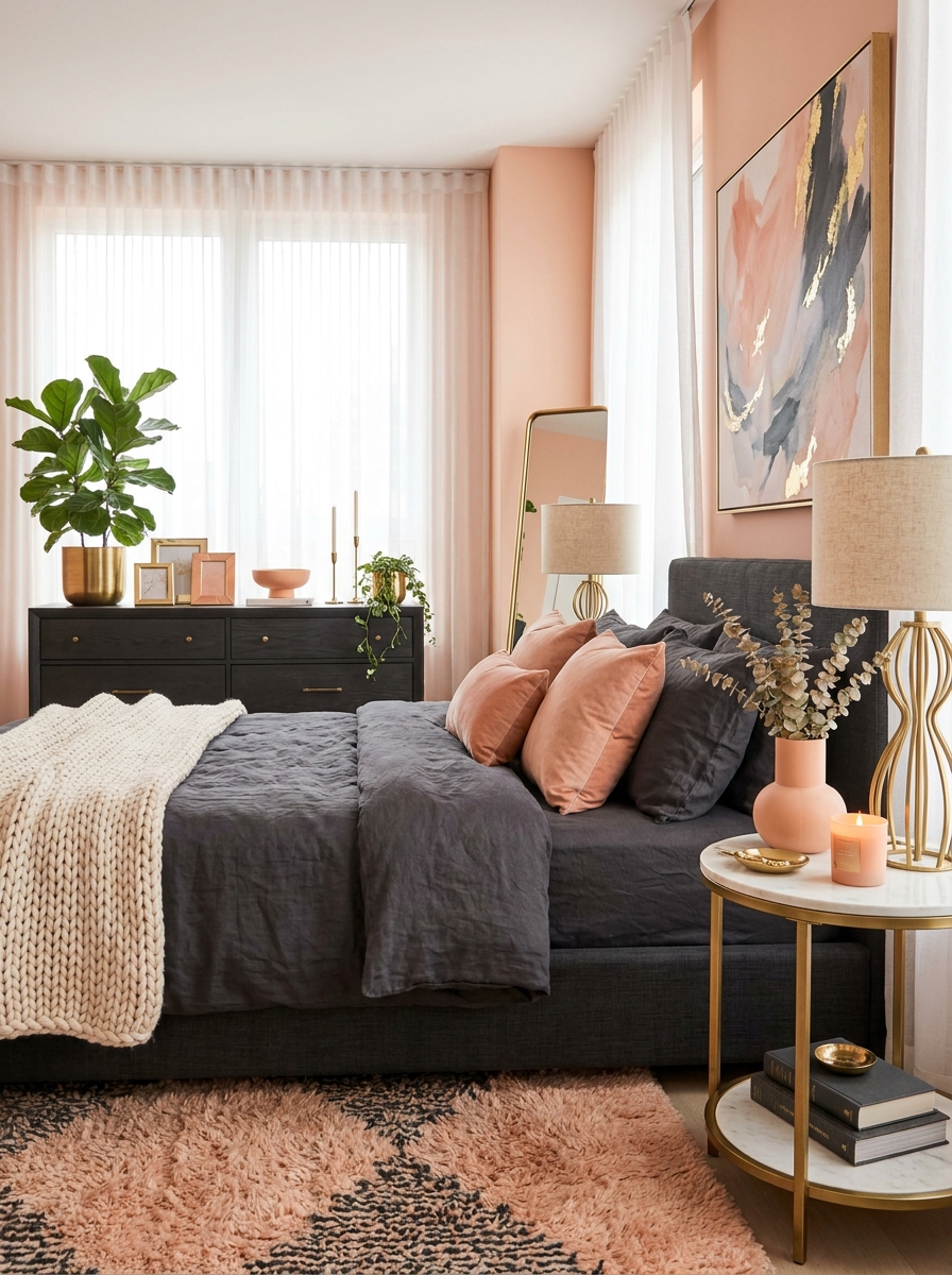
This is the palette for anyone who wants a little pink in their life but refuses to do anything cutesy. Peachy pink—sophisticated, warm, slightly coral—mixed with deep charcoal and warm brass metallics. It’s feminine without being fussy, bold without screaming for attention. Total grown-up glamour vibes.
The peachy pink brings softness and warmth that feels fresh for 2026, especially as we’re all craving color that makes us happy. But the charcoal keeps it grounded and modern, adding that necessary edge so it never tips into saccharine territory. Then the brass comes in with its warm glow, elevating everything to a more luxe place. I’m picturing this in a bedroom with peachy walls, charcoal bedding, and brass light fixtures. Or a powder room with peachy pink tile, charcoal vanity, and brass hardware. It’s one of those palettes that photographs like a dream and makes you feel fancy every single day. The balance is key—too much pink and it’s overwhelming, too much charcoal and you lose the warmth.
20. Soft Mint with Natural Wood and Ivory: Fresh Organic Modern
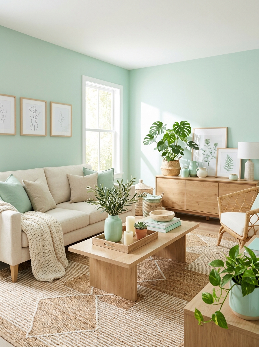
This palette feels like spring morning air bottled up and poured into your home. Soft mint green—barely there but definitely present—combined with natural light wood tones and warm ivory. It’s fresh, it’s organic, it’s modern without trying too hard. I want to live in this color story.
The mint is doing all the heavy lifting here in the most subtle way possible. It’s not screaming green, it’s whispering freshness and calm. Paired with natural wood—think light oak, ash, or maple—it feels grounded and earthy. The ivory keeps everything light and airy, making spaces feel larger and more open. This palette is perfect for small spaces that need to feel bigger, or sunny rooms where you want to enhance that natural light rather than compete with it. I’m seeing this in kitchens with mint cabinets and light wood counters, living rooms with mint accent walls and natural wood furniture, or bathrooms with mint tile and warm wood vanities. It’s that effortlessly pretty look that never goes out of style but feels totally right for right now.
21. Saffron Yellow with Deep Teal and Warm Cream: Global Eclectic
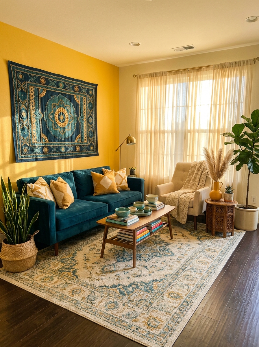
This one feels like you’ve traveled the world and brought home all the best colors. Saffron yellow — that gorgeous golden spice shade — pairs with deep teal for a combination that’s bold but balanced. Add warm cream to keep it from feeling too intense.
I’m obsessed with how worldly this palette feels. It works beautifully in eclectic spaces where you want personality and warmth. Think saffron-colored accent walls, teal velvet chairs, cream sofas with patterned pillows that pull it all together. The contrast is striking without being jarring.
This palette loves pattern and texture. Moroccan-inspired textiles, carved wood furniture, globally-sourced ceramics — they all feel at home here. It’s maximalist in spirit but grounded enough that it won’t overwhelm your space. The cream acts as your visual breathing room, letting the saffron and teal really sing.
Quick Guide
Which 2026 Color Palette Is Right for Your Room?
Choose Terracotta Sunset if: Your space gets lots of natural light and you want warmth that feels current and earthy.
Choose Forest Depth if: You love moody, sophisticated spaces and want a palette that feels timeless and calming.
Choose Dusty Mauve & Sage if: You’re ready to move beyond beige but want something soft, soothing, and universally appealing.
Choose Chocolate Brown Revival if: You crave cozy, luxe vibes and want a forgiving palette that hides everyday wear beautifully.
Pro move: You can actually mix elements from two palettes in one room. Try terracotta with chocolate brown, or sage with forest green. The key is keeping one palette as your dominant story and using the other as a subtle accent.
Your Home, Your Palette, Your Way
Here’s what I love most about these 2026 color trends — they’re not dictating one specific look. You’ve got warm, cool, earthy, moody, soft, and bold options. That means there’s genuinely something here for your actual taste and your actual home, not some fantasy version that only exists on Instagram. Maybe you’re drawn to those rich chocolate browns, or maybe the dusty mauve combo is calling your name. Trust that instinct.
Start small if you’re nervous. Paint a single accent wall. Buy new throw pillows in your chosen palette. Swap out your curtains. You don’t need to renovate your entire house to feel the impact of these gorgeous color combinations. And honestly? The best homes are the ones that evolve slowly, room by room, as you figure out what makes you feel good when you walk through the door.
So grab some paint samples, order a few fabric swatches, and see which of these 21 palettes makes your heart skip a little. That’s the one. Your home should make you happy every single day, and the right colors absolutely help with that. Now go make something beautiful.
Frequently Asked Questions
What are the biggest color trends for homes in 2026?
The standout color trends for 2026 include warm earth tones like terracotta and chocolate brown, moody jewel tones like forest green and sapphire, and soft combinations like dusty mauve with sage. We’re moving away from cool grays toward warmer, richer palettes that feel more personal and layered. The key theme is depth — colors that create atmosphere rather than just sitting on the walls.
How do I choose the right color palette for my living room in 2026?
Consider your room’s natural light first — spaces with lots of sunlight can handle deeper, moodier colors, while darker rooms benefit from warmer, reflective tones. Think about the mood you want: cozy and enveloping means browns and terracottas, calm and sophisticated points to greens and blues. Start with one main color and build around it with two or three accent shades. Test paint samples on your walls and live with them for a few days before committing.
Are gray colors still popular in 2026 interior design?
Gray is definitely taking a back seat in 2026. We’re seeing a major shift toward warmer, more complex colors that have actual personality. That said, charcoal gray still works beautifully as an accent color when paired with warmer tones like terracotta, forest green, or chocolate brown. If you love gray, consider mixing it with one of these trending palettes rather than using it as your dominant neutral.
What colors make a small room look bigger in 2026?
Lighter versions of trending colors work beautifully in small spaces — think soft sage instead of forest green, or dusty mauve instead of deep plum. Cream and warm white still make rooms feel larger, but 2026’s approach is to add depth through layered accent colors rather than painting everything light. Try one deeper accent wall in a rich color with lighter tones on the other three walls. This creates dimension that actually makes the space feel more interesting and, surprisingly, more spacious.
How can I incorporate 2026 color trends without repainting my whole house?
Start with textiles and accessories in your chosen palette — throw pillows, blankets, curtains, and area rugs give you instant color impact without commitment. Swap out artwork and add decorative objects like vases, bowls, and planters in trending shades. Consider painting just one accent wall or even a piece of furniture. You’d be amazed how much a freshly painted bookshelf or side table in terracotta or forest green can transform a room’s whole vibe.