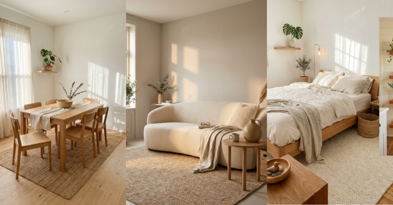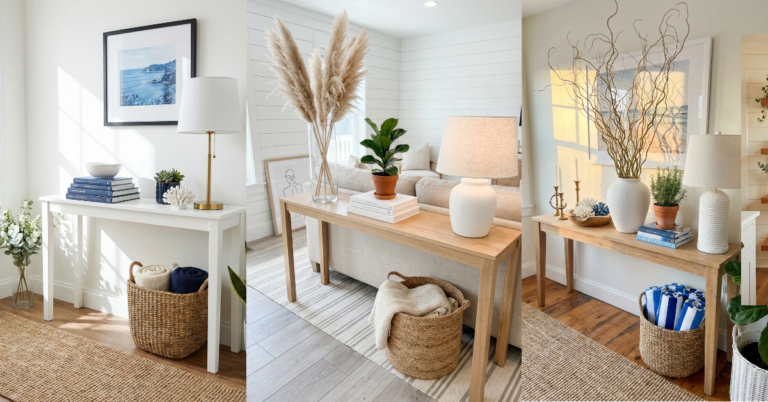
32 Living Room Color Schemes That Never Disappoint
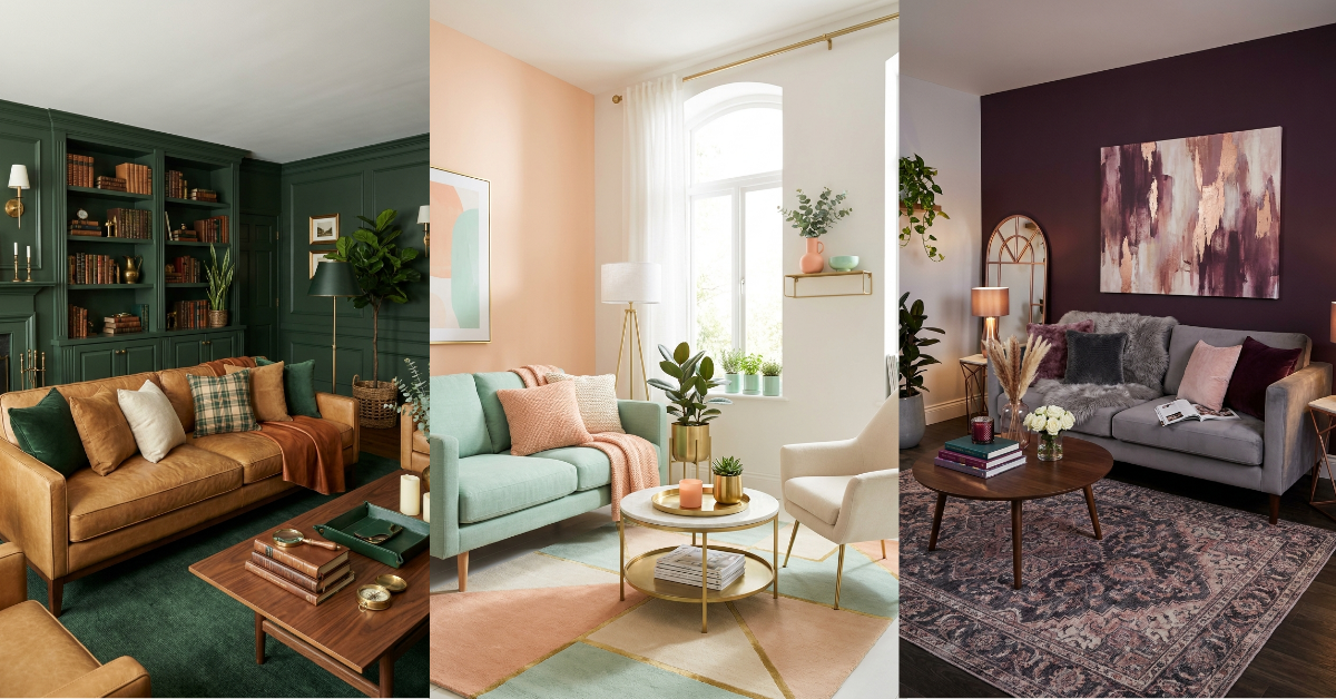
You know that feeling when you walk into someone’s living room and everything just clicks? The walls, the sofa, the pillows, even that random vase on the coffee table—it all flows together like they hired a designer. But here’s the secret: they probably didn’t. They just nailed the color scheme. And that’s honestly the hardest part of decorating any space. Pick colors that clash? The room feels off. Go too matchy-matchy? It looks like a furniture showroom, not a home. But when you get it right? Magic. Your living room becomes the kind of space where people actually want to hang out, where you feel calm after a long day, where everything looks pulled together without trying too hard. I’ve rounded up 32 color schemes that work every single time—no design degree required. These aren’t trendy combos that’ll look dated next year. They’re the real deal. Let’s get into it.
1. Classic Greige with Warm Oak and Ivory
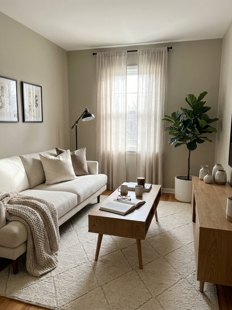
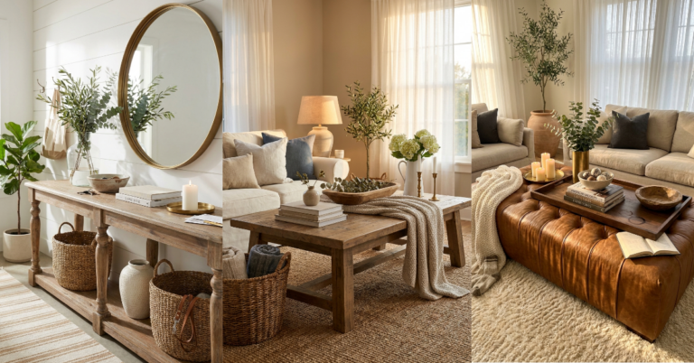
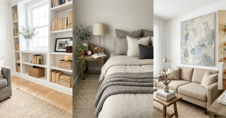
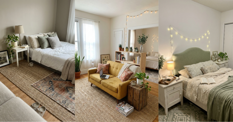
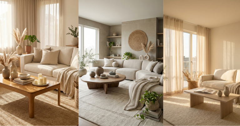
Greige is that beautiful in-between shade that gives you the warmth of beige without looking dated, plus the sophistication of gray without feeling cold. It’s the chameleon of paint colors, honestly. Pair it with warm oak furniture—think mid-century modern pieces or even a chunky wooden coffee table—and layer in ivory textiles like linen throw pillows and a creamy wool rug. The magic happens when you add just enough contrast so the room doesn’t fade into boring territory.
This scheme works beautifully in living rooms that get lots of natural light, but it’s also forgiving in darker spaces because greige reflects light better than true gray. The oak brings in those honey tones that make everything feel lived-in and cozy. Add a few black accents—maybe a metal floor lamp or picture frames—and suddenly you’ve got depth and interest.
What I love most about this combination is how easy it is to switch up your accessories. Burnt orange pillows for fall? Perfect. Soft blues for summer? Also gorgeous. The neutral base lets you play without committing to a whole new color story every season.
2. Navy Blue with Cognac Leather and Brass
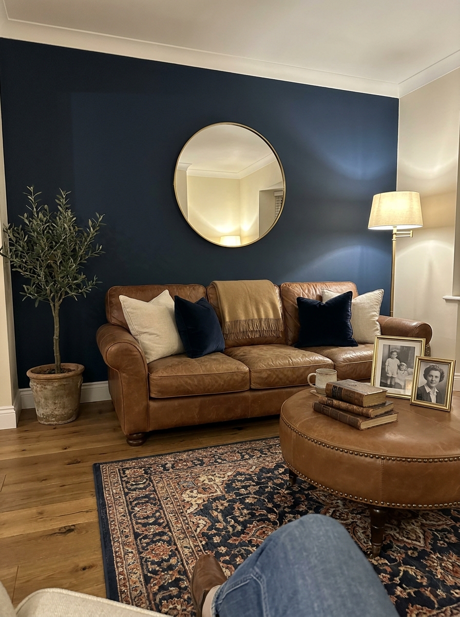
There’s something about navy that instantly makes a room feel more grown-up and intentional. It’s bold without being aggressive, classic without feeling stuffy. When you pair navy walls with cognac leather furniture, you’re creating this rich, library-like vibe that’s equal parts sophisticated and welcoming. The warm brown tones in the leather prevent the navy from reading too cold or nautical.
Brass accents are your secret weapon here. They catch the light and add warmth that ties the whole scheme together. Think brass table lamps, picture frames, or even curtain rods. The golden tones bridge the gap between the cool navy and warm leather beautifully. This combination works especially well in rooms with good natural light, but it’s also stunning in cozy spaces where you want that intimate, moody feel.
Don’t be afraid to layer in cream or ivory textiles to lighten things up a bit. A cream wool rug or linen curtains keep the space from feeling too heavy. And honestly? This is one of those color schemes that photographs like a dream, so your living room will look amazing in person and on Instagram.
3. Soft Sage Green with Cream and Natural Oak
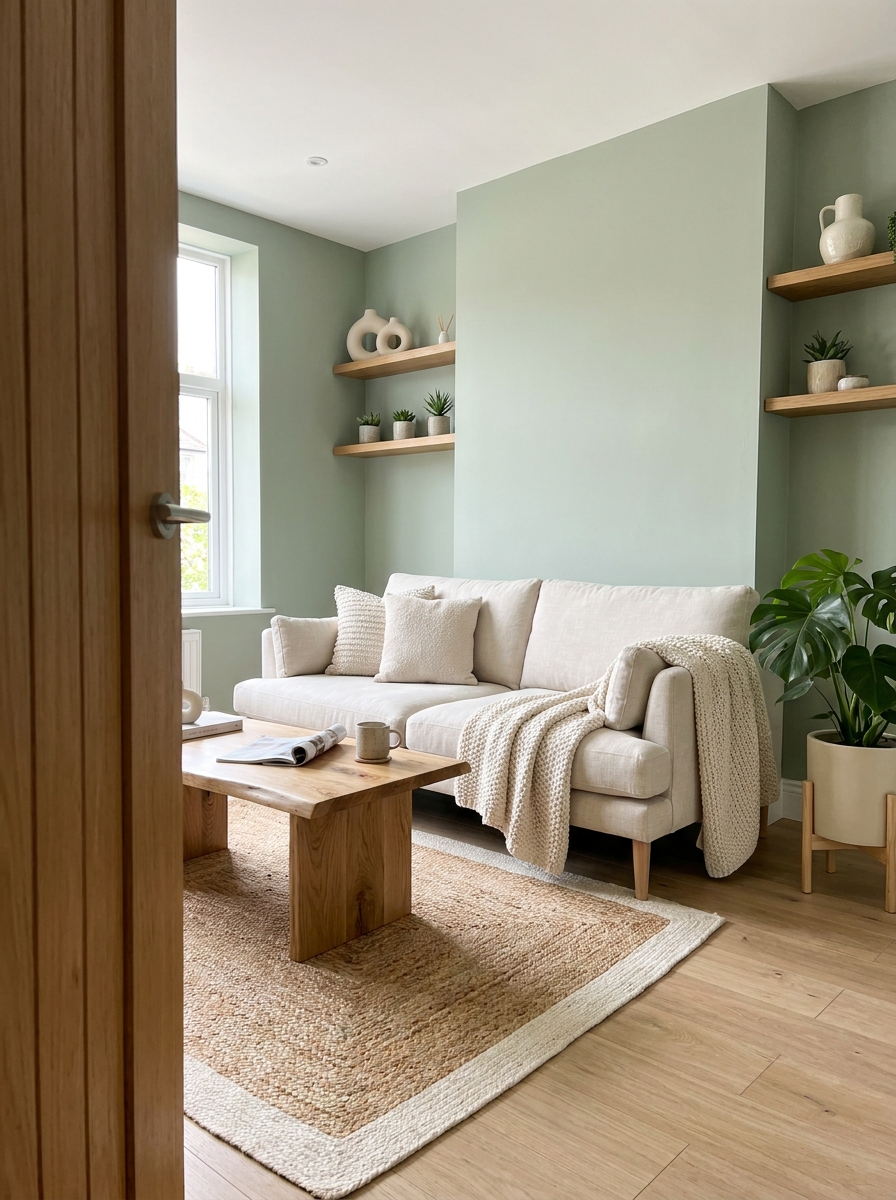
Sage green is having such a moment right now, but honestly, it’s one of those colors that’ll never really go out of style. It brings the outdoors in without being too literal about it. Paired with cream and natural oak, you get this fresh, airy feeling that makes your living room feel like a breath of fresh air—literally. The combo is calming without being boring, and it works in basically any home style from farmhouse to modern.
The key is choosing the right shade of sage. You want something muted and slightly gray-toned, not bright mint. Think more dried herbs than fresh leaves. Cream textiles add softness and keep the green from feeling too earthy or heavy. Natural oak furniture grounds everything with warmth and texture. The wood tones should lean honey or golden rather than cool gray oak.
This scheme is incredibly forgiving with accessories too. Terracotta pots, woven baskets, brass accents, white ceramics—they all play nicely here. And because the palette is so nature-inspired, adding plants feels totally natural and intentional rather than like you’re just trying to fill empty corners.
4. Warm Terracotta with Dusty Rose and Ivory
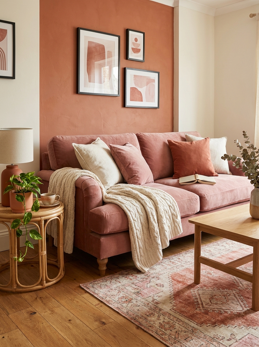
If you want a living room that feels warm and inviting without going full earthy-boho, this is your scheme. Terracotta brings in that sun-baked warmth, dusty rose adds unexpected softness, and ivory keeps everything from feeling too heavy or saturated. It’s a combination that feels current but won’t look dated in five years. The pink tones keep it from reading too southwestern, and the ivory gives your eyes a place to rest.
The trick with terracotta is using it strategically. You might do a terracotta accent wall, or bring it in through a sofa or large area rug. Dusty rose works beautifully in pillows, throws, or even an upholstered chair. Ivory should be your neutral anchor—think walls, curtains, or a large sofa. This palette photographs gorgeously in natural light, where all those warm tones really glow.
This scheme loves natural materials. Rattan, wood, ceramic, linen—they all enhance the organic, grounded feeling. And honestly, this is one of those color combinations where you can mix metals. Both brass and matte black look stunning here, so you’re not locked into one hardware finish throughout the room.
5. Charcoal Gray with Mustard Yellow and Walnut
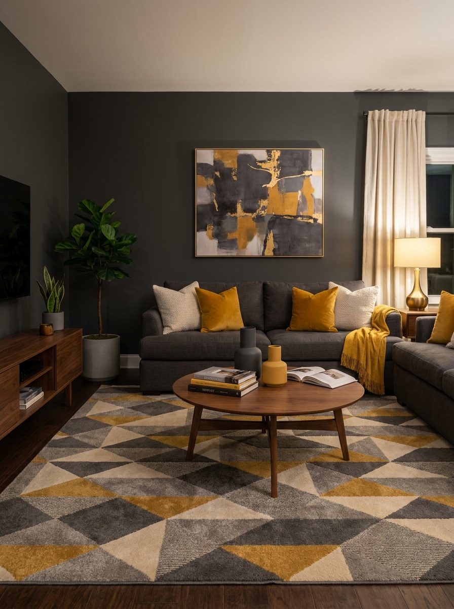
This color scheme is for everyone who thinks gray has to be boring. Charcoal walls create this moody, cocooning backdrop that makes mustard yellow accents absolutely sing. The warmth of walnut furniture bridges the gap perfectly between cool and warm tones.
I’m obsessed with how masculine yet inviting this combination feels. The charcoal gives you drama without going full black, while those pops of mustard bring in just enough sunshine to keep things cheerful. Walnut wood tones add that organic warmth that prevents the space from feeling too industrial.
The magic happens when you layer in cream or ivory as your fourth color. Use it in throw pillows, a chunky knit blanket, or even lampshades. This lighter neutral gives your eye a place to rest and keeps the scheme from feeling too heavy. The result is a living room that feels sophisticated, bold, and completely livable all at once.
6. Warm White with Black Accents and Natural Jute
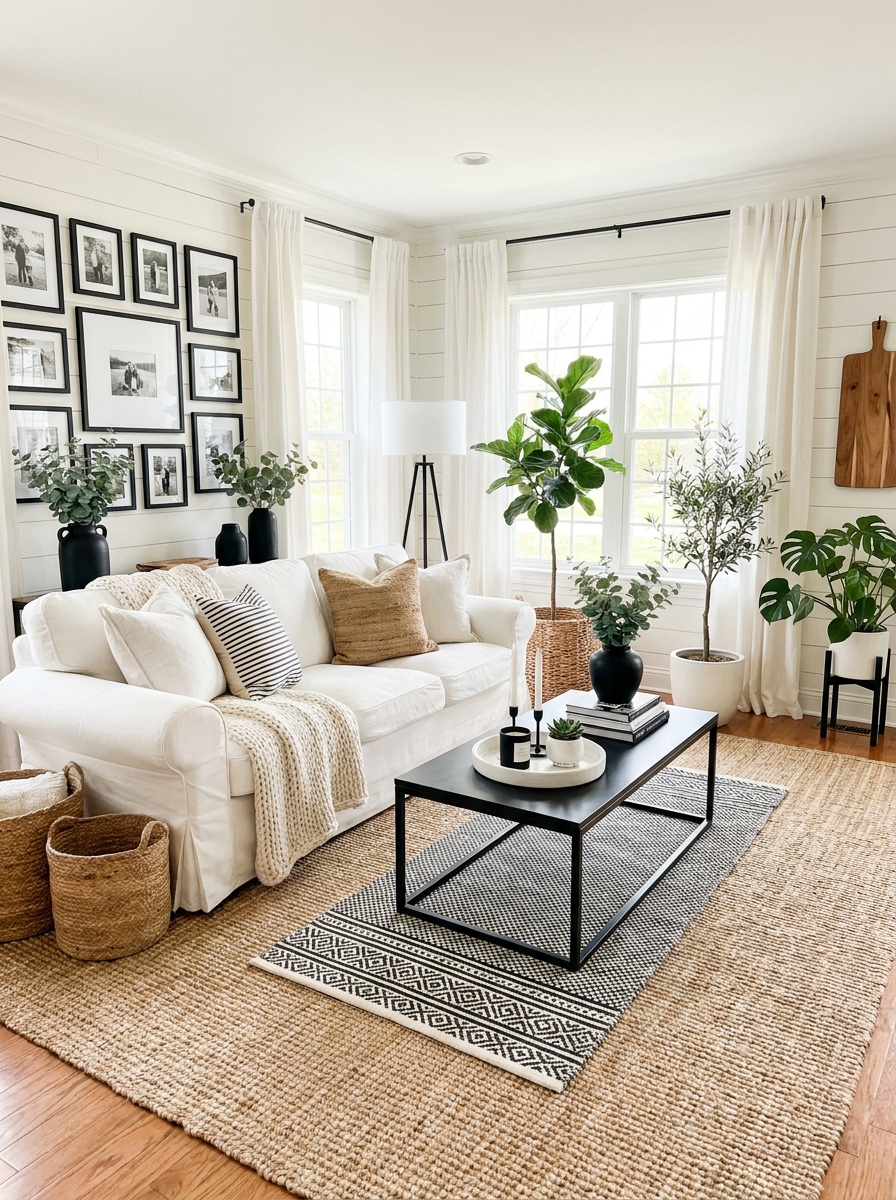
Sometimes the most timeless color scheme is the simplest one. Warm white walls with crisp black accents never goes out of style, and adding natural jute textures keeps it from feeling too stark or hotel-lobby generic.
What I love about this palette is how incredibly versatile it is. You can swing modern with black metal furniture, go coastal with woven textures, or lean traditional with black wood finishes. The warm white base adapts to whatever mood you’re creating. It’s like the perfect little black dress of living room design.
The jute element is what makes this scheme feel warm and collected rather than cold and minimal. A chunky jute rug, woven baskets, or even rattan furniture pieces bring in that organic texture that softens all those clean lines. Layer in some greenery and maybe a warm wood cutting board on the coffee table, and suddenly you’ve got a space that feels curated and calming instead of trying too hard.
7. Dusty Blue with Blush Pink and Antique Brass
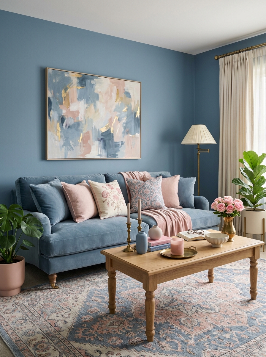
This is the color scheme that converts people who swear they don’t like pastels. Dusty blue has none of that baby-nursery vibe—it’s sophisticated and calming with just enough color to feel intentional. When you pair it with blush pink and antique brass, you get this romantic, layered look that still feels totally grown-up.
I’ve seen this palette work magic in living rooms that get amazing natural light. The dusty blue reads almost gray in certain lighting, then reveals its true color when the sun hits it just right. Blush pink accents add warmth without being too precious or feminine. And antique brass? That’s your secret weapon for adding vintage charm and tying everything together.
The key is keeping your ratios right. Use dusty blue as your dominant color on walls or a sofa, blush as your secondary accent in pillows and art, and brass in lighting and hardware. Throw in some cream and natural wood tones to ground it all, and you’ve got yourself a Pinterest-worthy space that actually feels livable.
8. Forest Green with Camel Leather and Aged Brass
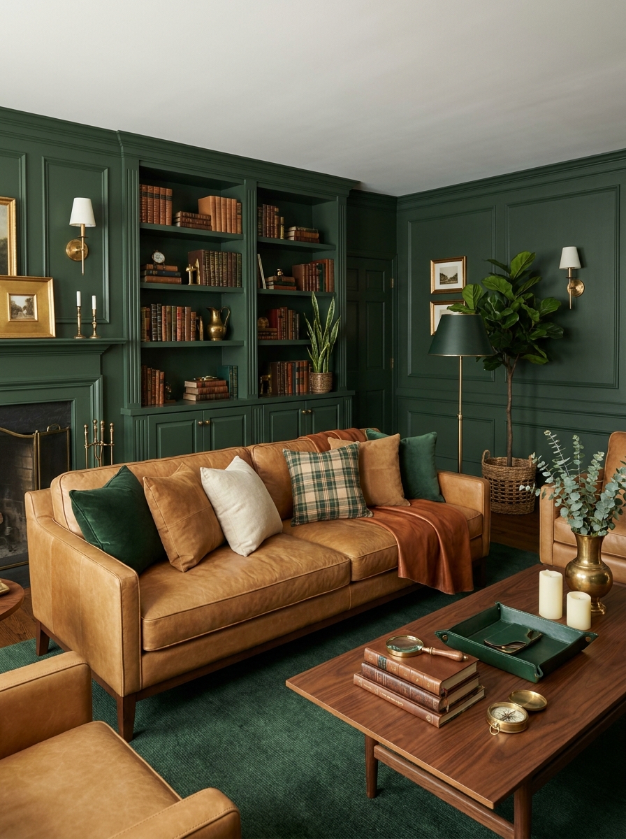
If you want your living room to feel like an expensive library in the best way possible, this is your color scheme. Forest green brings that rich, enveloping quality that makes a space feel instantly more sophisticated. Add camel leather furniture and aged brass accents, and you’re living in a Ralph Lauren ad.
This palette works because it’s grounded in nature—deep green, warm tan leather, golden brass. Everything feels organic and timeless rather than trendy. I love how this scheme works in rooms with lots of natural wood trim or built-ins. The forest green enhances all those warm wood tones instead of fighting them.
What really makes this combination special is the layering potential. Forest green walls or a velvet sofa, camel leather chairs or ottoman, brass lighting and picture frames—each layer adds depth. Bring in some warm cognac tones in pillows or throws, add cream accents to lighten things up, and suddenly you have a living room that feels collected over time rather than bought all at once from one store.
9. Creamy Beige with Chocolate Brown and Copper
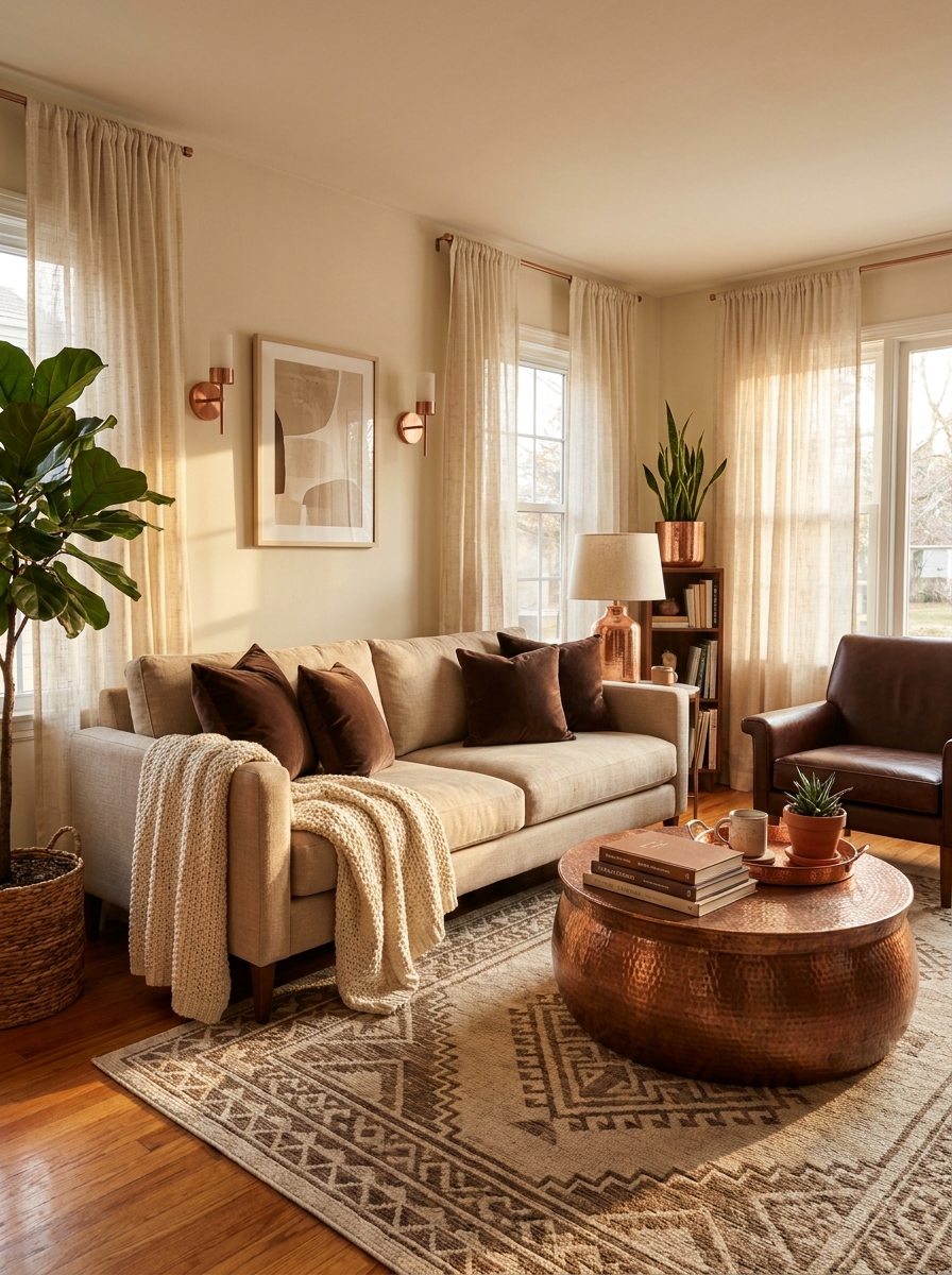
This color scheme feels like wrapping yourself in a cashmere blanket with a cup of hot cocoa. It’s warm, it’s rich, and it never goes out of style.
I love how chocolate brown grounds everything without feeling heavy. Pair it with layers of creamy beige—think linen sofa, wool throws, soft pillows—and suddenly you’ve got this incredibly cozy space that still feels elegant. The copper accents? Pure magic. They catch the light and add just enough shimmer to keep things interesting.
This palette works beautifully in spaces that don’t get tons of natural light because it creates its own warmth. The browns add depth, the beiges keep it airy, and those copper touches bring everything to life. It’s sophisticated without trying too hard, which is exactly what I want in a living room where I actually spend time.
10. Soft Lavender with Gray and Silver
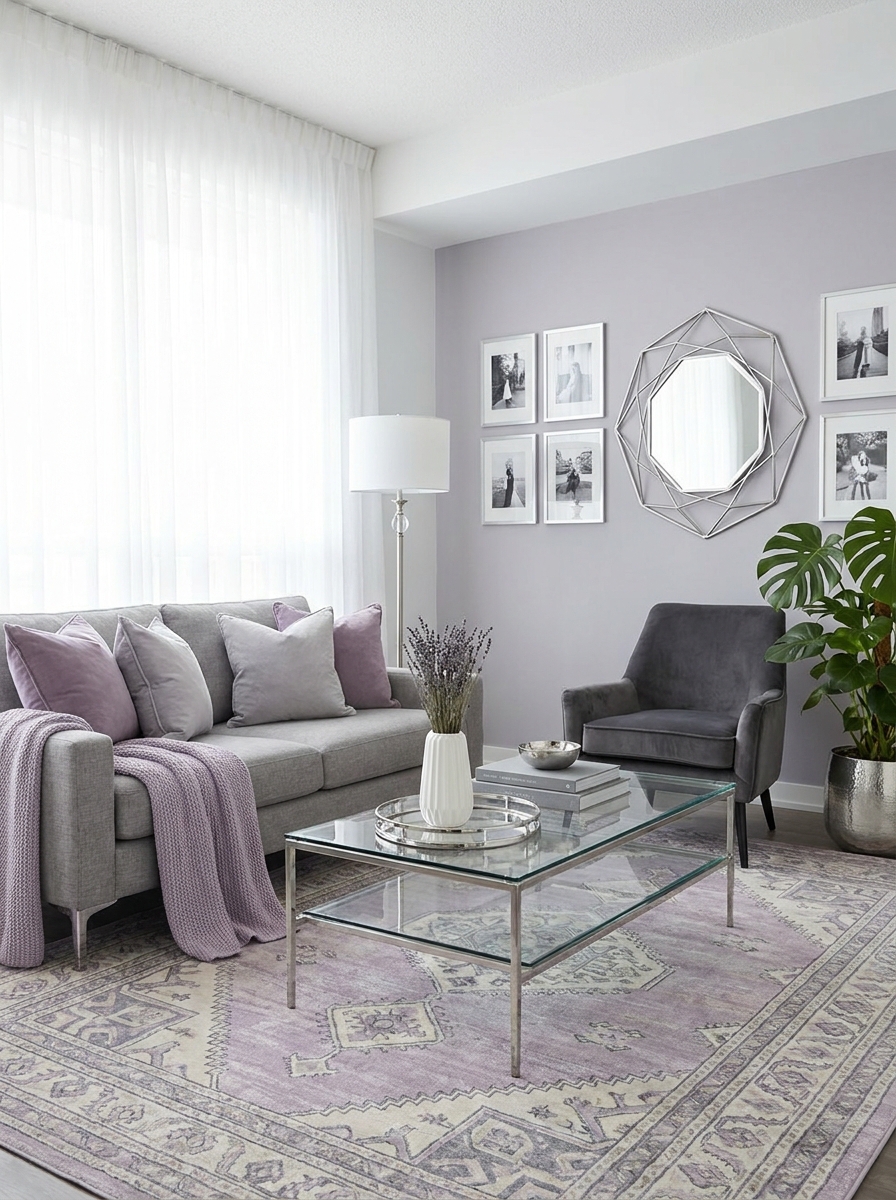
Okay, hear me out on this one. Lavender in the living room sounds risky, but when you keep it soft and pair it with cool grays, it’s absolutely stunning. It’s calming without being boring, and it feels fresh and modern.
The trick is keeping the lavender really subtle—think dusty lavender walls or a beautiful lavender-gray sofa, not bright purple everywhere. Then layer in different shades of gray, from charcoal to light dove gray, and add silver metallics for a little polish. The result is this serene, sophisticated space that feels like a breath of fresh air.
I especially love this scheme in city apartments or smaller spaces because it makes everything feel lighter and more spacious. It’s also surprisingly versatile—it works with both modern minimalist furniture and more traditional pieces. Plus, it photographs like a dream, which doesn’t hurt.
11. Rich Burgundy with Emerald Green and Gold
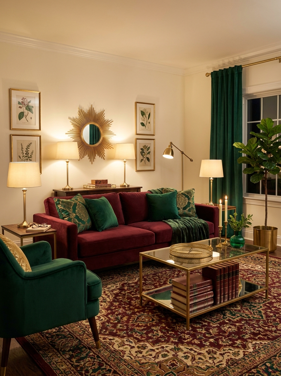
If you want drama, this is your color scheme. Burgundy and emerald together? It’s bold, it’s jewel-toned, and it makes a serious statement. But here’s the thing—it’s also incredibly livable when you balance it right.
I’m talking deep burgundy velvet sofa, emerald green accent chairs, and pops of gold everywhere the light can catch it. It feels luxurious and a little bit glamorous, like something out of a boutique hotel. The key is keeping your base neutral—cream or warm white walls—so these rich colors can really sing without overwhelming the space.
This palette absolutely glows in the evening with warm lamplight. Those jewel tones become even richer, and the gold accents create this cozy, intimate atmosphere. It’s perfect for people who love color but want something more sophisticated than bright primaries.
12. Soft Peach with Mint Green and Brass
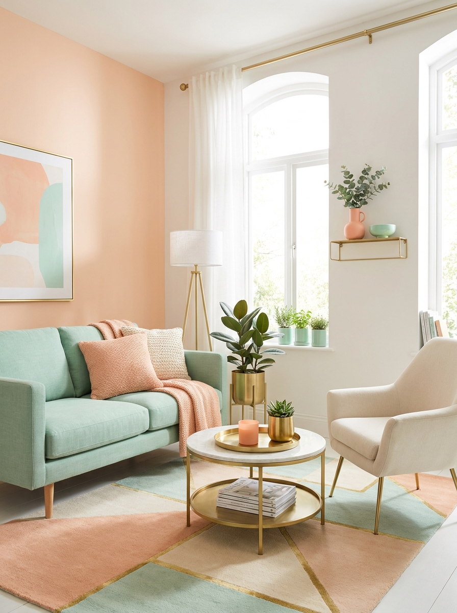
This combination surprised me the first time I tried it, and now I’m completely obsessed. Peach and mint sound like they belong in a 1950s diner, but when you use really soft, muted versions with warm brass accents, it’s fresh and contemporary and totally swoon-worthy.
Think pale peachy-pink walls, a mint green sofa (yes, really), and brass everything—lamps, picture frames, planters, hardware. The colors are soft enough that they don’t compete, and the brass ties everything together with this warm metallic thread. It feels happy and optimistic without being childish, which is surprisingly hard to pull off.
I love this palette in rooms with great natural light because both colors absolutely glow in sunshine. It’s also perfect if you want something different from the usual gray-and-white but don’t want to commit to really bold colors. It’s unique without being weird, you know?
13. Warm Caramel with Deep Teal and Bronze
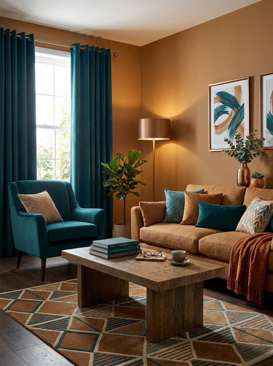
This color scheme feels like wrapping yourself in a cashmere blanket with a good book. The caramel tones bring instant warmth without feeling too sweet, while deep teal adds that rich, sophisticated punch that keeps things interesting.
I love how this combo works in rooms that don’t get tons of natural light. The caramel reflects what light you do have, and the teal adds depth without making the space feel cave-like. It’s cozy but never gloomy.
The bronze accents are what really pull this together. They catch the light and create these gorgeous moments throughout the room. Think bronze picture frames, lamp bases, or even just a tray on your coffee table. This palette feels collected and intentional, like you’ve been thoughtfully adding pieces over time rather than buying everything in one shopping trip.
14. Pale Gray with Soft Yellow and White Oak
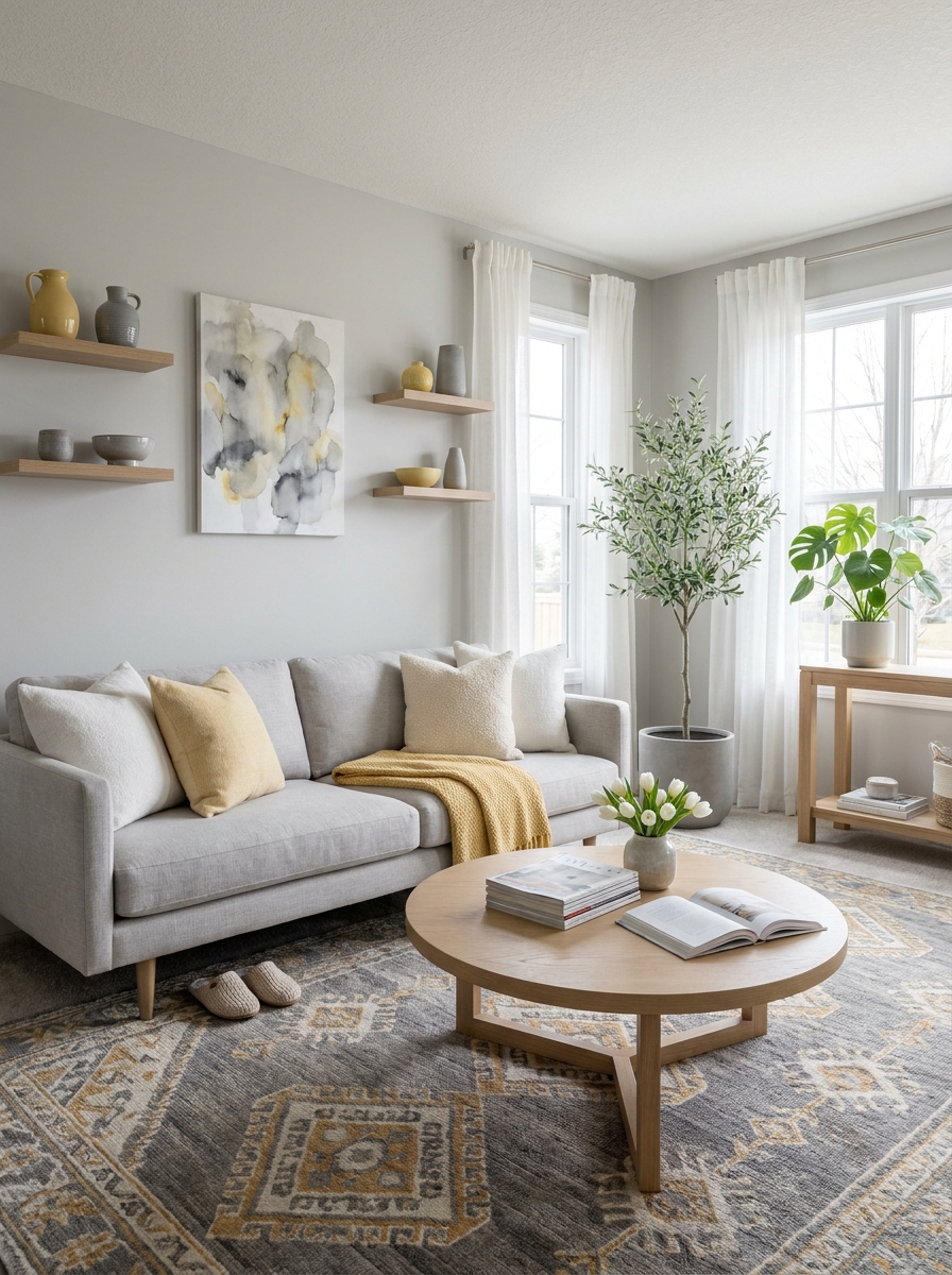
If you want a space that feels calm but never cold, this is your palette. The pale gray is like a soft morning fog—neutral enough to go with everything but way more interesting than plain white walls.
The soft yellow is the secret weapon here. Not that bright sunny yellow that screams at you, but a buttery, almost-cream yellow that just makes you feel happy. It’s subtle enough that it won’t tire you out, but present enough to lift the whole mood of the room.
White oak brings in that Scandinavian-inspired warmth everyone’s obsessed with right now. The light wood grain adds texture and keeps things from feeling too polished or staged. This combo works beautifully in smaller spaces because everything feels light and airy, but it’s also substantial enough for larger rooms.
15. Warm Taupe with Rust Orange and Ebony
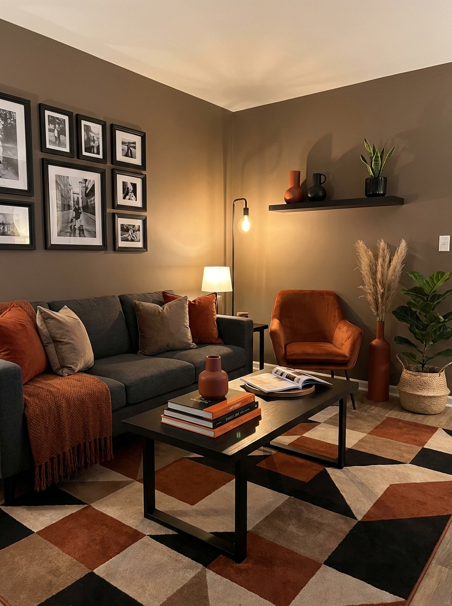
This is the color scheme for people who want something bold but still sophisticated. Warm taupe is one of those chameleon colors that looks different depending on the light—sometimes more brown, sometimes more gray, always elegant.
The rust orange is where things get fun. It’s earthy and warm, with just enough intensity to make a statement without overwhelming the space. I’ve seen this work as an accent wall, but I actually love it more in furniture and textiles where you can really play with texture.
Ebony accents add that grounding element that keeps everything from floating away. Black picture frames, a dark wood console, maybe ebony legs on your chairs. These dark touches create contrast and definition, making the warmer colors pop even more. The whole scheme feels very now—modern but warm, sophisticated but approachable.
16. Soft Seafoam with Coral and Natural Rattan
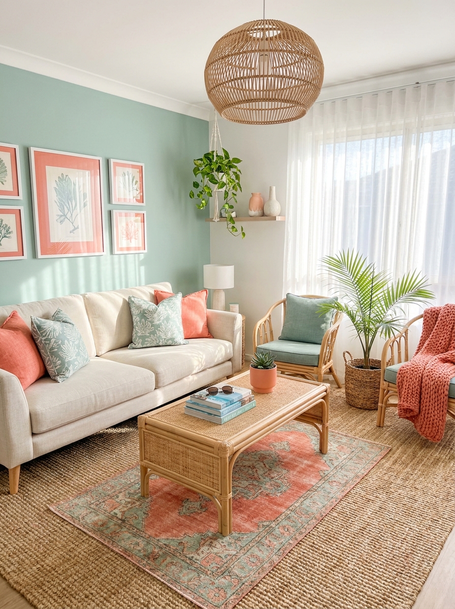
This palette is like bringing a coastal vacation home with you, but in a way that feels fresh and modern rather than themed. Soft seafoam has this incredible ability to feel calming without being cold—it’s got just enough green to feel natural and organic.
Coral is the surprise here. Not that bright neon coral, but a softer, more sophisticated peachy-coral that plays beautifully with the seafoam. Together, they create this really happy, optimistic vibe that’s perfect for spaces where you gather with people you love.
Natural rattan adds warmth and texture that keeps the cooler colors from feeling too icy. Rattan chairs, a woven coffee table, maybe some baskets for storage—these organic elements make the space feel lived-in and collected. The whole scheme has this effortless, breezy quality that makes everyone want to kick off their shoes and stay awhile.
17. Ivory White with Charcoal and Warm Honey Wood
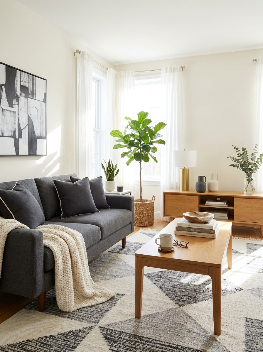
This is that clean, breathable scheme that never goes out of style. Ivory walls create the softest backdrop, while charcoal gray grounds everything without feeling heavy. Then you bring in those gorgeous honey-toned wood pieces that add instant warmth.
I love how this palette feels both modern and timeless. The ivory keeps everything bright and airy, perfect if you don’t have tons of natural light. Charcoal accents through your coffee table or picture frames add just enough contrast without being dramatic. And that warm wood? It’s the secret ingredient that keeps the whole thing from feeling cold.
This scheme works beautifully in smaller living rooms because the light colors make the space feel bigger. But it’s equally stunning in large, open spaces where you need something cohesive that doesn’t overwhelm. Layer in different textures and you’ve got yourself a living room that photographs like a dream.
18. Deep Plum with Soft Gray and Rose Gold
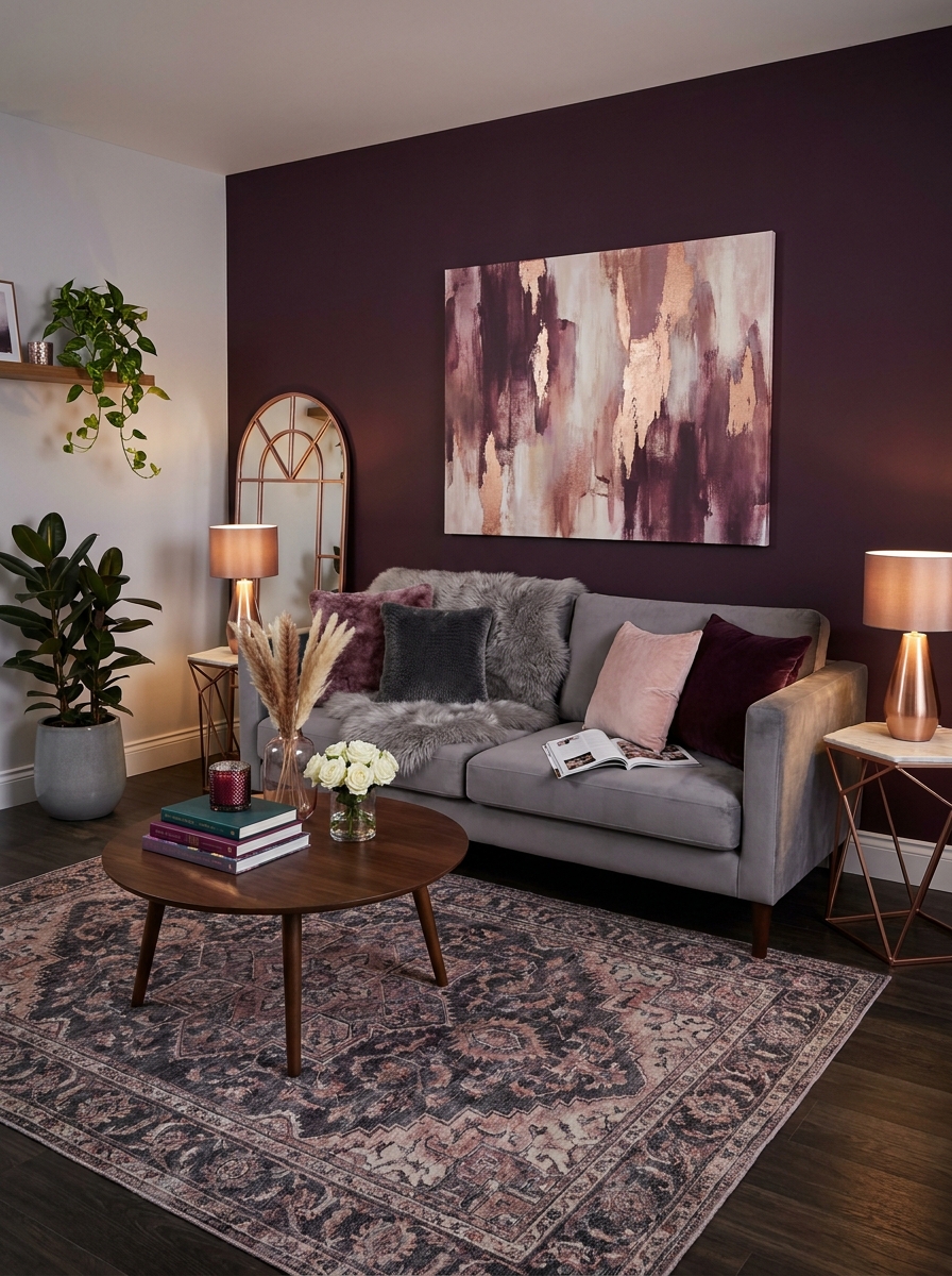
Oh, this one’s for the brave! Deep plum walls create this cozy, enveloping feeling that’s absolutely gorgeous in the evening. Pair it with soft gray furniture and those pretty rose gold accents, and you’ve got serious sophistication happening.
What I love about plum is how it reads different throughout the day. Morning light makes it feel rich and mysterious. Evening lamplight? Pure luxury. The soft gray keeps it from feeling too dark or dramatic, giving your eye a place to rest. And rose gold? That’s your jewelry. It catches the light and adds warmth that regular gold or silver just can’t match.
This scheme is perfect if you want your living room to feel like a retreat. It’s intimate without being cave-like, elegant without trying too hard. Just make sure you have good lighting because darker walls need it. But trust me, the mood you’ll create is worth it.
19. Pale Blue with Crisp White and Natural Wood
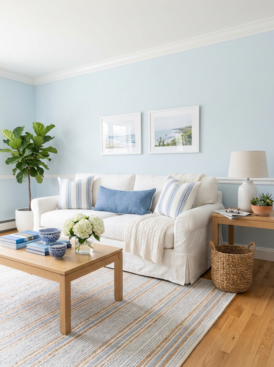
This is my go-to recommendation for anyone who wants their living room to feel like a breath of fresh air. Pale blue walls—think sky on a perfect spring day—with crisp white trim and all those beautiful natural wood tones. It’s coastal without being too beachy, fresh without feeling cold.
The magic here is in the balance. That soft blue creates instant calm, which is exactly what you want in a living room. White keeps everything feeling clean and intentional, not cluttered. And natural wood brings in warmth that prevents the blue-and-white combo from feeling too nautical or theme-y.
I’ve used this scheme in everything from tiny apartments to sprawling family rooms, and it works every single time. It’s one of those palettes that makes people feel good the second they walk in. Plus, it photographs beautifully if you’re into that. The light just bounces around in the prettiest way.
20. Warm Cream with Olive Green and Matte Black
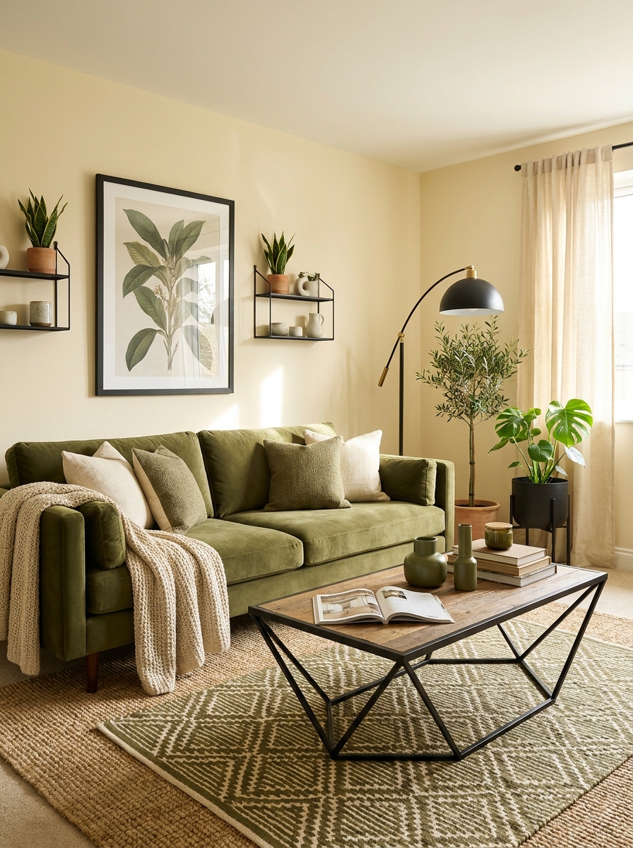
Here’s a scheme that feels both earthy and modern at the same time. Warm cream walls create this cozy foundation, olive green brings in that gorgeous natural element, and matte black accents add just enough edge to keep it interesting.
What makes this combination work so well is how grounded it feels. Cream is warmer than white, so your room feels inviting right away. Olive green is having such a moment, and for good reason—it’s sophisticated and works with basically everything. Those matte black touches? They’re your punctuation marks. They define spaces and add visual weight without being harsh.
This palette works beautifully if you love bringing plants into your space because the olive green makes your actual greenery pop even more. It’s also super forgiving with different wood tones, so you don’t have to match everything perfectly. Whether your style leans traditional or contemporary, this scheme adapts beautifully.
21. Soft Butter Yellow with Cloud White and Light Ash
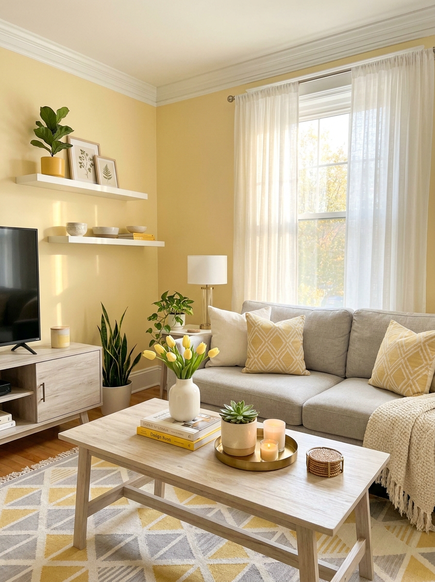
This is sunshine without the overwhelm. I’m obsessed with how butter yellow brings warmth to a room without feeling too bright or childish. It’s that perfect creamy yellow that makes you feel happy the second you walk in.
Pair it with cloud white trim and ceiling to keep everything feeling fresh and airy. Then bring in light ash wood furniture—think coffee tables, console pieces, or open shelving. The cool gray tones in ash wood balance the warmth of the yellow in the prettiest way.
I love adding texture here. A chunky knit throw in cream, linen curtains that puddle slightly on the floor, maybe a jute rug layered under something patterned. This palette works beautifully in rooms that don’t get tons of natural light because the yellow does all the heavy lifting. It’s like having permanent golden hour. Add fresh white flowers and suddenly you’ve got a room that feels like a breath of fresh air every single day.
22. Charcoal Black with Warm Cognac and Brushed Gold
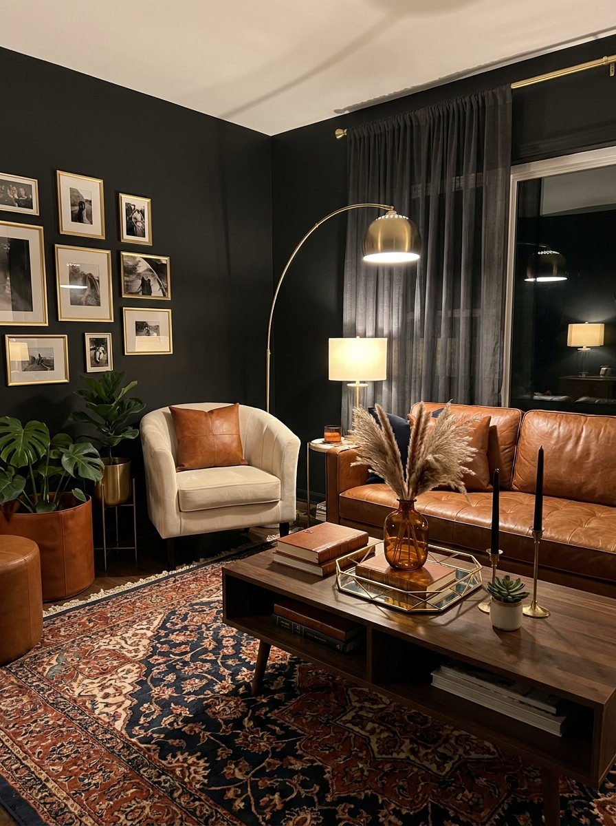
Okay, this one’s for the brave souls who aren’t afraid of drama. Deep charcoal walls might sound intimidating, but trust me—when you pair them with rich cognac leather and brushed gold accents, it’s pure magic.
The secret is layering in enough warmth so the room doesn’t feel like a cave. That cognac leather sofa or armchair becomes the star against those dark walls. Then you bring in brushed gold through lighting fixtures, picture frames, mirror trim, even curtain rods. The gold catches the light and creates these beautiful glowing moments.
What I love most is how cozy this palette feels at night. Turn on some warm-toned lamps and suddenly you’re in the chicest, most intimate space. Add in some cream or camel-colored textiles to soften things, maybe a vintage Persian rug with touches of rust and navy. This is a scheme for people who want their living room to feel like a sophisticated retreat.
23. Soft Dove Gray with Warm Honey and Crisp Linen
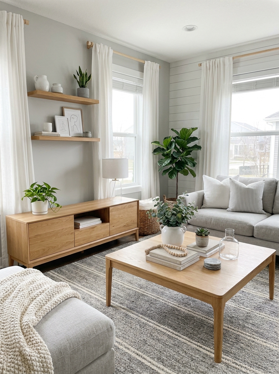
This is the palette I recommend to literally everyone who says they want something neutral but not boring. Dove gray is that perfect middle-ground gray—not too cool, not too warm, just beautifully balanced.
Bring in warm honey-toned wood furniture and suddenly the gray comes alive. I’m talking light oak, maple, or birch pieces that have that gorgeous golden glow. The contrast between cool gray and warm wood is chef’s kiss. Then layer in crisp linen white through your textiles—throw pillows, curtains, maybe a slipcovered chair.
This palette is incredibly forgiving and grows with you. Want to add color? It works with literally anything. Feeling minimalist? It’s gorgeous as-is. I especially love this combination in modern farmhouse or Scandinavian-inspired spaces. It feels clean and organized but never cold. Add some greenery and natural textures like wool, rattan, or stone, and you’ve got a room that feels like an expensive spa.
24. Rich Chocolate Brown with Burnt Orange and Cream
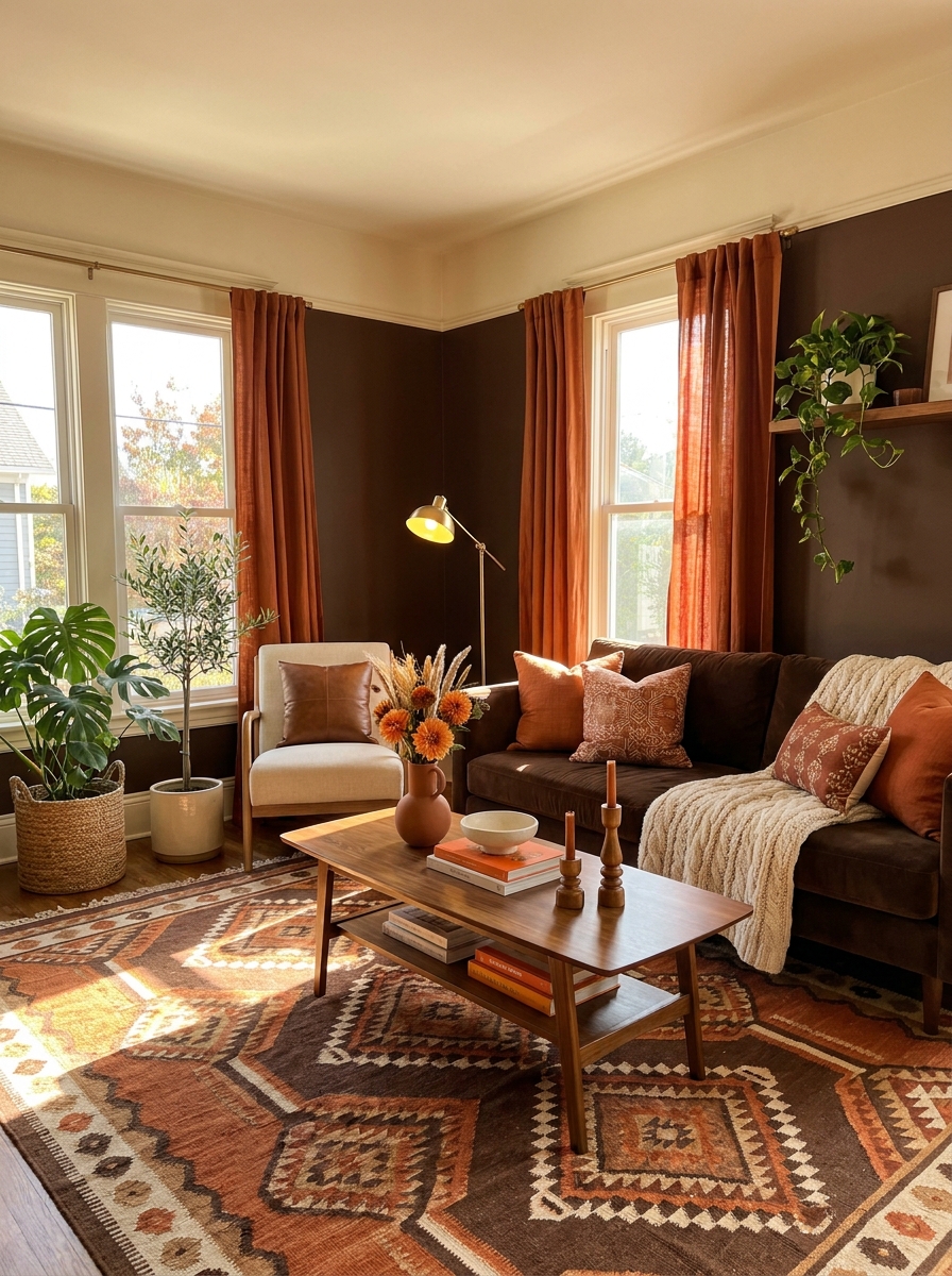
Chocolate brown is having such a moment right now, and I am here for it. This isn’t your grandmother’s brown living room—when you pair deep chocolate walls or a gorgeous brown sofa with burnt orange and cream, it feels fresh and modern.
The burnt orange is key. It’s earthy enough to feel natural with the brown but vibrant enough to add energy. Use it in your accent pillows, maybe a throw blanket, or even a statement armchair. Then cream comes in as your neutralizer—cream walls if you’ve got a brown sofa, or cream textiles if you’ve painted the walls brown.
What makes this palette work so well is how grounded it feels. These are colors pulled straight from nature—tree bark, autumn leaves, cotton. The room feels warm and enveloping without being dark or heavy. I love mixing in natural materials here: rattan, jute, terracotta, unfinished wood. Everything feels organic and intentional.
25. Soft Mauve with Cream and Brushed Brass
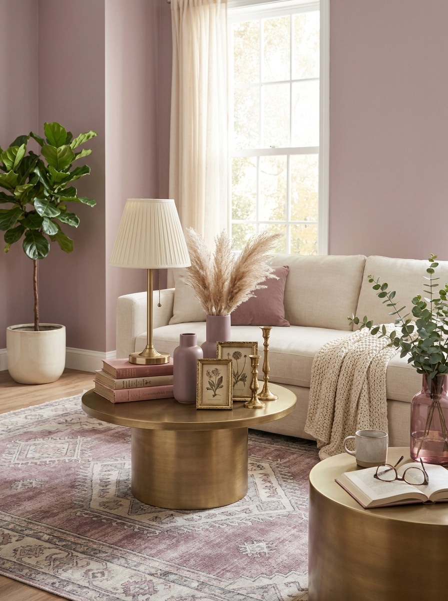
This is the color scheme for anyone who wants something romantic without going full pink. Mauve has this dusty, vintage quality that feels grown-up and sophisticated. It’s purple’s elegant older sister who drinks tea and reads poetry.
I love pairing soft mauve walls with lots of cream to keep things light and airy. The brushed brass adds just enough shimmer without being too shiny or dressy. This combo works beautifully in spaces that don’t get tons of natural light because the warmth compensates for what the windows can’t provide.
The trick is keeping your mauve on the softer, grayer side. Too pink and you’re in little-girl territory. Too purple and it feels costume-y. You want that perfect in-between shade that changes throughout the day. Morning light makes it look almost gray, evening light brings out the purple undertones. Add cream linen curtains and a cream sofa, then layer in mauve velvet pillows and a brass floor lamp. It’s moody but still inviting.
26. Crisp White with Denim Blue and Weathered Wood
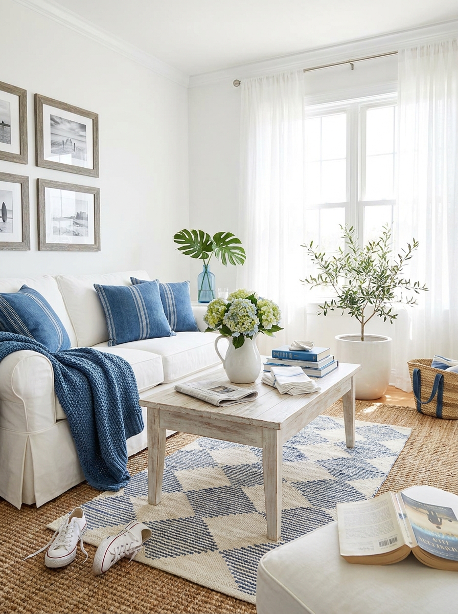
This is coastal living without the cliché anchors and rope. White and denim blue together feel fresh and breezy, like you just opened all the windows on the first warm day of spring. The weathered wood grounds everything so it doesn’t float away.
What I love about this scheme is how incredibly versatile it is. It works in a beach house, obviously, but it’s equally gorgeous in a city apartment or a farmhouse. The key is using real denim blue, not bright royal or navy. Think worn-in jeans, not new ones. That faded, lived-in quality makes all the difference.
Keep your whites crisp and clean, not cream or ivory. You want that fresh contrast. Then bring in weathered wood through a coffee table, picture frames, or floating shelves. Add denim blue through a slipcovered sofa, striped pillows, or even painted furniture. The whole thing feels relaxed and easy, like you didn’t try too hard but it still looks intentional.
27. Deep Eggplant with Dusty Pink and Antique Gold
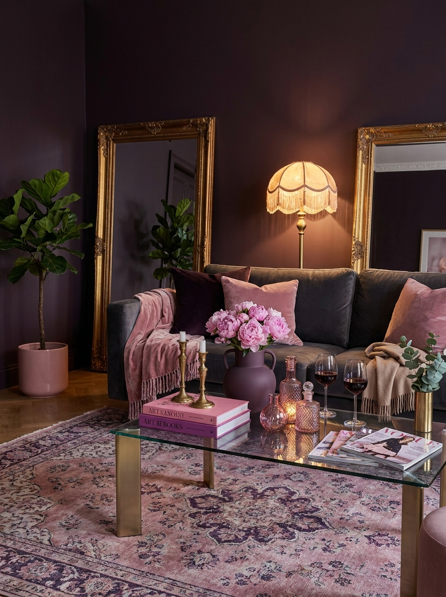
If you want drama but you’re tired of navy and charcoal, let me introduce you to deep eggplant. It’s dark and moody but with so much more personality. Paired with dusty pink and antique gold, it becomes absolutely stunning.
This is a bold move, I won’t lie. Eggplant walls are commitment. But oh, the payoff. The room feels like a jewel box, especially when you add dusty pink velvet and those antique gold accents that catch the light. It’s glamorous without being over-the-top fancy. More vintage boutique hotel than Vegas casino.
The dusty pink is crucial here because it softens the eggplant and keeps things from getting too dark or masculine. Think blush velvet pillows, a dusty pink rug with subtle patterns, maybe pale pink peonies in a gold vase. The antique gold should look old and worn, not shiny and new. Tarnished mirror frames, aged brass lamps, vintage gold picture frames. This color scheme works best in rooms with good lighting because you need that light to show off the richness.
28. Warm Sand with Jade Green and Dark Walnut
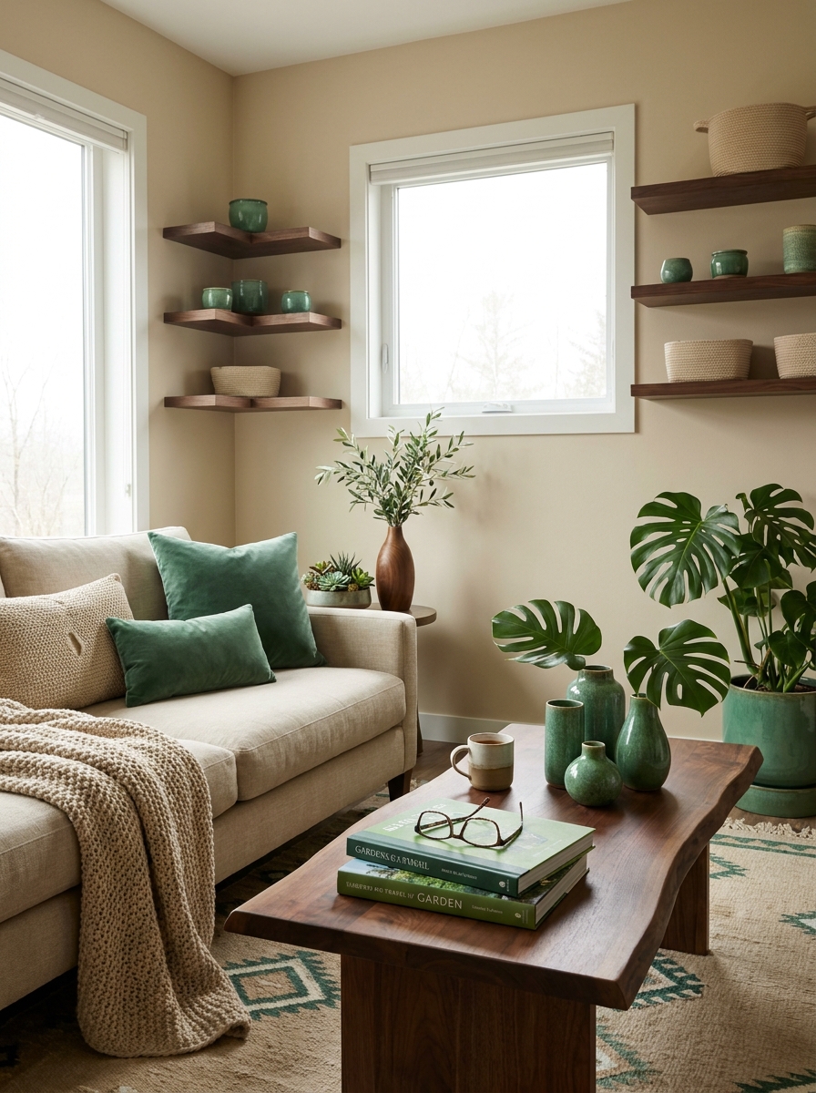
This color combination feels like a secret garden meeting a desert oasis. Warm sand tones create the most peaceful backdrop, and when you add jade green, everything comes alive. The dark walnut wood grounds it all with just the right amount of richness.
I’m obsessed with how organic this palette feels. Sand isn’t just one color, it’s a whole family of warm beiges and taupes that shift in different light. Jade green adds that pop of color without screaming for attention. It’s sophisticated green, the kind that looks expensive even when it’s not.
Bring in the jade through velvet pillows, a painted accent chair, or even glazed ceramic accessories. Keep your larger pieces in those warm sand tones, like a beige linen sofa or sand-colored walls. Then anchor everything with dark walnut furniture. A walnut coffee table, walnut picture frames, walnut shelving. The contrast between the light sand and dark wood creates visual interest without any harsh lines. It’s earthy and elegant at the same time.
29. Soft Clay Pink with Sage Green and Natural Linen
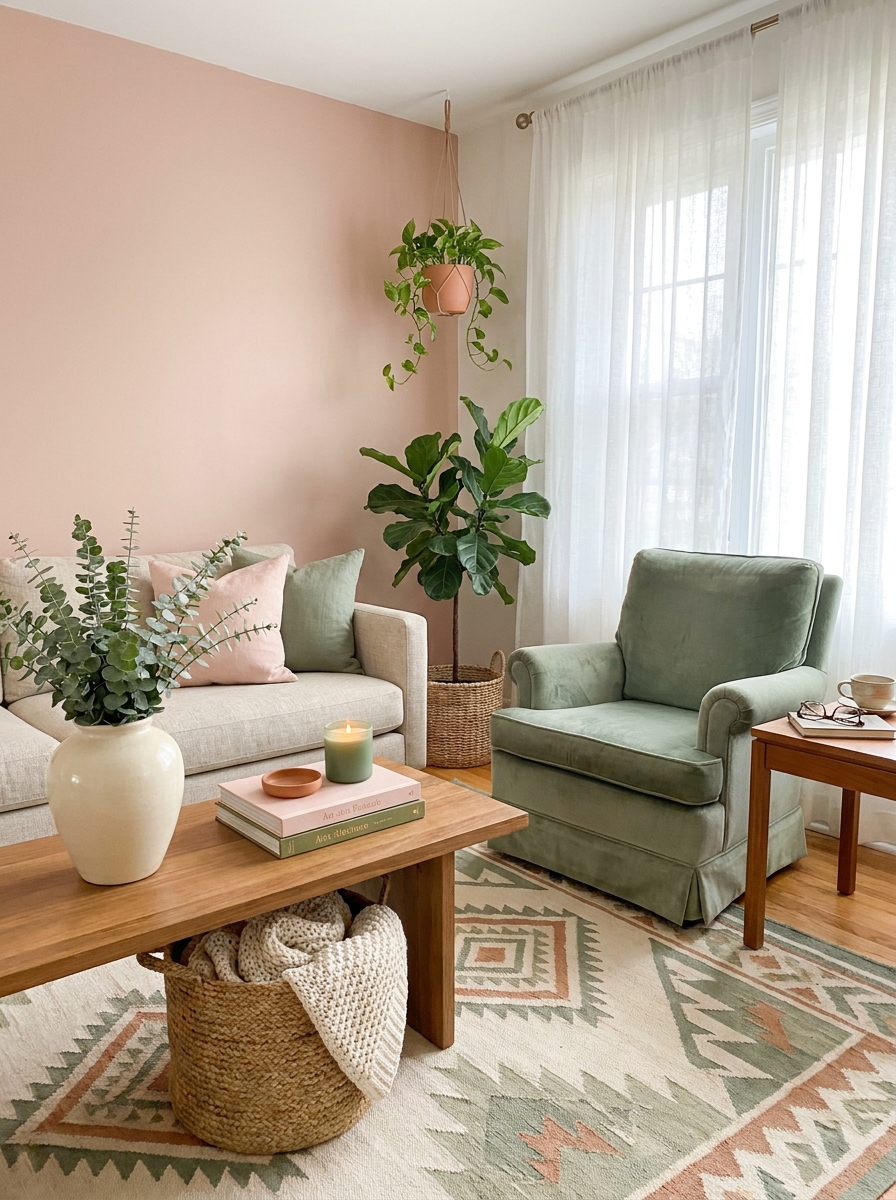
This is the gentle, soothing palette your living room has been waiting for. Soft clay pink on the walls creates a warm blush glow without feeling too feminine or overly sweet. It’s earthy and grounded, especially when you bring in muted sage green through velvet pillows and a vintage-inspired armchair.
I love how natural linen ties everything together here. A linen sofa in oatmeal keeps things light and breathable, while linen curtains filter the sunlight into something almost magical. Add in some terracotta pots with trailing pothos and maybe a chunky jute rug, and you’ve got a space that feels like a calm exhale after a long day.
This combo works beautifully in rooms that get tons of natural light. The pink stays soft and peachy during the day, then gets richer and cozier as evening rolls around. It’s one of those palettes that makes everyone who walks in say, “Wow, this just feels good.”
30. Crisp White with Kelly Green and Natural Rattan
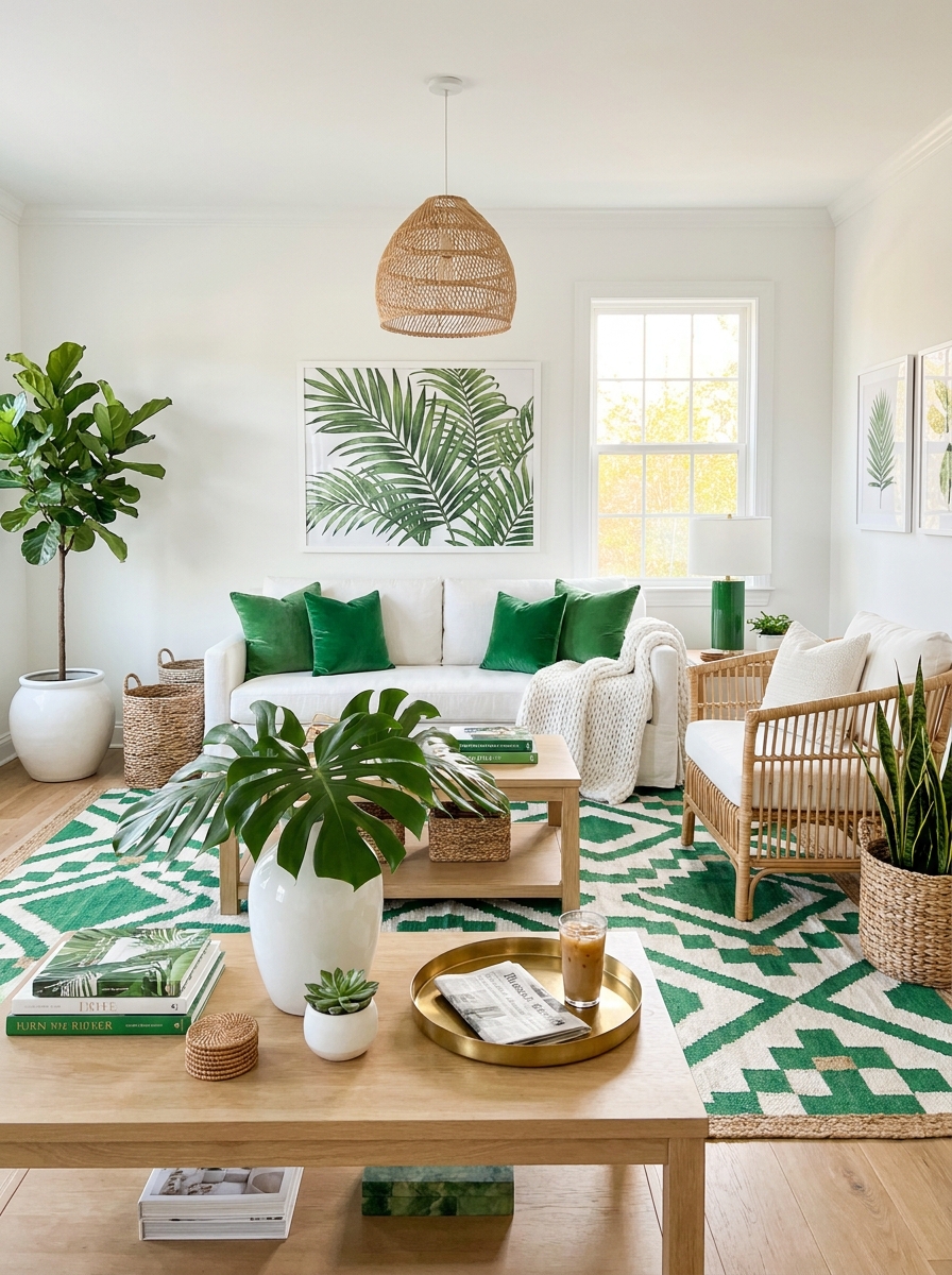
If you want a living room that feels fresh and energizing without being loud, this is it. Crisp white walls create the cleanest backdrop imaginable, and then you punch it up with pops of vibrant kelly green. Think emerald velvet pillows, a gorgeous green ceramic lamp, maybe even a bold green ottoman.
The natural rattan is what makes this scheme sing instead of shout. A rattan chair, woven pendant light, or even rattan baskets bring in warmth and texture that softens all that white. It’s like bringing a little bit of a tropical resort into your everyday life, but in a way that still feels sophisticated and livable.
I’m obsessed with how graphic this palette feels. The contrast between pure white and saturated green is striking, but because you’re mixing in those natural woven textures, it never feels cold or sterile. It’s fresh and modern, but also surprisingly cozy.
31. Warm Mocha with Burnt Sienna and Cream
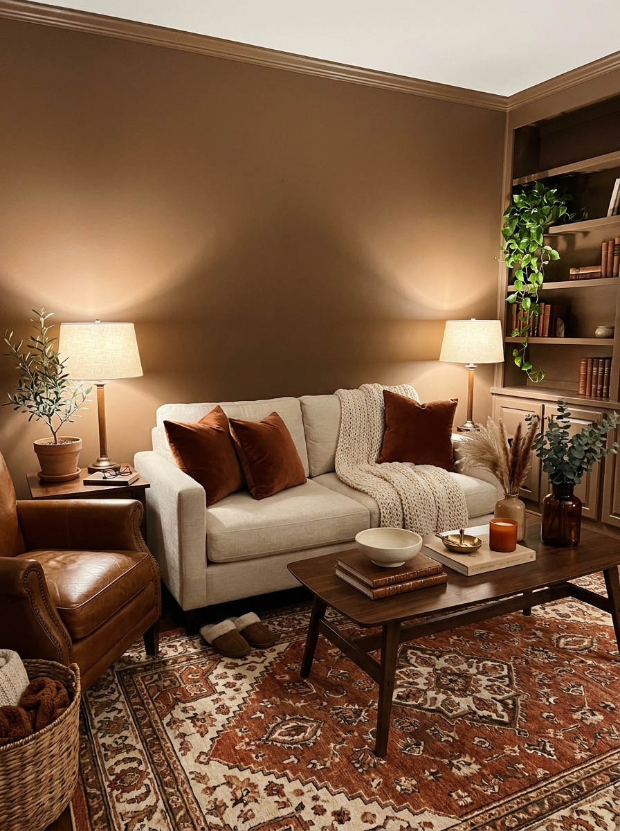
This is comfort in color form. Warm mocha walls wrap your living room in the coziest hug, creating a space that feels like a permanent sunset glow. When you layer in burnt sienna through leather accents, throw pillows, or a beautiful rust-colored rug, you get depth and richness that’s absolutely stunning.
Cream is your breathing room here. A cream-colored sofa or armchair keeps the space from feeling too dark or heavy, while cream-toned artwork and accessories add little pockets of light. I love mixing in lots of different textures in this palette because everything’s in the same warm family anyway.
This scheme works magic in rooms that don’t get tons of natural light. Instead of fighting it, you lean into the cozy cave vibe and make it intentional. Add warm-toned lighting, and suddenly you’ve got the room everyone gravitates toward on a cold evening.
32. Soft Pewter Gray with Warm Apricot and White Oak
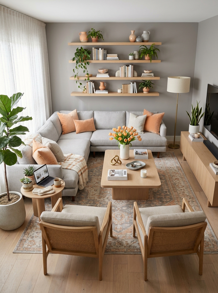
Here’s a sophisticated palette that feels current without trying too hard. Soft pewter gray on the walls gives you this beautiful neutral foundation that’s cooler than beige but warmer than straight gray. It’s that perfect in-between that works with everything.
The warm apricot accents are what make this scheme special. It’s peachy and inviting without being sugary sweet, and it brings just enough warmth to balance out the gray. A few apricot velvet pillows, a pretty throw, maybe some artwork with those tones and suddenly your whole room feels cohesive and intentional.
White oak furniture grounds everything beautifully here. The light wood tone has just enough warmth to complement the apricot while still feeling clean and modern against the pewter walls. It’s a palette that works for literally anyone because it’s balanced, sophisticated, and surprisingly versatile. You can dress it up or keep it casual depending on your accessories.
Quick Guide
## Which Color Scheme Fits Your Space?
Small living room with limited natural light: Go for lighter schemes like Soft Sage with Cream or Classic Greige—they’ll bounce light around and make the space feel bigger. Avoid dark moody palettes that’ll shrink the room.
Large open-plan living area: You can handle bolder choices like Navy with Cognac or deep jewel tones. The space can absorb darker colors without feeling cramped.
Rental restrictions: Stick with neutral walls and bring in color through furniture, rugs, and accessories. The Greige or Ivory-based schemes work perfectly since you can swap accent colors seasonally.
High-traffic family room: Choose forgiving colors that hide wear—medium tones like terracotta, sage, or warm grays are more practical than stark white or very dark navy.
Want a calming vibe: Lean toward cooler neutrals, soft greens, or dusty blues. Avoid high-contrast schemes with lots of black and white.
Love bold dramatic spaces: Navy, charcoal, forest green, or rich terracotta will give you that wow factor without overwhelming.
Your Living Room, Your Rules
Here’s the thing about color schemes—they’re not actually about following rules. They’re about finding combinations that make you feel good when you walk into your own living room. Maybe you’re drawn to those calm sage greens, or maybe your heart skips a beat over moody navy walls. Both are right if they’re right for you. The 32 schemes we covered here are tried-and-true starting points, but they’re not the finish line. They’re permission slips to experiment, to mix things up, to trust your gut about what works in your actual home with your actual life.
Start with one scheme that speaks to you. You don’t have to repaint everything this weekend or buy a whole new sofa. Grab some paint samples. Bring home a few pillow covers in your chosen colors. Live with them for a week and see how they make you feel. The best living room color scheme is the one that makes you want to curl up on your couch with a good book and stay awhile. So go ahead—pick your palette and make it yours.
Frequently Asked Questions
What’s the easiest living room color scheme for beginners?
Start with a greige or warm gray base—walls, sofa, or both. Then add one accent color through pillows, throws, and accessories. This approach is foolproof because neutrals are forgiving, and you can swap your accent color anytime without repainting or buying new furniture. Navy, sage, or terracotta all work beautifully as that pop of color.
How do I choose a living room color scheme that won’t look dated?
Stick with nature-inspired palettes—neutrals, greens, blues, and warm earths—rather than trendy colors like millennial pink or trendy teal. Classic combinations like navy with cognac, greige with oak, or cream with sage have staying power because they’re based on timeless color relationships. Avoid overly matchy-matchy schemes where everything is the exact same shade.
Can I mix warm and cool colors in my living room?
Absolutely, and it actually creates more interesting spaces. The key is choosing one temperature as your dominant tone and using the other as an accent. For example, cool gray walls with warm cognac leather and brass accents, or warm terracotta with cool dusty blue pillows. The contrast adds depth without feeling chaotic.
What colors make a small living room look bigger?
Light reflective colors like soft whites, light greiges, pale sage, and soft blues will make your space feel more open and airy. Paint the ceiling the same color as the walls to blur boundaries. Use a monochromatic scheme with varying shades of the same color family—this creates flow without visual interruption that chops up the space.
How many colors should I use in a living room color scheme?
Aim for 3-5 colors total: one dominant neutral for walls or large furniture, one secondary color for medium pieces like a sofa or rug, and 2-3 accent colors in smaller doses through pillows, art, and accessories. More than five colors can feel chaotic unless you really know what you’re doing. The 60-30-10 rule works great—60% dominant, 30% secondary, 10% accents.