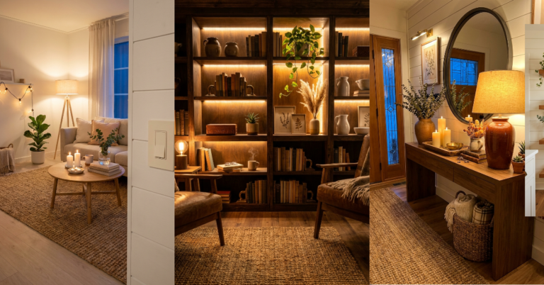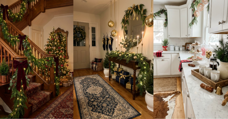
30 Cheap Decor Tricks That Feel Seriously Luxe
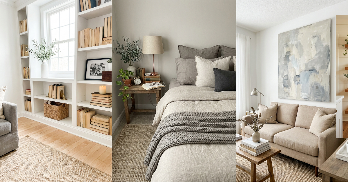
You know that feeling when you walk into someone’s home and immediately think they must’ve hired a designer? Then you find out they did it all themselves with finds from HomeGoods and a few smart tricks. That’s the magic we’re after here. You don’t need a massive budget to make your space look pulled together and expensive. You just need to know which details matter most and where to focus your energy. The secret isn’t about buying more stuff—it’s about buying the right stuff and styling it like you mean it. A $15 brass candlestick can look like a splurge when it’s paired with the right books and a vintage tray. A cheap linen pillow suddenly reads expensive when it’s layered with three others in complementary textures. These 30 ideas will show you exactly how to fake that high-end look without the high-end price tag. Let’s get into it.
1. Layer Three Textures in One Vignette
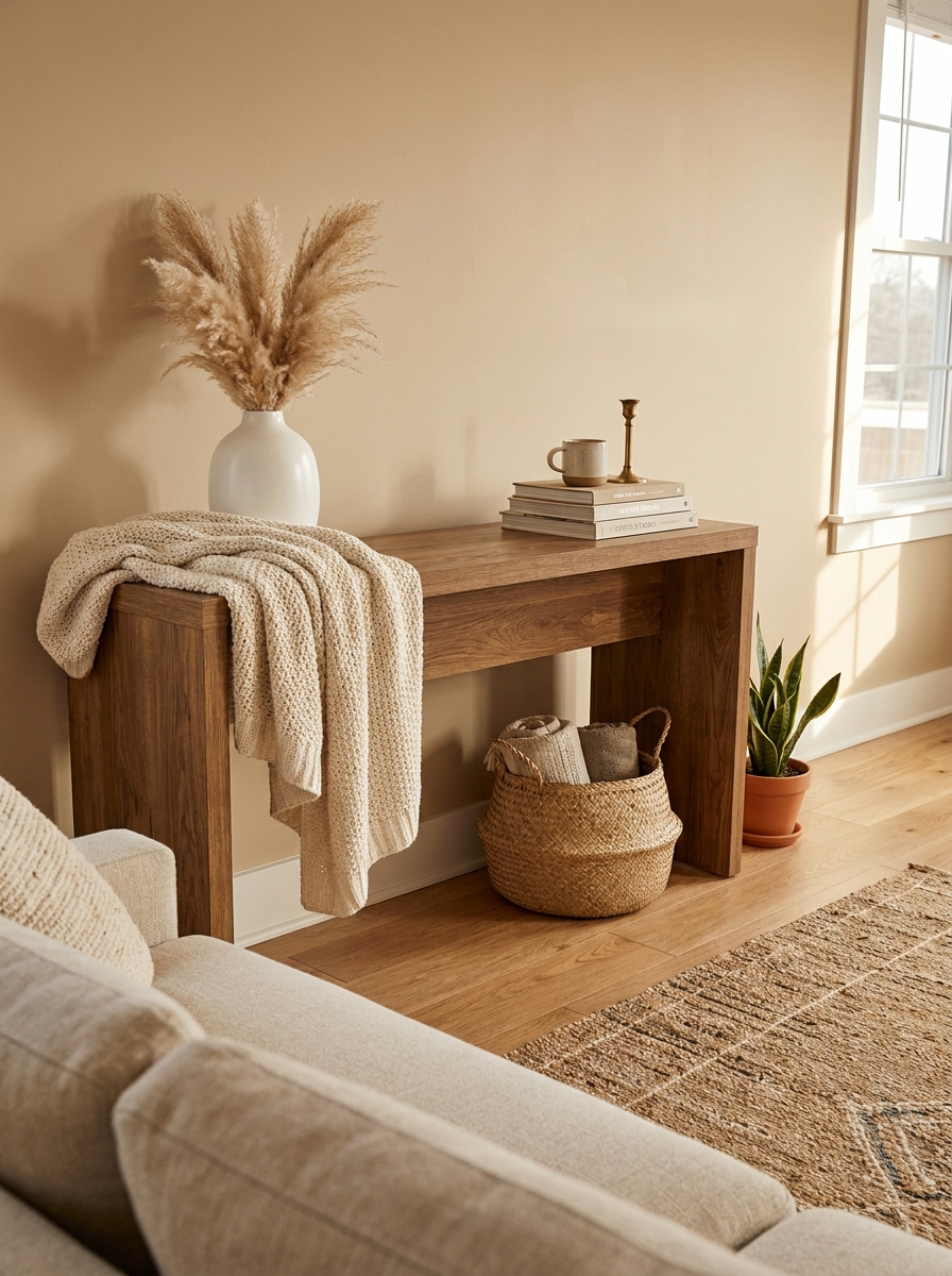
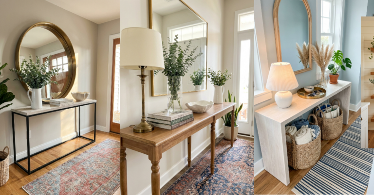
This is the fastest way to make any surface look intentionally designed. Pick three different textures and group them together—maybe a smooth ceramic vase, a chunky knit throw draped nearby, and a woven basket tucked underneath. Your eye reads all that texture variation as thoughtful and expensive, even when each piece cost under $20.
The trick is making sure the textures actually contrast. Don’t pair linen with cotton and call it a day. Go for dramatic differences: rough jute next to glossy metal next to soft velvet. That’s when it starts looking like you know what you’re doing.
You can do this on a coffee table, an entryway console, a nightstand, or even a bathroom counter. The formula works everywhere. And it instantly elevates whatever cheap finds you’re working with because the styling does the heavy lifting. People won’t notice the price tags when they’re busy admiring how good everything looks together.
2. Swap Out Builder-Grade Hardware for Brass
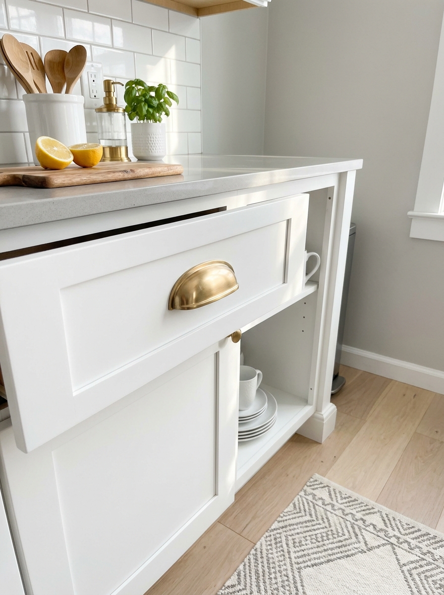
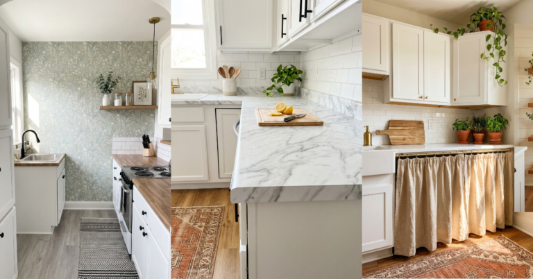
Those shiny silver cabinet pulls and drawer knobs that come standard in most homes? They scream rental. But brass hardware whispers expensive, even when you buy it for $3 a pull on Amazon. Seriously, this one swap transforms entire rooms.
You don’t have to do every cabinet in your kitchen if that feels overwhelming. Start with the most visible ones—maybe the island or the cabinets flanking your stove. Or just do all the drawers. Even a partial upgrade makes a massive visual difference because brass catches light differently and adds warmth that builder-grade nickel never will.
If you’re renting and can’t swap hardware permanently, stick-on brass pulls exist and they actually look decent. Or just focus on furniture pieces you own—a dresser with new brass pulls suddenly looks like a vintage find instead of an IKEA basic. The return on investment here is wild for how little effort it takes.
3. Frame Affordable Art in Oversized Mats
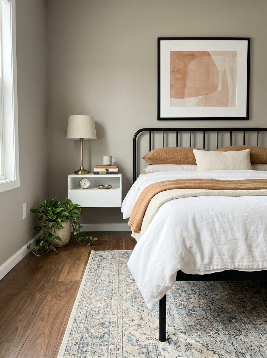
Here’s the thing about art that looks expensive—it’s usually about the framing, not the print itself. You can buy a $12 print from an Etsy artist and make it look like a gallery piece by putting it in a frame with a big, thick mat. That white space around the art is what makes it read as valuable.
Most people skip the mat or buy those prepackaged frame-and-mat combos where the mat is barely an inch wide. But a 3-4 inch mat border? That’s what you see in actual galleries and designer homes. It gives the art room to breathe and makes the whole thing feel more important.
You can buy custom mats cut to size online for pretty cheap, or you can get precut mats at craft stores and just trim your print to fit. Either way, pair it with a simple black or natural wood frame and suddenly your $12 art print looks like you spent $200. The scale and proportion do all the convincing.
4. Style Books with Spines Facing Backward
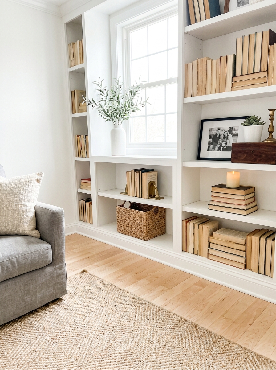
This one sounds weird until you see it, and then you can’t unsee how much chicer it looks. Flip some of your books so the pages face out instead of the spines. All those mismatched colors and fonts disappear, and you’re left with a clean, creamy neutral stack that looks incredibly expensive and curated.
It works best when you mix it up—some spines out, some pages out. You’re not trying to hide every book title like you’re in witness protection. You’re just creating visual calm on your shelves. Designers do this all the time because it lets other objects shine without all that visual clutter competing for attention.
Pair your backward books with a small object on top—a candle, a small plant, a decorative box. Now you’ve got a vignette that looks intentional instead of just looking like you shoved books on a shelf and called it decorated. And the best part? It’s completely free. You already own the books. You’re just styling them smarter.
5. Cluster Mirrors of Different Sizes on One Wall
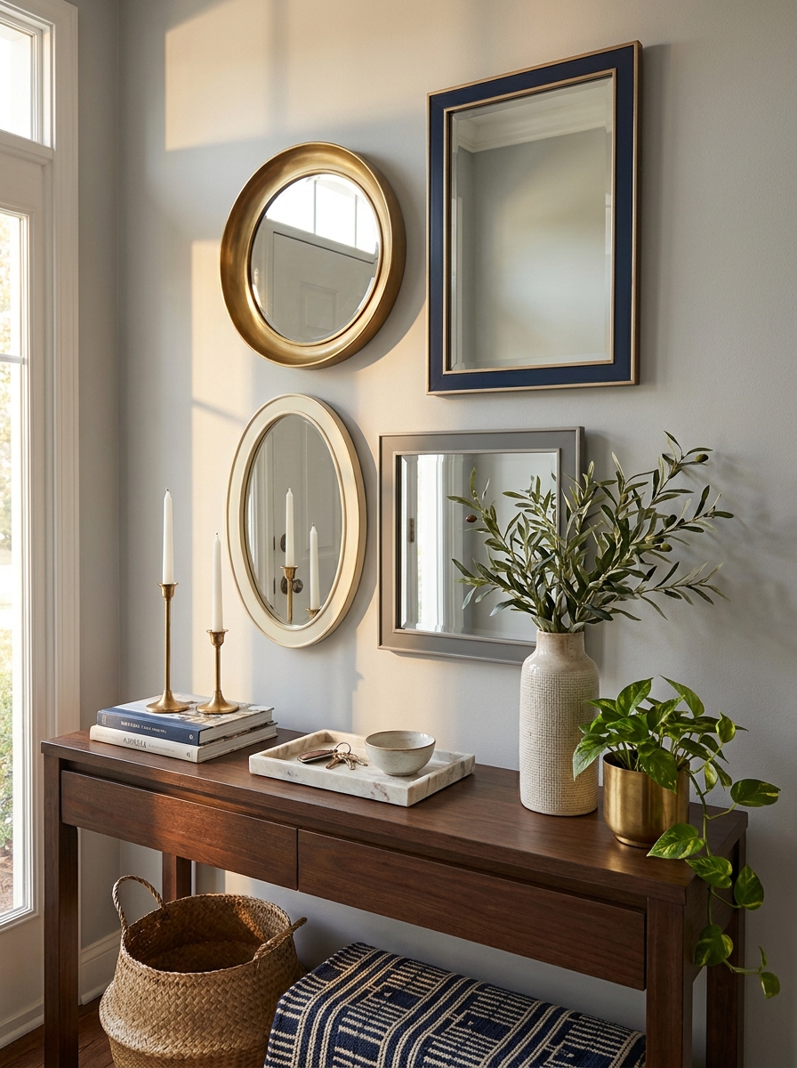
This is the trick that makes people stop and stare. Instead of one big mirror, grab three or four different ones from thrift stores or discount shops. Mix round with rectangular. Vary the frame finishes but keep them in the same color family.
Hang them in a loose cluster on an empty wall and suddenly you’ve got a gallery moment that screams custom design. The reflections bounce light around like crazy, making your space feel bigger and brighter. It’s that collected-over-time look that feels so intentional.
I love doing this behind a console table or above a bed. The asymmetry makes it feel artistic, not matchy-matchy. And because you’re using smaller mirrors, each one costs way less than a single statement piece. You can find great ones at estate sales for under ten bucks. The magic is in the arrangement, not the price tag.
6. Add Crown Molding (Even the Peel-and-Stick Kind)
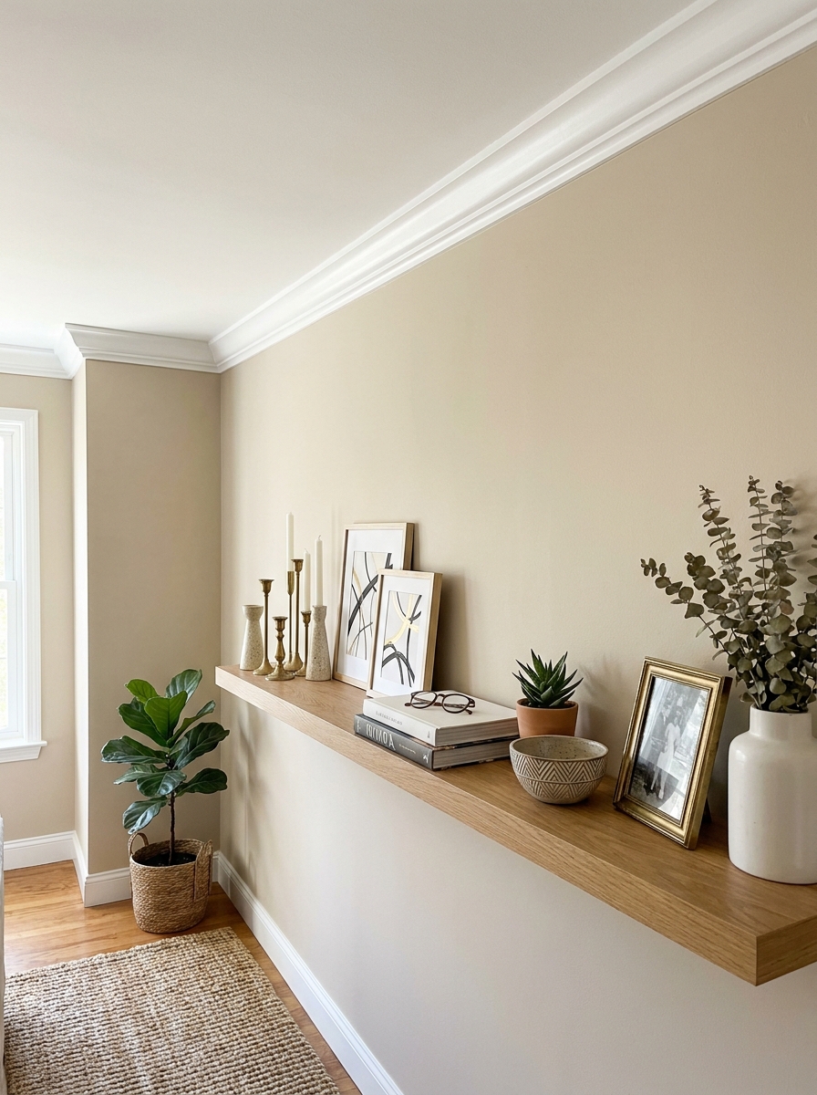
Nothing says expensive home like crown molding. It’s that architectural detail that makes rooms feel finished and fancy. But here’s the secret: you don’t need to hire a carpenter or learn complicated miter cuts.
Peel-and-stick crown molding exists now and it’s shockingly convincing. It goes up in an afternoon with just a utility knife and some patience. Paint it the same color as your ceiling and it looks completely built-in. I did my bedroom last year and guests genuinely think it’s original to the house.
The difference it makes is wild. Your ceilings look higher. Your walls look more intentional. The whole room feels more polished. It’s one of those upgrades that doesn’t scream its price tag but quietly elevates everything else in the space. Target the rooms guests see first: living room, entryway, or primary bedroom.
7. Use Linen (or Linen-Look) Everything
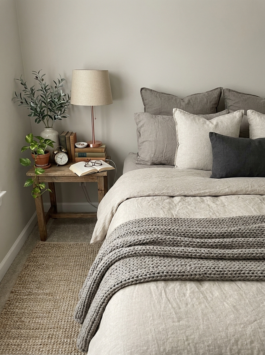
Real talk: linen just looks expensive. Something about that slightly rumpled, textured, casual-but-refined thing screams money. The good news? You don’t need actual Belgian linen that costs your rent.
Linen-look fabrics are everywhere now and they’re shockingly affordable. Grab linen-style throw pillows, a duvet cover, even cloth napkins for your coffee table styling. That nubby texture catches light differently than regular cotton. It adds this organic, elevated vibe that feels collected and intentional.
I especially love linen textures in neutral colors: oatmeal, warm white, soft gray. They layer beautifully with everything and never look cheap or shiny. Toss a linen throw over your sofa arm or layer linen pillow covers over your existing pillows. Instant upgrade. The wrinkles are actually part of the charm, which means less ironing and more looking like you tried without trying.
8. Paint Your Ceiling a Shade Darker Than Your Walls
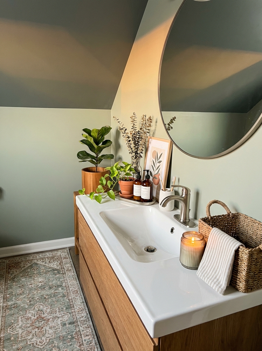
This one sounds backward but trust me. Everyone defaults to white ceilings, which is fine but boring. Painting your ceiling just one or two shades darker than your walls creates this cozy, wrapped, designer moment that feels so intentional.
It makes the room feel more intimate and expensive, like someone actually thought about the ceiling as part of the design. I love doing this in bedrooms with a soft greige on the walls and a deeper taupe on the ceiling. It’s subtle but so impactful.
The darker ceiling brings your eye up and makes the space feel more dimensional. It’s that collected, layered, nothing-standard-here vibe that expensive homes have. And the best part? It costs exactly the same as painting it white. Just one extra quart of paint in a deeper shade. Game changer for almost zero extra money.
9. Float One Oversized Piece of Art Above Your Sofa
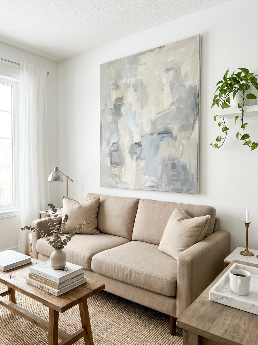
Here’s the thing about big art: it automatically makes a room look more intentional. And when I say big, I mean BIG. One huge piece above your sofa beats a scattered gallery wall every time if you’re going for that expensive, curated look.
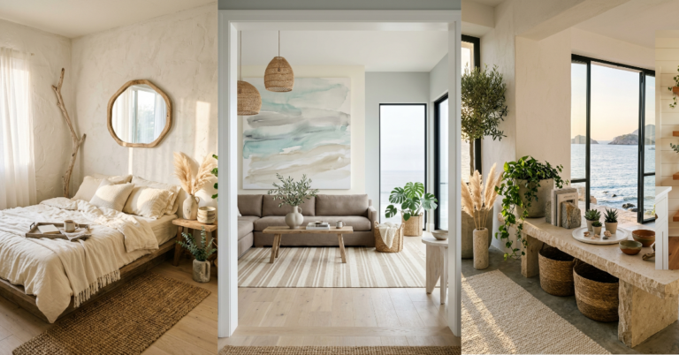
You don’t need an original painting either. Print a high-res abstract or landscape from an online print shop, then frame it in the largest size you can afford. Or go even cheaper and DIY your own abstract art with a canvas and some acrylic paint. Honestly, large-scale abstract is the easiest thing to make yourself.
The key is scale. That single piece should take up about two-thirds the width of your sofa. When art is properly sized, it grounds the whole room and makes everything else look more expensive by association. It’s like the room suddenly has a focal point, a reason for being. And people always assume big art costs big money.
10. Add a Vintage or Vintage-Look Runner in Your Hallway
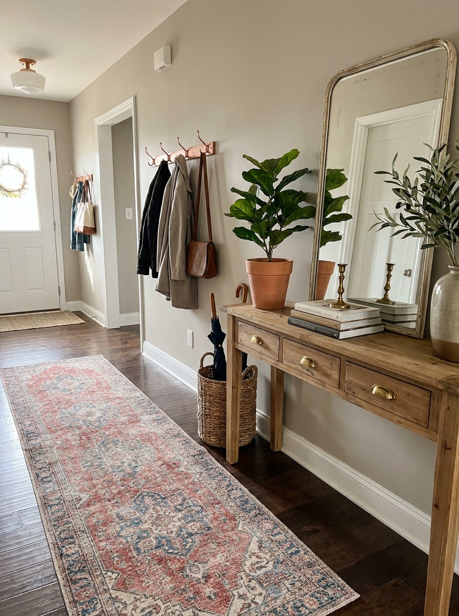
Nothing says “I have taste” quite like a faded, worn-in runner with a story. Real vintage Persian rugs can cost thousands, but the affordable knockoffs? They look shockingly good. And honestly, most people can’t tell the difference once it’s on your floor.
The secret is in the distressed look. Those faded colors and slightly worn patterns read as expensive and collected over time. It’s the opposite of brand-new builder beige, which screams budget. A vintage-style runner instantly elevates a boring hallway or entryway into something that feels layered and intentional.
I found mine at a discount home store for under $100, and every single person who visits asks where I got my “gorgeous antique rug.” I just smile. The best part? These runners hide dirt like champions, so they’re actually practical too. Wine spill? Can’t even see it. High-traffic wear? That just adds character.
11. Style Your Nightstands Like a Boutique Hotel
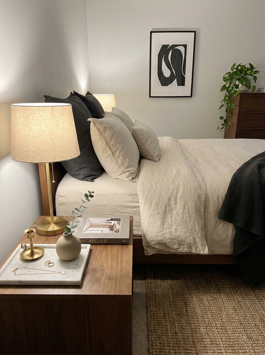
Ever notice how hotel nightstands always look so pulled-together? It’s not magic. It’s just really intentional styling. And you can totally copy it at home for almost nothing.
The formula is simple: one beautiful lamp, one small tray to corral little things, something living or organic, and one decorative object. That’s it. No clutter, no random charging cables everywhere, no stack of unread books tipping over. Just calm, expensive-looking simplicity.
I use a faux marble tray from the dollar section to hold my rings and a small candle. Add a brass lamp I scored at a thrift store, and a single stem in a bud vase? Suddenly my bedroom feels like a boutique hotel instead of my regular messy life. The trick is editing ruthlessly. Less really is more here, and that minimalism reads as luxury every single time.
12. Upgrade Your Light Switch Plates to Match Your Hardware
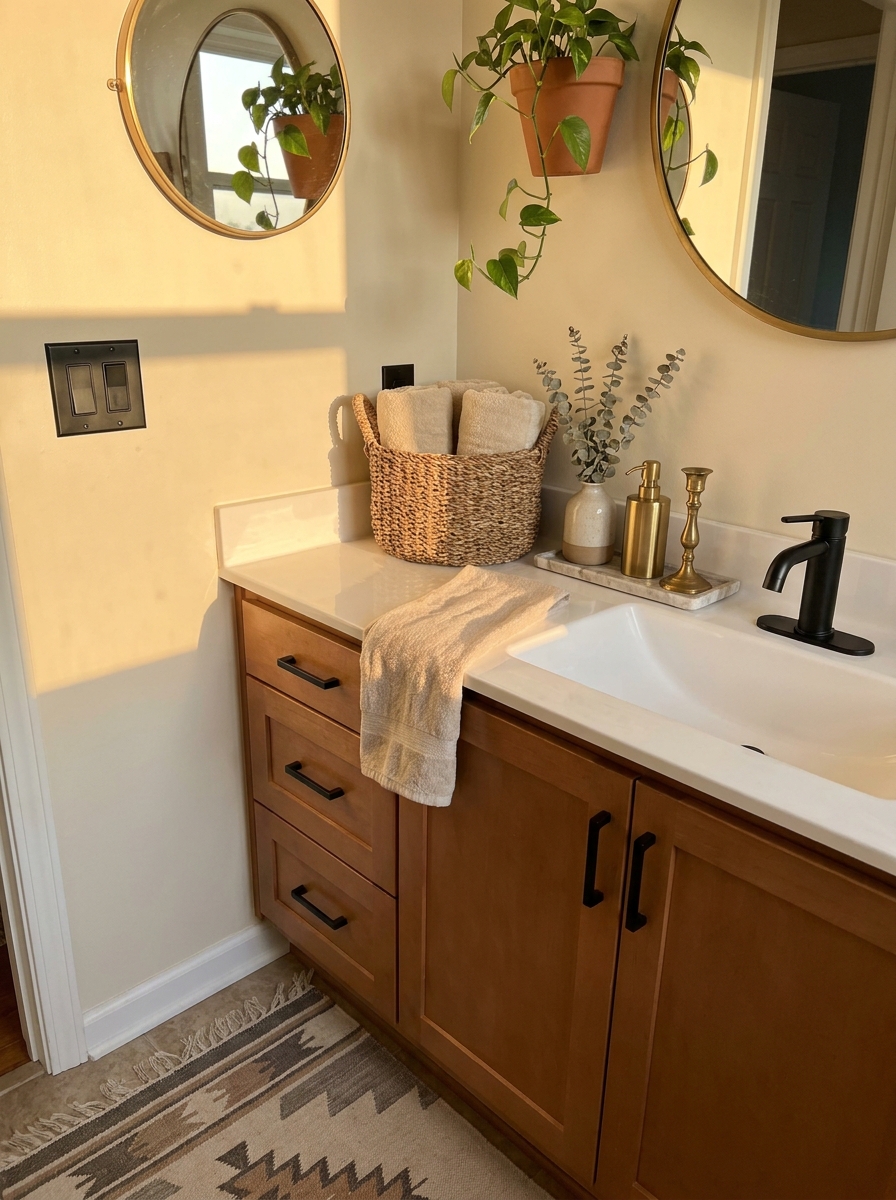
Okay, this sounds so small it’s almost silly. But I promise you, mismatched switch plates are one of those tiny things that quietly screams “budget rental.” And replacing them? It takes about four minutes and costs maybe twenty bucks for your whole house.
If you’ve upgraded your cabinet hardware to brass or black, your light switches should match. It’s such a small detail, but it makes everything feel cohesive and considered. Like someone actually designed this space instead of just accepting whatever the builder installed.
I switched all mine to matte black to match my door hardware and cabinet pulls, and the difference is ridiculous. Suddenly my whole house feels more finished and expensive. It’s one of those “once you see it, you can’t unsee it” upgrades. And guests absolutely notice, even if they don’t consciously realize what’s different. Your space just feels more polished overall.
You can find these at any hardware store, and installation is literally just two screws. Easiest upgrade ever.
13. Display Fresh Flowers in Unexpected Vessels
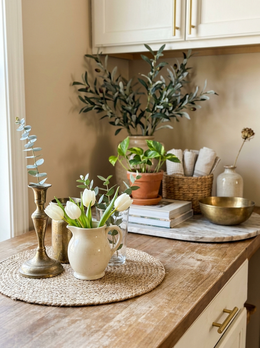
Stop buying expensive vases and start looking at what you already own with fresh eyes. That vintage pitcher? Perfect for peonies. A pretty drinking glass? Gorgeous with a single stem rose. Even a cleaned-out tomato can wrapped in linen ribbon looks boutique-y with wildflowers.
The trick is mixing your vessels like a florist would. Group three different heights together on a tray. Pair a tall glass bottle with a short ceramic cup. The mismatched look feels collected and intentional, not matchy-matchy boring.
And here’s the secret nobody tells you: grocery store flowers in interesting containers look way more expensive than fancy flowers in basic vases. I grab $5 trader bouquets every week and split them into three different vessels. Suddenly my kitchen looks like I have a standing order with a florist. It’s all about the styling, not the price tag. Your guests will never know those tulips cost less than a latte.
14. Hang Curtains Higher and Wider Than Your Window
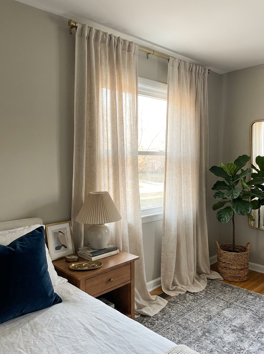
This might be the cheapest trick that makes the biggest visual impact. Mount your curtain rod almost at the ceiling and extend it several inches past your window frame on each side. Suddenly your window looks custom, your ceilings look taller, and your whole room feels more expensive.
I learned this from a designer friend who said most people hang curtains exactly where the window is, which makes everything look boxy and builder-grade. When you go high and wide, you’re creating the illusion of architectural grandeur that costs absolutely nothing extra.
You don’t even need expensive curtains. Basic white or linen-look panels from Target look like they came from a fancy shop when they’re hung properly. The installation does all the heavy lifting. I did this in my bedroom with $30 curtains and people constantly ask where I got my “custom drapes.” I just smile and say they were a great find.
15. Create a Gallery Wall with Matching Frames
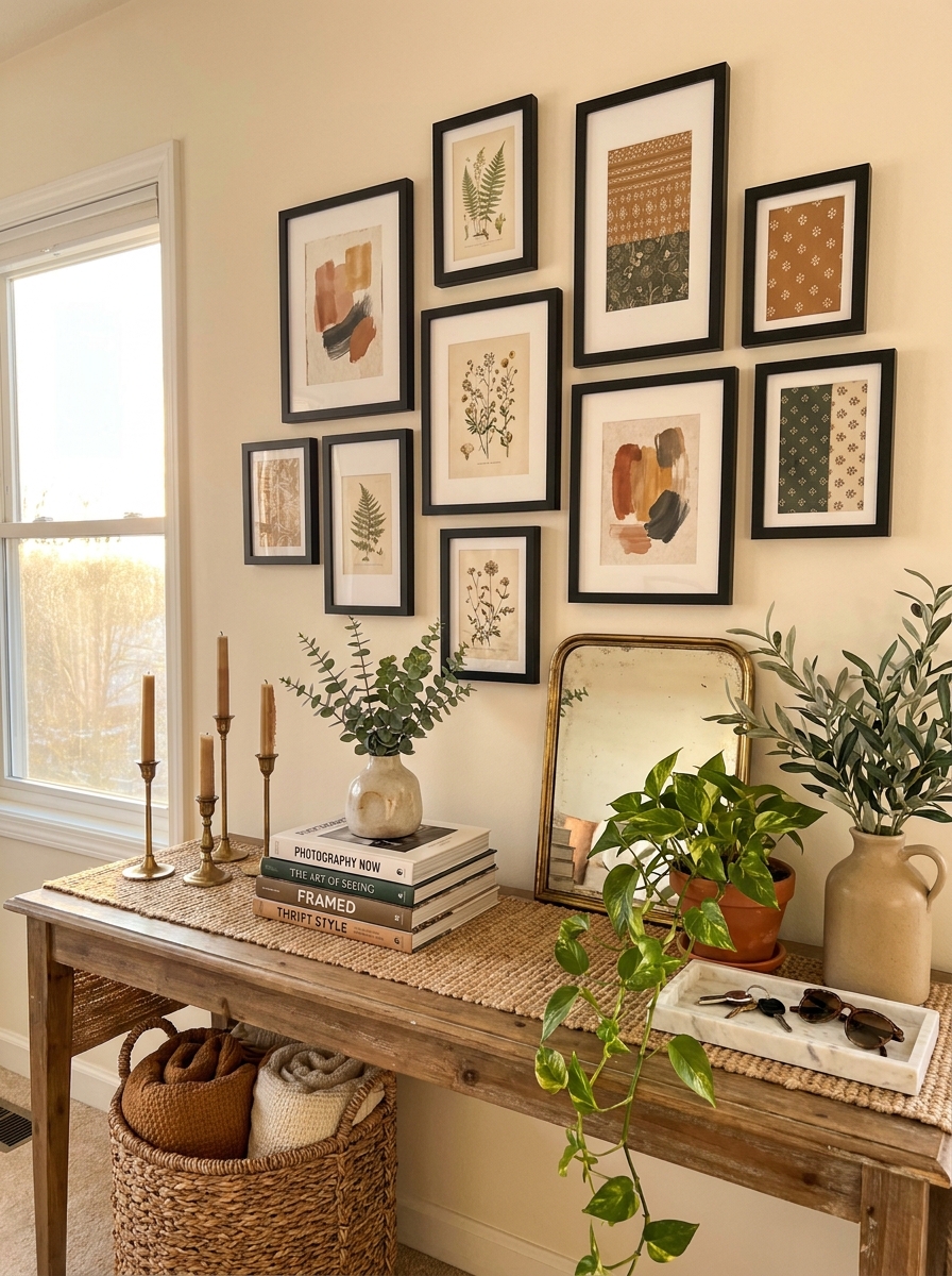
Gallery walls can look chaotic and cheap when frames don’t talk to each other. But when you commit to one frame style and just vary the sizes? Instant sophistication. It’s the difference between a college apartment and a collected, curated home.
I buy black frames in bulk when they go on sale and slowly build my gallery walls over time. Sometimes I frame art prints, sometimes pretty fabric scraps, sometimes pages from old books. The consistent frames make everything look intentional and elevated, even when the actual art cost nothing.
The beauty of this approach is you can start small and add as you go. Begin with three frames in different sizes. Arrange them in a cluster. Next month, add two more. Before you know it, you have a stunning focal wall that looks professionally designed. People always assume I spent a fortune, but really I just spent time making it look cohesive.
16. Style Open Shelving with the Rule of Three
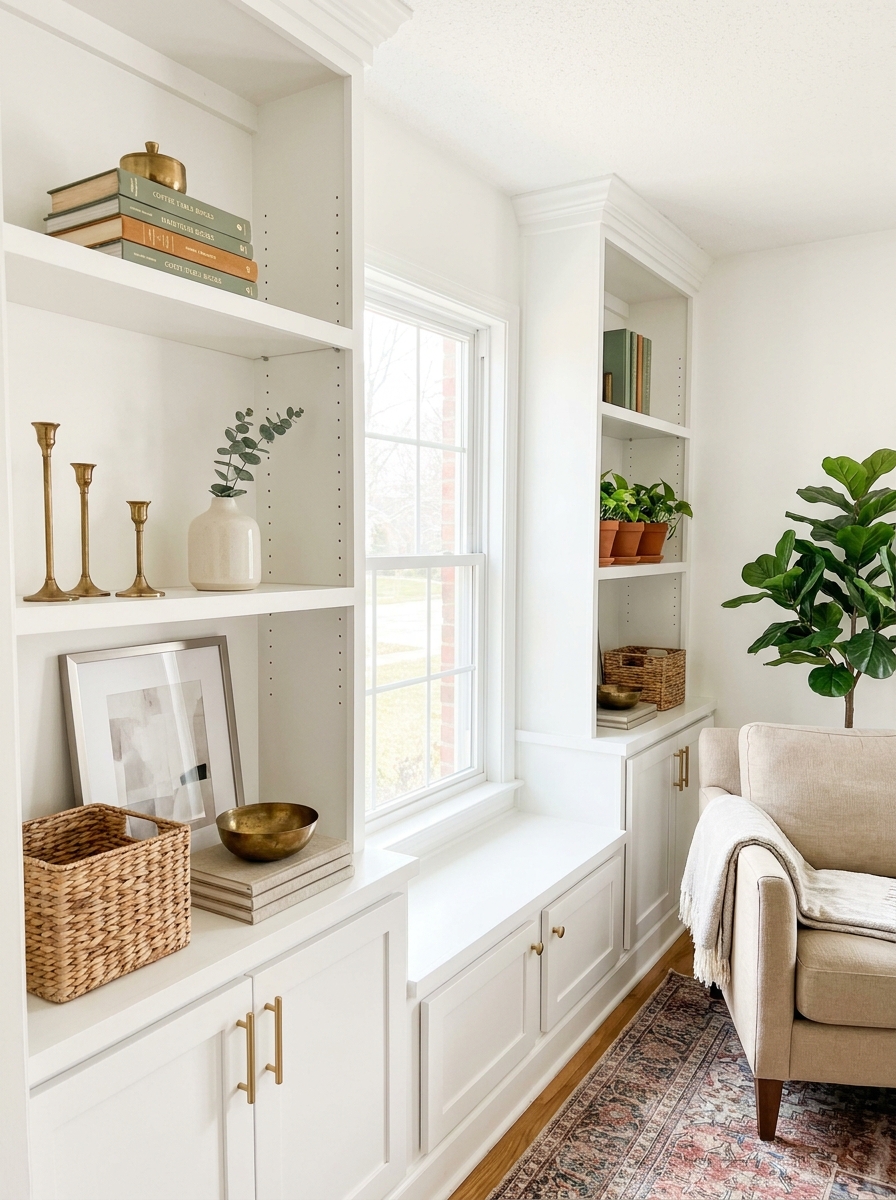
Open shelves can either look like expensive styled perfection or cluttered chaos. The difference? The rule of three. Group items in odd numbers, vary the heights, and leave breathing room. This simple formula makes even dollar store finds look curated.
I style each shelf like its own little vignette. A tall vase, a medium stack of books, a small plant. Or three books, two candlesticks, one bowl. The asymmetry feels natural and collected, not forced. And the empty space? That’s what makes it look expensive. Overcrowding screams budget.
Here’s what changed everything for me: I removed half of what I had on my shelves. Suddenly the pieces I kept looked important and intentional instead of just stuff. Now I rotate items seasonally, which keeps things fresh without spending money. It’s like getting a new room every few months.
17. Paint Your Front Door a Bold, Saturated Color
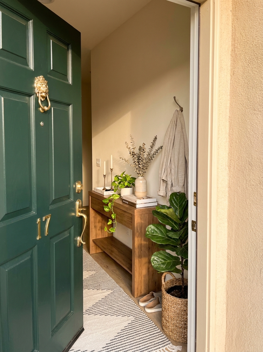
I cannot tell you how much this single move changed the entire feel of my house. A bold front door—we’re talking deep navy, forest green, or even a moody charcoal—instantly makes your home look custom and considered.
The crazy part? A quart of exterior paint costs maybe thirty dollars. That’s it. But the impact? People will literally stop and compliment it. It gives your whole exterior a designer vibe, like someone actually thought about the color story instead of just accepting whatever the builder chose.
I went with a deep hunter green, and now my plain brick house looks like it belongs in a magazine spread. The key is going darker and richer than you think you should. Forget safe. Safe looks builder-grade. Bold looks expensive and intentional, like you hired someone to pick it out. Plus, painting a door is genuinely one of the easiest DIY projects ever—if I can do it on a Saturday afternoon, anyone can.
18. Use Oversized Floor Pillows Instead of Extra Seating
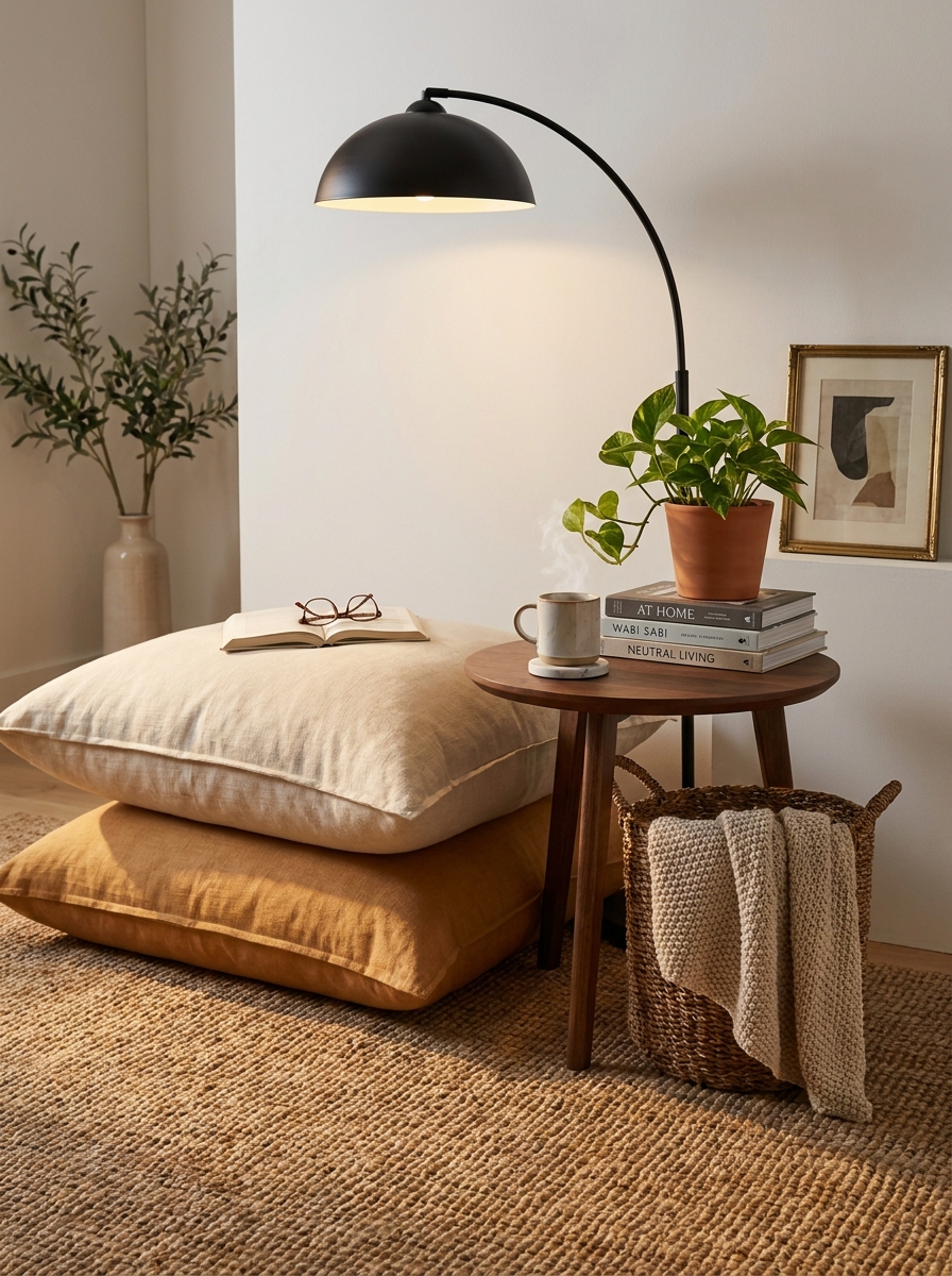
Here’s something I stumbled onto by accident: oversized floor pillows make a space look way more expensive and collected than those cheap folding chairs ever will. They give off this casual, worldly vibe—like you just got back from Morocco or spent a summer in Copenhagen.
I bought two huge linen-look floor cushions for about forty dollars each, tossed them in a corner of my living room, and suddenly that awkward empty space became this cozy, intentional reading nook. They look custom. They look curated. And bonus—they’re actually more comfortable than my couch.
The trick is sizing up. Don’t get those sad little throw pillows people try to sit on. Go big—like, really big. Twenty-four inches or bigger. And stick with neutral linen textures or subtle stripes. Nothing screams “I tried too hard” like a floor pillow covered in chevron print. Keep it simple, keep it oversized, and suddenly your living room looks like it belongs in an expensive loft somewhere cool.
19. Display Cookbooks Like Coffee Table Books
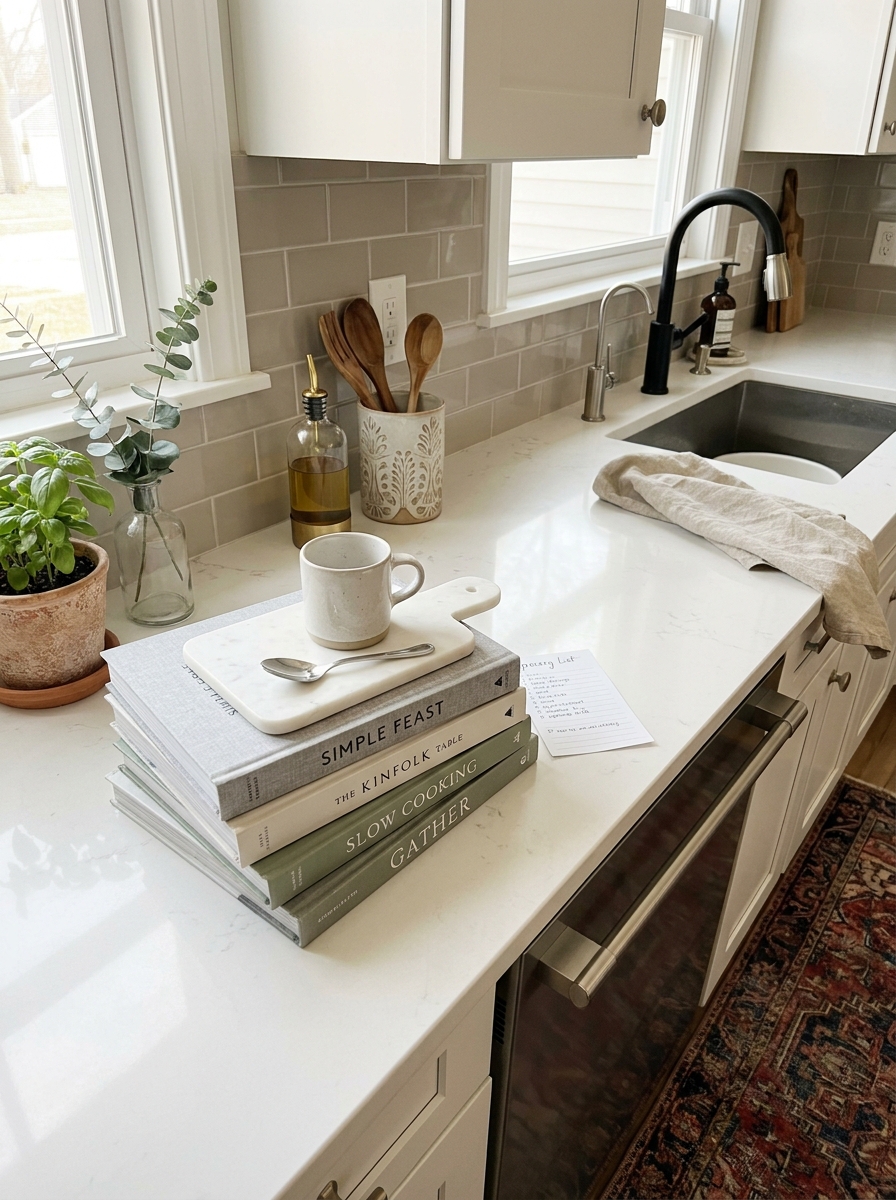
This one surprised me. I always kept my cookbooks shoved in a cabinet because, well, they’re cookbooks. But then I saw someone style them on a kitchen counter like they were expensive art books, and I had an actual lightbulb moment.
Good cookbooks have gorgeous covers. They’re designed to be beautiful. So why hide them? I pulled out my five prettiest ones—the ones with linen spines or moody food photography—and stacked them on my kitchen island next to a little vase of eucalyptus. Instantly, my kitchen looked more collected and thoughtful, like I actually care about cooking (even on nights when I’m definitely just ordering pizza).
It’s such a small move, but it makes your kitchen feel less “functional box” and more “curated space where a person with taste actually lives.” Plus, it’s free. You already own the books. You’re just putting them somewhere people can see them and thinking, “Wow, she has her life together.”
20. Swap Standard Outlet Covers for Screwless Ones
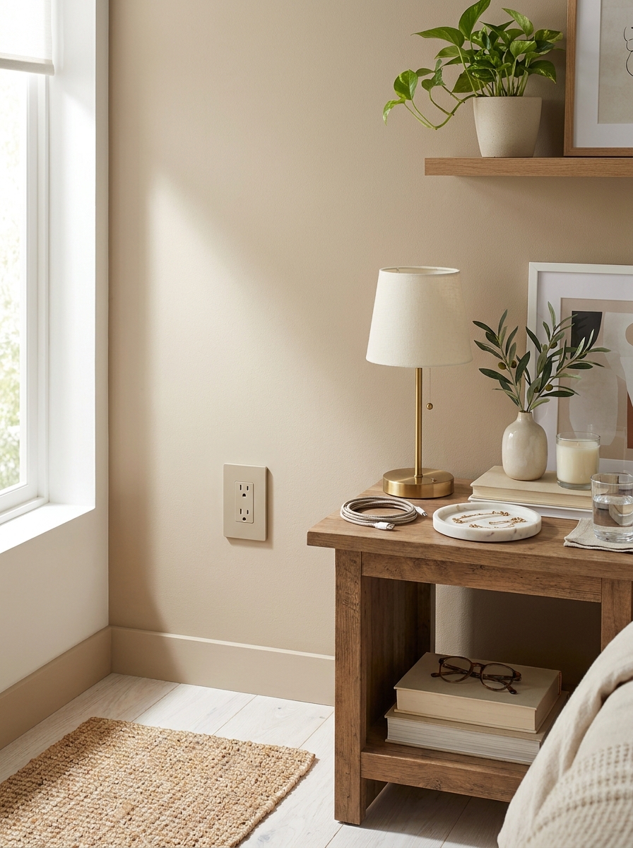
Okay, this sounds so weirdly specific, but hear me out. Those standard plastic outlet covers with visible screws? They’re quietly making your whole room look cheap. I never noticed until I swapped them out for screwless ones, and now I can’t unsee the difference.
Screwless outlet covers cost maybe three dollars each, and they snap on without any visible hardware. The faceplate looks smooth and clean, like it’s part of the wall instead of this clunky afterthought slapped on top. It’s one of those tiny details that nobody consciously notices, but everyone subconsciously registers as “expensive and finished.”
I did my entire living room in about twenty minutes, and the whole space immediately felt more polished. It’s the same effect as when you upgrade your cabinet hardware or switch plates—small touches that add up to a much more high-end overall feel. And honestly? If you’re going to spend money anywhere, spend it on the details people touch and see every single day.
21. Layer a Faux Sheepskin Over Your Desk Chair
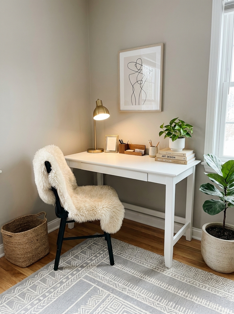
This trick instantly makes any basic office chair look like it came from a Scandinavian design studio. I draped a $20 faux sheepskin over my boring black desk chair and suddenly my whole workspace felt expensive and cozy.
The contrast between sleek and soft is what sells it. That plush texture against clean lines creates an effortless luxe vibe that designers charge thousands to achieve. Plus it actually makes sitting more comfortable, which is a bonus I wasn’t expecting.
You can find affordable faux sheepskins at home stores, and they work on any chair style. Dining chairs, accent chairs, even that old wooden chair in the corner—they all get an instant upgrade. The key is letting it drape naturally with a little asymmetry. Don’t try to make it perfect. That casual, just-tossed-there look is what makes it feel high-end and effortless.
22. Paint the Inside of a Bookshelf a Dark Contrasting Color
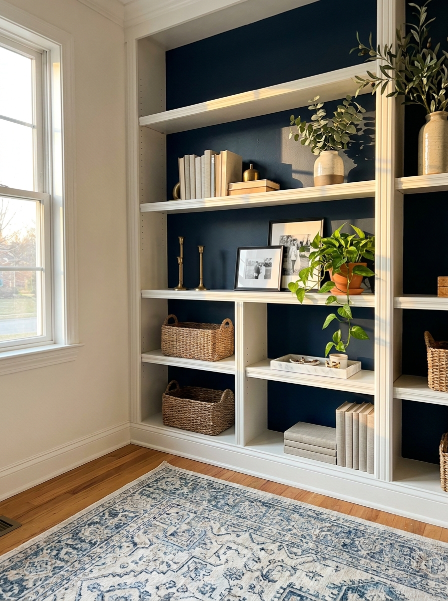
This is one of those five-dollar fixes that makes people think you hired a designer. I painted the back panel of my living room bookshelf a deep charcoal, and suddenly everything I styled on those shelves looked intentional and expensive.
The dark background creates depth and makes your objects pop. Books look crisper, vases look more sculptural, and even basic decor items appear more curated. It’s like instant visual sophistication with one quart of paint.
Navy, forest green, black, or even a rich terracotta all work beautifully. The key is choosing something significantly darker than your walls to create that contrast. I’ve seen people do this with built-ins, freestanding bookcases, even kitchen cabinets with glass doors. It takes maybe an hour and completely transforms the piece from basic to boutique.
23. Group Candles on a Decorative Tray by Height
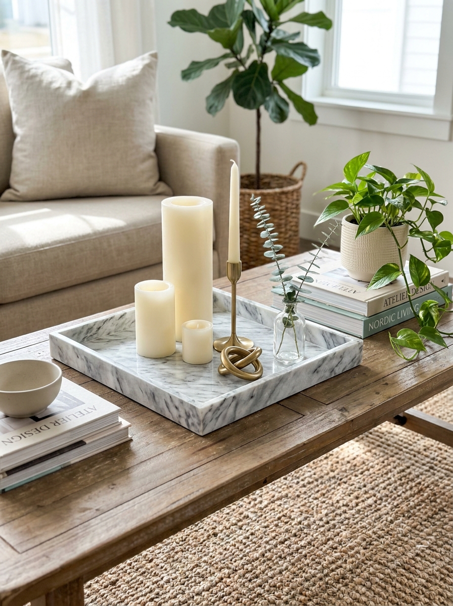
There’s something about candles arranged by size on a pretty tray that screams expensive spa vibes. I bought a marble-look tray for twelve dollars and added three different-height candles, and my coffee table instantly looked like it belonged in a design magazine.
The tray is key because it contains the arrangement and makes it look purposeful instead of random. And varying the heights creates visual interest that feels professionally styled. I use pillars, tapers in holders, and votives all in the same color family—usually ivory or soft gray.
This works on coffee tables, bathroom counters, dining tables, or bedroom dressers. The combo of the structured tray and the organic candlelight creates that perfect balance of polished and cozy. Bonus: when you light them, the whole space feels like a luxury hotel.
24. Add Texture with a Chunky Knit Throw Blanket
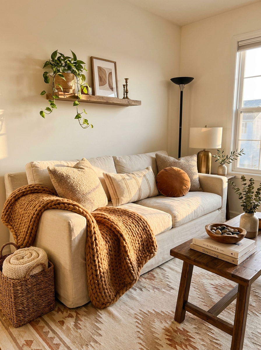
A chunky knit throw is probably the easiest way to add that expensive, cozy-luxe feeling to any room. I draped one over the arm of my sofa last winter, and people kept asking where I got my “new couch.” Same couch, just better styling.
The oversized texture is what does it. Those big, chunky stitches create visual weight and depth that makes everything around it look more intentional and layered. It’s the design equivalent of a statement necklace—it elevates the whole look.
You can find affordable versions at home stores, and they work everywhere. Sofa arms, the foot of your bed, draped over an accent chair, even folded in a basket. The key is letting it look casual and touchable, not perfectly arranged. That relaxed drape says “I live here and it’s lovely” instead of “don’t touch anything.”
25. Install Floating Shelves and Style Them Asymmetrically
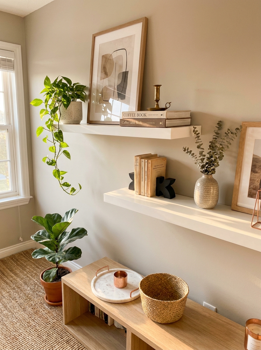
Floating shelves are the ultimate budget hack for instant architecture. They add dimension to flat walls and give you a chance to show off your styling skills without building custom cabinetry.
But here’s the secret most people miss: asymmetry is what makes them look expensive. Forget perfectly centered, evenly spaced objects. Mix heights. Lean art against the wall. Let a trailing plant drape over the edge. Tuck smaller objects in front of larger ones.
You want it to look like you casually collected beautiful things over time, not like you arranged them with a ruler. Group books in stacks of two or three. Add a small vase next to a sculptural object. The goal is curated, not matchy-matchy. When shelves feel a little unexpected, they read as designer-approved instead of DIY basic. And the best part? You can restyle them whenever the mood strikes without spending another dollar.
26. Use Architectural Corbels as Unexpected Shelf Brackets
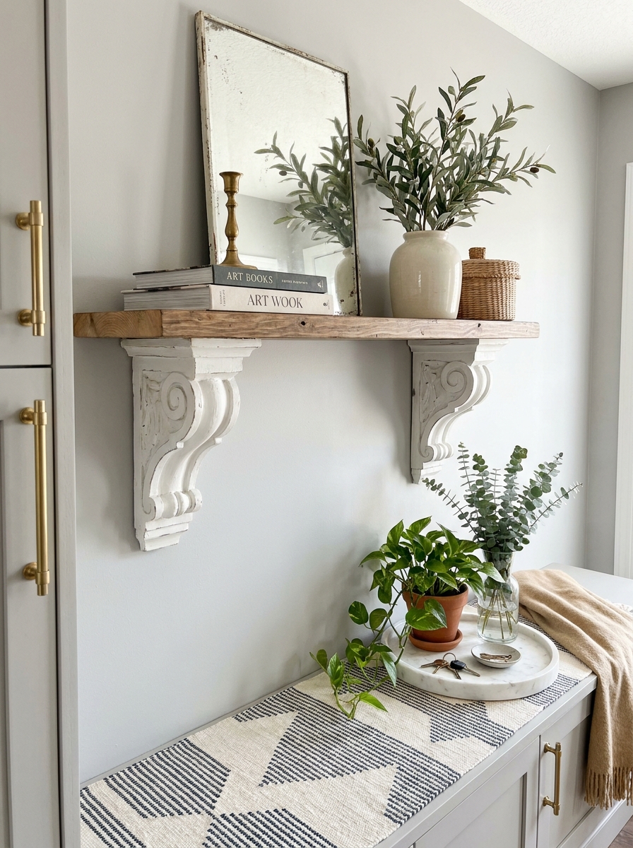
Want to make a simple shelf look like it belongs in a historic home? Swap boring metal brackets for decorative corbels. You can find affordable ones at home improvement stores or score vintage versions at thrift shops for just a few dollars.
These chunky, sculptural supports instantly add old-world charm and make even a basic wood plank look custom and considered. Paint them the same color as your wall for a subtle, built-in effect, or go bold with a contrasting finish like matte black or antique gold.
The beauty is in the detail. When someone walks into your space, they notice the craftsmanship first and assume everything cost more than it did. Corbels give you that architectural moment without the actual construction. Mount them under floating shelves in your kitchen, bathroom, or entryway, and suddenly your DIY project looks like something a designer specified. It’s a tiny upgrade that creates major visual impact.
27. Hang Drapery Panels on Each Side Without a Center Rod
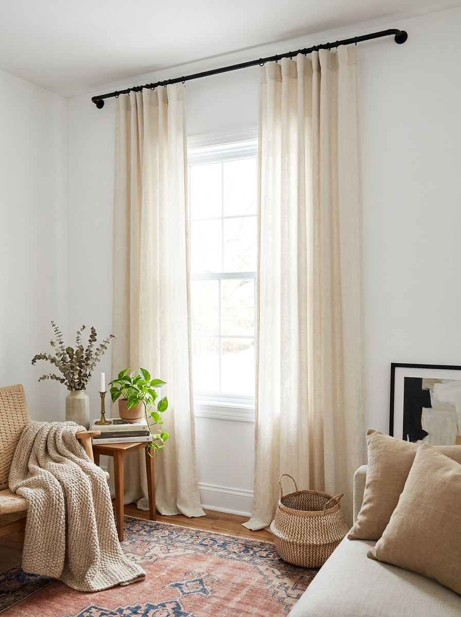
This trick is pure visual magic. Instead of a curtain rod that spans the entire window, mount two separate short rods on each side and hang panels that frame the window like elegant parentheses.
It looks so much more custom and expensive than a standard setup. The panels hang straighter, the fabric pools beautifully at the floor, and the whole window feels taller and more grand. Plus, you’re not wrestling with a giant sagging rod or dealing with that weird gap in the middle where light sneaks through.
This works especially well with linen or linen-look panels in neutral tones. The key is mounting the rods high and wide—almost to the ceiling and several inches past the window frame. When the panels just graze the sides of the window during the day, they create these beautiful vertical lines that make your room feel like it has soaring ceilings. It’s one of those details that people can’t quite put their finger on, but they know it looks expensive.
28. Layer a Smaller Rug Over a Larger Neutral One
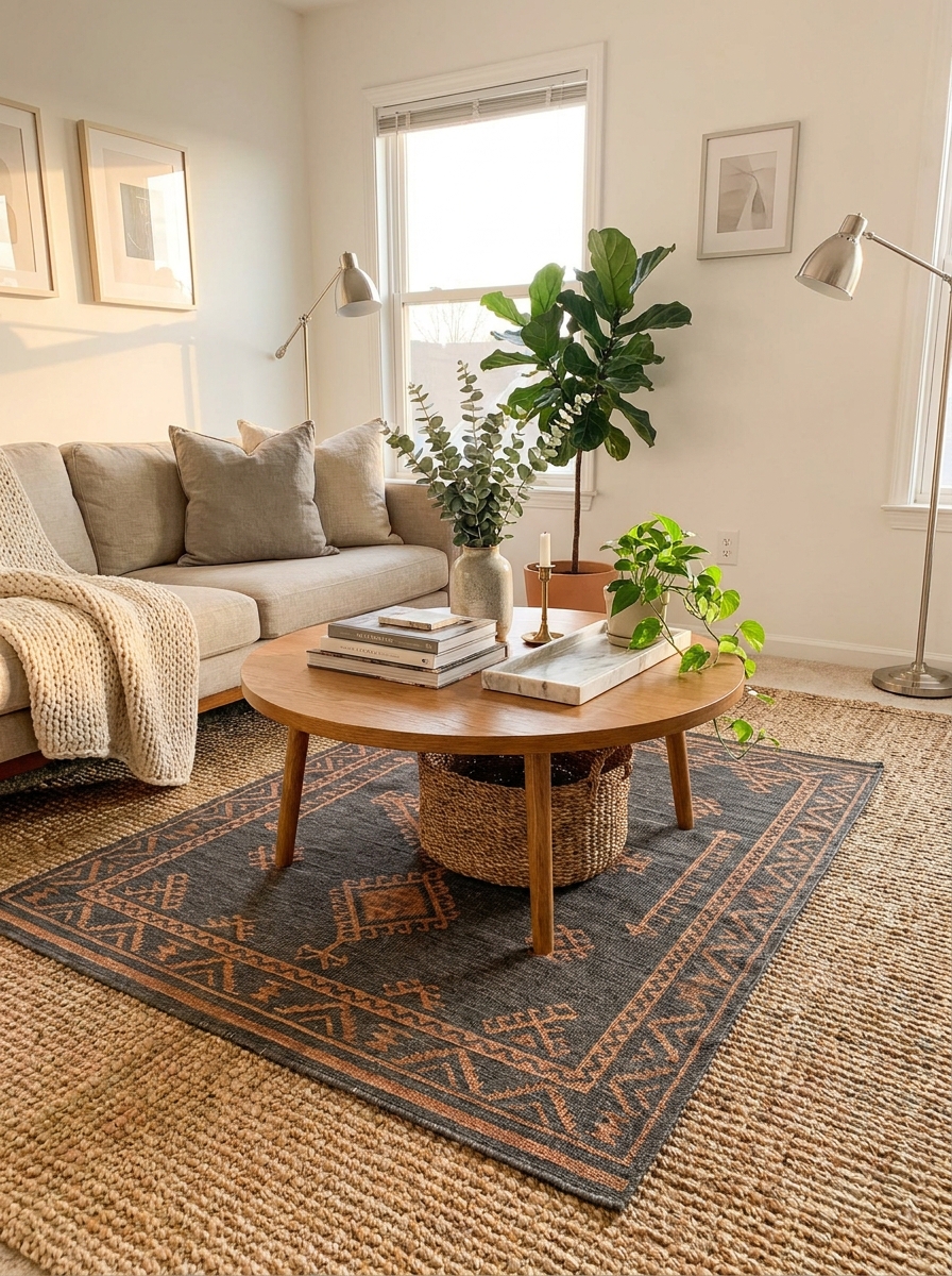
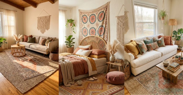
This is the styling trick that interior designers use to add pattern and color without commitment or major expense. Start with a large, neutral jute or sisal rug as your base, then layer a smaller patterned or textured rug on top.
It instantly makes your space look collected and intentional, like you’ve been thoughtfully curating pieces over time. The neutral base grounds everything and makes the room feel larger, while the smaller rug adds personality and visual interest exactly where you want it—under a coffee table, in front of a sofa, anchoring a reading nook.
The layered look also lets you experiment with bolder patterns and colors without overwhelming your space. Feeling adventurous? Try a vintage-inspired Persian rug. Want something modern? Go geometric. And because the top rug is smaller, it’s way more affordable than buying one massive statement piece. You get that expensive, layered, designer-approved look without the designer price tag. Plus, you can swap out the top rug seasonally without starting from scratch.
29. Display White Dishes Like They’re Collectible China
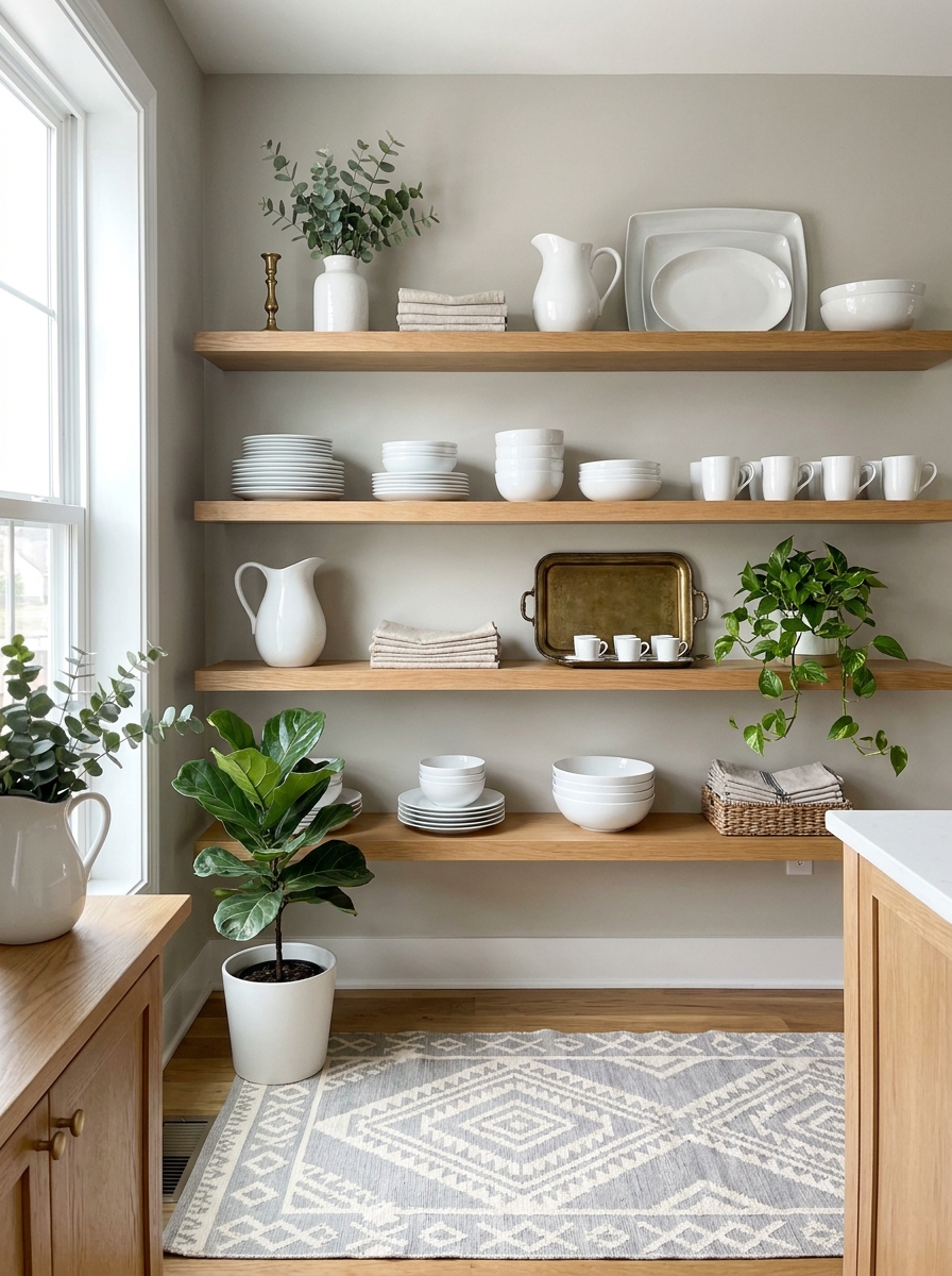
You know what looks ridiculously expensive? A collection of white dishes displayed on open shelving or in a glass-front cabinet. The secret? You don’t need heirloom china. Just basic white plates and bowls from IKEA or Target, styled like you inherited them from a fancy European grandmother.
The trick is mixing different white pieces—dinner plates, salad plates, bowls, serving platters—and arranging them with intention. Stack them in varying heights. Lean a few pieces against the back. Add a white pitcher or two. The monochromatic look reads as curated and expensive, even when each piece cost under ten dollars.
This works because white dishes have a timeless, classic elegance that never looks cheap. Plus, when you group them together, they create visual weight and importance. It’s the same reason high-end restaurants use all-white tableware. Suddenly your everyday dishes look like a designer’s intentional choice, not just what you grabbed on sale.
30. Hang One Dramatic Pendant Light Lower Than You Think
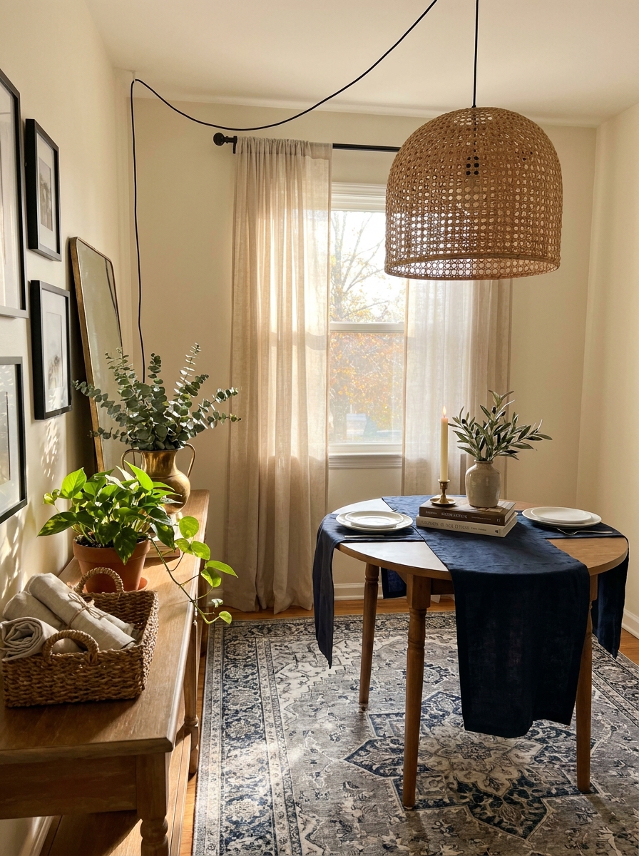
Here’s something designers do that instantly elevates a space: they hang pendant lights lower than most people would dare. Especially over a dining table, nightstand, or entryway console. When a beautiful light fixture hangs at eye level (or slightly above), it creates drama and intimacy that makes a room feel intentional and expensive.
You don’t need a $500 designer pendant. Even an affordable option from Amazon or a home improvement store looks custom when it’s hung at the right height. The key is going lower than feels safe—about 30-36 inches above a dining table, or low enough beside a bed that it feels like a sculptural moment.
This works because most people hang lights way too high, which makes them disappear into the ceiling. When you bring a pendant down into the sightline, it becomes a focal point. It creates visual weight. It looks like you hired someone who knows what they’re doing, even if you just watched a YouTube tutorial and installed it yourself.
Quick Guide
## Budget Breakdown: Where to Splurge vs. Save
SPLURGE ON: Hardware (brass pulls, knobs, hooks)—high-impact for low cost. Large area rugs—they anchor everything. One statement light fixture—it’s the jewelry of a room. Quality throw pillows in classic fabrics—they get touched and seen daily.
SAVE ON: Vases and decorative bowls—thrift stores are gold mines. Picture frames—spray paint cheap ones. Coffee table books—buy used. Throws and blankets—H&M Home and Target have great options. Wall art prints—support Etsy artists for $15-30. Faux plants—IKEA’s look shockingly real.
THE MAGIC RATIO: For every $100 you spend on decor, put $40 toward one quality foundational piece and $60 toward multiple smaller styled items. That balance creates the ‘expensive’ look because you’ve got both substance and styling working together.
Your Home, But Make It Look Pricey
Here’s what nobody tells you about expensive-looking homes: they’re not actually filled with expensive things. They’re filled with thoughtfully arranged things. A $12 thrifted brass tray becomes a bar cart essential. A $20 linen pillow looks custom when it’s layered with two others. A can of spray paint turns builder basic into designer chic. You’ve got 30 ways now to make your space look like you spent thousands when you definitely didn’t. The real secret is just caring enough to try. To swap out that hardware. To flip those book spines. To add that third texture. That’s it. That’s the whole game. Start with one idea from this list—maybe the easiest one, maybe the one that excites you most. Do that this weekend. Then pick another next month. Before you know it, people will be asking if you hired someone. And you’ll just smile and say you did it yourself. Because you did.
Frequently Asked Questions
How can I make cheap decor look expensive on a tight budget?
Focus on three key areas: upgrade hardware to brass or black matte finishes, layer different textures in every room, and use oversized mats when framing affordable art prints. These small changes create a high-end look without requiring a big investment. Strategic styling always beats expensive objects that aren’t arranged well.
What’s the fastest way to make a room look more luxurious?
Add one large area rug and swap out all visible hardware in that room. These two changes anchor the space and eliminate builder-grade vibes immediately. Then layer in three different textures on one surface—a coffee table or console—and you’ve created an expensive look in under an hour.
Where should I shop for affordable decor that looks high-end?
Hit thrift stores for brass candlesticks, trays, and vintage mirrors. Buy art prints on Etsy from independent artists. Get textiles like throw pillows and blankets from H&M Home, Target’s Threshold line, or HomeGoods. Amazon has surprisingly good brass hardware. Mix these sources and nobody will guess what cost $8 versus $80.
Can I make rental-friendly changes that still look expensive?
Absolutely. Focus on removable updates like peel-and-stick brass hardware, large area rugs that cover boring floors, and leaning large-scale art instead of hanging it. Style surfaces with layered textures and backwards books. Use removable wallpaper on one accent wall if your lease allows. All of these reverse when you move but look custom while you’re there.
How do I know which cheap items actually look expensive versus just cheap?
Look for simple, classic shapes without trendy details that’ll date quickly. Choose solid colors or subtle textures over loud patterns. Pick matte or brushed finishes instead of shiny plastic-looking ones. Natural materials like wood, linen, brass, and ceramic almost always read as more expensive than synthetic versions, even at budget prices.