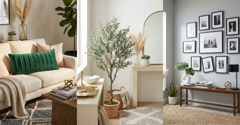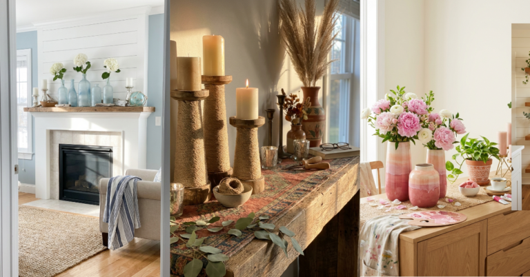
30 Warm Neutral Paint Colors That Transform Any Room
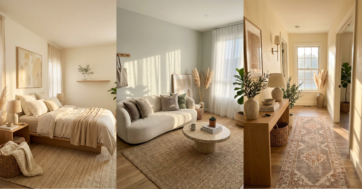
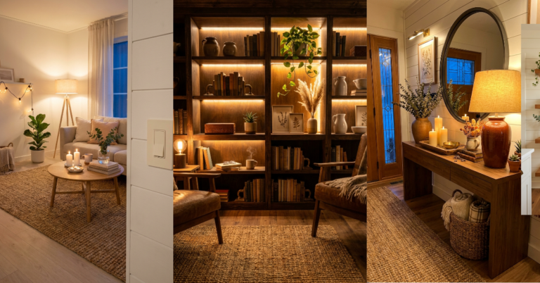
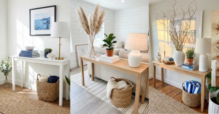
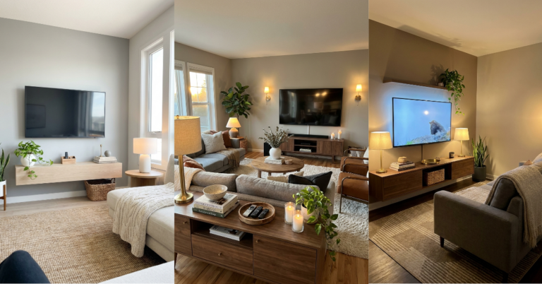
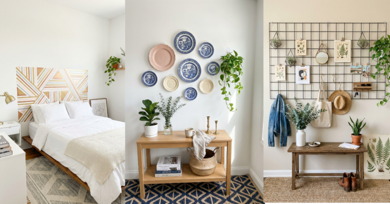
You know that feeling when you walk into a room and instantly exhale? That’s what the right warm neutral does. It’s not boring beige or cold gray—it’s that perfect in-between that makes everything feel softer, cozier, and somehow more expensive. But here’s the thing: picking a neutral is weirdly harder than choosing a bold color. They all look similar on those tiny paint chips, and then you get them on your wall and suddenly it’s either too yellow, too pink, or just… off. I’ve been there, staring at four different swatches of “white” wondering if I’ve lost my mind. The truth is, warm neutrals are magic when you get them right. They make your furniture look better, your light feel warmer, and your whole home feel like one cohesive, pulled-together space. And the best part? They never go out of style. Here’s what actually works.
1. Swiss Coffee: The Perfect Not-Quite-White
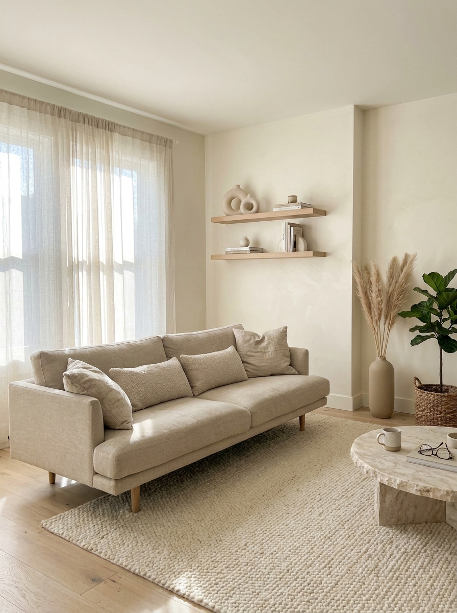
Swiss Coffee is that friend who gets along with everyone at the party. It’s warm without being yellow, soft without being flat, and it makes every room feel like it’s wrapped in cashmere. This color has serious depth—it shifts throughout the day, looking creamier in morning light and more sophisticated as the sun sets.
I love it in spaces where you want white walls but can’t stand that sterile hospital vibe. It works beautifully in living rooms with lots of natural light because it never looks stark or cold. Pair it with warm wood tones and linen textures, and you’ve got that effortless, expensive look everyone’s chasing.
The best part? Swiss Coffee plays incredibly well with other colors. Your navy sofa won’t look harsh against it. Your blush pillows will glow. Even your houseplants look happier. It’s one of those rare neutrals that makes decorating feel easy instead of stressful.
2. Accessible Beige: The Greige That Started It All
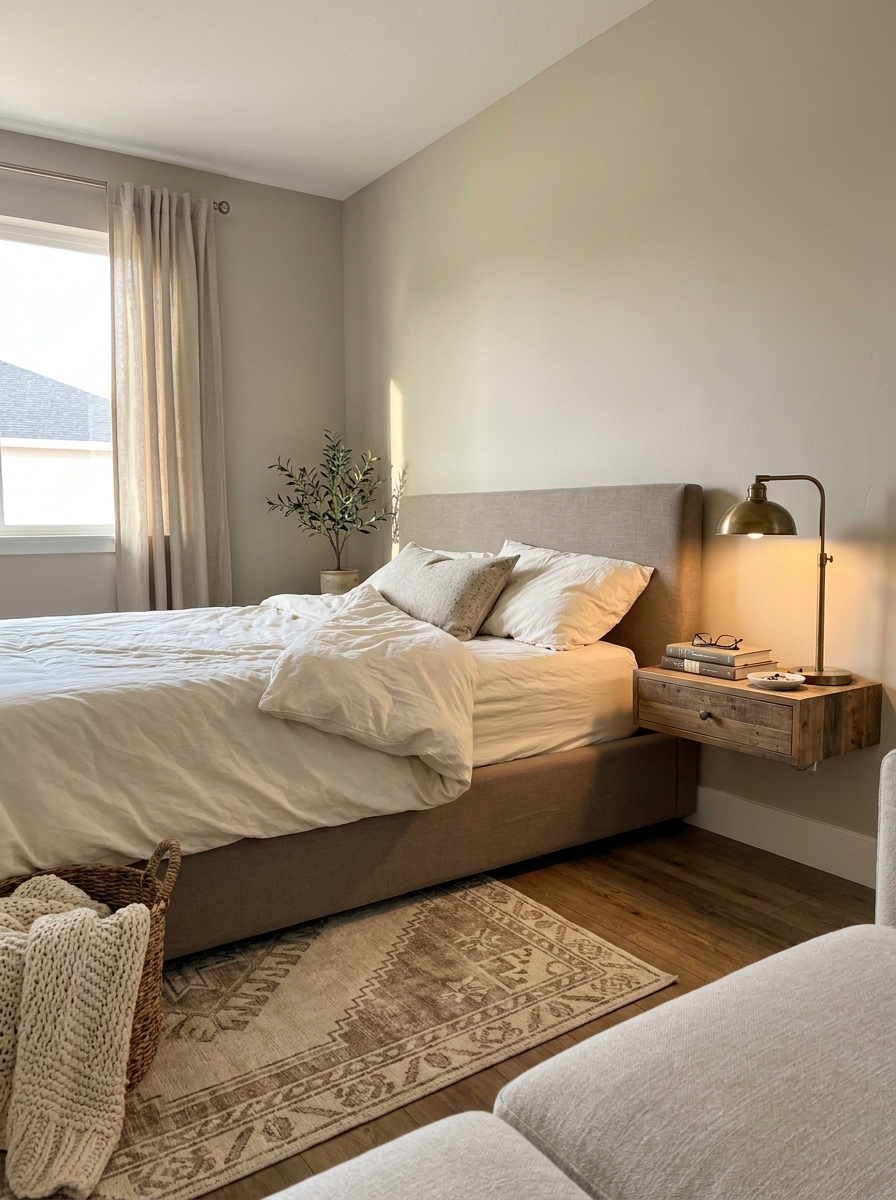
If greige had a queen, Accessible Beige would be wearing the crown. This is the color that launched a thousand Pinterest boards—and for good reason. It’s that perfect balance where gray meets beige and they decide to be best friends instead of fighting for dominance.
What makes Accessible Beige so special is how adaptable it is. In bright rooms, it leans slightly more gray and modern. In cozy spaces with warm lighting, the beige comes forward and everything feels instantly inviting. It’s like the chameleon of paint colors, but in the best possible way.
I’ve seen this color work in literally every room of the house. Bedrooms feel serene, kitchens feel sophisticated, and living rooms feel expensive. It’s especially gorgeous when you layer it with different textures—think chunky knits, smooth leather, rough linen, and natural wood all playing together. The color becomes this beautiful neutral backdrop that lets your personality shine through.
3. Edgecomb Gray: The Warm Gray That Isn’t Really Gray
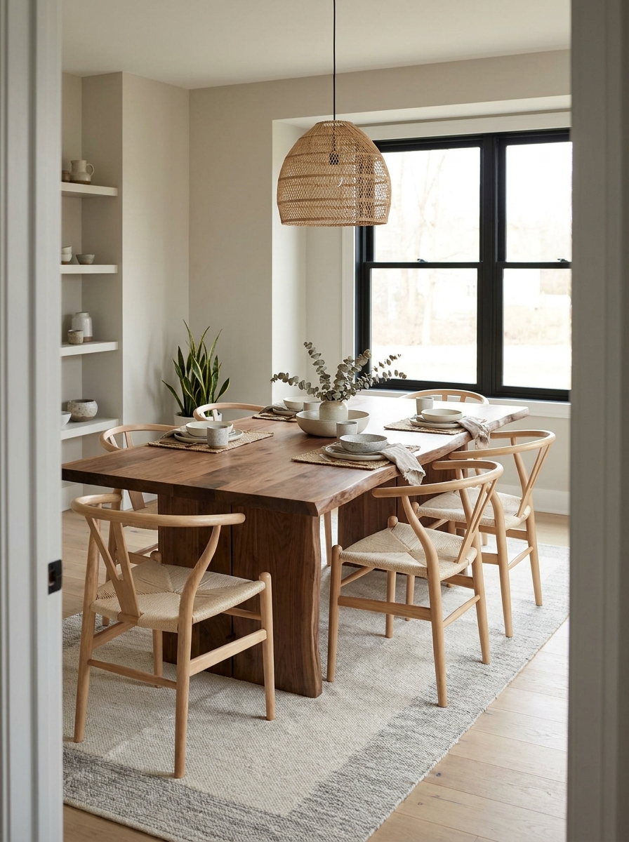
Here’s a secret: Edgecomb Gray is barely gray at all. It’s more like a warm hug disguised as a neutral paint color. This shade has strong beige undertones that keep it from ever feeling cold or builder-grade, which is exactly why designers obsess over it.
The magic happens in how this color responds to light. Morning sun brings out the softer, almost greige quality. Evening light makes it feel warmer and more golden. It never looks flat or one-dimensional, which is the kiss of death for a neutral. Your walls should have personality, and Edgecomb Gray delivers that without screaming for attention.
This is my go-to recommendation for people who want gray but are terrified of their home feeling cold. It bridges that gap beautifully. Works especially well in open-concept spaces because it flows from room to room without any awkward color shifts. Your dining room, kitchen, and living room can all wear this and feel cohesive.
4. Balboa Mist: Soft and Sophisticated
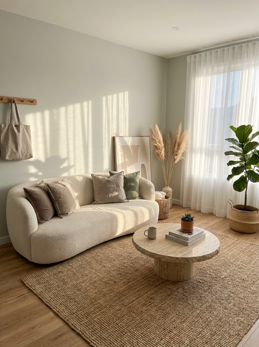
Balboa Mist is for people who want their walls to whisper instead of shout. This color has this ethereal, almost misty quality that makes every room feel larger and more serene. It’s cooler than most warm neutrals but still has enough warmth to avoid that sad gray apartment feeling.
What I love about Balboa Mist is how it plays with natural light. In bright spaces, it reads as a very soft, barely-there gray with subtle green undertones. Those green hints keep it from ever looking flat or boring. In rooms with less light, it warms up just enough to feel cozy without going dark. It’s basically the Goldilocks of paint colors.
This shade is absolutely stunning in bedrooms where you want that calm, spa-like vibe. But don’t sleep on it for living spaces—it creates the most beautiful, sophisticated backdrop for colorful artwork and bold furniture. Everything you put against it just looks more expensive and intentional.
5. Shaker Beige: The Cozy Neutral That Feels Like a Hug
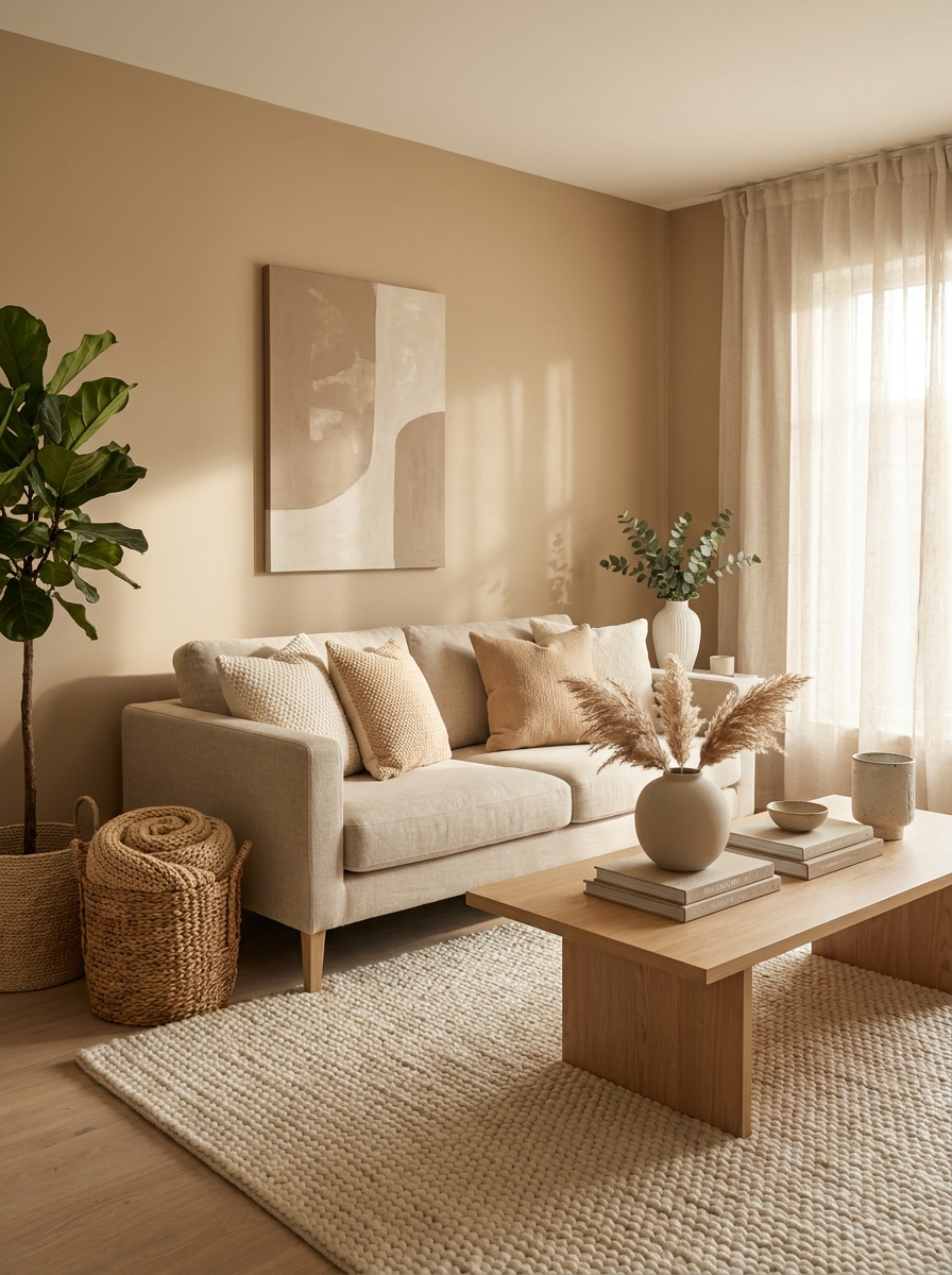
Shaker Beige is one of those colors that just makes you want to curl up with a good book and stay awhile. It’s warmer than your typical beige, with this beautiful honey-like undertone that catches the light in the most gorgeous way.
What I absolutely love about this color is how it changes throughout the day. Morning light makes it feel fresh and creamy, almost like vanilla ice cream. By afternoon, those warm peachy notes come out to play. And in the evening? Pure magic. It glows.
This is my go-to recommendation for anyone who says beige is boring. Shaker Beige proves them wrong every single time. It’s cozy without being dark, warm without feeling yellowy, and it makes literally everything in your room look better. Your white trim will pop, your wood furniture will sing, and your whole space will feel like it’s wrapped in the softest cashmere blanket.
6. Revere Pewter: The Chameleon Color Everyone Talks About
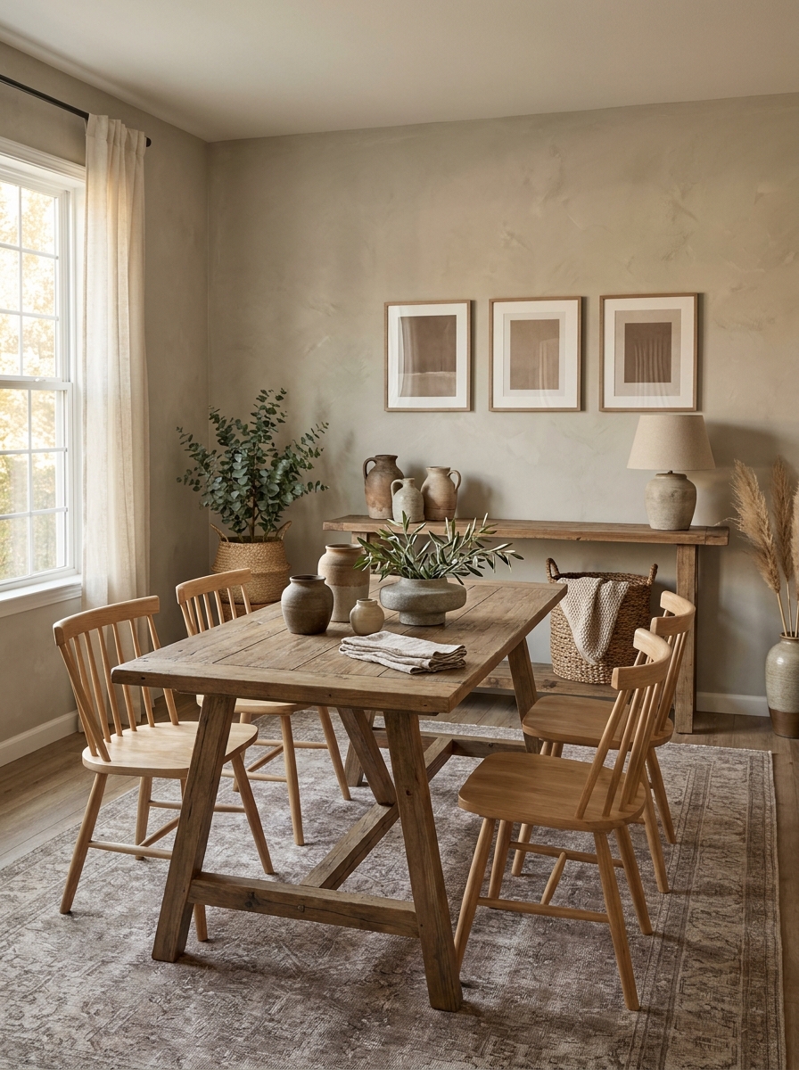
If paint colors had fan clubs, Revere Pewter would have the biggest one. And honestly? It totally deserves the hype. This color is like that effortlessly cool friend who looks good in everything and never tries too hard.
Revere Pewter sits right in that perfect sweet spot between gray and beige. Some people call it greige, but it’s more sophisticated than that. It has this incredible ability to read warmer or cooler depending on your lighting and what you pair it with. In a room with lots of natural light, it leans slightly gray. In spaces with warm artificial light, those soft beige undertones come forward.
What makes this color absolutely brilliant is its versatility. It works with literally any decorating style. Farmhouse? Check. Modern? Absolutely. Traditional? Perfect. It’s also one of those rare neutrals that plays well with both warm and cool accent colors, which makes decorating so much easier.
7. Alabaster: The Warm White That’s Not Scared of Color
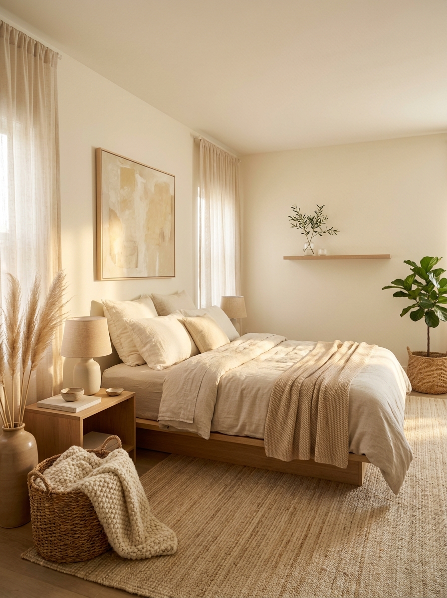
Alabaster is what happens when white gets cozy and inviting instead of stark and cold. It’s technically a white, but it has this gorgeous warm, creamy undertone that makes spaces feel finished and intentional rather than builder-grade basic.
Here’s what I love most about Alabaster: it’s white enough to make your trim and ceilings pop, but warm enough that your room doesn’t feel like a sterile doctor’s office. It has just a whisper of yellow-cream in it that catches the light beautifully. On sunny days, it looks crisp and fresh. On cloudy days, it still feels warm and welcoming.
This is my secret weapon color for people who are nervous about going too dark or too colorful. It gives you that clean, airy feeling everyone loves about white walls, but with actual personality and warmth. Plus, it’s incredibly forgiving and works beautifully with both cool and warm accent colors.
8. Natural Cream: The Buttery Neutral That Brings the Sunshine
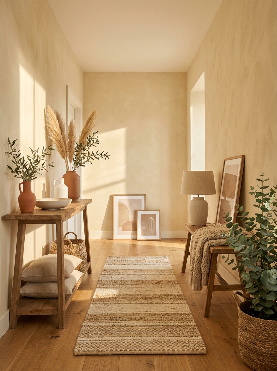
Natural Cream is like bottled sunshine for your walls. It’s warmer and richer than your standard cream, with this beautiful buttery quality that makes every room feel happy and welcoming the second you walk in.
This color has these lovely soft yellow undertones, but don’t worry—it doesn’t read as yellow at all. Instead, it just radiates warmth. Think of the color of heavy cream in your morning coffee, or the inside of a vanilla bean. It’s comforting, it’s classic, and it makes everything in your room look better.
What I absolutely adore about Natural Cream is how it makes small spaces feel bigger and brighter without feeling cold. It reflects light beautifully, so even hallways and rooms without tons of windows feel airy and open. And if you’ve got dark wood furniture or warm-toned floors, this color makes them look absolutely stunning.
9. Muslin: The Unsung Hero of Warm Neutrals
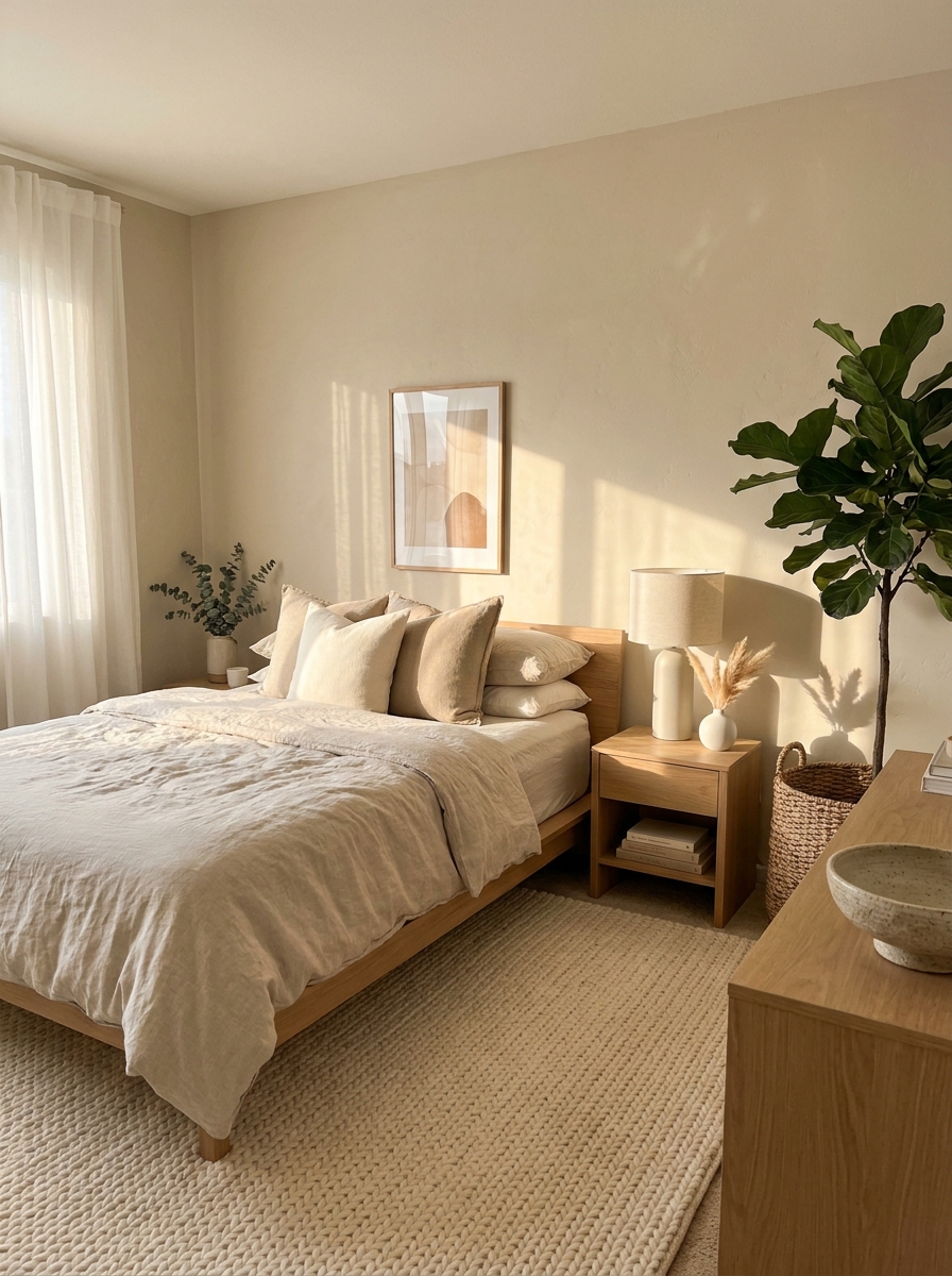
Okay, hear me out on this one. Muslin doesn’t get nearly enough love, and I honestly think it’s because the name sounds a little… boring? But this color is anything but! It’s like the perfect cup of milky coffee on a Saturday morning.
Muslin sits somewhere between a soft beige and a warm taupe, with just enough depth to feel grounded without ever looking heavy. It’s got this beautiful earthy quality that makes every room feel instantly cozy. I painted my guest bedroom in Muslin last spring, and I swear people sleep better in there now. It’s that comforting.
What I love most is how it plays with light throughout the day. Morning sun makes it feel fresh and airy, while evening light brings out these gorgeous warm undertones. It pairs beautifully with natural wood tones, linen textiles, and pretty much any greenery you throw at it. If you want a neutral that feels warm and welcoming without being too yellow or too gray, Muslin is your answer. It’s the friend who shows up with homemade soup when you’re sick.
10. Canvas: The Warm White That Actually Looks Expensive
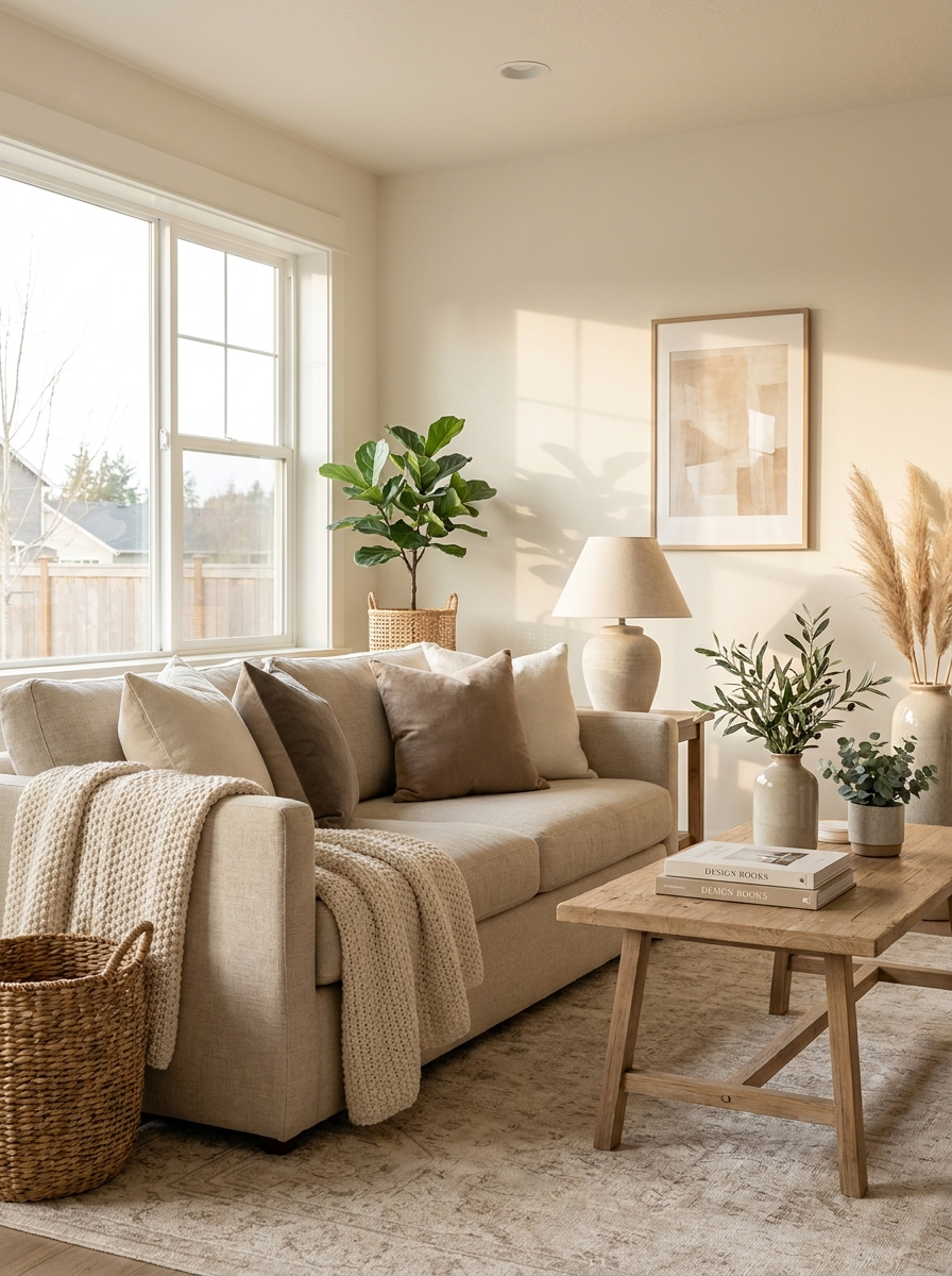
Canvas is what happens when white finally relaxes and stops trying so hard. It’s a warm white with the teeniest hint of beige that somehow manages to look incredibly high-end without any effort. I’m obsessed.
This color has a soft, sophisticated quality that makes everything in your home look more expensive. Seriously! Put your IKEA furniture against Canvas walls and suddenly it looks like it came from a boutique. There’s something about this particular shade that just elevates everything around it. It’s warm enough to feel inviting but light enough to make small spaces feel bigger.
I especially love Canvas in spaces with lots of natural light because it just glows. The beige undertones come alive in sunlight, creating this beautiful warm atmosphere that feels both airy and cozy at the same time. It’s perfect for modern farmhouse vibes, but it works just as well in a sleek contemporary space. Canvas is one of those colors that proves you don’t need bold color to make a statement. Sometimes the most beautiful choice is the one that whispers instead of shouts.
11. Kilim Beige: The Warm Neutral with Secret Depth
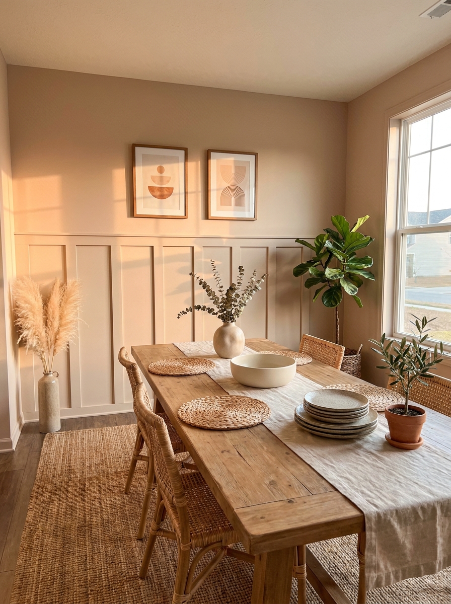
Don’t let the name fool you—Kilim Beige has way more personality than your average beige. It’s got these gorgeous warm undertones with just a whisper of pink and peach that come out depending on the light. It’s like the paint color equivalent of a plot twist!
What makes Kilim Beige so special is its complexity. In north-facing rooms, it leans more taupe and grounded. In south-facing spaces with lots of warm light, those peachy undertones come out to play and it feels absolutely glowing. I’ve seen this color look completely different in the same house depending on which room you’re standing in, and honestly? That’s part of its magic.
It’s a bit deeper than some of the lighter neutrals we’ve talked about, which makes it perfect if you want warmth without going full-on cream or beige. Kilim Beige creates this cocooning effect that makes rooms feel intimate and special. It’s especially beautiful in dining rooms or bedrooms where you want that wrapped-in-warmth feeling. And it plays so nicely with natural textures—think jute, linen, and worn leather.
12. Navajo White: The Creamy Neutral That Feels Like Home
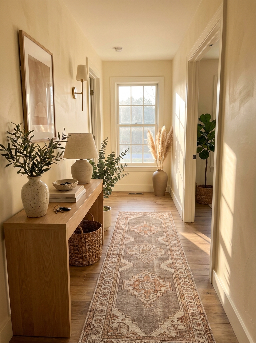
Navajo White is that perfect creamy neutral that feels like someone’s already lived in and loved your house for years. It’s got more warmth than your typical white, but it’s lighter and airier than traditional beige. Think vanilla ice cream melting into warm caramel.
This color has serious cozy credentials. It’s warm without being yellow, creamy without being heavy, and it has this wonderful way of making everything feel settled and comfortable. I painted my hallway in Navajo White and now it feels like the warm hug that connects all my rooms together. It’s especially gorgeous in spaces that don’t get tons of natural light because it brings its own gentle warmth to the party.
What I really appreciate about Navajo White is how forgiving it is. It doesn’t show every little scuff or handprint the way stark white does, which makes it perfect for high-traffic areas or homes with kids and pets. And it plays beautifully with both cool and warm accent colors, so you’re not locked into one decorating direction. It’s like the friend who gets along with everyone at the party.
13. Manchester Tan: The Neutral That Gets Better with Age
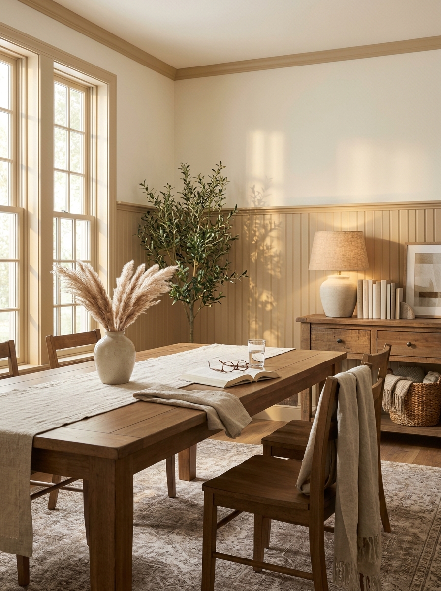
There’s something about Manchester Tan that just feels established. Like it’s been on your walls for years, getting better and richer with every season.
This is Benjamin Moore’s answer to the question: what if beige had a little more backbone? It’s got these gorgeous golden undertones that make it feel timeless without being boring. In morning light, it’s soft and buttery. By afternoon, it deepens into something almost honeyed.
I love Manchester Tan in dining rooms and studies where you want that warm, cocooning feeling. It’s the color equivalent of leather-bound books and good wine. It makes furniture look expensive and rooms feel collected over time rather than bought all at once. Pair it with dark wood tones and you’ll feel like you’re living in a beautifully aged European townhouse. But here’s the surprise — it also looks incredible with modern pieces. The warmth balances out sleek lines perfectly.
14. Soft Chamois: The Peachy Neutral That’s Not Actually Peach
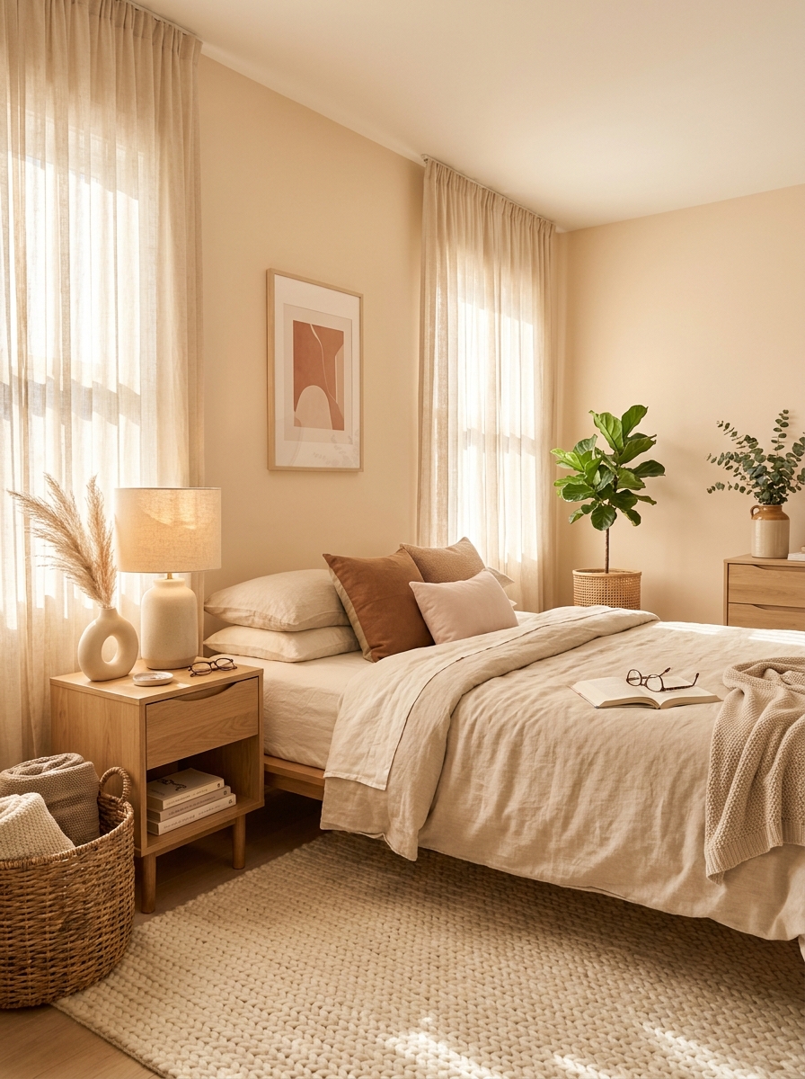
Okay, hear me out on this one. Soft Chamois sounds intimidating, but it’s actually the warmest, most forgiving neutral you’ll ever meet.
It’s got these subtle peachy-pink undertones that somehow don’t read as pink at all. Instead, it creates this incredible warmth that makes your skin look amazing and your whole house feel like it’s perpetually bathed in golden hour light. It’s a Behr color that deserves way more love than it gets.
I’m obsessed with Soft Chamois in bedrooms because it creates the dreamiest, most restful atmosphere. It’s like waking up inside a sunrise every single morning. But here’s what makes it really special — it works beautifully with both warm and cool accents. Want to add sage green? Perfect. Navy blue? Gorgeous. Terracotta? Chef’s kiss. The peachy undertones are just strong enough to add personality but subtle enough to play well with everything. It’s especially stunning in rooms that don’t get tons of natural light because it brings its own warmth.
15. Grant Beige: The Taupe That Finally Makes Sense
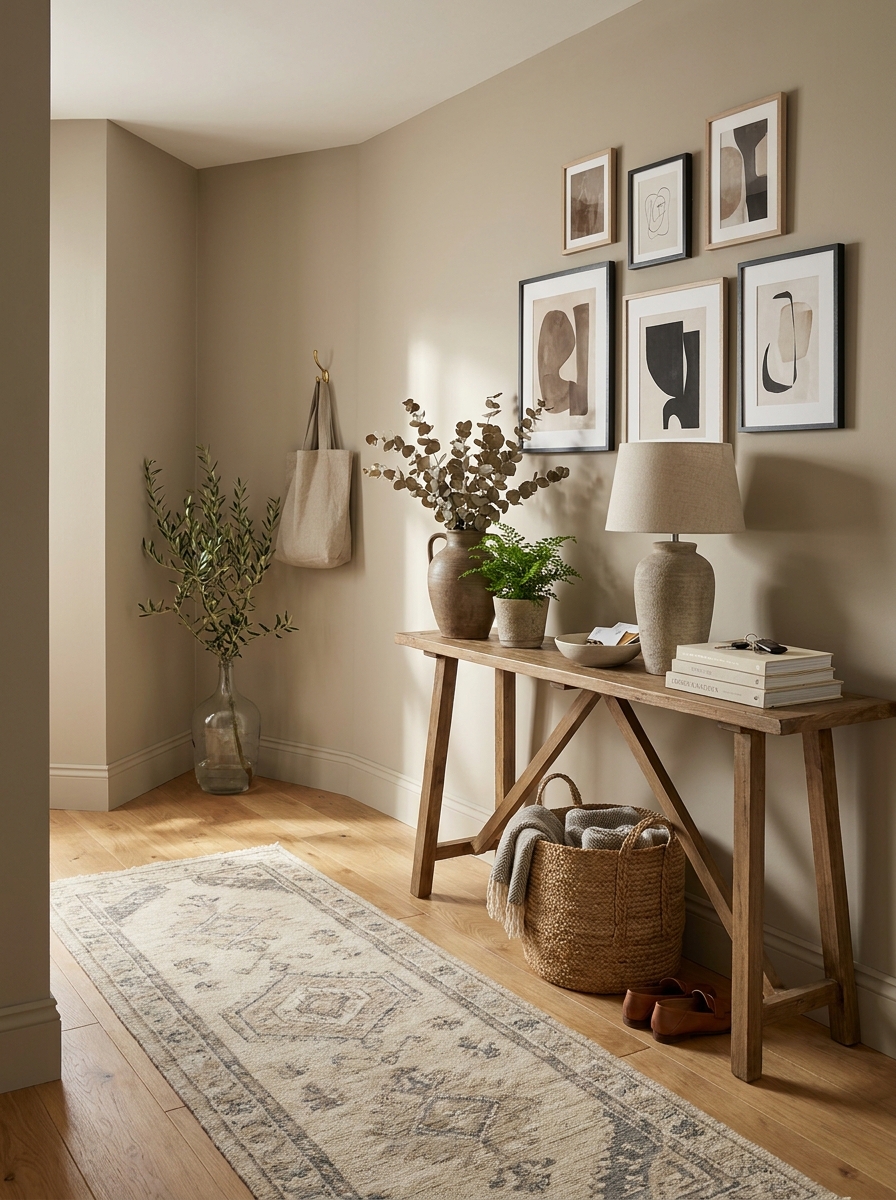
If you’ve been burned by taupe before, Grant Beige is here to heal those wounds. This Benjamin Moore color is taupe done right — no purple, no green, no weird surprises.
It’s perfectly balanced between warm and cool, which sounds impossible but somehow this color pulls it off. There’s enough gray to keep it sophisticated and enough beige to keep it cozy. It’s the Goldilocks of neutral paint colors, and once you see it in person, you’ll understand why designers keep it in their back pocket.
Grant Beige is my go-to for open concept spaces where you need one color to flow through multiple rooms. It’s substantial enough to create a real backdrop without ever feeling heavy. I especially love it in living rooms with lots of windows because it shifts beautifully throughout the day. Morning light makes it feel fresh and airy. Evening light brings out the warmth. It’s also phenomenal with both black and brass accents, which is rare for a neutral.
16. Nomadic Desert: The Earthy Neutral with Wanderlust
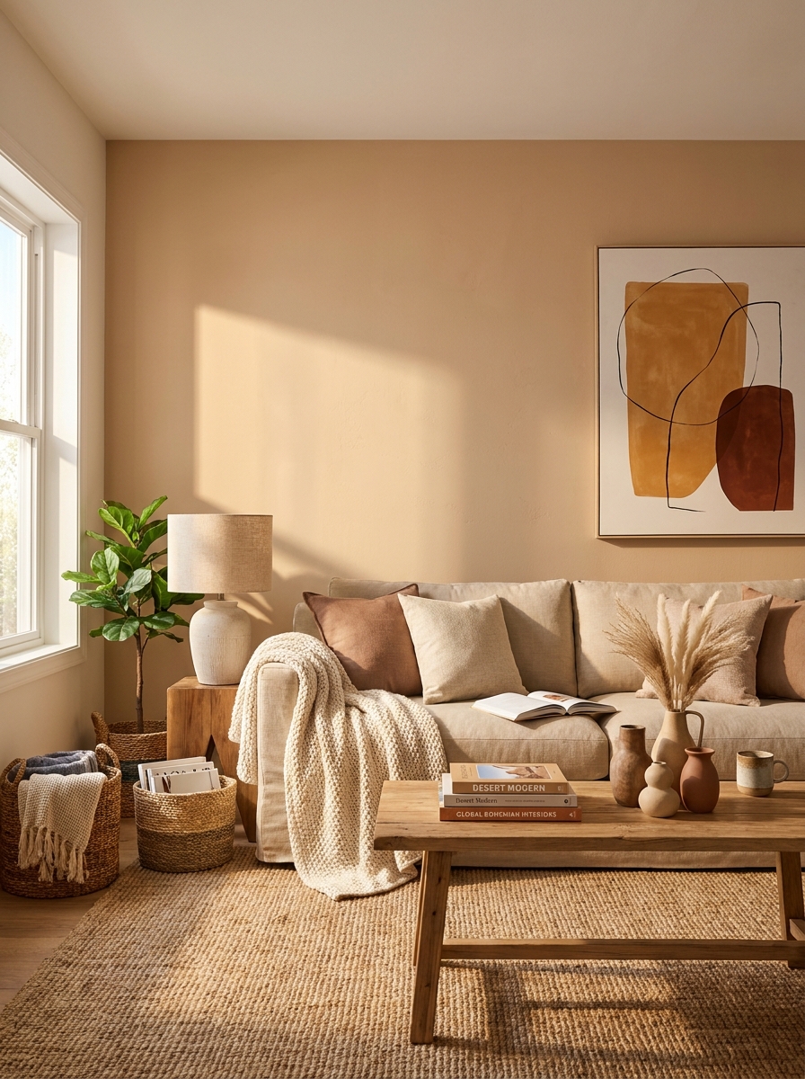
Nomadic Desert sounds like a Sherwin-Williams color that should come with a passport, and honestly, it kind of does. This is for anyone who wants their walls to feel like they’ve traveled the world.
It’s this gorgeous sandy beige with the slightest whisper of terracotta that makes every room feel like a sun-drenched Mediterranean villa. Not orange, not pink — just warmth with a story. It’s earthy and grounded but somehow also feels elevated and worldly.
I’m completely smitten with Nomadic Desert in living rooms with lots of natural textures. It makes jute rugs, linen sofas, and ceramic pottery look absolutely incredible. The color has this way of making everything feel intentionally collected rather than just bought. It’s especially beautiful with black accents and natural wood tones. And if you’re into the whole organic modern aesthetic, this color is basically made for you. It brings the outside in without trying too hard. Just real, honest warmth that makes you want to kick off your shoes and stay awhile.
17. Linen White: The Warm White That Breathes
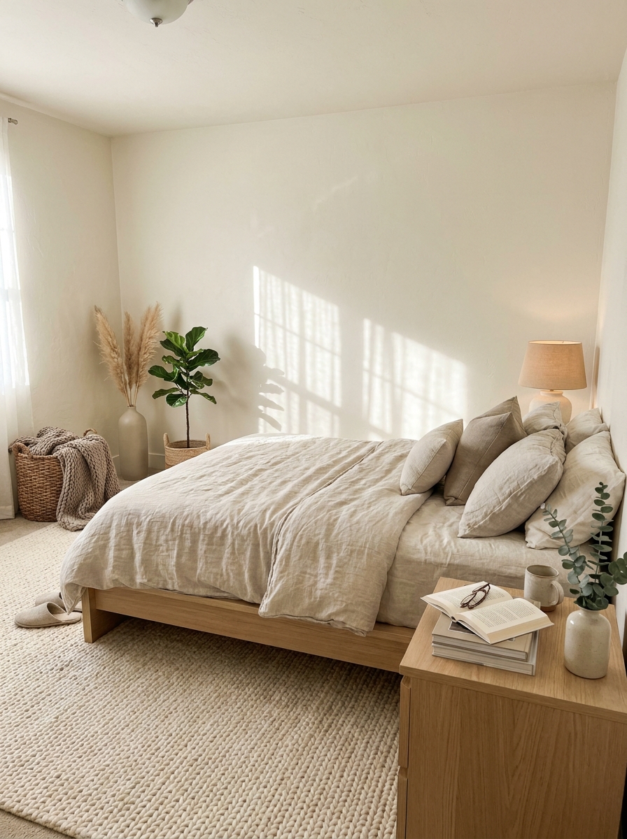
Okay, so Linen White isn’t exactly white. It’s more like what happens when cream decides to go on a minimalist retreat. It has this beautiful, barely-there warmth that makes rooms feel bright without that cold, sterile vibe.
What I love about Linen White is how it changes throughout the day. Morning light makes it feel fresh and airy. Evening light? Pure coziness. It’s got these subtle greige undertones that keep it from looking flat or builder-grade.
This color is perfect for those of us who want bright, clean walls but can’t deal with harsh white. It works beautifully in bedrooms where you want that crisp, fresh-sheets feeling. I’ve also seen it do magic in living rooms with tons of natural light. It basically takes all that sunshine and turns it into the softest, warmest glow. Pair it with natural linens, light wood, and lots of texture, and you’ve got yourself a Scandinavian dream space.
18. Barcelona Beige: The Sophisticated Neutral That Travels Well
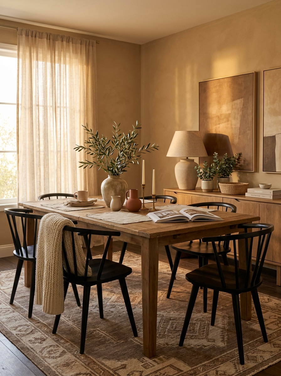
Barcelona Beige sounds fancy, and honestly? It kind of is. This is the neutral you choose when you want your home to feel like a boutique hotel in Europe. It’s warm, it’s elegant, and it has this gorgeous depth that cheaper beiges just don’t have.
Here’s what makes it special: it’s got these beautiful golden undertones that come alive in natural light. Not yellow, not orange—just this warm, sun-kissed glow that makes every room feel expensive. It’s darker than your typical builder beige, which means it creates a really cozy, wrapped-up feeling.
I especially love Barcelona Beige in dining rooms or entryways where you want to make an impression. It pairs beautifully with dark wood furniture, brass accents, and crisp white trim. The contrast is chef’s kiss. It’s also surprisingly gorgeous with pops of terracotta or rust if you’re feeling a little adventurous. This is definitely a grown-up neutral that knows what it’s doing.
19. Pashmina: The Cashmere-Soft Neutral You’ll Want to Touch
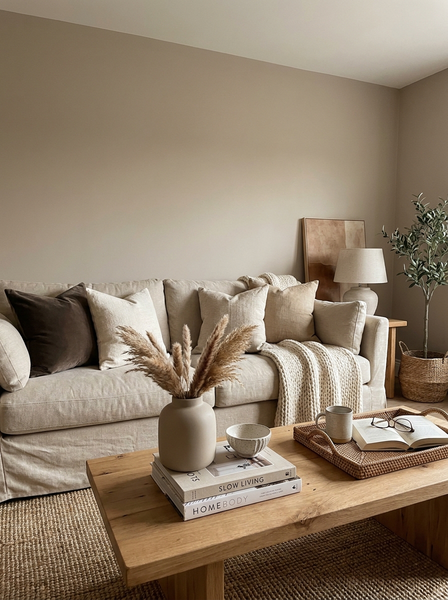
The name tells you everything. Pashmina feels exactly like wrapping yourself in the softest, most luxurious fabric. It’s a warm taupe-meets-greige that somehow manages to be both modern and timeless at the same time.
What makes Pashmina so special is its incredible versatility. It’s warm enough to feel cozy but neutral enough to work with literally everything. I’ve seen it look stunning with cool blues, gorgeous with warm terracottas, and absolutely perfect with all-white bedding. It’s that friend who gets along with everyone at the party.
This color really shines in bedrooms and living rooms where you want that sophisticated, pulled-together look without trying too hard. It has enough depth to make a statement but stays soft enough to be relaxing. The greige undertones keep it current and fresh—no grandma vibes here. It’s particularly beautiful when you layer in lots of different textures. Think velvet, linen, wool, wood. Pashmina is the perfect backdrop for all that tactile goodness.
20. Honey Wheat: The Golden Neutral That Brings the Sunshine In
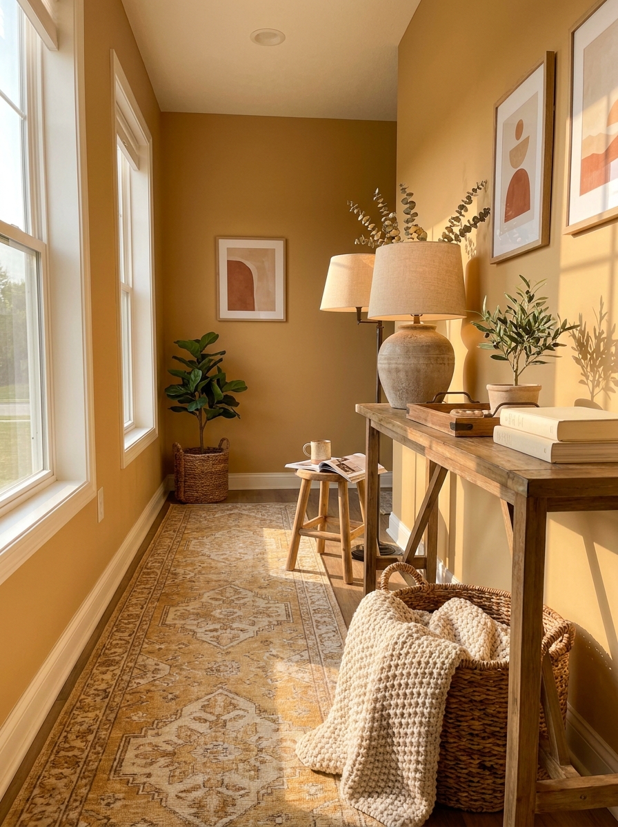
If you’ve been looking for a neutral that actually makes you smile when you walk into a room, meet Honey Wheat. This is warm, optimistic, and filled with golden goodness. It’s like bottled sunshine without being remotely yellow.
Honey Wheat has this amazing ability to make north-facing rooms feel warm and inviting. Those rooms that usually feel cold and sad? This color transforms them. It’s got beautiful amber undertones that glow in natural light and stay cozy even when the sun goes down. It’s warmer than your typical beige but not so saturated that it overwhelms.
I love this color in kitchens, breakfast nooks, or any space where you want to create happy, energizing vibes. It pairs beautifully with white cabinets, natural wood, and plants—lots of plants. Think of it as the neutral equivalent of a really good latte. Warm, comforting, makes everything better. It’s also gorgeous with navy blue or forest green if you want to add some contrast.
21. Pale Oak: The Barely-There Neutral That Does Everything
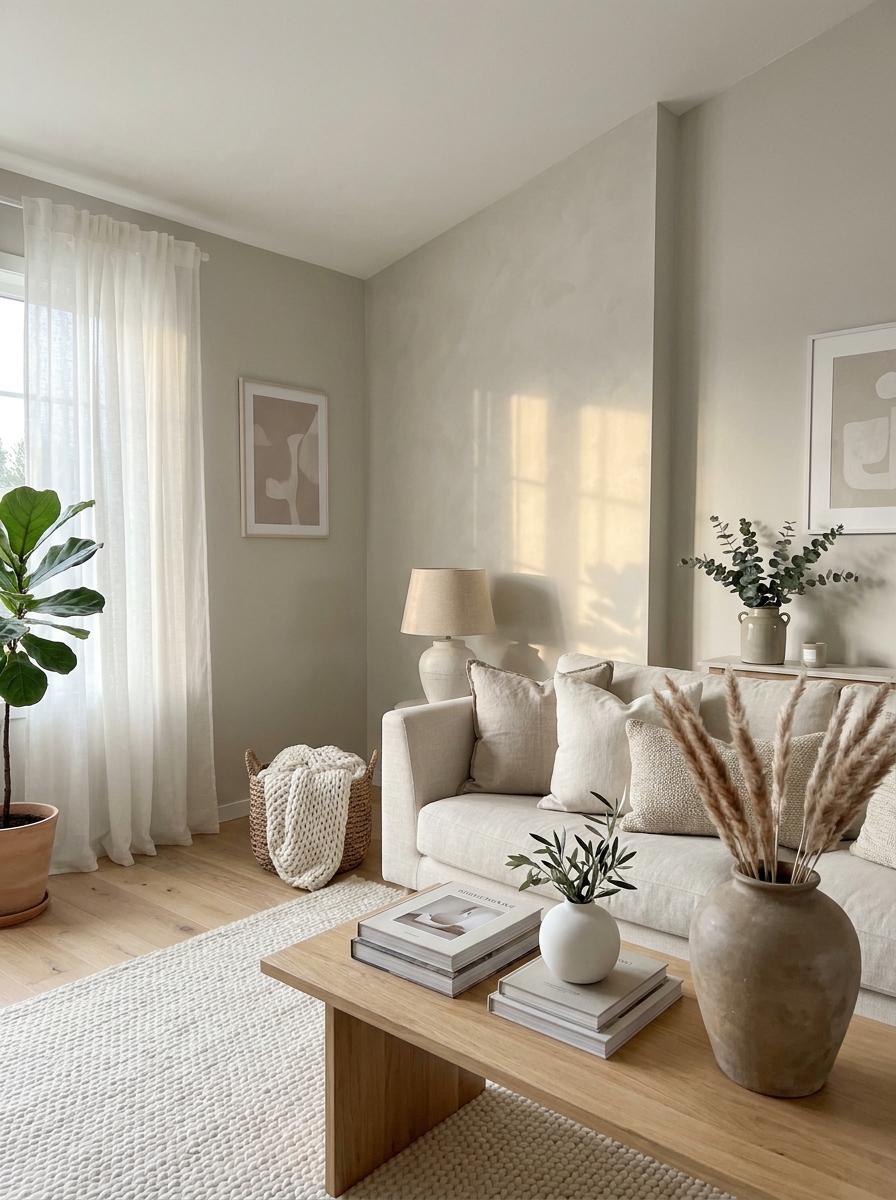
This is the color that makes everyone ask, “Wait, what color IS that?” And honestly? That’s exactly why it’s genius. Pale Oak sits in that magical space between beige and gray and greige, but it never commits fully to any of them. It just floats there, looking effortlessly beautiful in literally any light.
What I love most is how it disappears in the best way possible. It’s not boring—it’s just so perfectly balanced that it lets everything else in your room shine. Your art looks better. Your furniture looks more expensive. Your plants look greener. It’s like the friend who makes everyone around them look good without trying.
And the warmth? It’s there, but it’s subtle. You won’t get that pink undertone situation that happens with some neutrals. Just this gentle, soft warmth that makes rooms feel calm and put-together. It works in modern homes, traditional spaces, and everything in between. Honestly, if you can’t decide on a color, just pick this one. You won’t regret it.
22. Sandstone: The Desert-Inspired Neutral with Soul
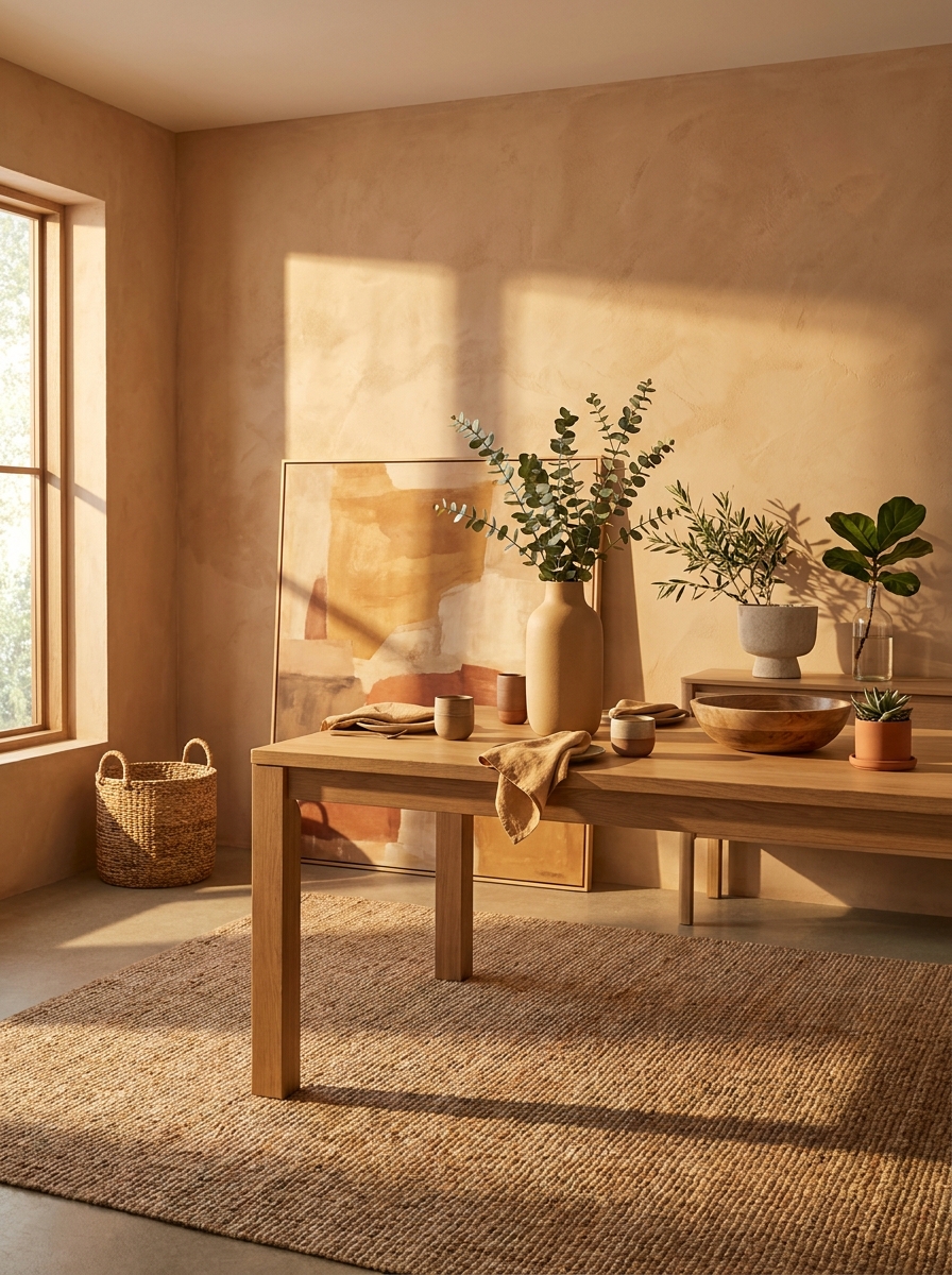
If you’ve ever been to the Southwest and felt that immediate sense of calm from all those gorgeous desert landscapes, that’s what Sandstone brings into your home. It’s this beautiful warm beige with just enough terracotta and clay undertones to feel earthy and grounded without going full adobe house.
This color actually changes throughout the day, and I’m obsessed with it. Morning light makes it look soft and peachy. Afternoon sun brings out those gorgeous golden tones. Evening? It gets richer and cozier, like the color equivalent of wrapping yourself in a warm blanket. It’s never boring, never flat.
What really gets me is how organic it feels. Sandstone doesn’t try to be cool or trendy—it just is. It pairs beautifully with natural materials like jute, linen, terracotta, and all those woven textures we’re loving right now. And if you’re into plants (who isn’t?), the warmth in this color makes all your greenery absolutely pop against the walls.
23. Classic Gray: The Warm Gray That Finally Got It Right
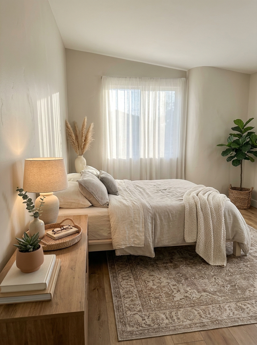
Okay, I know what you’re thinking. “Gray? Warm? Haven’t we been burned by this before?” Trust me, I get it. We’ve all painted a room “warm gray” only to end up with cold, sad walls that look purple at night. But Classic Gray is different. This is the warm gray that actually delivers on its promise.
It has these beautiful greige undertones that keep it from going cold, but it’s definitely more gray than beige. Think of it as the sophisticated older sibling of all those trendy greiges. It’s refined, it’s timeless, and it works in literally any style home. Modern? Check. Traditional? Absolutely. Farmhouse? You bet.
What I really appreciate is how it handles different lighting situations. North-facing room? It stays warm and inviting instead of going icy. South-facing with tons of sun? It doesn’t get washed out or look dingy. It’s just consistently, reliably beautiful. And in a world of paint colors that surprise you in terrible ways, that reliability is everything.
24. Smokey Taupe: The Cozy Neutral That’s Not Afraid of Drama
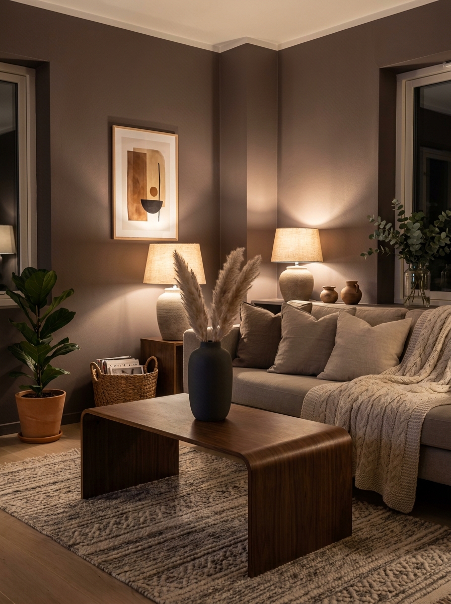
Here’s the thing about Smokey Taupe—it’s for people who want warmth but also want a little edge. This isn’t your safe beige. It’s deeper, moodier, and way more interesting. Think of it as the color equivalent of lighting candles in the afternoon just because you want to.
The “smokey” part gives it this beautiful depth that makes rooms feel intentional and curated, not just painted and done. But the taupe keeps it from going too dark or cold. You get coziness with sophistication, warmth with drama. It’s that perfect balance that’s really hard to find in paint colors.
I especially love this in spaces where you want to create intimacy—bedrooms, reading nooks, dining rooms. It wraps around you in the best way. And here’s a bonus: it makes everything look more expensive. Your basic Target pillows? Suddenly chic. Your hand-me-down furniture? Now it’s vintage and curated. Smokey Taupe is basically mood lighting in paint form, and I’m here for it.
25. Kestrel White: The Warm White with a Secret Glow
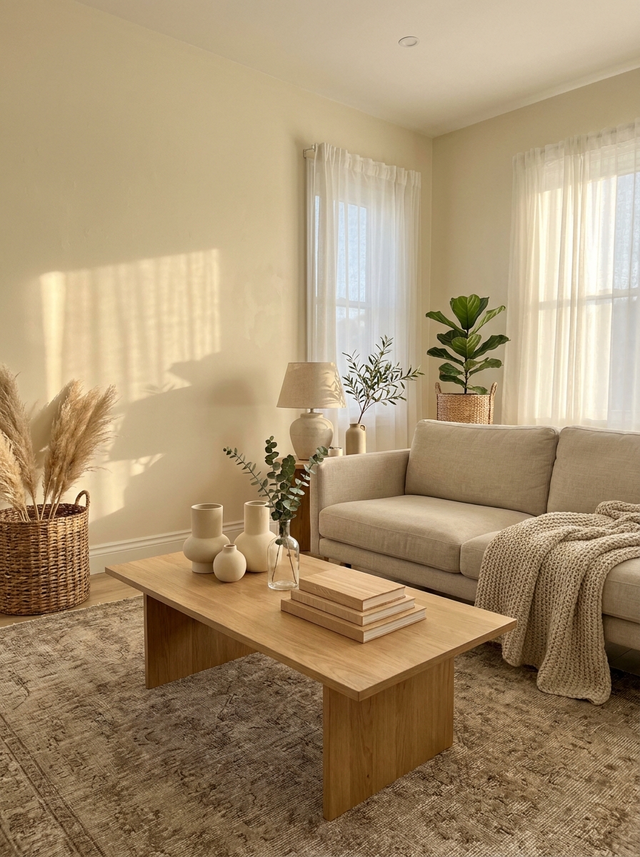
This is one of those colors that photographs terribly but looks absolutely stunning in real life. Kestrel White has this amazing quality where it catches light and bounces it back with the softest golden glow. It’s warmer than your typical white but stops short of looking creamy or yellow.
What I love most about this color is how it changes throughout the day. Morning light makes it look fresh and crisp, while afternoon sun brings out these gorgeous warm undertones. It’s the kind of white that makes a room feel bigger without feeling cold or sterile. Perfect for spaces that get tons of natural light but need that cozy factor.
It works beautifully in open floor plans because it’s warm enough to feel inviting but light enough to keep things airy. I’ve seen it look incredible in kitchens paired with natural wood and brass hardware. It’s also my secret weapon for making small spaces feel more expensive without going full stark white.
26. Stone Hearth: The Grounding Neutral That Feels Like Nature
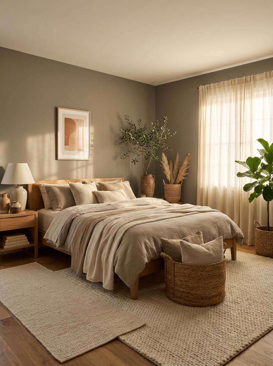
Stone Hearth is what happens when beige meets gray and they decide to invite a little earthiness to the party. It’s one of those colors that feels completely organic, like it was pulled straight from a riverbed or a hiking trail. There’s something incredibly grounding about this shade.
The name is perfect because it really does feel like sitting by a warm stone fireplace. It has these subtle gray-brown undertones that keep it from reading too warm or too cool. Instead, it just sits in this perfect neutral space that makes everything around it look better. It’s sophisticated without trying too hard, and it pairs beautifully with both modern and rustic elements.
What makes Stone Hearth special is its ability to anchor a space. It’s not a background color that disappears. It’s present and warm and inviting, but it never competes with your furniture or decor. I love it in dining rooms and bedrooms where you want that cozy, wrapped-in-warmth feeling.
27. Biscuit: The Warm Neutral That’s Basically a Hug for Your Walls
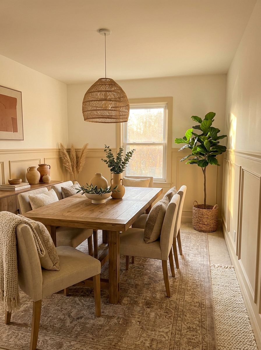
If you could paint your walls with the feeling of fresh-baked bread and butter, it would be Biscuit. This color is pure comfort. It’s warm and soft and just a little bit buttery without crossing into yellow territory. It’s the kind of color that makes guests want to kick off their shoes and stay awhile.
Biscuit has this amazing ability to make any space feel instantly cozy and lived-in. It’s warmer than beige, softer than tan, and somehow manages to feel both casual and elegant at the same time. The undertones are mostly golden with just a whisper of peachy warmth that becomes more obvious in natural light.
I especially love this color in spaces where people gather. Living rooms, breakfast nooks, reading corners. Anywhere you want to create that feeling of warmth and welcome. It pairs beautifully with warm woods, natural linens, and any shade of white or cream. It’s also fantastic with darker accent colors because it provides such a soft, warm backdrop.
28. Warm Stone: The Neutral That Makes Every Room Feel Expensive
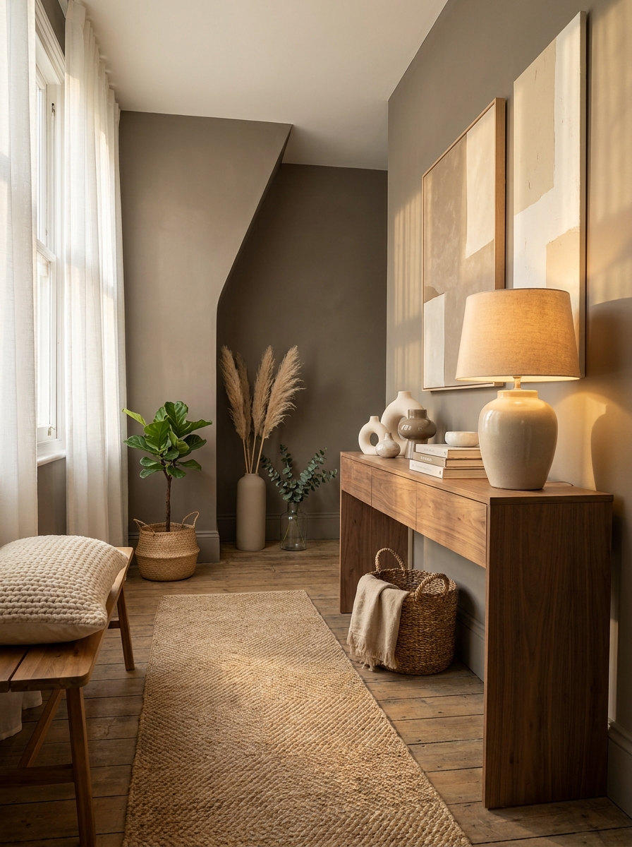
Warm Stone is that color you see in luxury hotels and high-end design magazines and wonder why everything looks so pulled-together. It’s a medium-toned greige that leans just slightly warm, with these gorgeous taupe undertones that add instant sophistication to any space.
What sets Warm Stone apart is its versatility paired with presence. It’s not trying to fade into the background like some neutrals. It has enough depth to create atmosphere and mood, but it’s still neutral enough to work with virtually any color palette. In morning light, it looks soft and serene. By evening, it takes on this rich, cozy quality that makes spaces feel incredibly inviting.
This is the color for anyone who wants their home to feel elevated without being fussy. It works equally well in modern spaces with clean lines and in more traditional homes with classic details. Pair it with crisp whites and it feels fresh and contemporary. Add in deeper woods and warm metals, and suddenly it’s cozy and layered.
29. Toasted Almond: The Nutty Neutral That Warms Everything Up
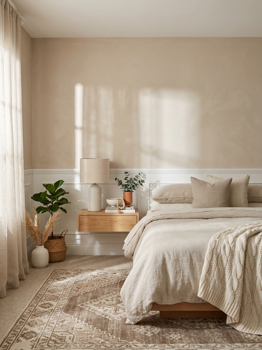
Okay, this one’s for anyone who wants their walls to feel like a cashmere sweater. Toasted Almond is that gorgeous barely-tan color that has just enough warmth to make everything feel cozy without going full beige. It’s like the paint equivalent of a perfect latte—smooth, creamy, and impossible not to love.
What makes this color so special is how it shifts throughout the day. Morning light makes it feel soft and buttery. Afternoon sun brings out these subtle peachy undertones that are just *chef’s kiss*. And in the evening? It absolutely glows. I’ve seen this color transform cold north-facing rooms into warm, inviting spaces that people never want to leave.
It plays incredibly well with whites and creams, so your trim and ceiling will look crisp and fresh. And if you’re worried about it reading too yellow, don’t be. The almond undertones keep it sophisticated and balanced.
30. Natural Linen: The Textured Neutral That Feels Like Fabric on Your Walls
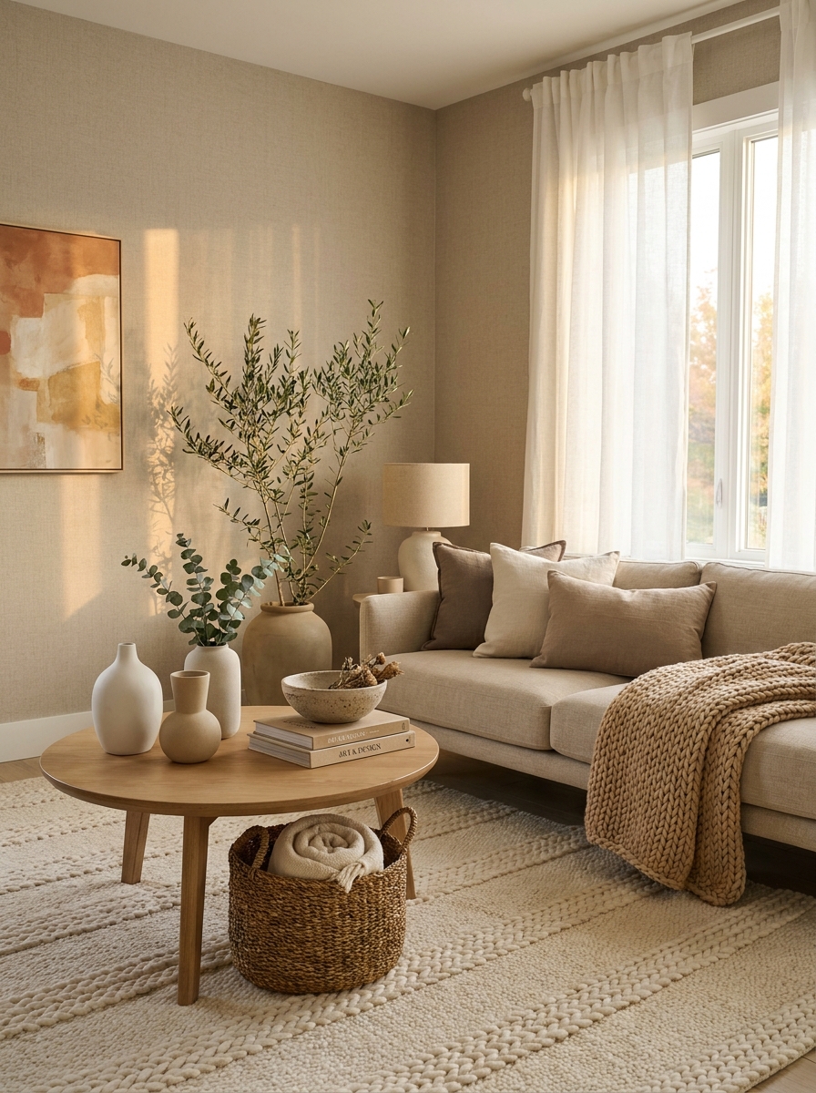
This is it—the color that wraps up our list with the coziest, most touchable vibe imaginable. Natural Linen isn’t just a paint color; it’s an experience. It has this incredible fabric-like quality that makes your walls feel soft and inviting, like they’re wrapped in actual linen cloth. I’m obsessed.
The magic is in the undertones. Natural Linen has these beautiful warm gray-beige notes with the tiniest hint of greige that keeps it from feeling too yellow or too pink. It’s the Goldilocks of warm neutrals—perfectly balanced, endlessly versatile, and ridiculously easy to live with. I’ve used this in everything from modern farmhouse kitchens to minimalist bedrooms, and it works every single time.
What I love most is how it creates this calm, sophisticated backdrop that lets your furniture and art take center stage. It never competes, never overwhelms. It just quietly makes everything look better and more expensive than it actually is. That’s the dream, right?
Quick Guide
Quick Guide: Finding Your Perfect Warm Neutral
If you love: Bright, airy spaces → Try Swiss Coffee, Alabaster, or White Dove
If you love: Cozy, moody vibes → Try Accessible Beige, Revere Pewter, or Agreeable Gray
If you love: Modern farmhouse → Try Edgecomb Gray, Shiplap, or Aesthetic White
If you love: Minimalist elegance → Try Balboa Mist, Classic Gray, or Pale Oak
Testing Tip: Paint large poster boards (at least 2×3 feet) and move them around your room throughout the day. Live with them for at least 48 hours. Colors change dramatically from morning to evening, and your lighting situation is completely unique to your space. What looks perfect at 10am might feel off at 7pm.
Undertone Check: Hold your sample next to pure white paper. You’ll immediately see if your neutral leans pink, yellow, green, or purple. This helps you understand how it’ll play with your existing furniture and decor.
Your Walls Are About to Thank You
Here’s the thing about warm neutrals—they’re not the boring choice. They’re actually the brave choice. It takes confidence to let your walls fade into the background so your life can be the star of the show. These 30 colors aren’t just paint. They’re the foundation of a home that feels like you, that welcomes people in, that makes ordinary Tuesday evenings feel a little bit special.
The right warm neutral makes decorating easier, not harder. Suddenly your thrifted finds look intentional. Your hand-me-down furniture looks curated. Your whole space feels cohesive even when you’re mixing ten different styles because you can’t commit to just one aesthetic (same, honestly).
So grab those samples. Paint those poster boards. Live with the colors for a few days. And then pick the one that makes you feel something. Because that’s what a great paint color does—it makes you feel at home the second you walk through the door. Your perfect warm neutral is waiting. Go find it.
Frequently Asked Questions
What’s the difference between warm and cool neutrals?
Warm neutrals have undertones of yellow, red, or orange that make spaces feel cozy and inviting—think beige, cream, and greige. Cool neutrals lean toward blue, green, or purple undertones and create a more crisp, modern feel. In rooms with lots of natural light, warm neutrals prevent that sterile look, while cool neutrals can feel refreshing in south-facing rooms with tons of sun.
How do I test paint colors before committing to a whole room?
Buy sample pots and paint large poster boards or directly on your wall in 2×3 foot sections. Move them around to different walls and observe how they look in morning, afternoon, and evening light. Live with them for at least two days. The color that still makes you happy after 48 hours in all lighting conditions is your winner.
Can I use different warm neutrals in connecting rooms?
Absolutely! The key is keeping them in the same color family with similar undertones. For example, Swiss Coffee in the living room can flow beautifully into Accessible Beige in the hallway because they both have warm, creamy undertones. Just avoid mixing warm beiges with cool grays—that’s where things start looking disjointed.
Why does my neutral paint look different than the paint chip?
Paint chips are tiny and viewed under store lighting, which is completely different from your home’s natural and artificial light. Your wall color is also influenced by your flooring, furniture, and even the color of light bouncing in from outside. This is why testing in your actual space is non-negotiable—those little chips lie, but big samples tell the truth.
What’s the best white trim color to pair with warm neutral walls?
Simply White and Chantilly Lace are classic choices that create crisp contrast without looking stark. If you want less contrast, go with White Dove or Decorators White—they have subtle warm undertones that complement warm neutral walls beautifully. The trim should be noticeably lighter than your wall color to define the space without harsh lines.